Challenges to the CO2 Global Warming Hypothesis: (6) The Greenhouse Effect Doesn’t Exist, Revisited

As a further addendum to my series of posts in 2020 and 2021 on the CO2 global warming hypothesis, this post presents another challenge to the hypothesis central to the belief that humans make a substantial contribution to climate change. The hypothesis is that observed global warming – currently about 0.85 degrees Celsius (1.5 degrees Fahrenheit) since the preindustrial era – has been caused primarily by human emissions of CO2 and other greenhouse gases into the atmosphere.

The challenge, made in two papers published by Australian scientist Robert Holmes in 2017 and 2018 (here and here), purports to show that there is no greenhouse effect, a heretical claim that even global warming skeptics such as me find dubious. According to the paper’s author, greenhouses gases in the earth’s atmosphere have played essentially no role in heating the earth, either before or after human emissions of such gases began.

The papers are similar to one that I discussed in an earlier post in the series, by U.S. research scientists Ned Nikolov and Karl Zeller, who claim that planetary temperature is controlled by only two forcing variables. A forcing is a disturbance that alters climate, producing heating or cooling. The two forcings are the total solar irradiance, or total energy from the sun incident on the atmosphere, and the total atmospheric pressure at a planetary body’s surface.

In Nikolov and Zeller’s model, the radiative effects integral to the greenhouse effect are replaced by a previously unknown thermodynamic relationship between air temperature, solar heating and atmospheric pressure, analogous to compression heating of the atmosphere.

Their findings are illustrated in the figure below where the red line shows the modeled, and the circles the actually measured, mean surface temperature of the rocky planets and moons in the solar system that have atmospheres: Venus, Earth, Mars, our Moon, Titan (a moon of Saturn) and Triton (a moon of Neptune). Ts is the surface temperature and Tna the calculated temperature with no atmosphere.

Like Nikolov and Zeller, Holmes claims that the temperatures of all planets and moons with an atmosphere are determined only by solar insolation and surface atmospheric pressure, but with a twist. The twist, in the case of Earth, is that its temperature of -18.0 degrees Celsius (-0.4 degrees Fahrenheit) in the absence of an atmosphere is entirely due to heating by the sun, but the additional 33 degrees Celsius (59 degrees Fahrenheit) of warmth provided by the atmosphere comes solely from atmospheric compression heating.

Holmes argues that the extra 33 degrees Celsius (59 degrees Fahrenheit) of heating cannot be provided by the greenhouse effect. If it were, he says, planetary surface temperatures could not be accurately calculated using the ideal gas law, as Holmes shows that they can.

The next figure compares Holmes’ calculated temperatures for seven planets including Earth, the moon Titan and Earth’s South Pole, using the ideal gas law in the form T = PM/Rρ, where T is the near-surface temperature, M is the mean molar mass near the surface, R is the gas constant and ρ is the near-surface atmospheric density.

However, the close agreement between calculated and actual surface temperatures is not as remarkable as Holmes thinks, simply because we would expect planets and moons with an atmosphere to obey the ideal gas law.

In any case, the argument of both Holmes and Nikolov and Zeller that compression of the atmosphere can explain greenhouse heating has been invalidated by PhD meteorologist Roy Spencer. Spencer points out that, if atmospheric pressure causes the lower troposphere (the lowest layer of the atmosphere) to be warmer than the upper troposphere, then the same should be true of the stratosphere, where the pressure at the bottom of this atmospheric layer is about 100 times larger than that at the top.

Yet the bottom of the stratosphere is cooler than the top for all planets except Venus, as can be seen clearly from the following figure of Holmes. The vertical scale of decreasing pressure is equivalent to increasing altitude; the dotted horizontal line at 0.100 bar (10 kilopascals) marks the boundary between the troposphere and stratosphere.

Both of these farfetched claims that there is no greenhouse effect stem from misunderstandings about energy, as I discussed in my earlier post.

Next: Arctic Sea Ice Refuses to Disappear, despite Ever Rising Arctic Temperatures

No Evidence That Climate Change Is Making Droughts Any Worse

The hullabaloo in the mainstream media about the current drought in Europe, which has been exacerbated by the continent’s fourth heat wave this summer, has only amplified the voices of those who insist that climate change is worsening droughts around the world. Yet an exami­nation of the historical record quickly confirms that severe droughts have been a feature of the earth’s climate for millennia – a fact corroborated by several recent research studies, which I described in a recent report.

The figure below shows a reconstruction of the drought pattern in central Europe from 1000 to 2012, using tree rings as a proxy, with observational data from 1901 to 2018 super­imposed. The width and color of tree rings consti­tute a record of past climate, including droughts. Black in the figure depicts the PDSI or Palmer Drought Severity Index that measures both dryness (negative values) and wetness (positive values); red denotes the so-called self-calibrated PDSI (scPDSI); and the blue line is the 31-year mean.

You can see that historical droughts from 1400 to 1480 and from 1770 to 1840 were much longer and more severe than any of those in the 21st century, when modern global warming began. The study’s conclusions are rein­forced by the results of another recent study, which failed to find any statistically significant drought trend in western Europe during the last 170 years.

Both studies give the lie to the media claim that this year’s drought is the “worst ever” in France, where rivers have dried up and crops are suffering from lack of water. But French measurements date back only to 1959: the media habitually ignores history, as indeed does the IPCC (Intergovernmental Panel on Climate Change)’s Sixth Assessment Report in discussing drought and other weather extremes.

And while it’s true that the 2022 drought in Italy is worse than any on record there since 1800, the 15th century was drier yet across Europe, as indicated in the figure above.

Another study was able to reconstruct the drought pattern in North America over the last 1200 years, also from tree ring proxies. The reconstruction is illustrated in the next figure, showing the PDSI-based drought area in western North America from 800 to 2003, as a percentage of the total land area. The thick black line is a 60-year mean, while the blue and red horizon­tal lines represent the average drought area during the periods 1900–2003 and 900–1300, respectively.

The reconstruc­tion reveals that several unprecedently long and severe “megadroughts” have also occurred in western North America since the year 800, droughts that the study authors re­mark have never been experienced in the modern era. This is em­phasized in the figure by the comparison between the period from 1900 to 2003 and the much more arid, 400-year interval from 900 to 1300. The four most significant historical droughts during that dry interval were centered on the years 936, 1034, 1150 and 1253.

As evidence that the study’s conclusions extend be­yond 2003, the figure below displays observational data showing the percentage of the contiguous U.S. in drought from 1895 up until 2015.

Comparison of this figure with the yearly data in the previous figure shows that the long-term pattern of overall drought in North America continues to be featureless, despite global warming during both the Medieval Warm Period and today. A similar conclusion was reached by a 2021 study comparing the duration and sever­ity of U.S. hydrological droughts between 1475 and 1899 to those from 1900 to 2014. A hydrological drought refers to drought-induced decreases in streamflow, reservoir levels and groundwa­ter.

A very recent 2022 paper claims that the southwestern U.S. is currently experiencing its dri­est 22-year period since at least the year 800, although it does not attribute this entirely to climate change. As shown in the figure below, from another source, the years 2000-2018 were the second-driest 19-year period in California over the past 1,200 years.

However, although the third-driest period in the 1100s and the fifth driest period in the 1200s both occurred during the Medieval Warm Period, the driest (1500s) and fourth-driest (800s) periods of drought occurred during relatively cool epochs. So there is no obvious connection between droughts and global warming. Even the IPCC concedes that a recent harsh drought in Mada­gascar cannot be attributed to climate change; one of the main sources of episodic droughts globally is the ENSO (El Niño Southern Oscillation) ocean cycle.

Regional variations are significant too. A 2021 research pa­per found that, from 1901 to 2017, the drought risk increased in the southwestern and southeastern US, while it decreased in northern states. Such regional differences in drought patterns are found throughout the world.

Next: Challenges to the CO2 Global Warming Hypothesis: (6) The Greenhouse Effect Doesn’t Exist, Revisited

Evidence for More Frequent and Longer Heat Waves Is Questionable

In a warming world, it would hardly be surprising if heat waves were becoming more common. By definition, heat waves are periods of abnormally hot weather, last­ing from days to weeks. But is this widely held belief actually supported by observational evidence?

Examination of historical temperature records reveals a lack of strong evidence linking increased heat waves to global warming, as I’ve explained in a recent report. Any claim that heat waves are now more frequent and longer than in the past can be questioned, either because data prior to 1950 is completely ignored in many compilations, or because the data before 1950 is sparse.

One of the main compilations of global heat wave and other tem­perature data comes from a large international group of climate scientists and meteorologists, who last updated their dataset in 2020. The dataset is derived from the UK Met Office Hadley Centre’s gridded daily temperature da­tabase.

The figure below depicts the group’s global heat wave frequency (lower panel) from 1901 to 2018, and the calculated global trend (upper panel) from 1950 to 2018. The frequency is the annual number of calendar days the maximum temperature exceeded the 90th percentile for 1961–1990 for at least six consecutive days, in a window centered on that calendar day.

As you can see, the Hadley Centre data­set appears to support the assertion that heat waves have been on the rise globally since about 1990. However, the dataset also indicates that current heat waves are much more frequent than during the 1930s – a finding at odds with heat wave frequency data for the U.S., which has detailed heatwave records back to 1900. The next figure shows the frequency (top panel) and magnitude (bottom panel) of heat waves in the U.S. from 1901 to 2018.

It's clear that there were far more frequent and/or longer U.S. heat waves, and they were hotter, in the 1930s than in the present era of global warming. The total annual heat­ wave (warm spell) duration is seen to have dropped from 11 days during the 1930s to about 6.5 days during the 2000s. The peak heat wave index in 1936 was a full three times higher than in 2012 and up to nine times higher than in many other years.

Al­though the records for both the U.S. (this figure) and the world (previous figure) show an increase in the total annual heat wave duration since 1970, the U.S. increase is well below its 1930s level of 11 days – a level that is only about 7 days in the Hadley dataset’s global record.

The discrepancy between the two datasets very likely reflects the difference in the number of temperature stations used to calculate the average maximum temperature: the Hadley dataset used only 942 stations, compared with as many as 11,000 stations in the U.S. dataset. Before one can have any confidence in the Hadley global compilation, it needs to be tested on the much larger U.S. data­set to see if it can reproduce the U.S. data profile.

A noticeable feature of the global trend data from 1950 in the first figure above is a pronounced variation from country to country. The purported trend varies from an increase of more than 4 heat ­wave days per decade in countries such as Brazil, to an in­crease of less than 0.5 days per decade in much of the U.S. and South Africa, to a decrease of 0.5 days per decade in north­ern Argentina.

While regional differences should be expected, it seems improbable that global warming would result in such large variations in heat wave trend worldwide. The disparities are more likely to arise from insufficient data. Furthermore, the trend is artificially exaggerated because the start date of 1950 was in the middle of a 30-year period of global cooling, from 1940 to 1970.

The 1930s heat waves in the U.S. were exacerbated by Dust Bowl drought that depleted soil moisture and reduced the moderating effects of evaporation. But it wasn’t only the Dust Bowl that experienced searing temperatures in the 1930s.

In the summer of 1930 two record-setting, back-to-back scorchers, each lasting eight days, afflicted Washington, D.C.; while in 1936, the province of Ontario – well removed from the Great Plains, where the Dust Bowl was concentrated – saw the mercury soar to 44 degrees Celsius (111 degrees Fahrenheit) during the longest, deadliest Canadian heat wave on record. On the other side of the Atlantic Ocean, France too suffered during a heat wave in 1930.

Next: No Evidence That Climate Change Is Making Droughts Any Worse

Are Current Hot and Cold Extremes Climate Change or Natural Variability?

While sizzling temperatures in Europe have captured the attention of the mainstream media, recent prolonged bouts of cold in the Southern Hemisphere have gone almost unnoticed. Can these simultaneous weather extremes be ascribed to climate change, or is natural variability playing a major role?

It’s difficult to answer the question because a single year is a short time in the climate record. Formally, climate is the average of weather, or short-term changes in atmospheric conditions, over a 30-year period. But it is possible to compare the current heat and cold in different parts of the globe with their historical trends.

The recent heat wave in western and southern Europe is only one of several that have afflicted the continent recently. The July scorcher this year, labeled unprecedented by the media, was in fact less severe than back-to-back European heat waves in the summer of 2019.

In the second 2019 wave, which also occurred in July, the mercury in Paris reached a new record high of 42.6 degrees Celsius (108.7 degrees Fahrenheit), besting the previous record of 40.4 degrees Celsius (104.7 degrees Fahrenheit) set back in July 1947. A month earlier, during the first heat wave, temperatures in southern France hit a blistering 46.0 degrees Celsius (114.8 degrees Fahrenheit). Both readings exceed the highest temperatures reported in France during the July 2022 heat wave.

Yet back in 1930, the temperature purportedly soared to a staggering 50 degrees Celsius (122 degrees Fahrenheit) in the Loire valley during an earlier French heat wave, according to Australian and New Zealand newspapers. The same newspapers reported that in 1870, the ther­mometer had reached an even higher, unspecified level in that region. Europe’s official all-time high-temperature record is 48.0 degrees Celsius (118.4 degrees Fahrenheit) set in 1977.

Although the UK, Portugal and Spain have also suffered from searing heat this year, Europe experienced an unseasonably chilly spring. On April 4, France experienced its coldest April night since records began in 1947, with no less than 80 new low-temperature records being established across the nation. Fruit growers all across western Europe resorted to drastic measures to save their crops, including the use of pellet stoves for heating and spraying the fruit with water to create an insulating layer of ice.

South of the Equator, Australia and South America have seen some of their coldest weather in a century. Australia’s misery began with frigid Antarctic air enveloping the continent in May, bringing with it the heaviest early-season mountain snow in more than 50 years. In June, Brisbane in normally temperate Queensland had its coldest start to winter since 1904. And Alice Springs, which usually enjoys a balmy winter in the center of the country, has just endured 12 consecutive mornings of sub-freezing temperatures, surpassing the previous longest streak set in 1976.

South America too is experiencing icy conditions this year, after an historically cold winter in 2021 which decimated crops. The same Antarctic cold front that froze Australia in May brought bone-numbing cold to northern Argentina, Paraguay and southern Brazil; Brazil’s capital Brasilia logged its lowest temperature in recorded history. Later in the month the cold expanded north into Bolivia and Peru.

Based on history alone then, there’s nothing particularly unusual about the 2022 heat wave in Europe or the shivery winter down under, which included the coldest temperatures on record at the South Pole. Although both events have been attributed to climate change by activists and some climate scientists, natural explanations have also been put forward.

A recent study links the recent uptick in European heat waves to changes in the northern polar and subtropical jet streams. The study authors state that an increasingly persistent double jet stream pattern and its associated heat dome can explain "almost all of the accelerated trend" in heat waves across western Europe. Existence of a stable double-jet pattern is related to the blocking phenomenon, an example of which is shown in the figure below.

Blocking refers to a jet stream buckling that produces alternating, stationary highs and lows in pressure. Normally, highs and lows move on quickly, but the locking in place of a jet stream for several days or weeks can produce a heat dome. The authors say double jets and blocking are closely connected, but further research is needed to ascertain whether the observed increase in European double jets is part of internal natural variability of the climate system, or a response to climate change.

Likewise, it has been suggested that the frigid Southern Hemisphere winter may have a purely natural explanation, namely cooling caused by the January eruption of an undersea volcano in the South Pacific kingdom of Tonga. Although I previously showed how the massive submarine blast could not have contributed to global warming, it’s well known that such eruptions pour vast quantities of ash into the upper atmosphere, where it lingers and causes subsequent cooling by reflecting sunlight.

Next: Evidence for More Frequent and Longer Heat Waves Is Questionable

No Evidence That Hurricanes Are Becoming More Likely or Stronger

Despite the claims of activists and the mainstream media that climate change is making major hurricanes – such as U.S. Hurricane Harvey in 2017 or Hurricane Katrina in 2005 – more frequent and stronger, several recent studies have found no evidence for either of these assertions.

In fact, a 2022 study reveals that tropical cyclones in general, which include hurricanes, typhoons and tropical storms, are letting up as the globe warms. Over the period from 1900 to 2012, the study authors found that the annual number of tropical cyclones declined by about 13% compared with the period between 1850 and 1900, when such powerful storms were actually on the rise.

This is illustrated in the figure below, showing the tropical cyclone trend calculated by the researchers, using a combination of actual sea-level observations and climate model experiments. The solid blue line is the annual number of tropical cyclones globally, and the red line is a five-year running mean. 

The tropical cyclone trend is almost the opposite of the temperature trend: the average global temperature went down from 1880 to 1910, and increased by approximately 1.0 degrees Celsius (1.8 degrees Fahrenheit) between 1910 and 2012. After 1950, the rate of cyclone decline accelerated to about 23% compared to the 1850-1900 baseline, as global warming increased during the second half of the 20th century. Although the study authors noted a variation from one ocean basin to another, all basins demonstrated the same downward trend.

The authors remark how their findings are consistent with the predictions of climate models, in spite of the popular belief that a warming climate will spawn more, not fewer, hurricanes and typhoons, as more water evaporates into the atmosphere from the oceans and provides extra fuel. At the same time, however, tropical cyclone formation is inhibited by wind shear, which also increases as sea surface temperatures rise.    

Some climate scientists share the view of the IPCC (Intergovernmental Panel on Climate Change)’s Sixth Assessment Report that, while tropical cyclones overall may be diminishing as the climate changes, the strongest storms are becoming more common, especially in the North Atlantic. The next figure depicts the frequency of all major North Atlantic hurricanes back to 1851. Major hurricanes in Categories 3, 4 or 5 have a top wind speed of 178 km per hour (111 mph) or higher.

You can see that hurricane activity in this basin has escalated over the last 20 years, especially in 2005 and 2020. But, despite the upsurge, the data also show that the frequency of major North Atlantic hurricanes in recent decades is merely comparable to that in the 1950s and 1960s – a period when the earth was cooling rather than warming.

A team of hurricane experts concluded in a 2021 study that, at least in the Atlantic, the recent apparent increase in major hur­ricanes results from improvements in observational capabilities since 1970 and is unlikely to be a true climate trend. And, even though it appears that major Atlantic hurricanes were less frequent before about 1940, the lower numbers simply reflect the rela­tive lack of measurements in early years of the record. Aircraft re­connaissance flights to gather data on hurricanes only began in 1944, while satellite coverage dates only from the 1960s.

The team of experts found that once they corrected the data for under­counts in the pre-satellite era, there were no significant recent increases in the frequency of either major or all North Atlantic hurricanes. They suggested that the reduction in major hurricanes between the 1970s and the 1990s, clearly visible in the figure above, could have been the result of natural climate variability or possibly aerosol-induced weakening.

Natural climate cycles thought to contribute to Atlantic hurricanes include the AMO (Atlantic Multi-Decadal Oscillation) and La Niña, the cool phase of ENSO (the El Niño – Southern Oscillation). The AMO, which has a cycle time of approximately 65 years and alternates between warm and cool phases, governs many extremes, such as cyclonic storms in the Atlantic basin and major floods in eastern North America and western Europe. In the U.S., La Niñas influence major landfalling hurricanes.

Just as there’s no good evidence that global warming is increasing the strength of hurricanes, the same is true for their typhoon cous­ins in the northwestern Pacific. Although long-term data on major typhoons is not available, the frequency of all typhoon categories combined appears to be un­changed since 1951, according to the Japan Meteorological Agency. Yet a new study demonstrates a decline in both total and major typhoons for the 32-year period from 1990 to 2021, reinforcing the recent decrease in global tropical cyclones discussed above.

Next: Are Current Hot and Cold Extremes Climate Change or Natural Variability?

Why There’s No Need to Panic about Methane in the Atmosphere

You’ve probably heard that methane, one of the minor greenhouse gases, allegedly makes an outsized contribution to global warming. But the current obsession with methane emissions is totally unwarranted and based on a fundamental misunderstanding of basic physics.

This misconception has been explained in detail by atmospheric physicists William Happer and William van Wijngaarden, in a recent summary of an extensive paper being prepared for a research publication. Happer is an emeritus professor at Princeton University with over 200 scientific papers to his credit, while van Wijngaarden is a professor at York University in Canada. The new paper compares the radiative forcings – disturbances that alter the earth’s climate – of methane (CH4) and carbon dioxide (CO2).

The largest source of CH4 in the atmosphere is emissions from cows and other livestock, in burps from animal mouths during rumination – not farts, as is popularly believed – together with decay of animal dung. Natural gas is mostly CH4, and large quantities of CH4 are sequestered on the seafloor as methane clathrates.

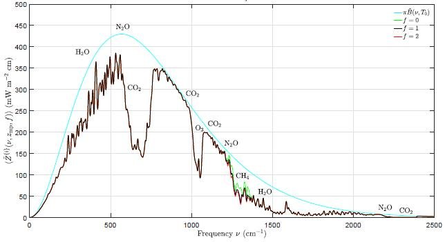
Hype about the impact of CH4 on climate change abounds, both in the media and in pronouncements from scientific organizations. One environmental website claims that “At least 25% of today's global warming is driven by methane from human actions.” To show how small an effect CH4 actually has on global warming in comparison with CO2, Happer and van Wijngaarden have calculated the spectrum of cooling outgoing radiation for various greenhouse gases at the top of the atmosphere.

The calculated spectrum is shown in the figure below, as a function of wavenumber or spatial frequency. The blue curve is the spectrum for an atmosphere with no greenhouse gases at all, while the black curve is the spectrum including all greenhouse gases. Removing the CH4 results in the green curve; the red curve, barely distinguishable from the black curve, represents a doubling of the CH4 concentration from its present 1.9 ppm to 3.8 ppm.

The tiny decrease in area underneath the curve, from black to red, as the CH4 level is doubled corresponds to a total forcing increase of 0.8 watts per square meter. This increase in forcing, which decreases the earth’s cooling radiation emitted to space and thus results in warming, is trivial compared with the total greenhouse gas forcing of about 140 watts per square meter at the top of the troposphere, or 120 watts per square meter at the top of the whole atmosphere.

The 25% attribution of global warming to CH4 that I mentioned above probably comes from comparing its 0.8 watts per square meter forcing increase for doubled CH4 to the 3 watts per square meter additional forcing for doubling of CO2, which I discussed in a previous post – 0.8 being approximately 25% of 3. However, the fallacy in such a comparison is that it completely ignores the much smaller concentration of CH4 relative to CO2, and a much smaller rate of increase from year to year.

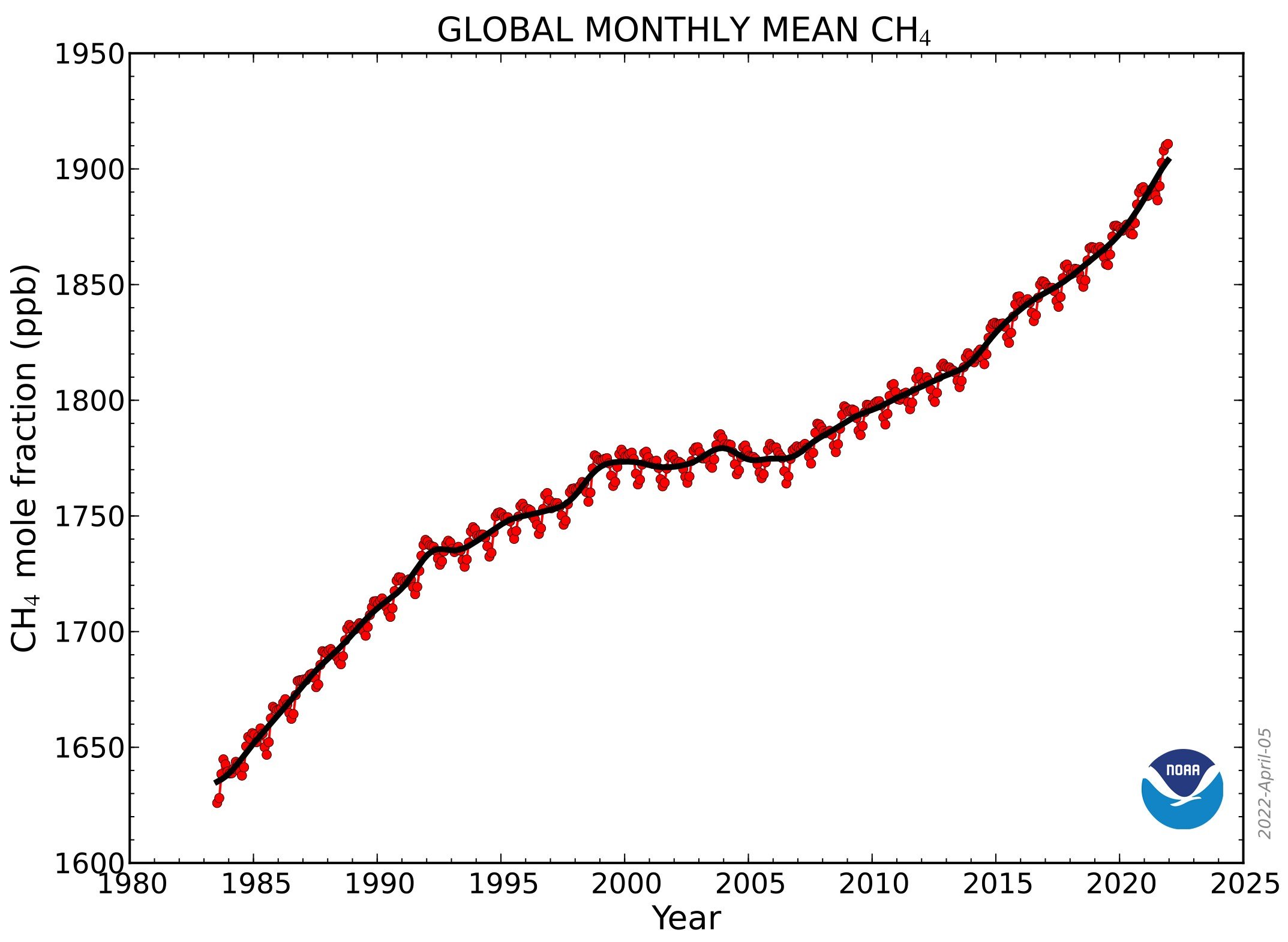
The yearly abundance of CH4 in the atmosphere since 1980, as measured by NOAA (the U.S. National Oceanic and Atmospheric Administration), is depicted in the next figure. Currently, the CH4 concentration is about 1.9 ppm (1900 ppb), two orders of magnitude lower than the CO2 level of approximately 415 ppm.

Combining the forcing calculations with the concentration data, the forcing per added molecule for CH4 is about 30 times larger than it is for CO2. But the rate of increase in the CH4 level over the last 10 years, of about 0.0076 ppm (7.6 ppb) per year, is about 300 times smaller than the rate of increase in the CO2 level, which is around 2.3 ppm per year. This means the contribution of CH4 to the annual increase in forcing is only 30/300 or one tenth that of CO2.

Although the CH4 concentration increased at a faster rate in 2020 and 2021, the rate has fluctuated in the past, both speeding up and slowing down (from 2000 to 2008, for example) for years at a time – as you can see from the figure above. But even if the rate were to permanently double, the CH4 contribution to the forcing increase would still be just one fifth (0.2) of the CO2 contribution. That’s nowhere near NOAA’s contention that "methane is roughly 25 times more powerful than carbon dioxide at trapping heat in the atmosphere."

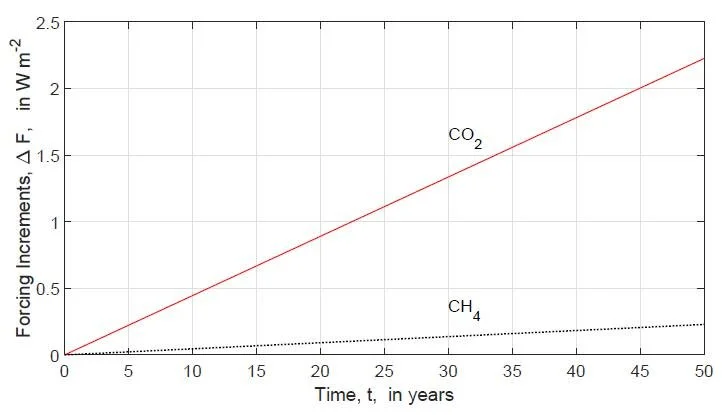
It won’t be any different in the future. Using average rates of increase for CH4 and CO2 concentrations from the past, Happer and van Wijngaarden have evaluated forcings at the top of the troposphere for the next 50 years, as shown in the following figure; the forcings are increments relative to today.

As can be seen, both projected forcings will still be small a half century from now. Panic over methane (or CO2) is completely unnecessary.

Next: No Evidence That Hurricanes Are Becoming More Likely or Stronger

No Convincing Evidence That Cleaner Air Causes More Hurricanes

According to a new research study by NOAA (the U.S. National Oceanic and Atmospheric Administration), aerosol pollution plays a major role in hurricane activity. The study author claims that a recent decline in atmospheric pollutants over Europe and the U.S. has resulted in more hurricanes in the North Atlantic Ocean, while a boost in aerosols over Asia has suppressed tropical cyclones in the western Pacific.

But this claim, touted by the media, is faulty since the study only examines changes in aerosol emissions and hurricane frequency since 1980 – a selective choice of data becoming all too common among climate scientists trying to bolster the narrative of anthropogenic climate change. The aerosol pollution is mostly in the form of sulfate particles and droplets from industrial and vehicle emissions. When pre-1980 evidence is included, however, the apparent connection between aerosols and hurricanes falls apart.

Let’s look first at the North Atlantic. Data for the Atlantic basin, which has the best quality data in the world, do indeed show heightened hurricane ac­tivity over the last 20 years, particularly in 2005 and 2020. You can see this in the following figure, which illustrates the frequency of all major Atlantic hurricanes as far back as 1851. Major hurricanes (Category 3 or greater) have a top wind speed of 178 km per hour (111 mph) or higher. The recent enhanced activity is less pronounced, though still noticeable, for Category 1 and 2 hurricanes.

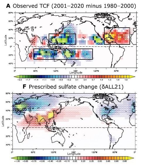
The next figure shows the observed increase in Atlantic hurricane frequency (top), from the 20 years between 1980 and 2000 to the 20 years between 2001 and 2020, compared to the NOAA study’s simulated change in sulfate aerosols during the same interval (bottom).

The hurricane frequency TCF is for all (Categories 1 through 5) hurricanes, with positive and negative color values denoting higher and lower frequency, respectively. A similar color scheme is used for the sulfate calculations. Both the Atlantic increase and western Pacific decrease in hurricane frequency are clearly visible, as well as the corresponding decrease and increase in aerosol pollution from 1980 to 2020.

But what the study overlooks is that the frequency of major Atlantic hurricanes in the 1950s and 1960s was at least compara­ble to that in the last two decades when, as the figure shows, it took a sudden upward hike from the 1970s, 1980s and early 1990s. If the study’s conclusions are correct, then pollution levels in Europe and the U.S. during the 1950s and 1960s must have been as low as they were from 2001 to 2020.

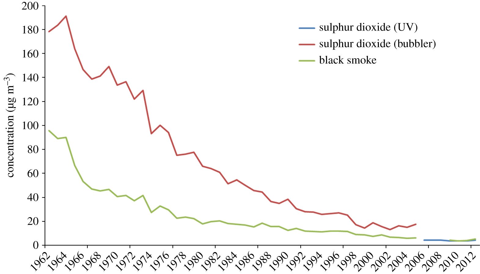
However, examination of pollution data for the North Atlantic reveals that the exact opposite is true: European and U.S. aerosol concentrations in the 1960s were much higher than in any later decade, including decades after 1980 during the study period. This can be seen in the figure below, which depicts the sulfate concentration in London air over the 50 years from 1962 to 2012; similar data exists for the U.S. (see here, for example).

Were the NOAA study valid, such high aerosol levels in European and U.S. skies during the 1960s would have decreased North Atlantic hurricane activity in that period – the reverse of what the data demonstrates in the first figure above. In the Pacific, the study links a supposed reduction in tropical cyclones to a well-documented rise in aerosol pollution in that region, due to growing industrial emissions.

But a close look at the bottom half of the second figure above shows the increase in pollution since 1980 has occurred mostly in southern Asia. The top half of the same figure indicates increased cyclone activity near India and the Persian Gulf, associated with higher, not lower pollution. The only decreases are in the vicinity of Japan and Australia, where any changes in pollution level are slight.

The NOAA study aside, changes in global hurricane frequency are much more likely to be associated with naturally occurring ocean cycles than with aerosols. Indeed, NOAA has previously linked increased Atlantic hurricane activity to the warm phase of the Atlantic Multidecadal Oscillation (AMO).

The AMO, which has a cycle time of approximately 65 years and alternates between warm and cool phases, governs many extremes, such as cyclonic storms in the Atlantic basin and major floods in eastern North America and western Europe. The present warm phase began in 1995, triggering a more tempestuous period when both named Atlantic storms and hurricanes have become more common on average.

Another contribution to storm activity in the Atlantic comes from La Niña cycles in the Pacific. Apart from a cooling effect, La Niñas result in quieter conditions in the eastern Pacific and enhanced activity in the Atlantic. In the U.S., major landfalling hurricanes are tied to La Niña cycles in the Pacific, not to global warming.

Next: Why There’s No Need to Panic about Methane in the Atmosphere

Climate Science Establishment Finally Admits Some Models Run Too Hot

The weaknesses of computer climate models – in particular their exaggeration of global warming’s impact – have long been denied or downplayed by modelers. But in a recent about-face published in the prestigious scientific journal Nature, a group of prominent climate scientists tell us it’s time to “recognize the ‘hot model’ problem.” 

The admission that some models predict a future that gets too hot too soon has far-reaching implications, not only for climate science, but also for worldwide political action being considered to curb greenhouse gas emissions. Widespread panic about an unbearably hot future is largely a result of overblown climate model predictions.

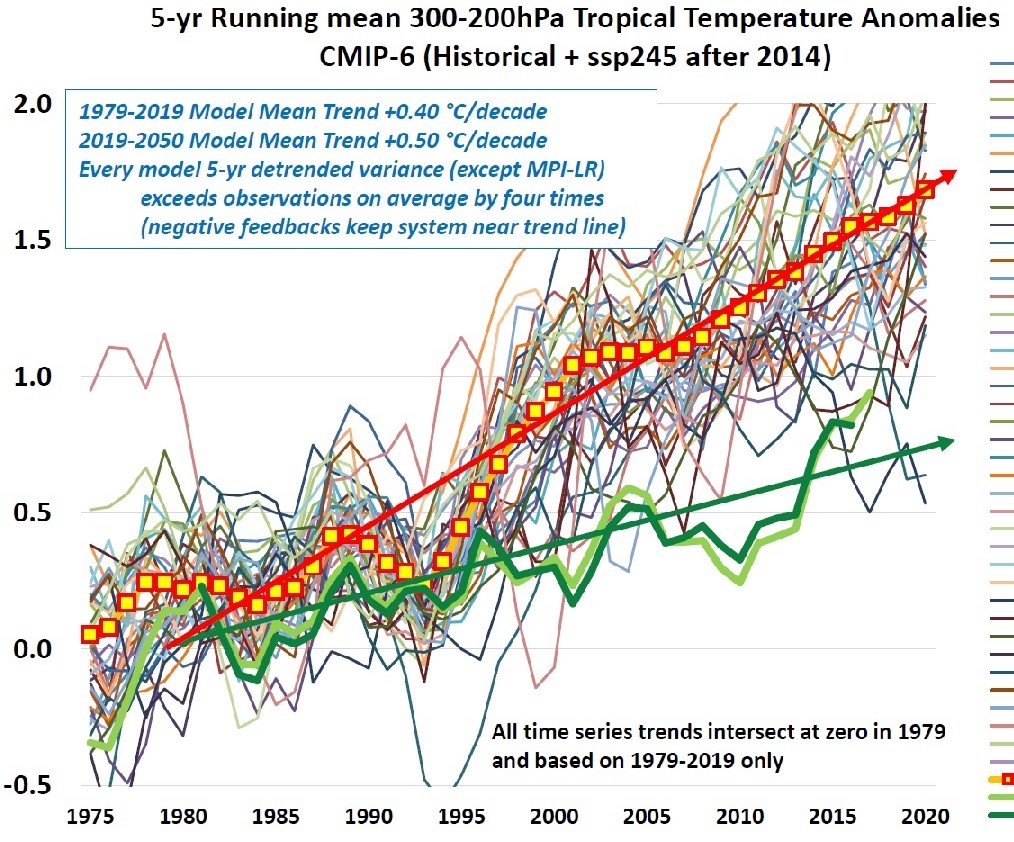
I’ve discussed the shortcomings of climate models in previous posts (see here and here). As well as their omission of many types of natural variability and their overestimation of predicted future temperatures, most models can’t even reproduce the past climate accurately – a process known to modelers as hindcasting. You can see this in the following figure, which shows global warming, relative to 1979 in degrees Celsius, hindcasted by 43 different models for the period from 1975 to 2019.  

The thin colored lines indicate the modeled variation of temperature with time for the different models, while the thick red and green lines show the mean trend for models and observations, respectively. It's evident that, even in the past, many models run too hot, with only a small number coming close to actual measurements.

Current projections of future warming represent an average of an ensemble of typically 55 different models. Researchers have found the reason some of the 55 models run hot is because of their inaccurate representation of clouds, which distorts the ensemble average upwards. When these too-hot models are excluded from the ensemble, the projected global mean temperature in the year 2100 drops by as much as 0.7 degrees Celsius (1.3 degrees Fahrenheit).  

Zeke Hausfather, lead author of the Nature article, remarks that it’s therefore a mistake for scientists to continue to assume that each climate model is independent and equally valid. “We must move away from the naïve idea of model democracy,” he says.

This approach has in fact been adopted in the Sixth Assessment Report (AR6) of the UN’s IPCC (Intergovernmental Panel on Climate Change). To estimate future global temperatures, AR6 authors assigned weights to the different climate models before averaging them, using various statistical weighting methods. More weight was given to the models that agreed most closely with historical temperature observations.

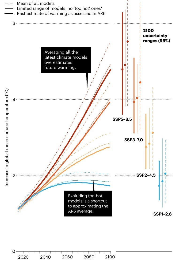
Their results are illustrated in the next figure, showing projected temperature increases to 2100, for four different possible CO2 emissions scenarios ranging from low (SSP1-2.6) to high (SSP5-8.5) emissions. The dashed lines for each scenario are projections that average all models, as done previously; the thin solid lines are projections that average all but the hottest models; and the thick solid lines are projections based on the IPCC statistical adjustment, which are seen to be slightly lower than the average excluding hot models

The figure sheds light on a second reason that climate models overestimate future temperatures, aside from their inadequate simulation of climatic processes, namely an emphasis on unrealistically high emissions scenarios. The mean projected temperature rise by 2100 is seen to range up to 4.8 degrees Celsius (8.6 degrees Fahrenheit) for the highest emissions scenario.

But the somewhat wide range of projected warming has been narrowed in a recent paper by the University of Colorado’s Roger Pielke Jr. and coauthors, who select the scenarios that are most consistent with temperature observations from 2005 to 2020, and that best match emissions projected by the IEA (International Energy Agency).

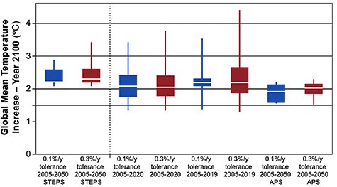
As shown in the figure below, their selected scenarios project warming by 2100 of between 2 and 3 degrees Celsius (3.6 and 5.4 degrees Fahrenheit), the exact value depending on the particular filter used in the analysis. Boxes denote the 25th to 75th percentile ranges for each filter, while white lines denote the medians.

Overall, the projected median is 2.2 degrees Celsius (4 degrees Fahrenheit), considerably lower than the implausible 4 to 5 degrees Celsius (7.2 to 9 degrees Fahrenheit) of future warming often touted by the media – although it’s slightly above the upper limit of 2 degrees Celsius (3.6 degrees Fahrenheit) targeted by the 2015 Paris Agreement. But, as Pielke has commented, the unrealistic high-emissions scenarios are the basis for dozens of research papers published every week, leading to ever-proliferating “sources of error in projections of future climate change.”

Likewise, Hausfather and his coauthors are concerned that “… much of the scientific literature is at risk of reporting projections that are … overly influenced by the hot models.” In addition to prioritizing models with realistic warming rates, he suggests adopting another IPCC approach to predicting the future climate: one that emphasizes the effects of specific levels of global warming (1.5, 2, 3 and 4 degrees Celsius for example), regardless of when those levels are reached.

Next: No Convincing Evidence That Cleaner Air Causes More Hurricanes

Sea Level Rise Is Partly Anthropogenic – but Due to Subsidence, Not Global Warming

Rising sea levels are all too often blamed on climate change by activists and the media. But a recent research study has revealed that, while much of sea level rise in coastal cities is indeed due to human activity, the culprit is land subsidence caused by groundwater extraction, rather than any human-induced global warming.

The study, conducted by oceanographers at the University of Rhode Island, measured subsidence rates in 99 coastal cities around the world between 2015 and 2020, using data from a pair of Europe’s Sentinel-1 satellites. The subsidence rates for each city were calculated from satellite images taken once every two months during the observation period – a procedure that enabled the researchers to measure the height of the ground with millimeter accuracy.

Several different processes can affect vertical motion of land, as I discussed in a previous post. Long-term glacial rebound after melting of the last ice age’s heavy ice sheets is causing land to rise in high northern latitudes. But in many regions, the ground is sinking because of sediment settling and aquifer compaction caused by human activities, especially groundwater depletion resulting from rapid urbanization and population growth. 

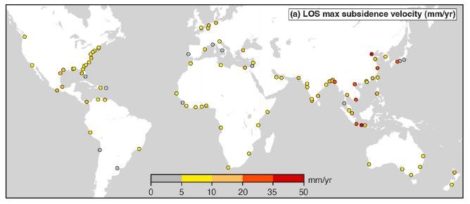
The study found that subsidence is common across the globe. The figure below shows the maximum subsidence rates measured by the authors in the 99 coastal cities studied, from 2015 to 2020.

In Tianjin, China and Jakarta, Indonesia, parts of the city are subsiding at alarming rates exceeding 30 mm (1.2 inches) per year. Maximum rates of this magnitude dwarf average global sea level rise by as much as 15 times. Even in 31 other cities, the maximum subsidence rate is more than 5 times faster than global sea level rise.

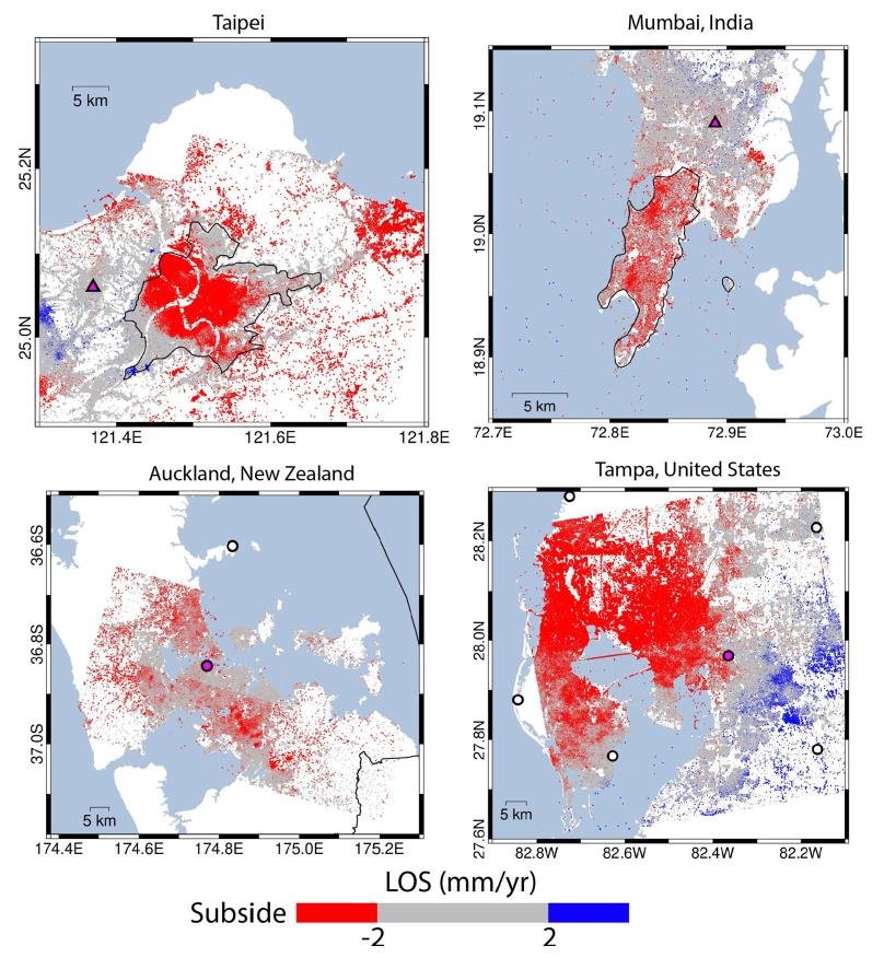
The most rapid subsidence is occurring in southern, southeastern and eastern Asia. Even in cities that are relatively stable, some areas of the cities are sinking faster than sea levels are rising. The next figure demonstrates four examples: Taipei, the largest city in Taiwan with a population of 2.7 million; Mumbai, with a population of about 20 million; Auckland, the largest city in New Zealand and home to 1.6 million people; and for comparison with the U.S., Tampa, which has a population of over 3 million. Both Taipei and Tampa are seen to have major subsidence.

This study of subsidence throws light on a long-standing dilemma: what is the true rate of global sea level rise? According to NOAA (the U.S. National Oceanic and Atmospheric Administration) tide gauge records, the average rate of rise during the 20th century was 1.7 mm (about 1/16th of an inch) per year. But NASA’s satellite measurements say the rate is more like 3.4 mm (1/8th of an inch) per year, double NOAA’s value.

The difference comes from subsidence. Satellite observations of absolute sea level measure the height of the sea – the distance of its surface to the center of the earth. Tide gauges measure the height of the sea relative to the land to which the gauge is attached, the so-called RSL (Relative Sea Level) metric. Sinking of the land independently of sea level, as in the case of the 99 cities studied, artificially amplifies the RSL rise and makes satellite-measured sea levels higher than tide gauge RSLs.

But it's the tide gauge measurements that matter to the local community and its engineers and planners. Whether or not tidal cycles or storms cause flooding of critical coastal structures depends on the RSL measured at that location. Adaptation needs to be based on RSLs, not sea levels determined by satellite.

Shown in the two figures below are tide gauge time series compiled by NOAA for various sites around the globe that have long-term records dating back to 1900 or before. The graph in the left panel of the upper figure is the average of records at two sites: Harlingen in the Netherlands and Honolulu in Hawaii. The average rate of RSL rise at these two locations is 1.38 mm (0.05 inches) per year, with an acceleration of only 0.007 mm per year per year, which is essentially zero. At Sydney in Australia (right panel of upper figure), the RSL is rising at only 0.78 mm (0.03 inches) per year.

In the lower figure, the rate of RSL rise at Charleston – a “hotspot” for sea level rise on the U.S. Atlantic coast – is a high 3.4 mm (0.13 inches) per year. At Mumbai, where much of the city is subsiding more rapidly than 2 mm (0.08 inches) per year as seen earlier, the RSL is rising at 0.83 mm (0.03 inches) per year, comparable to Sydney. Without subsidence at Mumbai, the RSL would be falling.  

Were it not for anthropogenic subsidence, actual rates of sea level rise in many parts of the world would be considerably lower than they appear.

Next: Climate Science Establishment Finally Admits Some Models Run Too Hot

Science on the Attack: Nuclear Fusion – the Energy Hope of the Future

As one of my series of occasional posts showcasing science on the attack rather than under attack, this post reviews the present status of nuclear fusion as an energy source. Although not yet an engineering reality, fusion is one of two potential long-term technologies for meeting the world’s future energy needs – the other being already commercialized nuclear fission.

Whatever one’s views on fossil fuels, it’s likely this now abundant source of energy will become depleted in a century or so. And despite the promise of renewable energy sources such as wind and solar, the necessary development of large-scale battery storage capability, to store energy for those times when the wind stops blowing or the sun isn’t shining, is decades away.

Fission and fusion are both nuclear processes. Fission is the splitting through bombardment of a heavy nucleus such as uranium into two lighter nuclei. Establishment of a self-sustaining chain reaction unleashes an explosive amount of energy; a controlled chain reaction is the basis for a nuclear reactor, while an uncontrolled reaction is the basis of the atomic bomb.

Fusion, on the other hand, smashes two light nuclei together at high speed to form a heavier nucleus. The light nuclei are typically deuterium and tritium, isotopes of hydrogen containing one and two neutrons, respectively (the hydrogen nucleus consists of just a single proton). This process, which powers our sun and other stars, also releases vast amounts of energy and can result in a self-sustaining chain reaction when enough fusion reactions occur. Uncontrolled fusion is the principle of the so-called hydrogen bomb, while fusion as an energy source involves a controlled reaction.

That fusion hasn’t become commercial after nearly 80 years of research and development is because it’s difficult to sustain the very high temperatures required – 50 to 100 million degrees Celsius – to make the process work. At lower temperatures, the light nuclei can’t be pushed close enough together for them to collide and fuse.
What this means in practice is that the deuterium and tritium fuel must be in the form of either a high-temperature plasma confined by strong magnetic fields, or a small pellet a few millimeters across that is heated and compressed by powerful lasers or particle beams. Typical experimental reactors for the first method, known as magnetic confinement, are shown in the two figures below.

The most common kind of magnetic confinement uses a doughnut-shaped or toroidal magnetic field combined with a perpendicular or poloidal field. The combination produces a spiral or helical field, as illustrated in the following schematic; the central solenoid induces a powerful electric current that both ionizes the deuterium and tritium reactor fuel and heats the resulting plasma. High-energy neutrons from the fusion reaction are absorbed in an outer blanket containing lithium, generating heat that can be converted to electricity.

In inertial confinement, precisely focused laser or ion beams heat the outer layers of the fuel pellet, exploding the fuel outwards and in turn producing an inward-moving shock wave that compresses the core of the pellet. The fusion reaction then spreads through the whole pellet as the chain reaction proceeds; extracting the resulting heat provides electricity.

The promise of fusion is immense. A few teaspoons of seawater, from which deuterium can be extracted, can provide as much energy through fusion as several tons of coal, oil or gas. But up until now there’s been a major problem: to release that much energy, an even greater amount of energy has to be supplied to the lasers or the coils powering the magnets.

Only recently have experimental fusion reactors achieved and ever so slightly surpassed this breakeven point. Researchers at the Joint European Torus, a magnetic confinement machine in Oxfordshire, UK reported in February this year that their reactor had been able to sustain a fusion reaction for five seconds, with a net output of heat energy. The National Ignition Facility at Lawrence Livermore National Laboratory in the U.S. announced last August that their inertial confinement reactor had generated over 10 quadrillion watts of fusion power for all of 100 trillionths of a second.

While these seem like baby steps, they represent a breakthrough for fusion technology. Now that the energy threshold has been exceeded at all, scientists are confident that extending the reaction time from seconds to hours or days is not far away. Those in the industry say they expect the 2020s to see a transition from experimental reactors to commercialization, with the first fusion facilities becoming connected to the grid in the 2030s.

Advantages of fusion energy over fission include a small footprint, no risk of a meltdown and no high-level nuclear waste. The radioactive waste that is generated is short-lived in comparison with fission waste.

Next:  Sea Level Rise Is Partly Anthropogenic – but Due to Subsidence, Not Global Warming

“Rescued” Victorian Rainfall Data Casts Doubt on Claims of a Wetter UK

Millions of handwritten rainfall records dating back nearly 200 years have revealed that the UK was just as wet in Victorian times as today. The records were “rescued” by more than 16,000 volunteers who digitally transcribed the observations from the archives of the UK Met Office, as a means of distracting themselves during the recent pandemic. The 5.3 million digitized records boost the number of pre-1961 observations by an order of magnitude.

The new data extends the official UK rainfall record back to 1836 and even earlier for some regions. The year 1836 was when Charles Darwin returned to the UK after his famous sea voyage gathering specimens that inspired his theory of evolution, and a year before Queen Victoria came to the throne. The oldest record in the collection dates back to 1677.

As a result of the project, the number of rain gauges contributing to the official record for the year 1862, for example, has increased from 19 to more than 700. The rain gauges were situated in almost every town and village across the UK, in locations as diverse as lighthouses, a chocolate factory, and next door to children’s author Beatrix Potter's Hilltop Farm in the Lake District.

Raw data in the form of “Ten Year rainfall sheets” included monthly rainfall amounts measured across the UK, Ireland and the Channel Islands between 1677 and 1960. After digitizing and organizing the raw data by county, the volunteer scientists combined data from different decades and applied quality control measures such as removing estimates and duplicate measurements, and identifying rain gauge moves.

The outcome of their efforts, presented in a recently published paper, is depicted in the figure below showing the annual average UK rainfall by season from 1836 to 2019. The rescue data for 1836-1960 is shown in black and the previous Met Office data for 1862-2019 in blue. Both sets of data agree well for the overlapping period from 1862 to 1960.

 While the annual rainfall for all seasons combined is not included in the paper, the figure shows clearly that current UK rainfall is no higher on average than it was during the 19th century, with the possible exception of winter. This conclusion conflicts with statements on the Met Office website, such as: “… the UK has become wetter over the last few decades … From the start of the observational record in 1862, six of the ten wettest years across the UK have occurred since 1998 … these trends point to an increase in frequency and intensity of rainfall across the UK.”

In fact, the wettest UK month on record was in the early 20th century, October 1903. The rescue data for the 19th century reveals that November and December 1852 were also exceptionally wet months. December 1852 is found to have been the third wettest month on record in Cumbria County in northern England, and November 1852 the wettest month on record for large parts of southern England.

The next figure illustrates how much UK rainfall varies regionally in time and space, for the four wettest months between 1836 and 1960. It can be seen that the soggiest regions of the nation are consistently Scotland, Wales and northwestern England. Shown in the subsequent figure is the monthly rainfall pattern from 1850 to 1960 recorded by rain gauges located near Seathwaite in Cumbria’s Lake District – one of the wettest spots in the country, with annual rainfall sometimes exceeding 5,000 mm (200 inches). The different colors represent nine different gauges.

By contrast, the driest UK month on record was February 1932 – during a prolonged period of heat waves across the globe. But the new data finds that the driest year on record was actually 1855. And 1844 now boasts the driest spring month of May, during a period of notably dry winters in the 1840s and 1850s.

Gathering the original rain gauge readings transcribed by the volunteers was evidently no simple task. The published paper summarizing the rescue project includes amusing comments found on the Ten Year sheets, such as “No readings as gauge stolen”; “Gauge emptied by child”; and “Gauge hidden by inmates of a mental hospital.”

But the newly expanded dataset does bring recent Met Office statements into question. While precipitation tends to increase as the world warms because of enhanced evap­oration from tropical oceans, which results in more water vapor in the atmosphere, there’s very little evidence that the UK has become any rainier so far.

Next: Science on the Attack: Nuclear Fusion – the Energy Hope of the Future

Natural Sources of Global Warming and Cooling: (2) The PDO and AMO

As a follow-on to my earlier post on solar variability and La Niña as natural sources of global cooling, this second post in the series examines the effect on our climate of two major ocean cycles – the PDO (Pacific Decadal Oscillation) and the AMO (Atlantic Multidecadal Oscillation).

Both the PDO and AMO have cycle times of 60-65 years and alternate between warm and cool phases of approximately equal length, though the warm phases of the AMO may last longer. The two cycles are compared in the following figure, which shows indexes measuring fluctuations in average Pacific (top) and Atlantic (bottom) sea surface temperature since 1854 (1856 for the AMO); red denotes the warm phase, blue the cool phase of the cycle.

PDO temperature fluctuations are greater than those of the AMO, and can be as much as 2 degrees Celsius (3.6 degrees Fahrenheit) from the mean. This is mainly because the Pacific Ocean is so much larger than the Atlantic in the tropics, the region where most of the forcing that drives the PDO and AMO occurs. It can be seen that phases of the AMO are more distinct than those of the PDO, in which the warm phase often includes cold spells and vice versa. In 2022, the PDO is in a cool phase that began either around 2000 or in 2007, but the AMO is in its warm phase.  

Although the PDO can be traced back at least several centuries, its distinctive behavior wasn’t recognized until the 1990s, when it was named by a U.S. fisheries scientist trying to explain the connection between Alaskan salmon harvests and the Pacific climate. The geographic pattern has a characteristic horseshoe shape, as shown in the figure below illustrating its warm (left) and cool (right) phases; the color scale represents the percentage of selected warm or cool years since 1951 with above-normal temperatures from December to February.

During the PDO warm phase, more El Niños occur and the southeastern U.S. is cooler and wetter than usual. Its cool phase is marked by an excess of La Niñas, and dominated by warmer, drier conditions inland. The cycle has also been linked to cold weather extremes in the U.S. and Canada.

Just as the warm phase of the PDO results in warmer than normal sea surface temperatures along the west coast of North America, the warm phase of the AMO produces warm waters off the west coast of Europe and Africa, as seen in the next figure showing its warm (left) and cool (right) phases. The AMO warm phase causes intense hurricanes in the North Atlantic basin together with heavier-than-normal rainfall in Europe, leading to major flooding, but lighter rainfall in North America. This pattern is reversed during the cool phase.

So what effect, if any, do the PDO and AMO have on global warming?

While the two cycles are approximately the same length, they’ve been almost exactly out of phase since 1854, with the warm phase of one cycle almost coinciding with the cool phase of the other, as revealed in the first figure above. Were the PDO and AMO of equal strength, you’d expect the opposite phases to cancel each other.

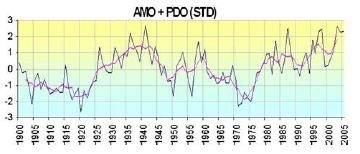
But, because the PDO dominates as noted earlier, a rather different pattern emerges when the two indexes are combined as in the figure below. Note that the combined index is defined differently from the indexes in the first figure above; the blue line depicts annual values from 1900 to 2005, while the purple line is a 5-year running mean. It’s seen that the combined index was negative, signifying cooling, from 1900 to about 1925; positive, signifying warming, until about 1950; negative again up to 1980; and positive once more to 2005.  

This is not too different from the behavior of the average global temperature since 1900, which went up from 1910 to 1940, down from 1940 to 1970, and upward since then – exhibiting perhaps a 10-year lag behind the combined AMO-PDO index.

Once the AMO switches back to its cool phase in about 2030, when the PDO will still be in the cool phase, strong cooling is likely. However, the actual effect of the PDO and AMO on climate is more complicated and depends not only on sea surface temperatures, but also on factors such as cloud cover – so that the correlation of these two natural cycles with global temperature may not be as real as it appears.

In addition, the PDO is no longer thought to be a single phenomenon, but rather a combination of different processes including random atmospheric forcing, large-scale teleconnections from the tropical Pacific, and changes in ocean currents. And the very existence of the AMO has been questioned, although most ocean scientists remain convinced of its reality. More research is needed to understand the influence of these two sources of natural variability on climate change.

Next:  “Rescued” Victorian Rainfall Data Casts Doubt on Claims of a Wetter UK

New Projections of Sea Level Rise Are Overblown

That sea levels are rising due to global warming is not in question. But there’s no strong scientific evidence that the rate of rise is accelerating, as claimed in a recent NOAA (the U.S. National Oceanic and Atmospheric Administration) report on sea level rise or the Sixth Assessment Report (AR6) of the UN’s IPCC (Intergovernmental Panel on Climate Change). Such claims create unnecessary alarm.

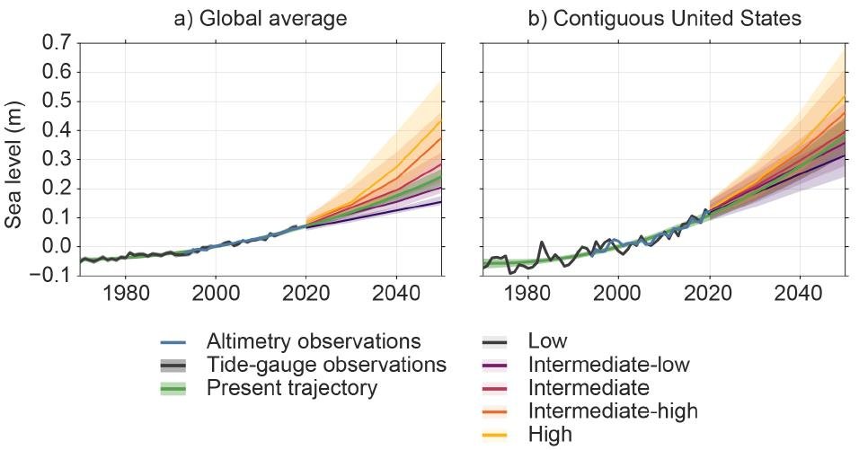
NOAA’s projections to 2050 are illustrated in the next figure, showing sea level relative to 2000 both globally and in the contiguous U.S. The green curves represent a smoothing of actual observations from 1970 to 2020, together with an extrapolation from 2020 to 2050 based on the earlier observations. The projections in other colors correspond to five different modeled scenarios ranging from low to high risk for coastal communities.

The U.S. projections are higher than the global average because the North American Atlantic coast is a “hotspot” for sea level rise, with anomalously high rates of rise. The extrapolated U.S. average is projected to increase from 11 cm (4.3 inches) above its 2000 level in 2020, to 19 cm (7.5 inches) in 2030, 28 cm (11 inches) in 2040 and 38 cm (15 inches) in 2050. Projected increases are somewhat higher than average for the Atlantic and Gulf coasts, and considerably lower for the west coast.

These projected NOAA increases clearly suggest an accelerating rate of sea level rise, from a rate of 5.5 cm (2.2 inches) per decade between 2000 and 2020, to an almost doubled 10 cm (3.9 inches) per decade between 2040 and 2050. That’s a rapid acceleration rate of 1.5 mm per year per year and implies a rise in U.S. sea levels by 2050 as large as that seen over the past century. The implied global acceleration rate is 0.83 mm per year per year.

But even the IPCC’s AR6, which makes exaggerated claims about extreme weather, estimates global sea level acceleration at only 0.1 mm per year per year from 1993 to 2018. It seems highly unlikely that the rate would increase by nearly an order of magnitude in 32 years, so the NOAA projections appear excessively high.  

However, all these estimates are based not only on actual measurements, but also on computer models. The models include contributions to sea level rise from the expansion of seawater as it warms; melting of the Greenland and Antarctic ice sheets, as well as glaciers; sinking of the seafloor under the weight of extra meltwater; and local subsidence due to groundwater depletion, or rebound after melting of the last ice age’s heavy ice sheet.

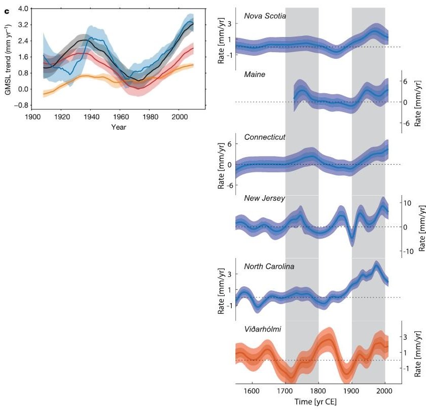
The figure on the left below shows the GMSL (global-mean sea level, blue curve) rise rate estimated by one of the models for the 100 years from 1910 to 2010. Although it’s clear that the rate has been increasing since the late 1960s, it did the same in the 1920s and 1930s, and may currently be turning downward. Not surprisingly, studies using these models often come to very different conclusions about future rates of sea level rise.

The figure on the right below is an historical reconstruction of the rise rate for various locations along the Atlantic North American and Icelandic coasts, derived from salt-marsh sediment proxies and corrected for glacial rebound. It can be seen that rates of rise in the 18th century were at times only slightly lower than those in the 20th century, and that sea levels have fluctuated for at least 300 years, long before modern global warming began.

Because of this, the reconstruction study authors comment that the high “hotspot” rates of sea level rise in eastern North America may not be associated with any human contribution to global warming. They hypothesize that the fluctuations are related to changes in the mass of Arctic land ice, possibly associated with the naturally occurring North Atlantic Oscillation.

Along with the IPCC estimates, the reconstruction casts doubt on NOAA’s claim of continuing acceleration of today’s sea level rise rate. An accompanying news release adds to the hype, stating that “Sea levels are continuing to rise at an alarming rate, endangering communities around the world.”

Supporting the conclusion that NOAA’s projections are exaggerated is a 2021 assessment by climate scientist Judith Curry of projected sea level scenarios for the New Jersey coast. Taking issue with a 2019 report led by scientists from Rutgers University, her assessment found that the Rutgers sea level projections were – like NOAA’s estimates – substantially higher than those of the IPCC in its Fifth Assessment Report prior to AR6. Curry’s finding was that the bottom of the Rutgers “likely” scenarios was the most probable indicator of New Jersey sea level rise by 2050.

Interestingly, NOAA’s “low” scenario projected a U.S. average sea level of 31 cm (12 inches) in 2050, rather than 38 cm (15 inches), implying essentially no acceleration of the rise rate at all – and no cause for its media hype.

(This post has also been kindly reproduced in full on the Climate Depot blog.)

Next: Natural Sources of Global Warming and Cooling: (2) The PDO and AMO

Can Undersea Volcanoes Cause Global Warming?

It’s well known that active volcanoes on land can cause significant global cooling when they erupt, from shielding of sunlight by sulfate aerosol particles in the eruption plume which linger in the atmosphere. But what is the effect on climate of undersea volcanic eruptions such as the massive submarine blast that blanketed the nearby South Pacific kingdom of Tonga with ash in January?

Submarine volcanoes are relatively unexplored but are thought to number over a million, of which several thousand may be currently active. Many lie along tectonic plate boundaries, where plates are pulling apart or colliding with each other. The Tonga volcano sits above a geological pileup, where the western edge of the Pacific plate dives under the Indian–Australian plate.

The eruption of any volcano releases a huge amount of energy. In the case of a submarine volcano that may be thousands of meters deep, the plume may not even reach the surface and all the energy is absorbed by the ocean. The Tonga eruption was from a shallow depth, so much of the energy was dissipated at the ocean surface – launching a destructive tsunami – and in the atmosphere – generating a plume of ash that reached a record altitude of 55 kilometers (34 miles), a shockwave that traveled around the globe, and nearly 400,000 lightning strikes.

You might think all that energy could contribute to global warming, had the volcano erupted in deeper water that would have converted all the energy to heat. However, the oceans, which cover 71% of the earth’s surface, are vast and can hold 1,000 times more heat than the atmosphere. Any change in sea surface temperatures from even multiple underwater volcanic eruptions would be imperceptible.

This can be seen from a simple calculation. According to NASA scientists, the energy released by the undersea Tonga eruption was equivalent to the explosive power of 3.6 to 16 megatonnes (4 to 18 megatons) of TNT. For comparison, the 1980 eruption on land of Mount Saint Helens in Washington state released about 22 megatonnes of TNT equivalent, and the famous 1883 explosion of Indonesia's Krakatoa unleashed 180 megatonnes; the atomic bomb that the U.S. dropped on Hiroshima in Japan in 1945 released roughly 14 kilotonnes of TNT equivalent.

The upper Tonga limit of 16 megatonnes is equal to 7.5 x 10¹⁶ Joules of energy. Assuming the heat capacity of seawater to be 3,900 Joules per kilogram per degree Celsius and the total mass of the oceans to be 1.4 × 10²¹ kilograms, it would take 5.5 × 1024 Joules (5.5 trillion trillion Joules) to warm the entire ocean by 1 degree Celsius (1.8 degrees Fahrenheit).

So if all 16 megatonnes had gone into the ocean, ocean temperatures would have risen by (7.5 x 10¹⁶)/( 5.5 × 1024) or a minuscule 1.4 x 10⁻⁸ (14 billionths) of a degree Celsius. The Krakatoa above-water eruption, on the other hand, decreased global air temperatures by as much as 1.2 degrees Celsius (2.2 degrees Fahrenheit) for several years and may have cooled the oceans as well.

But there’s another potential source of warming from submarine volcanoes, and that is the CO2 emitted along with the sulfur dioxide (SO2) that causes cooling through formation of sulfate aerosols. If the underwater plume reaches the ocean surface, both gases are released into the atmosphere. In the case of Tonga, while the amount of SO2 emitted was too small to have any cooling effect, the emitted CO2 could in theory contribute to global warming.

However, the yearly average of CO2 emissions from all volcanoes, both on land and submarine, is only 1 to 2% of current human emissions that have raised global temperatures by 1 degree Celsius (1.8 degrees Fahrenheit) at most. So any CO2 warming effect from an underwater eruption is unlikely to be much larger than the above calculation for energy release. Interestingly though, Chinese researchers recently reported that the atmospheric concentration of CO2 near Tonga after the eruption jumped by 2 parts per million, which is as much as the global concentration normally increases in a whole year from human sources. But this is most probably a temporary local effect that won’t affect the global CO2 increase expected in 2022.

Despite the inability of undersea eruptions to affect our present climate, it was suggested in a 2015 research paper that CO2 from submarine volcanoes may have triggered the warming that pulled the earth out of the last ice age about 15,000 years ago.

The basic idea is that lower sea levels during glaciation relieved the hydrostatic pressure on submarine volcanoes that suppressed eruptions during warmer times. This caused them to erupt more. After a lengthy ice age, the buildup of CO2 from undersea eruptions initiated warming that then began to melt the ice sheets covering volcanoes on land, causing them in turn to belch CO2 that enhanced the warming, melting more ice in a feedback effect.

Next: New Projections of Sea Level Rise Are Overblown

Little Evidence That Global Warming Is Causing Extinction of Coral Reefs

Coral reefs, like polar bears, have become a poster child for global warming. According to the climate change narrative, both are in imminent peril of becoming extinct.

But just as polar bears are thriving despite the loss of sea ice in the Arctic, coral reefs are in good health overall despite rising temperatures. Recent research shows that not only are corals capable of much more rapid recovery from bleaching events than most reef scientists thought, but they are a lot more abundant around the globe than anyone knew.

During the massive, prolonged El Niño of 2014-17, higher temperatures caused mass bleaching of coral reefs all across the Pacific Ocean, including the famous Great Barrier Reef that hugs the northeastern coast of Australia. Corals lose their vibrant colors when the water gets too hot, because heat causes the microscopic food-producing algae that normally live inside them to poison the coral – so the coral kicks them out. However, corals have the ability to select from the surrounding water a different species of algae better suited to hot conditions, and thus to survive.

Until recently, it was believed that the recovery process, if it occurred at all, took years. But new studies (see here and here) have found that both the Great Barrier Reef and coral colonies on reefs around Christmas Island in the Pacific were able to recover from the 2014-17 El Niño much more rapidly, even while seawater temperatures were still higher than normal. The authors of the studies attribute the corals’ recovery capacity to lack of exposure to other stressors such as the crown-of-thorns starfish and water pollution from farming runoff.

That corals worldwide are not on the verge of extinction was first revealed in a 2021 study by four researchers at Australia’s James Cook University (JCU). The study completely contradicted previous apocalyptic predictions of the imminent demise of coral reefs, predictions that included an earlier warning from three of the same authors and others of ongoing coral degradation from global warming.

The JCU study included data on more than 900 coral reefs across the Pacific, from Indonesia to French Polynesia, as shown in the figure below. To estimate abundances, the researchers used a combination of coral reef habitat maps and counts of coral colonies. They estimated the total number of corals in the Pacific at approximately half a trillion, similar to the number of trees in the Amazon or birds in the world. This colossal population is for a mere 300 species, a small fraction of the 1,619 coral species estimated to exist worldwide by the International Union for Conservation of Nature (IUCN).

Reinforcing the JCU finding is a very recent discovery made by Scuba divers working with the UN Educational, Scientific and Cultural Organization (UNESCO). The divers mapped out a massive reef of giant rose-shaped corals in pristine condition off the coast of Tahiti, the largest island in French Polynesia. The stunning reef, described as “a work of art” by the diving expedition leader, is remarkable for its size and its survival of a mass bleaching event in 2019.

Approximately 3 kilometers (2 miles) long and 30 to 65 meters (100 to 210 feet) across, the reef lies between 30 and 55 meters (100 and 180 feet) below the surface, about 2 kilometers (1 mile) off shore. The giant corals measure more than 2 meters (6.5 feet) in diameter, according to UNESCO. Studying a reef at such great depths for Scuba divers required special technology, such as the use of air containing helium, which negates hallucinations caused by oxygen and nitrogen at depth and helps prevent decompression sickness.

CREDIT: Alexis Rosenfeld/Associated Press

The existence of this and likely many other deep coral reefs, together with the JCU study, mean that the global extinction risk of most coral species is much lower than previously thought, even though a local loss can be ecologically devastating to coral reefs in the vicinity.

The newly discovered rapid recovery of corals probably helped save the Great Barrier Reef from being added to a list of World Heritage Sites that are “in danger.” This classification had been recommended in 2021 by a UNESCO committee, to counter the supposed deleterious effects of climate change.

But, after intensive lobbying by an angry Australian government keen to avoid a politically embarrassing classification for a popular tourist attraction, the committee members agreed to an amendment. The amended recommendation required Australia to produce an updated report on the state of the reef by this month, when a vote could follow on whether or not to classify the site as being in danger.

Next: Can Undersea Volcanoes Cause Global Warming?

No Evidence That Islands Are Sinking Due to Rising Seas

According to the climate-change narrative, island nations such as the Maldives in the Indian Ocean and Tuvalu in the Pacific face the specter of rising seas, fleeing residents and vanishing villages. But recent research belies the claim that such tropical paradises are about to disappear beneath the waves, revealing that most of the hundreds of atolls studied actually grew in size from 2000 to 2017.

Low-lying atoll islands consist of a ring-shaped coral reef partly or completely encircling a shallow green lagoon in the midst of a deep blue sea. Perched just a few meters above sea level, these coral-reef islands are susceptible to rising waters that can cause flooding, damage to infrastructure and the intrusion of saltwater into groundwater. Such concerns are behind the grim prognosis that islanders will become “climate refugees,” forced to leave their homes as the oceans rise.

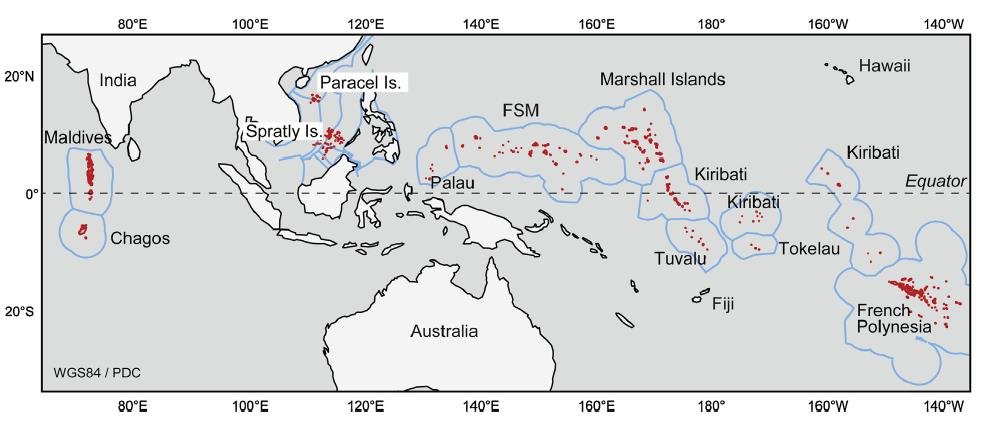
However, two recent studies conclude that this threat is unfounded. A 2021 study analyzed changes in land area on 221 atolls in the Indian and Pacific Oceans, utilizing cloud-free imagery from Landsat satellites. The atolls studied are shown in red in the following figure. Apart from the Maldives and Tuvalu, the dataset included islands in the South China Sea, the Marshall Islands and French Polynesia.

The study found that the total land area of the atolls increased by 6.1% between 2000 and 2017, from 1,008 to 1,069 square kilometers (389 to 413 square miles). Most of the gain was from the Maldives and South China Sea atolls, which together accounted for 88% of the total increase, and came from artificial building of islands within those areas for development of infrastructure, extra land and resorts.

As shown in the next figure, the areas of two island groups – French Polynesia and Palau – did diminish over the study period. Although these two groups accounted for 68 of the 221 atolls studied, the combined decrease represents only 0.15% of the global total area. The Republic of the Marshall Islands is designated as RMI; the percentages at the bottom of the figure are the increases or decreases of the individual island groups.

An earlier study by the same researchers analyzed shoreline changes in the 101 reef islands of the Pacific nation of Tuvalu between 1971 and 2014; this excluded the 9 atolls forming part of the subsequent study. During these 43 years the local sea level rose at twice the global average, at a rate of 3.9 mm (about 1/8 of an inch) per year. But despite surging seas, the total land area of the 101 islands expanded by 2.9% over the slightly more than four decades. The changes are illustrated in the figure below, where the areas on the horizontal axis and the changes on the vertical axis are measured in hectares (ha).

Altogether, 73 reef islands grew in size – some by more than 100% – and the other 28 shrank, though by a smaller average amount. Light blue circles enclosing symbols in the figure denote populated islands. Tuvalau is home to 10,600 people, half of whom live on the urban island of Fogafale in Funafuti atoll. Fogafale expanded by 3% or 4.6 hectares (11.4 acres) over the 43-year study period.

Concerns about rising seas in the Maldives, the world’s lowest country, gained worldwide attention in 2009 when the Maldivian president and cabinet held an underwater meeting at the bottom of a turquoise lagoon. But the theatrics of ministers clad in black diving suits and goggles, signing a document asking all countries to reduce their CO2 emissions, were unnecessary. A research paper published subsequently in 2018 by Northumbria University scientists found that the Maldives actually formed when sea levels were even higher than they are today.

The researchers studied the formation of five atoll rim islands in the southern Maldives, by drilling cores in sand- and gravel-based reefs. A timeline was established by radiocarbon dating. What they found was that the islands formed approximately three to four thousand years ago, through the pounding on the reefs of large waves caused by distant storms off the coast of South Africa.

These large waves, known as high-energy wave events, broke coral debris off the reefs and transported it onto reef platforms, initiating reef island growth. Sea levels at that time were at least 0.5 meters (1.6 feet) higher than they are today, so the waves had more energy than current ocean swells. Further vertical reef growth is possible in the future, the study authors say, as sea levels continue to rise and large wave events increase, accompanied by sedimentation.

Next: Little Evidence That Global Warming Is Causing Extinction of Coral Reefs

Science Under Renewed Attack: New Zealand Proposal to Equate Māori Mythology with Science

Already under assault from many directions, science has recently come under renewed attack in New Zealand, a country perhaps better known for its prowess in rugby and its filming of The Lord of the Rings trilogy. The attack involves a government working group's proposal that schools should give the same weight to Māori mythology as they do to science in the classroom.

The proposal prompted a letter to the New Zealand Listener, signed by seven professors from the University of Auckland, questioning a plan to give mātauranga Māori (Māori knowledge) equal standing with scientific fields such as physics, chemistry and biology. The letter was critical of one of the working group’s new course descriptions, which promotes:

discussion and analysis of the ways in which science has been used to support the dominance of Eurocentric views … and the notion that science is a Western European invention and itself evidence of European dominance over Māori and other indigenous peoples.

The letter went on to say that such a statement perpetuated “disturbing misunderstandings of science emerging at all levels of education and in science funding,” and concluded that indigenous knowledge “falls far short of what we can define as science itself.” 

The professors did acknowledge the role that Māori knowledge in New Zealand has played in “the preservation and perpetuation of culture and local practices.” One of the letter’s coauthors, biological scientist Garth Cooper, is of Māori descent himself.

But the letter sparked a firestorm of complaints from fellow scientists and academics. The New Zealand Association of Scientists said it was “dismayed” by the comments. An open response signed by the staggering number of over 2,000 academics condemned the authors for causing "untold harm and hurt," and said they “categorically disagree” with their colleagues’ opinions, claiming that:

Mātauranga is far more than just equivalent to or equal to ‘Western’ science. It offers ways of viewing the world that are unique and complementary to other knowledge systems.

and

The seven professors ignore the fact that colonisation, racism, misogyny, and eugenics have each been championed by scientists wielding a self-declared monopoly on universal knowledge.

New Zealand’s Royal Society also issued a statement rejecting the authors’ views, saying it “strongly upholds the value of mātauranga Māori and rejects the narrow and outmoded definition of science”. The society is now contemplating drastic action by investigating whether Garth Cooper and another coauthor, philosophy professor Robert Nola, should be expelled from its membership as a result of the letter.

Aside from the politics involved, the reaction to the letter constitutes an enormous onslaught on science. True science emphasizes empirical evidence and logic. But indigenous Māori knowledge – which includes the folklore that all living things originated with Papa, the earth mother and Rangi, the sky father – is pseudoscience because it depends not on scientific evidence, but on religious beliefs and therefore can’t be falsified, as required of a valid scientific theory.

In the U.S., the issue of whether to teach schoolchildren creationism, a purely religious belief that rejects the theory of evolution, was settled long ago by the infamous Scopes Monkey Trial of 1925. Later, the Supreme Court struck down the last of the old state laws banning the teaching of evolution in schools; in 1987 it went further, in upholding a lower-court ruling that a Louisiana state law, mandating that equal time be given to the teaching of creation science and evolution in public schools, was unconstitutional.

As for the claim of the Auckland letter’s critics that science has been colonising, Professor Nola responded:

I don't think science is a coloniser at all: all people are colonisers, and we've done plenty of colonising, and we may have used our science to help do that. But science itself, I can't see how that is colonising – Newton's laws of motion, colonising of the brain or the mind or whatever, it's nonsense.

Nola added that such a claim could deter young New Zealanders from studying science at all.

The Royal Society’s investigation continues but not without opposition. Several fellows of the Royal Society have threatened to resign if the letter coauthors are disciplined. These include two recipients of the Society’s prestigious Rutherford Medal: Peter Schwerdtfeger, the director of Massey University’s Theoretical Chemistry and Physics Centre and Brian Boyd, University of Auckland literature professor. Schwerdtfeger called the investigation “shameful” and accused the Society of succumbing to woke ideology.

Famous UK evolutionary biologist Richard Dawkins has recently weighed in on the controversy as well, writing that:

The Royal Society of New Zealand … is supposed to stand for science. Not ‘Western’ science, not ‘European’ science, not ‘White’ science, not ‘Colonialist’ science. Just science. Science is science is science, and it doesn’t matter who does it, or where … True science is evidence­-based, not tradition-based.

Next: No Evidence That Islands Are Sinking Due to Rising Seas

No Evidence That Thwaites Glacier in Antarctica Is about to Collapse

Contrary to recent widespread media reports and dire predictions by a team of earth scientists, Antarctica’s Thwaites Glacier – the second fastest melting glacier on the continent – is not on the brink of collapse. The notion that catastrophe is imminent stems from a basic misunderstanding of ice sheet dynamics in West Antarctica.

The hoopla began with publication of a research study in November 2021 and a subsequent invited presentation to the AGU (American Geophysical Union). Both postulated that giant cracks recently observed in the Thwaites Eastern Ice Shelf (pictured to the left) may cause the whole ice shelf to shatter within as little as five years. The cracks result from detachment of the ice shelf’s seaward edge from an underwater mountain about 40 kilometers (25 miles) offshore that pins the shelf in place like a cork in a bottle.

Because the ice shelf already floats on the ocean, collapse of the shelf itself and release of a flotilla of icebergs wouldn’t cause global sea levels to rise. But the researchers argue that loss of the ice shelf would speed up glacier flow, increasing the contribution to sea level rise of the Thwaites Glacier – often dubbed the “doomsday glacier” – from 4% to 25%. A sudden increase of this magnitude would have a devastating impact on coastal communities worldwide. The glacier’s location is indicated by the lower red dot in the figure below.  

But such a drastic scenario is highly unlikely, says geologist and UN IPCC expert reviewer Don Easterbrook. The misconception is about the submarine “grounding” of the glacier terminus, the boundary between the glacier and its ice shelf extending out over the surrounding ocean, as illustrated in the next figure.

The grounding line of the Thwaites Glacier, shown in red in the left figure below, has been retreating since 2000. According to the study authors, this spells future disaster: the retreat, they say, will lead to dynamic instability and greatly accelerated discharge of glacier ice into the ocean, by as much as three times.

As evidence, the researchers point to propagating rifts on the top of the ice shelf and basal crevasses beneath it, both of which are visible in the satellite image above, the rifts as diagonal lines and the crevasses as nearly vertical ones. The crevasses arise from basal melting produced by active volcanoes underneath West Antarctica combined with so-called circumpolar deep water warmed by climate change.

However, as Easterbrook explained in response to a 2014 scare about the adjacent Pine Island glacier, this reasoning is badly flawed since a glacier is not restrained by ice at its terminus. Rather, the terminus is established by a balance between ice gains from snow accumulation and losses from melting and iceberg calving. The removal of ice beyond the terminus will not cause unstoppable collapse of either the glacier or the ice sheet behind it.

Other factors are important too, one of which is the source area of Antarctic glaciers. Ice draining into the Thwaites Glacier is shown in the right figure above in dark green, while ice draining into the Pine Island glacier is shown in light green; light and dark blue represent ice draining into the Ross Sea to the south of the two glaciers. The two glaciers between them drain only a relatively small portion of the West Antarctic ice sheet, and the total width of the Thwaites and Pine Island glaciers constitutes only about 170 kilometers (100 miles) of the 4,000 kilometers (2,500) miles of West Antarctic coastline.

Of more importance are possible grounding lines for the glacier terminus. The retreat of the present grounding line doesn’t mean an impending calamity because, as Easterbrook points out, multiple other grounding lines exist. Although the base of much of the West Antarctic ice sheet, including the Thwaites glacier, lies below sea level, there are at least six potential grounding lines above sea level, as depicted in the following figure showing the ice sheet profile. A receding glacier could stabilize at any of these lines, contrary to the claims of the recent research study.

As can be seen, the deepest parts of the subglacial basin lie beneath the central portion of the ice sheet where the ice is thickest. What is significant is the ice thickness relative to its depth below sea level. While the subglacial floor at its deepest is 2,000 meters (6,600 feet) below sea level, almost all the subglacial floor in the above profile is less than 1,000 meters (3,300 feet) below the sea. Since the ice is mostly more than 2,500 meters (8,200 ft) thick, it couldn’t float in 1,000 meters (3,300 feet) of water anyway.

Next: Science Under Renewed Attack: New Zealand Proposal to Equate Maori Mythology with Science

Sudden Changes in Ocean Currents Warmed Arctic, Cooled Antarctic in Past

Abrupt changes in ocean currents – and not greenhouse gases – were responsible for sudden warming of the Arctic and for sudden cooling in the Antarctic at different times in the past, according to two recent research studies. The Antarctic cooling marked the genesis of the now massive Antarctic ice sheet.

The first study, by a team of European scientists, discovered that the expansion of warm Atlantic Ocean water flowing into the Arctic caused sea surface temperatures in the Fram Strait east of Greenland to rise by about 2 degrees Celsius (3.6 degrees Fahrenheit) as early as 1900. The phenomenon, known as “Atlantification” of the Arctic, is important because it precedes instrumental measurements of the effect by several decades and is not simulated by computer climate models.

The conclusion is based on an 800-year reconstruction of Atlantification along the Fram Strait, which separates Atlantic waters from the Arctic Ocean. The researchers used marine sediment cores as what they call a “natural archive” of past climate variability, deriving the chronological record from radionuclide dating.

Shown in the figure below is the sea surface temperature and Arctic sea ice extent from 1200 to 2000. The blue curve represents the reconstructed mean summer temperature (in degrees Celsius) of Atlantic waters in the eastern Fram strait, while the red curve indicates the April retreat (in kilometers) of the sea ice edge toward the Arctic. You can see clearly that the seawater temperature increased abruptly around 1900, after centuries of remaining constant, and that sea ice began to retreat at the same time, after at least a century of extending about 200 kilometers farther into the strait.

Along with temperature, the salinity of Atlantic waters in the strait suddenly increased also. The researchers suggest that this Atlantification phenomenon could have been due to weakening of two ocean currents – the AMOC (Atlantic Meridional Overturning Circulation) and the SPG (Subpolar Gyre), a circular current south of Greenland – at the end of the Little Ice Age. The AMOC forms part of the ocean conveyor belt that redistributes seawater and heat around the globe.

This abrupt change in ocean currents is thought to have redistributed nutrients, heat and salt in the northeast Atlantic, say the study authors, but is unlikely to be associated with greenhouse gases. The change caused subtropical Atlantic waters to flow northward through the Fram Strait, as illustrated schematically in the figure below; the halocline is the subsurface layer in which salinity changes sharply from low (at the surface) to high. The WSC (West Spitsbergen Current) carries heat and salt to the Arctic and keeps the eastern Fram Strait ice-free.

Sudden cooling occurred in the Antarctic but millions of years earlier, a second study has found. Approximately 34 million years ago, a major reorganization of ocean currents in the Southern Ocean resulted in Antarctic seawater temperatures abruptly falling by as much as 5 degrees Celsius (9 degrees Fahrenheit). The temperature drop initiated growth of the Antarctic ice sheet, at the same time that the earth underwent a drastic transition from warm Greenhouse to cold Icehouse conditions.

This dramatic cooling was caused by tectonic events that opened up two underwater gateways around Antarctica, the international team of researchers says. The gateways are the Tasmanian Gateway, formerly a land bridge between Antarctica and Tasmania, and Drake Passage, once a land bridge from Antarctica to South America. The scientists studied the effect of tectonics using a high-resolution ocean model that includes details such as ocean eddies and small-scale seafloor roughness.

After tectonic forces caused the two land bridges to submerge, the present-day ACC (Antarctic Circumpolar Current) began to flow. This circumpolar current, although initially less strong than today, acted to weaken the flow of warm waters to the Antarctic coast. As the two gateways slowly deepened, the warm-water flow weakened even further, causing the relatively sudden cooling event.

Little cooling occurred before one or both gateways subsided to a depth of more than 300 meters (1,000 feet). After the second gateway had subsided from 300 meters (1,000 feet) to 600 meters (2,000 feet), surface waters along the entire Antarctic coast cooled by 2 to 3.5 degrees Celsius (3.6 to 6.3 degrees Fahrenheit). And once the second gateway had subsided below 600 meters (2,000 feet), the temperature of Antarctic coastal waters decreased another 0.5 to 2 degrees Celsius (0.9 to 3.6 degrees Fahrenheit). The next figure depicts the gradual opening of the two gateways.

Although declining CO2 levels in the atmosphere may have played a minor role, the study authors conclude that undersea tectonic changes were the key factor in altering Southern Ocean currents and in creating our modern-day Icehouse world.

Next: No Evidence That Thwaites Glacier in Antarctica Is about to Collapse

El Niño and La Niña May Influence the Climate More than Greenhouse Gases

The familiar El Niño and La Niña cycles are known to cause drastic fluctuations in global temperature, along with often catastrophic climatic effects in tropical regions of the Pacific Ocean. What is less well known is that the powerful ocean oscillations have been a feature of our climate for at least 20,000 years – that is, since before the most recent ice age ended.

A 2005 study established a complete record of El Niño events in the southeastern Pacific, by examining marine sediment cores drilled off the coast of Peru. The cores contain an El Niño signature in the form of tiny, fine-grained stone fragments, washed into the sea by multiple Peruvian rivers following floods on the continent caused by heavy El Niño rainfall. As indicated in the adjacent figure, the study site was approximately 80 kilometers (50 miles) from Lima at a depth of 184 meters (604 feet).

Northern Peru sees the heaviest El Niño rainfall, generating floods capable of dispersing large amounts of fine-grained river sediments. Smaller amounts of rainfall in central and southern Peru, which are not caused by El Niño, don’t result in flooding with the same dispersal capability.

The study authors classified the flood event signal as very strong when the concentration of stone fragments, known as lithics, was more than two standard deviations above the centennial mean. The frequency of these very strong events over the last 12,000 years is illustrated in the next figure; the black and gray bars show the frequency as the number of 500- and 1,000-year floods, respectively. Radiocarbon dating of the sediment cores was used to establish the timeline.

It can be seen that the number of very strong Peruvian flood events peaked around 9,500 years ago and again about 2,500 years ago, since when the number has been decreasing. No extreme floods occurred at all from about 5,500 to 7,500 years in the past.

A more detailed record is presented in the following figure, showing the variation over 20,000 years of the sea surface temperature off Peru (top), the lithic concentration (bottom) and a proxy for lithic concentration (middle). Sea surface temperatures were derived from chemical analysis of the marine sediment cores.

As indicated in this figure, the lithic concentration and therefore El Niño strength were high around 2,000 and 10,000 years ago – approximately the same periods when the most devastating floods occurred. The figure also reveals the absence of strong El Niño activity from 5,500 to 7,500 years ago, a dry interval without any major Peruvian floods.

But it’s seen that El Niños were strong in other eras too. During this 20,000-year span, El Niños first became prominent between 17,000 and 16,000 years before now, at the same time that sea surface temperatures jumped several degrees. The initial rise in both El Niños and ocean temperature was followed by roughly centennial fluctuations, alternating between weaker and stronger El Niño activity. After the gap from 7,500 to 5,500 years ago, El Niños surged again, as did sea surface temperatures.

On a finer scale, El Niños during the last two millennia were distinctly stronger than their modern counterparts between 2,000 and 1,300 years ago, then relatively weak during the MWP (Medieval Warm Period) from about 800 (1,300 years ago) to 1300. During the LIA (Little Ice Age) from about 1500 to 1850, El Niños strengthened once more before falling back to their present-day levels.

It may seem counterintuitive that El Niños, which release vast amounts of heat from the Pacific Ocean into the atmosphere and often raise the global temperature by several tenths of a degree for a year or so, are associated historically with prolonged periods of cooling such as the LIA. But ecologist Jim Steele has explained this phenomenon as arising from the absence of La Niña conditions during an El Niño. La Niña is the cool phase of the so-called ENSO (El Niño–Southern Oscillation), El Niño being the warm phase.

In a La Niña event, east to west trade winds cause warm water heated by the sun to pile up in the western tropical Pacific. This removes solar‑heated water from the eastern Pacific, resulting in upwelling of cooler subsurface waters there that replace the surface waters transported to the west and cause a temporary decline in global temperatures. But at the same time, the ocean gains heat at greater depths.

With the absence of this recharging of ocean heat during an El Niño, global cooling sets in for an extended period. Such cooling is usually associated with lower heat output from the sun, characterized by a falloff in the average monthly number of sunspots. Conversely, La Niñas usually accompany periods of higher solar output and result in extended global warming, as occurred during the MWP.

El Niño and La Niña have been major influences on our climate for many millennia and will continue to be. Until they are better understood, we can’t be sure they play less of a role in global warming than greenhouse gases.

Next: Sudden Changes in Ocean Currents Warmed Arctic, Cooled Antarctic in Past