The Sun Can Explain 70% or More of Global Warming, Says New Study

Few people realize that the popular narrative of overwhelmingly human-caused global warming, with essentially no contribution from the sun, hinges on a satellite dataset showing that the sun’s output of heat and light has decreased since the 1950s.

But if a different but plausible dataset is substituted, say the authors of a new study, the tables are turned and a staggering 70% to 87% of global warming since 1850 can be explained by solar variability. The 37 authors constitute a large international team of scientists, headed by U.S. astrophysicist Willie Soon, from many countries around the world.

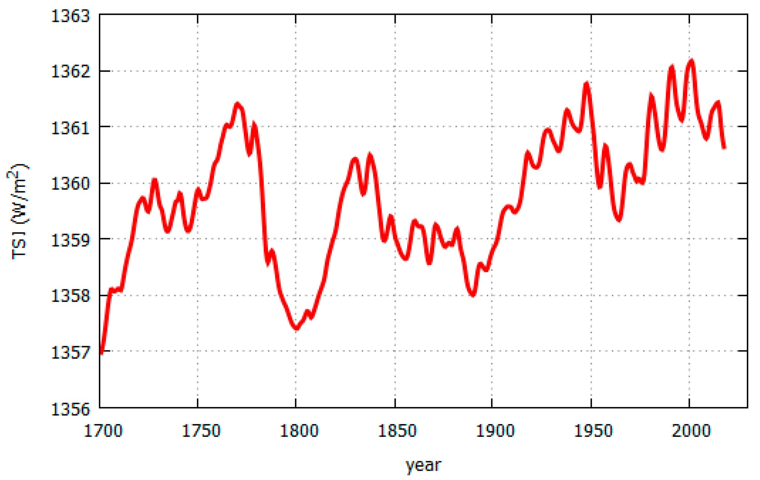
The two rival datasets, each of which implies a different trend in solar output or TSI (total solar irradiance) since the late 1970s when satellite measurements began, are illustrated in the figure below, which includes pre-satellite proxy data back to 1850. The TSI and associated radiative forcing – the difference in the earth’s incoming and outgoing radiation, a difference which produces heating or cooling – are measured in units of watts per square meter, relative to the mean from 1901 to 2000.   

The upper graph (Solar #1) is the TSI dataset underlying the narrative that climate change comes largely from human emissions of greenhouse gases, and was used by the IPCC (Intergovernmental Panel on Climate Change) in its 2021 AR6 (Sixth Assessment Report). The lower graph (Solar #2) is a TSI dataset from a different satellite series, as explained in a previous post, and exhibits a more complicated trend since 1950 than Solar #1.

To identify the drivers of global warming since 1850, the study authors carried out a statistical analysis of observed Northern Hemisphere land surface temperatures from 1850 to 2018; the temperature record is shown as the black line in the next figure. Following the approach of the IPCC’s AR6, three possible drivers were considered: two natural forcings (solar and volcanic) and a composite of multiple human-caused or anthropogenic forcings (which include greenhouse gases and aerosols), as employed in AR6.   

Time series for the different forcings, or a combination of them, were fitted to the temperature record utilizing multiple linear regression. This differs slightly from the IPCC’s method, which used climate model hindcasts based on the forcing time series as an intermediate step, as well as fitting global land and ocean, rather than Northern Hemisphere land-only, temperatures.

The figure below shows the new study’s best fits to the Northern Hemisphere land temperature record for four scenarios using a combination of solar, volcanic and anthropogenic forcings. Scenarios 1 and 2 correspond to the Solar #1 and Solar #2 TSI time series depicted in the first figure above, respectively, combined with volcanic and anthropogenic time series. Scenarios 3 and 4 are the same without the anthropogenic component – that is, with natural forcings only. Any volcanic contribution to natural forcing usually has a cooling effect and is short in duration.

The researchers’ analysis reveals that if the Solar #1 TSI time series is valid, as assumed by the IPCC in AR6, then natural (solar and volcanic) forcings can explain at most only 21% of the observed warming from 1850 to 2018 (Scenario 3). In this picture, adding anthropogenic forcing brings that number up to an 87% fit (Scenario 1).

However, when the Solar #1 series is replaced with the Solar #2 series, then the natural contribution to overall warming increases from 21% to a massive 70% (Scenario 4), while the combined natural and anthropogenic forcing number rises from an 87% to 92% fit (Scenario 2). The better fits with the Solar #2 TSI time series compared to the Solar #1 series are visible if you look closely at the plots in the figure above.

These findings are enhanced further if urban temperatures are excluded from the temperature dataset, on the grounds that urbanization biases temperature measurements upward. The authors have also found that the long-term warming rate for rural temperature stations is only 0.55 degrees Celsius (0.99 degrees Fahrenheit) per century, compared with a rate of 0.89 degrees Celsius (1.6 degrees Fahrenheit) per century for rural and urban stations combined, as illustrated in the figure below.

Fitting the various forcing time series to a temperature record based on rural stations alone, the natural contribution to global warming rises from 70% to 87% when the Solar #2 series is used.

If the Solar #2 TSI time series represents reality better than the Solar #1 series used by the IPCC, this means that between 70% and 87% of global warming is mostly natural and the human-caused contribution is less than 30% – the complete opposite to the IPCC’s claim of largely anthropogenic warming.

Unsurprisingly, such an upstart conclusion has raised some hackles in the climate science community. But the three lead authors of the study have effectively countered their critics in lengthy, detailed rebuttals (here and here).

The study authors do point out that “it is still unclear which (if any) of the many TSI time series in the literature are accurate estimates of past TSI,” and say that we cannot be certain yet whether the warming since 1850 is mostly human-caused, mostly natural, or some combination of both. In another paper they remark that, while three of 27 or more different TSI time series can explain up to 99% of the warming, another seven time series cannot account for more than 3%.

Next: Challenges to the CO2 Global Warming Hypothesis: (9) Rotation of the Earth’s Core as the Source of Global Warming

Are Ocean Surface Temperatures, Not CO2, the Climate Control Knob?

According to the climate change narrative, modern global warming is largely the result of human emissions of CO2 into the atmosphere. But a recent lecture questioned that assertion with an important observation suggesting that ocean surface temperatures, not CO2, are the planet’s climate control knob.

The lecture was delivered by Norwegian Ole Humlum, who was formerly a full professor in physical geography at both the University Centre in Svalbard, Norway and the University of Oslo, in addition to holding visiting positions in Scotland and the Faroe Islands. He currently publishes regular updates on the state of the global climate.

In his lecture, Humlum dwelt on temperature measurements of the world’s oceans. Since 2004, ocean temperatures have been studied in detail at depths of up to 2 km (1.2 miles), by means of a global array of almost 3,900 Argo profiling floats. These free-drifting robotic floats patrol the oceans, taking a deep dive every 10 days to probe the temperature and salinity of the watery depths, and transmitting the data to a satellite within hours of reaching the surface again. A 2018 map of the Argo array is shown below.

The next figure illustrates how the oceans have warmed during the period that the floats have been in operation, up to August 2020. The vertical scale is the global ocean temperature change in degrees Celsius averaged from 65oS to 65oN (excluding the polar regions), while the horizontal scale gives the depth up to 1,900 meters (6,200 feet).

You can see that warming has been most prominent at the surface, where the average sea surface temperature has gone up since 2004 by about 0.27 degrees Celsius (0.49 degrees Fahrenheit). The temperature increase deep down is an order of magnitude smaller. Most of the temperature rise at shallow depths comes from the tropics (30oS to 30oN) and the Antarctic (65oS to 55oS), although the Arctic (55oN to 65oN) measurements reveal considerable cooling down to about 1,400 meters (4,600 feet) in that region.

But Humlum’s most profound observation is of the timeline for Argo temperature measurements as a function of depth. These are depicted in the following figure showing global depth profiles for the tropical oceans in degrees Celsius, from 2004 to 2014. The tropics cover almost 40% of the earth’s surface; the oceans in total cover 71%.

The fluctuations in each Argo depth profile arise from seasonal variations in temperature from summer to winter, which are more pronounced at the surface than at greater depths. If you focus your attention on any yearly summer peak at zero depth, you will notice that it moves to the right – that is, to later times – as the depth increases. In other words, there is a time delay of any temperature change with depth.

From a correlation analysis of the Argo data, Humlum finds that the time delay at a depth of 200 meters (650 feet) is a substantial 20 months, so that it takes 20 months for a temperature increase or decrease at the tropical surface to propagate down to that depth. A similar, though smaller, delay exists between any change in sea surface temperature (SST) and corresponding temperature changes in the atmosphere and on land, as shown in the figure below.

At an altitude of 200 meters (650 feet) in the atmosphere, changes in the SST show up slightly less than half a month later. But in the lower troposphere, where satellite temperature measurements are made, the delay is 2 months, as it is also for land surface temperatures. Humlum’s crucial argument is that sea surface temperatures lead all other global temperature observations – that is, the global temperature signal originates at the ocean surface.

However, according to the CO2 global warming hypothesis, the CO2 signal originates at an altitude of about 9 km (5.6 miles) in the upper troposphere and is seen at the sea surface some time later. So the CO2 hypothesis predicts that the sea surface is a lagging, not a leading indicator – exactly the opposite of what actual observations are telling us.

Humlum concludes that CO2 cannot be the earth’s climate control knob and that our global climate is apparently controlled by the SST. The climate control knob must instead be whatever natural system controls sea surface temperatures. Potential candidates, he says, include the sun, cloud cover, sediments and organic life in the oceans, and the action of winds. Further research is needed to identify which of these possibilities truly powers the global climate.

Next: Mainstream Media Jumps on Extreme Weather Caused by Climate Change Bandwagon

El Niño and La Niña May Influence the Climate More than Greenhouse Gases

The familiar El Niño and La Niña cycles are known to cause drastic fluctuations in global temperature, along with often catastrophic climatic effects in tropical regions of the Pacific Ocean. What is less well known is that the powerful ocean oscillations have been a feature of our climate for at least 20,000 years – that is, since before the most recent ice age ended.

A 2005 study established a complete record of El Niño events in the southeastern Pacific, by examining marine sediment cores drilled off the coast of Peru. The cores contain an El Niño signature in the form of tiny, fine-grained stone fragments, washed into the sea by multiple Peruvian rivers following floods on the continent caused by heavy El Niño rainfall. As indicated in the adjacent figure, the study site was approximately 80 kilometers (50 miles) from Lima at a depth of 184 meters (604 feet).

Northern Peru sees the heaviest El Niño rainfall, generating floods capable of dispersing large amounts of fine-grained river sediments. Smaller amounts of rainfall in central and southern Peru, which are not caused by El Niño, don’t result in flooding with the same dispersal capability.

The study authors classified the flood event signal as very strong when the concentration of stone fragments, known as lithics, was more than two standard deviations above the centennial mean. The frequency of these very strong events over the last 12,000 years is illustrated in the next figure; the black and gray bars show the frequency as the number of 500- and 1,000-year floods, respectively. Radiocarbon dating of the sediment cores was used to establish the timeline.

It can be seen that the number of very strong Peruvian flood events peaked around 9,500 years ago and again about 2,500 years ago, since when the number has been decreasing. No extreme floods occurred at all from about 5,500 to 7,500 years in the past.

A more detailed record is presented in the following figure, showing the variation over 20,000 years of the sea surface temperature off Peru (top), the lithic concentration (bottom) and a proxy for lithic concentration (middle). Sea surface temperatures were derived from chemical analysis of the marine sediment cores.

As indicated in this figure, the lithic concentration and therefore El Niño strength were high around 2,000 and 10,000 years ago – approximately the same periods when the most devastating floods occurred. The figure also reveals the absence of strong El Niño activity from 5,500 to 7,500 years ago, a dry interval without any major Peruvian floods.

But it’s seen that El Niños were strong in other eras too. During this 20,000-year span, El Niños first became prominent between 17,000 and 16,000 years before now, at the same time that sea surface temperatures jumped several degrees. The initial rise in both El Niños and ocean temperature was followed by roughly centennial fluctuations, alternating between weaker and stronger El Niño activity. After the gap from 7,500 to 5,500 years ago, El Niños surged again, as did sea surface temperatures.

On a finer scale, El Niños during the last two millennia were distinctly stronger than their modern counterparts between 2,000 and 1,300 years ago, then relatively weak during the MWP (Medieval Warm Period) from about 800 (1,300 years ago) to 1300. During the LIA (Little Ice Age) from about 1500 to 1850, El Niños strengthened once more before falling back to their present-day levels.

It may seem counterintuitive that El Niños, which release vast amounts of heat from the Pacific Ocean into the atmosphere and often raise the global temperature by several tenths of a degree for a year or so, are associated historically with prolonged periods of cooling such as the LIA. But ecologist Jim Steele has explained this phenomenon as arising from the absence of La Niña conditions during an El Niño. La Niña is the cool phase of the so-called ENSO (El Niño–Southern Oscillation), El Niño being the warm phase.

In a La Niña event, east to west trade winds cause warm water heated by the sun to pile up in the western tropical Pacific. This removes solar‑heated water from the eastern Pacific, resulting in upwelling of cooler subsurface waters there that replace the surface waters transported to the west and cause a temporary decline in global temperatures. But at the same time, the ocean gains heat at greater depths.

With the absence of this recharging of ocean heat during an El Niño, global cooling sets in for an extended period. Such cooling is usually associated with lower heat output from the sun, characterized by a falloff in the average monthly number of sunspots. Conversely, La Niñas usually accompany periods of higher solar output and result in extended global warming, as occurred during the MWP.

El Niño and La Niña have been major influences on our climate for many millennia and will continue to be. Until they are better understood, we can’t be sure they play less of a role in global warming than greenhouse gases.

Next: Sudden Changes in Ocean Currents Warmed Arctic, Cooled Antarctic in Past

Has the Sun’s Role in Climate Change Been Trivialized?

Central to the narrative that climate change comes largely from human emissions of greenhouse gases is the assertion that the sun plays almost no role at all. According to its Fifth Assessment Report, the IPCC (Intergovernmental Panel on Climate Change) attributes no more than a few percent of total global warming to the sun’s influence.

But the exact amount of the solar contribution to global warming is critically dependent on how much the sun’s heat and light output, known technically as the TSI (total solar irradiance), has varied since the 19th century. According to an international team of scientists in a recently published paper, different estimates of the TSI lead to different conclusions about global warming – ranging from the sun making a trivial contribution, which backs up the IPCC claim that recent warming is mostly human-caused, to the opposite conclusion that global warming is mostly natural and due to changes in solar activity.

How can there be such a wide discrepancy between these two positions? Over the approximately 11-year solar cycle, the TSI varies by only a tenth of one percent. However, long-term fluctuations in the sun’s internal magnetic field cause the baseline TSI to vary over decades and centuries.

This can be seen in the somewhat congested figure below, which depicts several reconstructions of the TSI since 1850 and shows variations in both the TSI baseline and its peak-to-peak amplitude. The curve plotted in black forms the basis for the current CMIP6 generation of computer climate models; the curve in yellow was the basis for the previous CMIP5 models featured in the IPCC’s Fifth Assessment Report.

TSI Matthes.jpg

A rather different reconstruction of the TSI since 1700 is shown in the next figure, based on an earlier solar irradiance model augmented with recent satellite data. You can see that in this reconstruction, the TSI since 1850 exhibits much larger fluctuations – from 1358 to 1362 watts per square meter – compared with the reconstruction above, in which the variation since 1850 is only from about 1360.5 to 1362 watts per square meter.

The dramatic difference between the two estimates of the TSI arises from rival sets of satellite data. Satellite measurements of TSI began in 1978, the two main sources of data being the Royal Meteorological Institute of Belgium’s so-called ACRIM (Active Cavity Radiometer Irradiance Monitor) composite, and the World Radiation Center’s PMOD (Physikalisch-Meteorologisches Observatorium Davos) composite.

The ACRIM composite implies that the TSI rose during the 1980s and 1990s but has fallen slightly since then, as seen in the second figure above. The PMOD composite implies that the TSI has been steadily dropping since the late 1970s, a trend just visible in the first figure. The PMOD composite, showing a decline in solar activity during the period after 1975 in which global temperatures went up, therefore downplays the sun’s role in global warming. On the other hand, the ACRIM composite indicates an increase in solar activity over the same period, so supports the notion that global temperatures are strongly linked to the TSI.

The ACRIM satellite data set and the PMOD data differ in the procedures used to bridge a two-year gap in ACRIM data around 1990. The gap in data gathering occurred after the launch of a new ACRIM satellite was delayed by the Challenger disaster. It’s these disparate gap-bridging procedures that result in the ACRIM and PMOD composite data showing such different behavior of the TSI during the most recent solar cycles 21 to 23.

The authors of the recent paper also discuss other TSI reconstructions, some of which support the ACRIM data and some of which back the rival PMOD data. Rather than passing judgment on which dataset is the better representation of reality, the authors urge the climate science community to consider all relevant estimates of the TSI and not just the one illustrated in the first figure above. But they conclude that, contrary to the current narrative, the question of how much the sun has influenced recent global temperatures – at least in the Northern Hemisphere – has not yet been answered satisfactorily.

The researchers go on to comment: “The PMOD dataset is more politically advantageous to justify the ongoing considerable political and social efforts to reduce greenhouse gas emissions under the assumption that the observed global warming since the late 19th century is mostly due to greenhouse gases.” They add that political considerations have been acknowledged as one of the motivations for the development of the PMOD composite as a rival dataset to the ACRIM measurements.

Next: Latest UN Climate Report Is More Hype than Science

Upcoming Grand Solar Minimum Could Wipe Out Global Warming for Decades

Unknown to most people except those with an interest in solar science, the sun is about to shut down. Well, not completely – we’ll still have plenty of sunlight and heat, but the small dark blotches on the sun’s surface called sunspots, visible in the figure below, are on the verge of disappearing. According to some climate scientists, this heralds a prolonged cold stretch of maybe 35 years starting in 2020, despite global warming.  

Blog 10-1-18 JPG.jpg

How could that happen? Because sunspots, which are caused by magnetic turbulence in the sun’s interior, signal subtle changes in solar output or activity – changes that can have a significant effect on the earth’s climate. Together with the sun’s heat and light, the monthly or yearly number of sunspots goes up and down during the approximately 11-year solar cycle. For several decades now, the maximum number of sunspots seen in a cycle has been declining.

The last time sunspots disappeared altogether was during the so-called Maunder Minimum, a 70-year cool period in the 17th and 18th centuries forming part of the Little Ice Age, and illustrated in the next figure showing the sunspot number over time. The Maunder Minimum from approximately 1645 to 1710 was the most recent occurrence of what are known as grand solar minima, or periods of very low solar activity, that recur every 350 to 400 years. So we’re due for another minimum.

GSM Sunspot history.jpg

Northumbria University’s Valentina Zharkova, a researcher who’s published several papers on sunspots and grand solar minima, has linked the minima to a drastic falloff in the sun’s internal magnetic field. The roughly 70% downswing in magnetic field from its average value is part of a 350- to 400-year cycle arising from regular variations in behavior of the very hot plasma powering our sun.

In between grand solar minima come grand solar maxima, when the magnetic field and number of sunspots reach their highest values. The most recent (“modern”) grand solar maximum, even though slightly lopsided, is represented by the blue peaks in the figure above. The figure below shows Zharkova’s calculated magnitude of the magnetic field from 1975 to 2040, which is seen to diminish as the minimum approaches.

GSM Zharkova.jpg

Her calculations predict that the upcoming grand solar minimum will last from 2020 to 2053, with global temperatures dropping by up to 1.0 degrees Celsius (1.8 degrees Fahrenheit) in the late 2030s. That’s as much as the world has warmed since preindustrial times, and would put the mercury only 0.4 degrees Celsius (0.7 degrees Fahrenheit) above the frigid temperatures recorded in 1710 at the end of the Maunder Minimum.

GSM Frost fair.jpg

The Maunder Minimum was unquestionably chilly: alpine glaciers in Europe encroached on farmland; the Netherlands’ canals froze every winter; and frost fairs on the UK’s frozen Thames River became a common sight. Solar scientists have calculated that the sun’s heat and light output, a quantity known as the total solar irradiance, decreased by 0.22% during the Maunder minimum, which is about four times its normal rise or fall over an 11-year cycle.

Other solar researchers have also predicted an imminent grand solar minimum, but for different reasons. One of the earliest predictions was by German astronomer and scholar, Theodor Landscheidt, in 2003. Landscheidt predicted a protracted cold period centered on the year 2030, based on his observations of an 87-year solar cycle known as a Gleissberg cycle, which has been linked to regional climate fluctuations such as flooding of the Nile River in Africa.

A more recent prediction, based on a longer 210-year solar cycle, is that of Russian astrophysicist Habibullo Abdussamatov. He projects a more extended period of global cooling than either Zharkova or Landscheidt, lasting as long as 65 years, with the coldest interval around 2043.

Not all solar scientists agree with such predictions. Although NOAA (the U.S. National Oceanic and Atmospheric Administration) has recognized that sunspot numbers are falling and may approach zero in the 2030s, the international Solar Cycle 25 Prediction Panel forecasts that the sunspot number will remain the same in the coming 11-year cycle (Cycle 25) as it was in the cycle just completed (Cycle 24). Declaring that the recent decline in sunspot number is at an end, panel co-chair and solar physicist Lisa Upton says: “There is no indication we are approaching a Maunder-type minimum in solar activity.”

But if the predictions of Zharkova and others are correct, tough times are ahead. A relatively sudden drop in temperature of 1.0 degrees Celsius (1.8 degrees Fahrenheit) would have drastic effects on agriculture, causing crop failures and widespread hunger – as occurred during the Maunder Minimum. And the need for extra heating in both hemispheres would come at a time when it’s likely that much of our heating capacity, supplied largely by fossil fuels, will have been eliminated in the name of combating climate change.

Next: The Scientific Method at Work: The Carbon Cycle Revisited

The Futility of Action to Combat Climate Change: (1) Scientific and Engineering Reality

Amidst the clamor for urgent action to supposedly combat climate change, the scientific and engineering realities of such action are usually overlooked. Let’s imagine for a moment that we humans are indeed to blame for global warming and that catastrophe is imminent without drastic measures to curb fossil fuel emissions – views not shared by climate skeptics like myself.

In this and the subsequent blog post, I’ll show how proposed mitigation measures are either impractical or futile. We’ll start with the 2015 Paris Agreement – the international agreement on cutting greenhouse gas emissions, which 195 nations, together with many of the world’s scientific societies and national academies, have signed on to.

The agreement endorses the assertion that global warming comes largely from our emissions of greenhouse gases, and commits its signatories to “holding the increase in the global average temperature to well below 2 degrees Celsius (3.6 degrees Fahrenheit) above pre-industrial levels,” preferably limiting the increase to only 1.5 degrees Celsius (2.7 degrees Fahrenheit). According to NASA, current warming is close to 1 degree Celsius (1.8 degrees Fahrenheit).

How realistic are these goals? To achieve them, the Paris Agreement requires nations to declare a voluntary “nationally determined contribution” toward emissions reduction. However, it has been estimated by researchers at MIT (Massachusetts Institute of Technology) that, even if all countries were to follow through with their voluntary contributions, the actual mitigation of global warming by 2100 would be at most only about 0.2 degrees Celsius (0.4 degrees Fahrenheit).

Higher estimates, ranging up to 0.6 degrees Celsius (1.1 degrees Fahrenheit), assume that countries boost their initial voluntary emissions targets in the future. The agreement actually stipulates that countries should submit increasingly ambitious targets every five years, to help attain its long-term temperature goals. But the targets are still voluntary, with no enforcement mechanism.

Given that most countries are already falling behind their initial pledges, mitigation of more than 0.2 degrees Celsius (0.4 degrees Fahrenheit) by 2100 seems highly unlikely. Is it worth squandering the trillions of dollars necessary to achieve such a meager gain, even if the notion that we can control the earth’s thermostat is true?     

Another reality check is the limitations of renewable energy sources, which will be essential to our future if the world is to wean itself off fossil fuels that today supply almost 80% of our energy needs. The primary renewable technologies are wind and solar photovoltaics. But despite all the hype, wind and solar are not yet cost competitive with cheaper coal, oil and gas in most countries, when subsidies are ignored. Higher energy costs can strangle a country’s economy.

Source: BP

Source: BP

And it will be many years before renewables are practical alternatives to fossil fuels. It’s generally unappreciated by renewable energy advocates that full implementation of a new technology can take many decades. That’s been demonstrated again and again over the past century in areas as diverse as electronics and steelmaking.

The claim is often made, especially by proponents of the so-called Green New Deal, that scale-up of wind and solar power could be accomplished quickly by mounting an effort comparable to the U.S. moon landing program in the 1960s. But the claim ignores the already mature state of several technologies crucial to that program at the outset. Rocket technology, for example, had been developed by the Germans and used to terrify Londoners in the UK during World War II. The vacuum technology needed for the Apollo crew modules and spacesuits dates from the beginning of the 20th century.

Renewable energy.jpg

Such advantages don’t apply to renewable energy. The main engineering requirements for widespread utilization of wind and solar power are battery storage capability, to store energy for those times when the wind stops blowing or the sun isn’t shining, and redesign of the electric grid.

But even in the technologically advanced U.S., battery storage is an order of magnitude too expensive today for renewable electricity to be cost competitive with electricity generated from fossil fuels. That puts battery technology where rocket technology was more than 25 years before Project Apollo was able to exploit its use in space. Likewise, conversion of the U.S. power grid to renewable energy would cost trillions of dollars – and, while thought to be attainable, is currently seen as merely “aspirational.”

The bottom line for those who believe we must act urgently on the climate “emergency”: it’s going to take a lot of time and money to do anything at all, and whatever we do may make little difference to the global climate anyway.

Next: The Futility of Action to Combat Climate Change: (2) Political Reality

Solar Science Shortchanged in Climate Models

The sun gets short shrift in the computer climate models used to buttress the mainstream view of anthropogenic (human-caused) global warming. That’s because the climate change narrative, which links warming almost entirely to our emissions of greenhouse gases, trivializes the contributions to global warming from all other sources. According to its Fifth Assessment Report, the IPCC (Intergovernmental Panel on Climate Change) attributes no more than a few percent of total global warming to the sun’s influence.

That may be the narrative but it’s not one universally endorsed by solar scientists. Although some, such as solar physicist Mike Lockwood, adhere to the conventional wisdom on CO2, others, such as mathematical physicist Nicola Scafetta, think instead that the sun has an appreciable impact on the earth’s climate. In disputing the conventional wisdom, Scafetta points to our poor understanding of indirect solar effects as opposed to the direct effect of the sun’s radiation, and to analytical models of the sun that oversimplify its behavior. Furthermore, a lack of detailed historical data prior to the recent observational satellite era casts doubt on the accuracy and reliability of the IPCC estimates.

I’ve long felt sorry for solar scientists, whose once highly respectable field of research before climate became an issue has been marginalized by the majority of climate scientists. And solar scientists who are climate change skeptics have had to endure not only loss of prestige, but also difficulty in obtaining research funding because their work doesn’t support the consensus on global warming. But it appears that the tide may be turning at last.

Judging from recent scientific publications, the number of papers affirming a strong sun-climate link is on the rise. From 93 papers in 2014 examining such a link, almost as many were published in the first half of 2017 alone. The 2017 number represents about 7% of all research papers in solar science over the same period (Figure 1 here) and about 16% of all papers on computer climate models during that time (Figure 4 here).

Sunspots.jpg

This rising tide of papers linking the sun to climate change may be why UK climate scientists in 2015 attempted to silence the researcher who led a team predicting a slowdown in solar activity after 2020. Northumbria University’s Valentina Zharkova had dared to propose that the average monthly number of sunspots will soon drop to nearly zero, based on a model in which a drastic falloff is expected in the sun’s magnetic field. Other solar researchers have made the same prediction using different approaches.

Sunspots are small dark blotches on the sun caused by intense magnetic turbulence on the sun’s surface. Together with the sun’s heat and light, the number of sunspots goes up and down during the approximately 11-year solar cycle. But the maximum number of sunspots seen in a cycle has recently been declining. The last time they disappeared altogether was during the so-called Maunder Minimum, a 70-year cool period in the 17th and 18th centuries forming part of the Little Ice Age.

While Zharkova’s research paper actually said nothing about climate, climate scientists quickly latched onto the implication that a period of global cooling might be ahead and demanded that the Royal Astronomical Society – at whose meeting she had originally presented her findings – withdraw her press release. Fortunately, the Society refused to accede to this attack on science at the time, although the press release has since been removed from the Web. Just last month, Zharkova’s group refuted criticisms of its methodology by another prominent solar scientist.

Apart from such direct effects, indirect solar effects due to the sun’s ultraviolet (UV) radiation or cosmic rays from deep space could also contribute to global warming. In both cases, some sort of feedback mechanism would be needed to amplify what would otherwise be tiny perturbations to global temperatures. However, what’s not generally well known is that the warming predicted by computer climate models comes from assumed water vapor amplification of the modest temperature increase caused by CO2 acting alone. Speculative candidates for amplification of solar warming involve changes in cloud cover as well as the earth’s ozone layer.

Next week: Measles or Autism? False Choice, Says Science