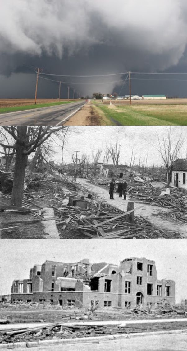
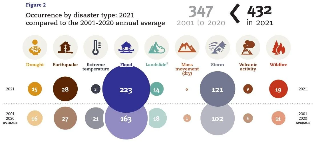
No Evidence That Extreme Weather on the Rise: A Look at the Past - (3) Floods
/Devastating 2022 floods in Pakistan that affected 33 million people and damaged or destroyed over 2 million homes. A 2021 once-in-a-millennium flood in Zhengzhou, China that drowned passengers in a subway tunnel. Both events were trumpeted by the mainstream media as unmistakable signs that climate change has intensified the occurrence of weather extremes such as major floods, droughts, hurricanes, tornadoes and heat waves.
But a close look at history shows that it’s the popular narrative that is mistaken. Just as with hurricanes and tornadoes, floods today are no more common nor deadly or disruptive than any of the thousands of floods in the past, despite heavier precipitation in a warming world.
Floods tend to kill more people than hurricanes or tornadoes, either by drowning or from subsequent famine, although part of the death toll from landfalling hurricanes is often drownings caused by the associated storm surge. Many of the world’s countries regularly experience flooding, but the most notable on a recurring basis are China, India, Pakistan and Japan.

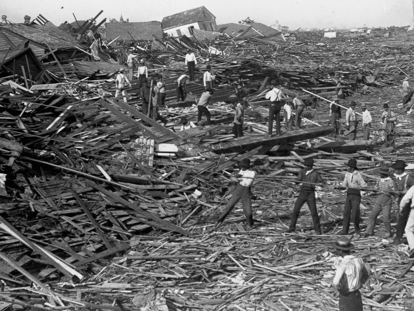
China has a long history of major floods going back to the 19th century and before. One of the worst was the flooding of the Yangtze and other rivers in 1931 that inundated approximately 180,000 square kilometers (69,500 square miles) following rainfall in July of over 610 mm (24 inches). That was a far greater area flooded than the 85,000 square kilometers (33,000 square miles) underwater in Pakistan’s terrible floods last year, and affected far more people – as many as 53 million.
The extent of the watery invasion can be seen in the top two photos of the montage on the left; the bottom photo displays the havoc wrought in the city of Wuhan. A catastrophic dike failure near Wuhan left almost 800,000 people homeless and covered the city with several meters of water for months.
Chinese historians estimate the countrywide death toll at 422,000 from drowning alone; an additional 2 million people reportedly died from starvation or disease resulting from the floods, and much of the population was reduced to “eating tree bark, weeds, and earth.” Some sold their children to survive, while others resorted to cannibalism.
The disaster was widely reported. The Evening Independent wrote in August 1931:
Chinese reports … indicate that the flood is the greatest catastrophe the country has ever faced.
The same month, the Pittsburgh Post-Gazette, an extract from which is shown in the figure below, recorded how a United News correspondent witnessed:
thousands of starving and exhausted persons sitting motionless on roofs or in shallow water, calmly awaiting death.

The Yangtze River flooded again in 1935, killing 145,000 and leaving 3.6 million homeless, and also in 1954 when 30,000 lost their lives, as well as more recently. Several other Chinese rivers also flood regularly, especially in Sichuan province.
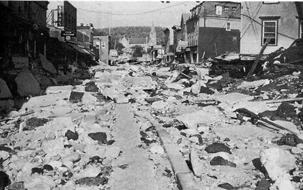
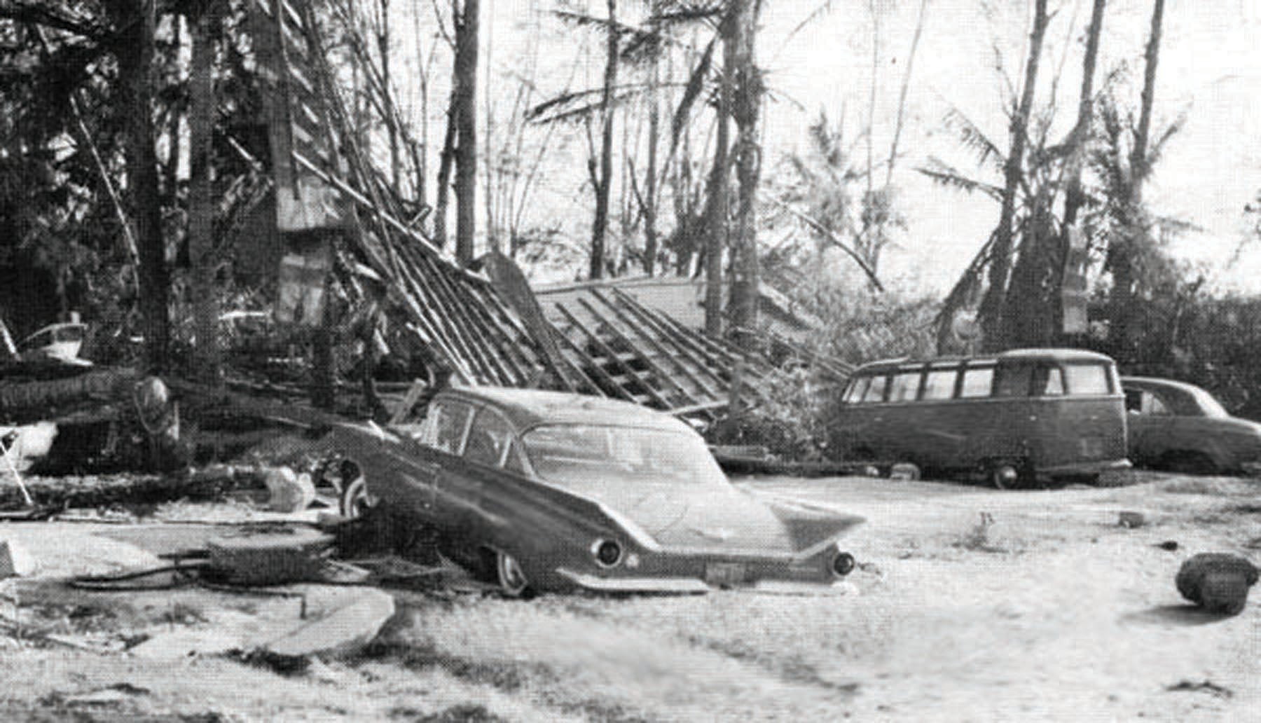
The Pakistan floods of 2022 are the nation’s sixth since 1950 to kill over 1,000 people. Major floods afflicted the country in 1950, 1955, 1956, 1957, 1959, throughout the 1970s, and in more recent years. Typical flood scenes are shown in the photos below, together with a New York Times report of a major flood in 1973.
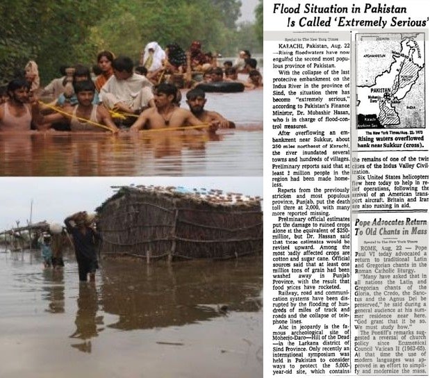
Monsoonal rains in 1950 led to flooding that killed an estimated 2,900 people across the country and caused the Ravi River in northeastern Pakistan to burst its banks; 10,000 villages were decimated and 900,000 people made homeless.
In 1973, one of Pakistan’s worst-ever floods followed intense rainfall of 325 mm (13 inches) in Punjab (which means five rivers) province, affecting more than 4.8 million people. The Indus River – of which the Ravi River is a tributary – became a swollen, raging torrent 32 km (20 miles) wide, sweeping 300,000 houses and 70,000 cattle away. 474 people perished.
In an area heavily dependent on agriculture, 4.3 million bales of the cotton crop and hundreds of millions of dollars worth of stored wheat were lost. Villagers had to venture into floodwaters to cut fodder from the drowned and ruined crops in order to feed their livestock. Another article on the 1973 flood in the New York Times reported the plight of flood refugees:
In Sind, many farmers, peasants and shopkeepers fled to a hilltop railway station where they climbed onto trains for Karachi.
Monsoon rainfall of 580 mm (23 inches) just three years later in July and September of 1976, again mostly in Punjab province, caused a flood that killed 425 and affected another 1.7 million people. It’s worth noting here that the 1976 deluge far exceeded the 375 mm (15 inches) of rain preceding the massive 2022 flood, although both inundated approximately the same area. The 1976 flood affected a total of 18,400 villages.
A shorter yet deadly flood struck the coastal metropolis of Karachi the following year in 1977, after 210 mm (8 inches) of rain fell on the city in 12 hours. Despite its brief duration, the flood drowned 848 people and left 20,000 homeless. That same year, the onslaught of floods in the country prompted the establishment of a Federal Flood Commission.
The figure below shows the annual number of flood fatalities in Pakistan from 1950 to 2012, which includes drownings from cyclones as well as monsoonal rains.

Many other past major floods, in India, Japan, Europe and other countries, are recorded in the history books, all just as devastating as more recent ones such as those in Pakistan or British Columbia, Canada. Despite the media’s neglect of history, floods are not any worse today than before.
Next: No Evidence That Extreme Weather on the Rise: A Look at the Past - (4) Droughts