The Futility of Action to Combat Climate Change: (1) Scientific and Engineering Reality

Amidst the clamor for urgent action to supposedly combat climate change, the scientific and engineering realities of such action are usually overlooked. Let’s imagine for a moment that we humans are indeed to blame for global warming and that catastrophe is imminent without drastic measures to curb fossil fuel emissions – views not shared by climate skeptics like myself.

In this and the subsequent blog post, I’ll show how proposed mitigation measures are either impractical or futile. We’ll start with the 2015 Paris Agreement – the international agreement on cutting greenhouse gas emissions, which 195 nations, together with many of the world’s scientific societies and national academies, have signed on to.

The agreement endorses the assertion that global warming comes largely from our emissions of greenhouse gases, and commits its signatories to “holding the increase in the global average temperature to well below 2 degrees Celsius (3.6 degrees Fahrenheit) above pre-industrial levels,” preferably limiting the increase to only 1.5 degrees Celsius (2.7 degrees Fahrenheit). According to NASA, current warming is close to 1 degree Celsius (1.8 degrees Fahrenheit).

How realistic are these goals? To achieve them, the Paris Agreement requires nations to declare a voluntary “nationally determined contribution” toward emissions reduction. However, it has been estimated by researchers at MIT (Massachusetts Institute of Technology) that, even if all countries were to follow through with their voluntary contributions, the actual mitigation of global warming by 2100 would be at most only about 0.2 degrees Celsius (0.4 degrees Fahrenheit).

Higher estimates, ranging up to 0.6 degrees Celsius (1.1 degrees Fahrenheit), assume that countries boost their initial voluntary emissions targets in the future. The agreement actually stipulates that countries should submit increasingly ambitious targets every five years, to help attain its long-term temperature goals. But the targets are still voluntary, with no enforcement mechanism.

Given that most countries are already falling behind their initial pledges, mitigation of more than 0.2 degrees Celsius (0.4 degrees Fahrenheit) by 2100 seems highly unlikely. Is it worth squandering the trillions of dollars necessary to achieve such a meager gain, even if the notion that we can control the earth’s thermostat is true?     

Another reality check is the limitations of renewable energy sources, which will be essential to our future if the world is to wean itself off fossil fuels that today supply almost 80% of our energy needs. The primary renewable technologies are wind and solar photovoltaics. But despite all the hype, wind and solar are not yet cost competitive with cheaper coal, oil and gas in most countries, when subsidies are ignored. Higher energy costs can strangle a country’s economy.

Source: BP

Source: BP

And it will be many years before renewables are practical alternatives to fossil fuels. It’s generally unappreciated by renewable energy advocates that full implementation of a new technology can take many decades. That’s been demonstrated again and again over the past century in areas as diverse as electronics and steelmaking.

The claim is often made, especially by proponents of the so-called Green New Deal, that scale-up of wind and solar power could be accomplished quickly by mounting an effort comparable to the U.S. moon landing program in the 1960s. But the claim ignores the already mature state of several technologies crucial to that program at the outset. Rocket technology, for example, had been developed by the Germans and used to terrify Londoners in the UK during World War II. The vacuum technology needed for the Apollo crew modules and spacesuits dates from the beginning of the 20th century.

Renewable energy.jpg

Such advantages don’t apply to renewable energy. The main engineering requirements for widespread utilization of wind and solar power are battery storage capability, to store energy for those times when the wind stops blowing or the sun isn’t shining, and redesign of the electric grid.

But even in the technologically advanced U.S., battery storage is an order of magnitude too expensive today for renewable electricity to be cost competitive with electricity generated from fossil fuels. That puts battery technology where rocket technology was more than 25 years before Project Apollo was able to exploit its use in space. Likewise, conversion of the U.S. power grid to renewable energy would cost trillions of dollars – and, while thought to be attainable, is currently seen as merely “aspirational.”

The bottom line for those who believe we must act urgently on the climate “emergency”: it’s going to take a lot of time and money to do anything at all, and whatever we do may make little difference to the global climate anyway.

Next: The Futility of Action to Combat Climate Change: (2) Political Reality

Australian Bushfires: Ample Evidence That Past Fires Were Worse

Listening to Hollywood celebrities and the mainstream media, you’d think the current epidemic of bushfires in Australia means the apocalypse is upon us. With vast tracts of land burned to the ground, dozens of people and millions of wild animals killed, and thousands of homes destroyed, climate alarmists would have you believe it’s all because of global warming.

But not only is there no scientific evidence that the frequency or severity of wildfires are on the rise in a warming world, but the evidence also clearly shows that the present Australian outbreak is unexceptional.

Bushfire.jpg

Although almost 20 million hectares (50 million acres, or 77,000 square miles) nationwide have burned so far, this is less than 17% of the staggeringly large area incinerated in the 1974-75 bushfire season and less than the burned area in three other conflagrations. Politically correct believers in the narrative of human-caused climate change seem unaware of such basic facts about the past.

The catastrophic fires in the 1974-75 season consumed 117 million hectares (300 million acres), which is 15% of the land area of the whole continent. Because nearly two thirds of the burned area was in remote parts of the Northern Territory and Western Australia, relatively little human loss was incurred, though livestock and native animals such as lizards and red kangaroos suffered.

The Northern Territory was also the location of major bushfires in the 1968-69, 1969-70 and 2002-03 seasons that burned areas of 40 million, 45 million and 38 million hectares (99 million, 110 million and 94 million acres), respectively. That climate change wasn’t the cause should be obvious from the fact that the 1968-69 and 1969-70 fires occurred during a 30-year period of global cooling from 1940 to 1970.

Despite the ignorance and politically charged rhetoric of alarmists, the primary cause of all these terrible fires in Australia has been the lack of intentional or prescribed burning. The practice was used by the native Aboriginal population for as long as 50,000 years before early settlers abandoned it after trying unsuccessfully to copy indigenous fire techniques – lighting fires so hot that flammable undergrowth, the main target of prescribed burns, actually germinated more after burning.

The Aboriginals, like native people everywhere, had a deep knowledge of the land. They knew what types of fires to burn for different types of terrain, how long to burn, and how frequently. This knowledge enabled them to keep potential wildfire fuel such as undergrowth and certain grasses in check, thereby avoiding the more intense and devastating bushfires of the modern era. As the Aboriginals found, small-scale fires can be a natural part of forest ecology.

Only recently has the idea of controlled burning been revived in Australia and the U.S., though the approach has been practiced in Europe for many years. Direct evidence of the efficacy of controlled burning is presented in the figure below, which shows how bushfires in Western Australia expanded significantly as prescribed burning was suppressed over the 50 years from 1963 to 2013.

WA bushfires.jpg

Bushfires have always been a feature of life in Australia. One of the earliest recorded outbreaks was the so-called Black Thursday bushfires of 1851, when then record-high temperatures up to 47.2 degrees Celsius (117 degrees Fahrenheit) and strong winds exacerbated fires that burned 5 million hectares (12 million acres), killed 12 people and terrified the young colony of Victoria. The deadliest fires of all time were the Black Saturday bushfires of 2009, also in Victoria, with 173 fatalities.    

Pictures of charred koala bears, homes engulfed in towering flames and residents seeking refuge on beaches are disturbing. But there’s simply no evidence for the recent statement in Time magazine by Malcolm Turnbull, former Australian Prime Minister, that “Australia’s fires this summer – unprecedented in the scale of their destruction – are the ferocious but inevitable reality of global warming.” Turnbull and climate alarmists should know better than to blame wildfires on this popular but erroneous belief.

Next: The Futility of Action to Combat Climate Change: (1) Scientific and Engineering Reality
No Evidence That Snow Is Disappearing

“Let It Snow! Let It Snow! Let It Snow!”

- 1945 Christmas song

You wouldn’t know it from mainstream media coverage but, far from disappearing, annual global snowfall is actually becoming heavier as the world warms. This is precisely the opposite of what climate change alarmists predicted as the global warming narrative took shape decades ago.

The prediction of less snowy winters was based on the simplistic notion that a higher atmospheric temperature would allow fewer snowflakes to form and keep less of the pearly white powder frozen on the ground. But, as any meteorologist will tell you, the crucial ingredient for snow formation, apart from near-freezing temperatures, is moisture in the air. Because warmer air can hold more water vapor, global warming in general produces more snow when the temperature drops.

This observation has been substantiated multiple times in recent years, in the Americas, Europe and Asia. As just one example, the eastern U.S. has experienced 29 high-impact winter snowstorms in the 10 years from 2009 though 2018. There were never more than 10 in any prior 10-year period.

The overall winter snow extent in the U.S. and Canada combined is illustrated in the figure below, which shows the monthly extent, averaged over the winter, from 1967 to 2019. Clearly, total snow cover is increasing, not diminishing.

Snow NAmerica 1967-2019.jpg

In the winter of 2009-10, record snowfall blanketed the entire mid-Atlantic coast of the U.S. in an event called Snowmaggedon, contributing to the record total for 2010 in the figure above. The winter of 2013-14 was the coldest and snowiest since the 1800s in parts of the Great Lakes. Further north in Canada, following an exceptionally cold winter in 2014-15, the lower mainland of British Columbia endured the longest cold snap in 32 years during the winter of 2016-17. That same winter saw record heavy Canadian snowfalls, in both British Columbia in the west and the maritime provinces in the east. 

The trend toward snowier winters is reflected in the number of North American blizzards over the same period, depicted in the next figure. Once again, it’s obvious that snow and harsh conditions have been on the rise for decades, especially as the globe warmed from the 1970s until 1998.  

US blizzard frequency 1960-2014.jpeg

But truckloads of snow haven’t fallen only in North America. The average monthly winter snow extent for the whole Northern Hemisphere from 1967 to 2019, illustrated in the following figure, shows a trend identical to that for North America.

Snow NH 1967-2019.jpg

Specific examples include abnormally chilly temperatures in southern China in January 2016, accompanying the first snow in Guangzhou since 1967 and the first in nearby Nanning since 1983. Extremely heavy snow that fell in the Panjshir Valley of Afghanistan in February 2015 killed over 200 people. During the winters of 2011-12 and 2012-13, much of central and eastern Europe experienced very cold and snowy weather, as they did once more in the winter of 2017-18. Eastern Ireland had its heaviest snowfalls for more than 50 years with totals exceeding 50 cm (20 inches).

Despite all this evidence, numerous claims have been made that snow is a thing of the past. “Children just aren’t going to know what snow is,” opined a research scientist at the CRU (Climatic Research Unit) of the UK’s University of East Anglia back in 2000. But, while winter snow is melting more rapidly in the spring and there’s less winter snow in some high mountain areas, the IPCC (Intergovernmental Panel on Climate Change) and WMO (World Meteorological Organization) have both been forced to concede that it’s now snowing more heavily at low altitudes than previously. Surprisingly, the WMO has even attributed the phenomenon to natural variability – as it should.

The IPCC and WMO, together with climate alarmists, are fond of using the term “unprecedented” to describe extreme weather events. As we’ve seen in previous blog posts, such usage is completely unjustified in every case – with the single exception of snowfall, though that’s a concession few alarmists make.

Next: When Science Is Literally under Attack: Ad Hominem Attacks

No Evidence That Marine Heat Waves Are Unusual

A new wrinkle in the narrative of human-induced global warming is the observation and study of marine heat waves. But, just as in other areas of climate science, the IPCC (Intergovernmental Panel on Climate Change) twists and hypes the evidence to boost the claim that heat waves at sea are becoming more common.

Marine heat waves describe extended periods of abnormally high ocean temperatures, just like atmospheric heat waves on land. The most publicized recent example was the “Blob,” a massive pool of warm water that formed in the northeast Pacific Ocean from 2013 to 2015, extending all the way from Alaska to the Baja Peninsula in Mexico as shown in the figure below, and up to 400 meters (1,300 feet) deep. Sea surface temperatures across the Blob averaged 3 degrees Celsius (5 degrees Fahrenheit) above normal. A similar temperature spike lasting for eight months was seen in Australia’s Tasman Sea in 2015 and 2016.

Recent Marine Heat Waves

OceanHeatWaveGlobe.jpg

The phenomenon has major effects on marine organisms and ecosystems, causing bleaching of coral reefs or loss of kelp forests, for example. Shellfish and small marine mammals such as sea lions and sea otters are particularly vulnerable, because the higher temperatures deplete the supply of plankton at the base of the ocean food chain. And toxic algae blooms can harm fish and larger marine animals.

OceanHeatWave kelp.jpg

Larger marine heat waves not only affect maritime life, but may also influence weather conditions on nearby land. The Blob is thought to have worsened California’s drought at the time, while the Tasman Sea event may have led to flooding in northeast Tasmania. The IPCC expresses only low confidence in such connections, however.   

Nevertheless, in its recent Special Report on the Ocean and Cryosphere in a Changing Climate, the IPCC puts its clout behind the assertion that marine heat waves doubled in frequency from 1982 to 2016, and that they have also become longer-lasting, more intense and more extensive. But these are false claims, for two reasons.

First, the observations supporting the claims were all made during the satellite era. Satellite measurements of ocean temperature are far more accurate and broader in coverage than measurements made by the old-fashioned methods that preceded satellite data. These cruder methods included placing a thermometer in seawater collected in wooden, canvas or insulated buckets tossed overboard from ships and hauled back on deck, or in seawater retained in ship engine-room inlets from several different depths; and data from moored or drifting buoys.

Because of the unreliability and sparseness of sea surface temperature data from the pre-satellite era, it’s obvious that earlier marine heat waves may well have been missed. Indeed, it would be surprising if no significant marine heat waves occurred during the period of record-high atmospheric temperatures of the 1930s, a topic discussed in a previous blog post.

The second reason the IPCC claims are spurious is that most of the reported studies (see for example, here and here) fail to take into account the overall ocean warming trend. Marine heat waves are generally measured relative to the average surface temperature over a 30-year baseline period. This means that any heat wave measured toward the end of that period will appear hotter than it really is, since the actual surface temperature at that time will be higher than the 30-year baseline. As pointed out by a NOAA (U.S. National Oceanic and Atmospheric Administration) scientist, not adjusting for the underlying warming falsely conflates natural regional variability with climate change.  

Even if the shortcomings of the data are ignored, it’s been found that from 1925 to 2016, the global average marine heatwave frequency and duration increased by only 34% and 17%, respectively – hardly dramatic increases. And in any case, the sample size for observations made since satellite observations began in 1982 is statistically small.

There’s no evidence, therefore, that marine heat waves are anything out of the ordinary.

Next: No Evidence That Snow Is Disappearing

Ocean Acidification: No Evidence of Impending Harm to Sea Life

ocean fish.jpg

Apocalyptic warnings about the effect of global warming on the oceans now embrace ocean acidification as well as sea level rise and ocean heating, both of which I’ve examined in previous posts. Acidification is a potential issue because the oceans absorb up to 30% of our CO2 emissions, according to the UN’s IPCC (Intergovernmental Panel on Climate Change). The extra CO2 increases the acidity of seawater.

But there’s no sign that any of the multitude of ocean inhabitants is suffering from the slightly more acidic conditions, although some species are affected by the warming itself. The average pH – a measure of acidity – of ocean surface water is currently falling by only 0.02 to 0.03 pH units per decade, and has dropped by only 0.1 pH units over the whole period since industrialization and CO2 emissions began in the 18th century. These almost imperceptible changes pale in comparison with the natural worldwide variation in ocean pH, which ranges from a low of 7.8 in coastal waters to a high of 8.4 in upper latitudes.

The pH scale sets 7.0 as the neutral value, with lower values being acidic and higher values alkaline. It’s a logarithmic scale, so a change of 1 pH unit represents a 10-fold change in acidity. A decrease of 0.1 units, representing a 26% increase in acidity, still leaves the ocean pH well within the alkaline range.    

The primary concern with ocean acidification is its effect on marine creatures – such as corals, some plankton, and shellfish – that form skeletons and shells made from calcium carbonate. The dissolution of CO2 in seawater produces carbonic acid (H2CO3), which in turn produces hydrogen ions (H+) that eat up any carbonate ions (CO32-) that were already present, depleting the supply of carbonate available to calcifying organisms, such as mussels and krill, for shell building.

Yet the wide range of pH values in which sea animals and plants thrive tells us that fears about acidification from climate change are unfounded. The figure below shows how much the ocean pH varies even at the same location over the period of one month, and often within a single day.

ocean pH over 1 month.jpg

In the Santa Barbara kelp forest (F in the figure), for example, the pH fluctuates by 0.5 units, a change in acidity of more than 200%, over 13 days; the mean variation in the Elkhorn Slough estuary (D) is a full pH unit, or a staggering 900% change in acidity, per day. Likewise, coral reefs (E) can withstand relatively large fluctuations in acidity: the pH of seawater in the open ocean can vary by 0.1 to 0.2 units daily, and by as much as 0.5 units seasonally, from summer to winter.

ocean coral.jpg

A 2011 study of coral formation in Papua New Guinea at underwater volcanic vents that exude CO2 found that coral reef formation ceased at pH values less than 7.7, which is 0.5 units below the pre-industrial ocean surface average of 8.2 units and 216% more acidic. However, at the present rate of pH decline, that point won’t be reached for at least another 130 to 200 years. In any case, there’s empirical evidence that existing corals are hardy enough to survive even lower pH values.

Australia’s Great Barrier Reef periodically endures surges of pronouncedly acid rainwater at the low pH of about 5.6 that pours onto the Reef from flooding of the Brisbane River, which has occurred 11 times since 1840. But the delicate corals have withstood the onslaught each time. And there have been several epochs in the distant past when the CO2 level in the atmosphere was much higher than now, yet marine species that calcify were able to persist for millions of years.

Nonetheless, advocates of the climate change narrative insist that marine animals and plants are headed for extinction if the CO2 level continues to rise, supposedly because of reduced fertility and growth rates. However, there’s a paucity of research conducted under realistic conditions that accurately simulates the actual environment of marine organisms. Acidification studies often fail to provide the organisms with a period of acclimation to lowered seawater pH, as they would experience in their natural surroundings, and ignore the chemical buffering effect of neighboring organisms on acidification.

Ocean acidification, often regarded as the evil twin of global warming, is far less of a threat to marine life than overfishing and pollution. In Shakespeare’s immortal words, the uproar over acidification is much ado about nothing.

Next: No Evidence That Marine Heat Waves Are Unusual

Ocean Heating: How the IPCC Distorts the Evidence

Part of the drumbeat accompanying the narrative of catastrophic human-caused warming involves hyping or distorting the supposed evidence, as I’ve demonstrated in recent posts on ice sheets, sea ice, sea levels and extreme weather. Another gauge of a warming climate is the amount of heat stashed away in the oceans. Here too, the IPCC (Intergovernmental Panel on Climate Change) and alarmist climate scientists bend the truth to bolster the narrative.

Perhaps the most egregious example comes from the IPCC itself. In its 2019 Special Report on the Ocean and Cryosphere in a Changing Climate, the IPCC declares that the world’s oceans have warmed unabated since 2005, and that the rate of ocean heating has accelerated – despite contrary evidence for both assertions presented in the very same report! It appears that catastrophists within the IPCC are putting a totally unjustified spin on the actual data.

Argo float being deployed.

Argo float being deployed.

Ocean heat, known technically as OHC (ocean heat content), is currently calculated from observations made by Argo profiling floats. These floats are battery-powered robotic buoys that patrol the oceans, sinking 1-2 km (0.6-1.2 miles) deep once every 10 days and then bobbing up to the surface, recording the temperature and salinity of the water as they ascend. When the floats eventually reach the surface, the data is transmitted to a satellite. Before the Argo system was deployed in the early 2000s, OHC data was obtained from older types of instrument.

The table below shows empirical data documented in the IPCC report, for the rate of ocean heating (heat uptake) over various intervals from 1969 to 2017, in two ocean layers: an upper layer down to a depth of 700 meters (2,300 feet), and a deeper layer from 700 meters down to 2,000 meters (6,600 feet). The data is presented in alternative forms: as the total heat energy absorbed by the global ocean yearly, measured in zettajoules (1021 joules), and as the rate of areal heating over the earth’s surface, measured in watts (1 watt = 1 joule per second) over one square meter.

OHC Table.jpg

Examination of the data in either form reveals clearly that in the upper, surface layer, the oceans heated less rapidly during the second half of the interval between 1993 and 2017, that is from 2005 to 2017, than during the first half from 1993 to 2005.

The same is true for the two layers combined, that is for all depths from the surface down to 2,000 meters (6,600 feet). When the two lines in the table above are added together, the combined layer heating rate was 9.33 zettajoules per year or 0.58 watts per square meter from 2005 to 2017, and 10.14 zettajoules per year or 0.63 watts per square meter from 1993 to 2017. Although these numbers ignore the large uncertainties in the measurements, they demonstrate that the ocean heating rate fell between 1993 and 2017.

Yet the IPCC has the audacity to state in the same report that “It is likely that the rate of ocean warming has increased since 1993,” even while correctly recognizing that the present heating rate is higher than it was back in 1969 or 1970. That the heating rate has not increased since 1993 can also be seen in the following figure, again from the same IPCC report.

Ocean Heat Content 1995-2017

OHC recent.jpg

The light and dark green bands in the figure show the change in OHC, measured in zettajoules, from the surface down to 2,000 meters (6,600 feet), relative to its average value between 2000 and 2010, over the period from 1995 to 2017. It’s obvious that the ocean heating rate – characterized by the slope of the graph – slowed down over this period, especially from 2003 to about 2008 when ocean heating appears to have stopped altogether. Both the IPCC’s table and figure in the report completely contradict its conclusions.

This contradiction is important not only because it reveals how the IPCC is a blatantly political more than a scientific organization, but also because OHC science has already been tarnished by the publication and subsequent retraction of a 2018 research paper claiming that ocean heating had reached the absurdly high rate of 0.83 watts per square meter.

If true, the claim would have meant that the climate is much more sensitive to CO2 emissions than previously thought – a finding the mainstream media immediately pounced on. But mathematician Nic Lewis quickly discovered that the researchers had miscalculated the ocean warming trend, as well as underestimating the uncertainty of their result in the retracted paper. Lewis has also uncovered errors in a 2019 paper on ocean heating.

In a recent letter to the IPCC, the Global Warming Policy Foundation has pointed out the errors and misinterpretations in both the 2018 and 2019 papers, as well as in the IPCC report discussed above. There’s been no response to date.

Next: Ocean Acidification: No Evidence of Impending Harm to Sea Life

No Convincing Evidence That Greenland Ice Sheet Is Melting Rapidly

Greenland1.jpg

When Greenland’s ice sheet lost an estimated 11.3 billion tonnes (12.5 billion tons) of ice on a single warm day this August, following back-to-back heat waves in June and July in western Europe, the climate doomsday machine went into overdrive. Predictions abounded of ever-accelerating melting of both Greenland and Antarctic ice sheets, and the imminent drowning of cities such as London and Miami by rising seas.

But all this hype is unnecessary fear-mongering. As discussed in the previous post, the massive Antarctic ice sheet may not be melting at all as the world warms. And the much smaller Greenland ice sheet isn’t melting any faster on average now than it was 15 years ago. While this year’s summer melt was above average, it was no more than seen seven years before, in 2012.

Melting takes place only during the short Greenland summer, the meltwater running over the ice sheet surface into the ocean, as well as funneling its way down through thick glaciers, helping speed up their flow toward the sea. Although some of the ice lost in summer is normally ice gained over the long winter from the accumulation of compacted snow, last winter’s low snowfall quickly disappeared this year in an early start to the melt season.   

Greenland melt.jpg

The figure to the left shows that at the peak of the 2019 event, over 60% of the ice sheet surface melted; on July 30 and 31, NOAA (the U.S. National Oceanic and Atmospheric Administration) reported that even the very highest point of the ice sheet liquefied briefly – a rare occurrence. The ice sheet, 2-3 km (6,600-9,800 feet) thick, consists of layers of compressed snow built up over at least hundreds of thousands of years. In addition to summer melting, the sheet loses ice by calving of icebergs at its edges.

The figure below depicts the daily variation, over a full year, of the estimated mass of ice in the Greenland ice sheet, relative to its average value from 1981 to 2010. The loss of ice during the summer months of June, July and August is clearly visible, the biggest recent losses having occurred in 2012 and 2019.

Greenland ice loss 2019.jpg

This year’s total ice loss has been estimated at 329 billion tonnes (363 billion tons), somewhat lower than the record 458 billion tonnes (505 billion tons) that melted in 2012. Despite the high 2012 loss, however, the average loss from 2012 through 2016 of 247 billion tonnes (272 billion tons) per year was essentially the same as the 2002 through 2011 average loss of 263 billion tonnes (290 billion tons) per year, according to the IPCC (Intergovernmental Panel on Climate Change).

So, while the average annual loss of 258 billion tonnes (284 billion tons) between 2002 and 2016 is a big jump from the average 75 billion tonnes (83 billion tons) of ice lost yearly during the 20th century, it appears that the Greenland ice sheet has at least stabilized since 2002. The 21st-century increase in summer melt rate may arise partly from dominance of the negative phase of the natural North Atlantic Oscillation since about 2000.

Little known about Greenland is that the ice sheet was smaller than it is today over most of the period since the end of the last ice age. During the long interglacial epoch, as human civilization developed and thrived, there were several periods when it was warmer on average in Greenland than at present, as illustrated in the next figure. This has been deduced by analyzing ice cores extracted from the Greenland ice sheet; the cores carry a record of past temperatures and atmospheric composition. 

Greenland temp(2) 5,000 yrs.jpg

One of the warm spells was the Medieval Warm Period, an era when Scandinavian Vikings colonized Greenland – growing crops, raising animals and hunting seals for meat and walruses for ivory. The Vikings are thought to have abandoned the island after temperatures dropped with the onset of the Little Ice Age. But there’s little doubt that what made it possible for the Vikings to settle in Greenland at all were a relatively hospitable climate and less ice than exists today.

To put everything in perspective, the present ice loss of 247 billion tonnes (272 billion tons) every year represents only about 0.01% of the total mass of the ice sheet. At the current rate, therefore, it would take another 10,000 years for all Greenland’s ice to melt.

Next: Ocean Warming: How the IPCC Distorts the Evidence

No Convincing Evidence That Antarctic Ice Sheet Is Melting

Antarctica Dome A.jpg

Of all the observations behind mass hysteria over our climate, none induces as much panic as melting of the earth’s two biggest ice sheets, covering the polar landmasses of Antarctica and Greenland. As long ago as 2006, Al Gore’s environmental documentary “An Inconvenient Truth” proclaimed that global warming would melt enough ice to cause a 6-meter (20-foot) rise in sea level “in the near future.” Today, every calving of a large iceberg from an ice shelf or glacier whips the mainstream media into a frenzy.

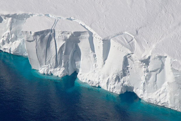
The huge Antarctic ice sheet alone would raise global sea levels by about 60 meters (200 feet) were it to melt completely. But there’s little evidence that the kilometers-thick ice sheet, which contains about 90% of the world’s freshwater ice, is melting at all.

Antarctica ice shelf.jpg

Any calving of large icebergs – a natural process unrelated to warming – from an ice shelf, or even disintegration into small icebergs, barely affects sea level. This is because the ice that breaks off was already floating on the ocean. Although a retreating ice shelf can contribute to sea level rise by accelerating the downhill flow of glaciers that feed the shelf, current breakups of Antarctic ice shelves are adding no more than about 0.1 mm (about 4/1000ths of an inch) per year to global sea levels, according to NOAA (the U.S. National Oceanic and Atmospheric Administration).

Global warming has certainly affected Antarctica, though not by as much as the Arctic. East Antarctica, by far the largest region that covers two thirds of the continent, heated up by only 0.06 degrees Celsius (0.11 degrees Fahrenheit) per decade between 1958 and 2012. At the South Pole, which is located in East Antarctica, temperatures actually fell in recent decades.

For comparison, global temperatures over this period rose by 0.11 degrees Celsius (0.20 degrees Fahrenheit) per decade, and Arctic temperatures shot up at an even higher rate. Antarctic warming from 1958 to 2012 is illustrated in the figure below, based on NOAA data. East Antarctica is to the right, West Antarctica to the left of the figure.

Antarctic temps 1958-2012.jpg

You can see, however, that temperatures in West Antarctica and the small Antarctic Peninsula, which points toward Argentina, increased more rapidly than in East Antarctica, by 0.22 degrees Celsius (0.40 degrees Fahrenheit) and 0.33 degrees Celsius (0.59 degrees Fahrenheit) per decade, respectively – faster than the global average. Still, the Peninsula has cooled since 2000.

It’s not surprising, therefore, that all the hype about imminent collapse of the Antarctic ice sheet centers on events in West Antarctica, such as glaciers melting at rapid rates. The Fifth Assessment Report of the UN’s IPCC (Intergovernmental Panel on Climate Change) maintained with high confidence that, between 2005 and 2010, the ice sheet was shedding mass and causing sea levels to rise by 0.41 mm per year, contributing about 24% of the measured rate of 1.7 mm (1/16th of an inch) per year between 1900 and 2010.

On the other hand, a 2015 NASA study reported that the Antarctic ice sheet was actually gaining rather than losing ice in 2008, and that ice thickening was making sea levels fall by 0.23 mm per year. The study authors found that the ice loss from thinning glaciers in West Antarctica and the Antarctic Peninsula was currently outweighed by new ice formation in East Antarctica resulting from warming-enhanced snowfall. Across the continent, Antarctica averages roughly  5 cm (2 inches) of precipitation per year. The same authors say that the trend has continued until at least 2018, despite a recent research paper by an international group of polar scientists endorsing the IPCC human-caused global warming narrative of diminishing Antarctic ice.

The two studies are both based on satellite altimetry – the same method used to measure sea levels, but in this case measuring the height of the ice sheet. Both studies also depend on models to correct the raw data for factors such as snowdrift, ice compaction and motion of the underlying bedrock. It’s differences in the models that give rise to the diametrically opposite results of the studies, one finding that Antarctic ice is melting away but the other concluding that it’s really growing.

Such uncertainty, even in the satellite era, shouldn’t be surprising. Despite the insistence of many climate scientists that theirs is a mature field of research, much of today’s climate science is dependent on models to interpret the empirical observations. The models, just like computer climate models, aren’t always good representations of reality.

Al Gore’s 6-meter (20-foot) rise hasn’t happened yet, and isn’t likely to happen even by the end of this century. Global panic over the impending meltdown of Antarctica is totally unwarranted.

(This post has also been kindly reproduced in full on the Climate Depot blog.)

Next: No Convincing Evidence That Greenland Ice Sheet Is Melting Rapidly

Shrinking Sea Ice: Evaluation of the Evidence

Most of us know about the loss of sea ice in the Arctic due to global warming. The dramatic reduction in summer ice cover, which has continued for almost 40 years, is frequently hyped by the mainstream media and climate activists as an example of what we’re supposedly doing to the planet.

But the loss is nowhere near as much as predicted, and in fact was no more in the summer of 2019 than in 2007. Also, it’s little known that Arctic sea ice has melted before during the record heat of the 1930s. And the sea ice around Antarctica, at the other end of the globe, has been expanding since at least 1979.

Actual scientific observations of sea ice in the Arctic and Antarctic have only been possible since satellite measurements began in 1979. The figure below shows satellite-derived images of Arctic sea ice extent in the summer of 1979 (left image), and the summer (September) and winter (March) of 2018 (right image). Sea ice expands to its maximum extent during the winter and shrinks during summer months.   

Arctic ice 1979.jpg
Arctic ice 2018.jpg

Arctic summer ice extent decreased by approximately 33% over the interval from 1979 to 2018; while it still encases northern Greenland, it no longer reaches the Russian coast.

However, there has been no net ice loss since 2007, with the year-to-year minimum extents fluctuating around a plateau. An exception was 2012, when a powerful August storm known as the Great Arctic Cyclone tore off a large chunk of ice from the main sea ice pack. Clearly, the evidence refutes numerous prognostications by advocates of catastrophic human-caused warming that Arctic ice would be completely gone by 2016. 

Before 1979, the only data available on Arctic sea ice are scattered observations from sources such as ship reports, aircraft reconnaissance and drifting buoys – observations recorded and synthesized by the Danish Meteorological Institute and the Russian Arctic and Antarctic Research Institute. Analyses of this spotty data have resulted in numerous reconstructions of Arctic sea ice extent in the pre-satellite era.

One such recent reconstruction is shown in the next figure, depicting reconstructed Arctic summer ice area, in millions of square kilometers, from 1900 to 2013. The reconstruction was based on the strong correlation of Arctic sea ice extent with Arctic air temperatures during the satellite era, especially in the summer, a correlation assumed to be the same in earlier years as well. This assumption then enabled the researchers to reconstruct the sea ice area before 1979 from observed temperatures in that era.  

Ice.jpg

What this graph reveals is that summer ice cover in the Arctic, apart from its present decline since about 1979, contracted previously in the 1920s and 1930s. According to the researchers, the biggest single-year decrease in area, which occurred in 1936, was about 26% – not much less than the 33% drop by 2018. Although this suggests that the relatively low sea ice extents in recent years are comparable to the 1930s, the reconstruction doesn’t incorporate any actual pre-satellite observations. Other reconstructions that do incorporate the earlier data show a smaller difference between the 1930s and today.

It’s the opposite story for sea ice in the Antarctic, which is at its lowest extent during the southern summer in February, as shown in the satellite-derived image below for 2018-19.

Antarctic ice 2018-2019.jpg

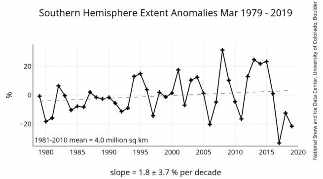
Despite the contraction in the Arctic, the sea ice around Antarctica has been expanding during the satellite era. As can be seen from the following figure, Antarctic sea ice has gained in extent by an average of 1.8% per decade (the dashed line represents the trend), though the ice extent fluctuates greatly from year to year. Antarctic sea ice covers a larger area than Arctic ice but occupies a smaller overall volume, because it’s only about half as thick.

Antarctic ice.jpg

Another fallacious claim about disappearing sea ice in the Arctic, one that has captured the public imagination like no other, is that the polar bear population is diminishing along with the ice. But, while this may yet happen in the future, current evidence shows that the bear population has been stable for the whole period that the ice has been decreasing and may even be growing, according to the native Inuit.

In summary, Arctic sea ice shrank from about 1979 to 2007 because of global warming, but has remained at the same extent on average in the 12 years since then, while Antarctic sea ice has expanded slightly over the whole period. So there’s certainly no cause for alarm.

Next: No Convincing Evidence That Antarctic Ice Sheet is Melting

No Evidence That Climate Change Is Accelerating Sea Level Rise

Malé, Maldives Capital City

Malé, Maldives Capital City

By far the most publicized phenomenon cited as evidence for human-induced climate change is rising sea levels, with the media regularly trumpeting the latest prediction of the oceans flooding or submerging cities in the decades to come. Nothing instills as much fear in low-lying coastal communities as the prospect of losing one’s dwelling to a hurricane storm surge or even slowly encroaching seawater. Island nations such as the Maldives in the Indian Ocean and Tuvalu in the Pacific are convinced their tropical paradises are about to disappear beneath the waves.

There’s no doubt that the average global sea level has been increasing ever since the world started to warm after the Little Ice Age ended around 1850. But there’s no reliable scientific evidence that the rate of rise is accelerating, or that the rise is associated with any human contribution to global warming.   

A comprehensive 2018 report on sea level and climate change by Judith Curry, a respected climate scientist and global warming skeptic, emphasizes the complexity of both measuring and trying to understand recent sea level rise. Because of the switch in 1993 from tide gauges to satellite altimetry as the principal method of measurement, the precise magnitude of sea level rise as well as projections for the future are uncertain.

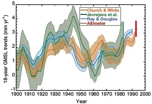
According to both Curry and the UN’s IPCC (Intergovernmental Panel on Climate Change), the average global rate of sea level rise from 1901 to 2010 was 1.7 mm (about 1/16th of an inch) per year. In the latter part of that period from 1993 onward, the rate of rise was 3.2 mm per year, almost double the average rate – though this estimate is considered too high by some experts. But, while the sudden jump may seem surprising and indicative of acceleration, the fact is that the globally averaged sea level fluctuates considerably over time. This is illustrated in the IPCC’s figure below, which shows estimates from tide gauge data of the rate of rise from 1900 to 1993.

cropped.jpg

It’s clear that the rate of rise was much higher than its 20th century average during the 30 years from 1920 to 1950, and much lower than the average from 1910 to 1920 and again from 1955 to 1980. Strong regional differences exist too. Actual rates of sea level rise range from negative in Stockholm, corresponding to a falling sea level, as that region continues to rebound after melting of the last ice age’s heavy ice sheet, to positive rates three times higher than average in the western Pacific Ocean.

The regional variation is evident in the next figure, showing the average rate of sea level rise across the globe, measured by satellite, between 1993 and 2014.

Sea level rise rate 1993-2014.jpg

You can see that during this period sea levels increased fastest in the western Pacific as just noted, and in the southern Indian and Atlantic Oceans. At the same time, the sea level fell near the west coast of North America and in the Southern Ocean near Antarctica.

The reasons for such a jumbled picture are several. Because water expands and occupies more volume as it gets warmer, higher ocean temperatures raise sea levels. Yet the seafloor is not static and can sink under the weight of the extra water in the ocean basin that comes from melting glaciers and ice caps, and can be altered by underwater volcanic eruptions. Land surfaces can also sink (as well as rebound), as a result of groundwater depletion in arid regions or landfilling in coastal wetlands. For example, about 50% of the much hyped worsening of tidal flooding in Miami Beach, Florida is due to sinking of reclaimed swampland.

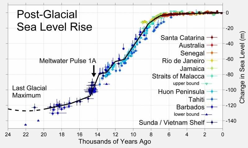
Historically, sea levels have been both lower and higher in the past than at present. Since the end of the last ice age, the average level has risen about 120 meters (400 feet), as depicted in the following figure. After it reached a peak in at least some regions about 6,000 years ago, however, the sea level has changed relatively little, even when industrialization began boosting atmospheric CO2. Over the 20th century, the worldwide average rise was about 15-18 cm (6-7 inches).

Sea level rise 24,000 yr.jpg

That the concerns of islanders are unwarranted despite rising seas is borne out by recent studies revealing that low-lying coral reef islands in the Pacific are actually growing in size by as much as 30% per century, and not shrinking. The growth is due to a combination of coral debris buildup, land reclamation and sedimentation. Another study found that the Maldives -- the world's lowest country -- formed when sea levels were even higher than they are today. Studies such as these belie the popular claim that islanders will become “climate refugees,” forced to leave their homes as sea levels rise.

Next: Shrinking Sea Ice: Evaluation of the Evidence

No Evidence That Heat Kills More People than Cold

The irony in the recent frenzy over heat waves is that many more humans die each year from cold than they do from heat. But you wouldn’t know that from sensational media headlines reporting “killer” heat waves and conditions “as hot as hell.” In reality, cold weather worldwide kills 17 times as many people as heat.

This conclusion was reached by a major international study in 2015, published in the prestigious medical journal The Lancet. The study analyzed more than 74 million deaths in 384 locations across 13 countries including Australia, China, Italy, Sweden, the UK and USA, over the period from 1985 to 2012. The results are illustrated in the figure below, showing the average daily rate of premature deaths from heat or cold as a percentage of all deaths, by country.

World heat vs cold deaths.jpg

Perhaps not surprisingly, moderate cold kills people far more often than extreme cold, for a wide range of different climates. Extreme cold was defined by the study authors as temperatures falling below the 2.5th percentile at each location, a limit which varied from as low as -11 degrees Celsius (12 degrees Fahrenheit) in Toronto, Canada to as high as 25 degrees Celsius (77 degrees Fahrenheit) in Bangkok, Thailand. Moderate cold includes all temperatures from this lower limit up to the so-called optimum, the temperature at which the daily death rate at that location is a minimum.

Likewise, extreme heat was defined as temperatures above the 97.5th percentile at each location, and moderate heat as temperatures from the optimum up to the 97.5th percentile. But unlike cold, extreme and moderate heat cause approximately equal numbers of excess deaths.

The study found that on average, 7.71% of all deaths could be attributed to hot or cold – to temperatures above or below the optimum – with 7.29% being due to cold, but only 0.42% due to heat. That single result puts the lie to the popular belief that heat waves are deadlier than cold spells. Hypothermia kills a lot more of us than heat stroke. And though both high and low temperatures can increase the risk of exacerbating cardiovascular, respiratory and other conditions, it’s cold that is the big killer.

This finding is further borne out by seasonal mortality statistics. France, for instance, recorded 700 excess deaths attributed to heat in the summer of 2016, 475 in 2017 and 1,500 in 2018. Yet excess deaths from cold in the French winter from December to March average approximately 24,000. Even the devastating summer heat wave of 2003 claimed only 15,000 lives in France.

Similar statistics come from the UK, where an average of 32,000 more deaths occur during each December to March period than in any other four-month interval of the year. Flu epidemics boosted this total to 37,000 in the winter of 2016-17, and to 50,000 in 2017-18. Just as in France, these numbers for deaths from winter cold far exceed summer mortalities in the UK due to heat, which reached only 1,700 in 2018 and just 2,200 in the heat-wave year of 2003.

Even more evidence that cold kills a lot more people than heat is seen in an earlier study, published in the BMJ (formerly the British Medical Journal) in 2000. This study, restricted to approximately 3 million deaths in western Europe from 1988 to 1992, found that annual cold related deaths were much higher than heat related deaths in all seven regions studied – with the former averaging 2,000 per million people and the latter only 220 per million. Additionally, no more deaths from heat occurred in hotter regions than colder ones.

A sophisticated statistical approach was necessary in both studies. This is because of differences between regions and individuals, and the observation that, while death from heat is typically rapid and occurs within a few days, death from cold can be delayed up to three or four weeks. The larger Lancet study used more advanced statistical modeling than the BMJ study.

And despite the finding that more than 50% of published papers in biomedicine are not reproducible, the fact that two independent papers reached essentially the same result gives their conclusions some credibility.

Next: No Evidence That Climate Change Is Accelerating Sea Level Rise

No Evidence That Climate Change Causes Weather Extremes: (6) Heat Waves

This Northern Hemisphere summer has seen searing, supposedly record high temperatures in France and elsewhere in Europe. According to the mainstream media and climate alarmists, the heat waves are unprecedented and a harbinger of harsh, scorching hot times to come.

But this is absolute nonsense. In this sixth and final post in the present series, I’ll examine the delusional beliefs that the earth is burning up and may shortly be uninhabitable, and that this is all a result of human-caused climate change. Heat waves are no more linked to climate change than any of the other weather extremes we’ve looked at.

The brouhaha over two almost back-to-back heat waves in western Europe is a case in point. In the second, which occurred toward the end of July, the WMO (World Meteorological Organization) claimed that the mercury in Paris reached a new record high of 42.6 degrees Celsius (108.7 degrees Fahrenheit) on July 25, besting the previous record of 40.4 degrees Celsius (104.7 degrees Fahrenheit) set back in July, 1947. And a month earlier during the first heat wave, temperatures in southern France hit a purported record 46.0 degrees Celsius (114.8 degrees Fahrenheit) on June 28.

How convenient to ignore the past! Reported in Australian and New Zealand newspapers from August, 1930 is an account of an earlier French heatwave, in which the temperature soared to a staggering 50 degrees Celsius (122 degrees Fahrenheit) in the Loire valley, located in central France. That’s a full 4.0 degrees Celsius (7.2 degrees Fahrenheit) above the so-called record just mentioned in southern France, where the temperature in 1930 may well have equaled or exceeded the Loire valley’s towering record.

And the same newspaper articles reported a temperature in Paris that day of 38 degrees Celsius (100 degrees Fahrenheit), stating that back in 1870 the thermometer had reached an even higher, unspecified level there – quite possibly above the July 2019 “record” of 42.6 degrees Celsius (108.7 degrees Fahrenheit).    

The same duplicity can be seen in proclamations about past U.S. temperatures. Although it’s frequently claimed that heat waves are increasing in both intensity and frequency, there’s simply no scientific evidence for such a bold assertion. The following figure charts official data from NOAA (the U.S. National Oceanic and Atmospheric Administration) showing the yearly number of days, averaged over all U.S. temperature stations, from 1895 to 2018 with extreme temperatures above 38 degrees Celsius (100 degrees Fahrenheit) and 41 degrees Celsius (105 degrees Fahrenheit).

ac-rebuttal-heat-waves-081819.jpg

The next figure shows NOAA’s data for the year in which the record high temperature in each U.S. state occurred. Of the 50 state records, a total of 32 were set in the 1930s or earlier, but only seven since 1990.

US high temperature records.jpg

It’s obvious from these two figures that there were more U.S. heat waves in the 1930s, and they were hotter, than in the present era of climate hysteria. Indeed, the annual number of days on which U.S. temperatures reached 100 degrees, 95 degrees or 90 degrees Fahrenheit has been steadily falling since the 1930s. The EPA (Environmental Protection Agency)’s Heat Wave Index for the 48 contiguous states also shows clearly that the 1930s were the hottest decade.

Globally, it’s exactly the same story, as depicted in the figure below.

World record high temperatures 500.jpg

Of the seven continents, six recorded their all-time record high temperatures before 1982, three records dating from the 1930s or before; only Asia has set a record more recently (the WMO hasn’t acknowledged the 122 degrees Fahrenheit 1930 record in the Loire region). And yet the worldwide baking of the 1930s didn’t set the stage for more and worse heat waves in the years ahead, even as CO2 kept pouring into the atmosphere – the scenario we’re told, erroneously, that we face today. In fact, the sweltering 1930s were followed by global cooling from 1940 to 1970.

Contrary to the climate change narrative, the recent European heat waves came about not because of global warming, but rather a weather phenomenon known as jet stream blocking. Blocking results from an entirely different mechanism than the buildup of atmospheric CO2, namely a weakening of the sun’s output that may portend a period of global cooling ahead. A less active sun generates less UV radiation, which in turn perturbs winds in the upper atmosphere, locking the jet stream in a holding or blocking pattern. In this case, blocking kept a surge of hot Sahara air in place over Europe for extended periods.

It should be clear from all the evidence presented above that mass hysteria over heat waves and climate change is completely unwarranted. Current heat waves have as little to do with global warming as floods, droughts, hurricanes, tornadoes and wildfires.

Next: No Evidence That Heat Kills More People than Cold

No Evidence That Climate Change Causes Weather Extremes: (5) Wildfires

Probably the most fearsome of the weather extremes commonly blamed on human-caused climate change are tornadoes – the previous topic in this series – and wildfires. Both can arrive with little or no warning, making it difficult or impossible to flee, are often deadly, and typically destroy hundreds of homes and other structures. But just like tornadoes, there is no scientific evidence that the frequency or severity of wildfires are on the rise in a warming world.

You wouldn’t know that, however, from the mass hysteria generated by the mainstream media and climate activists almost every time a wildfire breaks out, especially in naturally dry climates such as those in California, Australia or Spain. While it’s true that the number of acres burned annually in the U.S. has gone up over the last 20 years or so, the present burned area is still only a small fraction of what it was back in the record 1930s, as seen in the figure below, showing data compiled by the U.S. National Interagency Fire Center.

Wildfires US-acres-burned 1926-2017 copy.jpg

Because modern global warming was barely underway in the 1930s, climate change clearly has nothing to do with the incineration of U.S. forests. Exactly the same trend is apparent in the next figure, which depicts the estimated area worldwide burned by wildfires, by decade from 1900 to 2010. Clearly, wildfires have diminished globally as the planet has warmed.

Global Burned Area

1900-2010

Wildfires global-acres-burned JPG.jpg

In the Mediterranean, although the annual number of wildfires has more than doubled since 1980, the burned area over three decades has mimicked the global trend and declined:

Mediterranean Wildfire Occurrence & Burnt Area

1980-2010

Wildfires Mediterranean_number_and_area 1980-2010 copy.jpg

The contrast between the Mediterranean and the U.S., where wildfires are becoming fewer but larger in area, has been attributed to different forest management policies on the two sides of the Atlantic – despite the protestations of U.S. politicians and firefighting officials in western states that climate change is responsible for the uptick in fire size. The next figure illustrates the timeline from 1600 onwards of fire occurrence at more than 800 different sites in western North America. 

Western North America Wildfire Occurrence

1600-2000

Western North American wildfires JPG.jpg

The sudden drop in wildfire occurrence around 1880 has been ascribed to the expansion of American livestock grazing in order to feed a rapidly growing population. Intensive sheep and cattle grazing after that time consumed most of the grasses that previously constituted the fuel for wildfires. This depletion of fuel, together with the firebreaks created by the constant movement of herds back and forth to water sources, and by the arrival of railroads, drastically reduced the incidence of wildfires. And once mechanical equipment for firefighting such as fire engines and aircraft became available in the 20th century, more and more emphasis was placed on wildfire prevention.

But wildfire suppression in the U.S. has led to considerable increases in forest density and the buildup of undergrowth, both of which greatly enhance the potential for bigger and sometimes hotter fires – the latter characterized by a growing number of terrifying, superhot “firenadoes” or fire whirls occasionally observed in today’s wildfires.

Intentional burning, long used by native tribes and early settlers and even advocated by some environmentalists who point out that fire is in fact a natural part of forest ecology as seen in the preceding figure, has become a thing of the past. Only now, after several devastating wildfires in California, is the idea of controlled burning being revived in the U.S. In Europe, on the other hand, prescribed burning has been supported by land managers for many years.

Combined with overgrowth, global warming does play a role by drying out vegetation and forests more rapidly than before. But there’s no evidence at all for the notion peddled by the media that climate change has amplified the impact of fires on the ecosystem, known technically as fire severity. Indeed, at least 10 published studies of forest fires in the western U.S. have found no recent trend in increasing fire severity.

You may think that the ever-rising level of CO2 in the atmosphere would exacerbate wildfire risk, since CO2 promotes plant growth. But at the same time, higher CO2​ levels reduce plant transpiration, meaning that plants’ stomata or breathing pores open less, the leaves lose less water and more moisture is retained in the soil. Increased soil moisture has led to a worldwide greening of the planet.

In summary, the mistaken belief that the “new normal” of devastating wildfires around the globe is a result of climate change is not supported by the evidence. Humans, nevertheless, are the primary reason that wildfires have become larger and more destructive today. Population growth has caused more people to build in fire-prone areas, where fires are frequently sparked by an aging network of power lines and other electrical equipment. Coupled with poor forest management, this constitutes a recipe for disaster.

Next: No Evidence That Climate Change Causes Weather Extremes: (6) Heat Waves

No Evidence That Climate Change Causes Weather Extremes: (4) Tornadoes

tornadoes.jpg

Tornadoes are smaller and claim fewer lives than hurricanes. But the roaring twisters can be more terrifying because of their rapid formation and their ability to hurl objects such as cars, structural debris, animals and even people through the air. Nonetheless, the narrative that climate change is producing stronger and more deadly tornadoes is as fallacious as the nonexistent links between climate change and other weather extremes previously examined in this series.

Again, the UN’s IPCC (Intergovernmental Panel on Climate Change), whose assessment reports constitute the bible for the climate science community, has dismissed any connection between global warming and tornadoes. While the agency concedes that escalating temperatures and humidity may create atmospheric instability conducive to tornadoes, it also points out that other factors governing tornado formation, such as wind shear, diminish in a warming climate. In fact, declares the IPCC, the apparent increasing trend in tornadoes simply reflects their reporting by a larger number of people now living in remote areas.

A tornado is a rapidly rotating column of air, usually visible as a funnel cloud, that extends like a dagger from a parent thunderstorm to the ground. Demolishing homes and buildings in its often narrow path, it can travel many kilometers before dissipating. The most violent EF5 tornadoes attain wind speeds up to 480 km per hour (300 mph).

The U.S. endures by far the most tornadoes of any country, mostly in so-called Tornado Alley extending northward from central Texas through the Plains states. The annual incidence of all U.S. tornadoes from 1954 to 2017 is shown in the figure below. It’s obvious that no trend exists over a period that included both cooling and warming spells, with net global warming of approximately 1.1 degrees Celsius (2.0 degrees Fahrenheit) during that time.

US Tornadoes (NOAA) 1954-2017.jpg

But, as an illustration of how U.S. tornado activity can vary drastically from year to year, 13 successive days of tornado outbreaks in 2019 saw well over 400 tornadoes touch down in May, with June a close second – and this following seven quiet years ending in 2018, which was the quietest year in the entire record since 1954. The tornado surge, however, had nothing to do with climate change, but rather an unusually cold winter and spring in the West that, combined with heat from the Southeast and late rains, provided the ingredients for severe thunderstorms. 

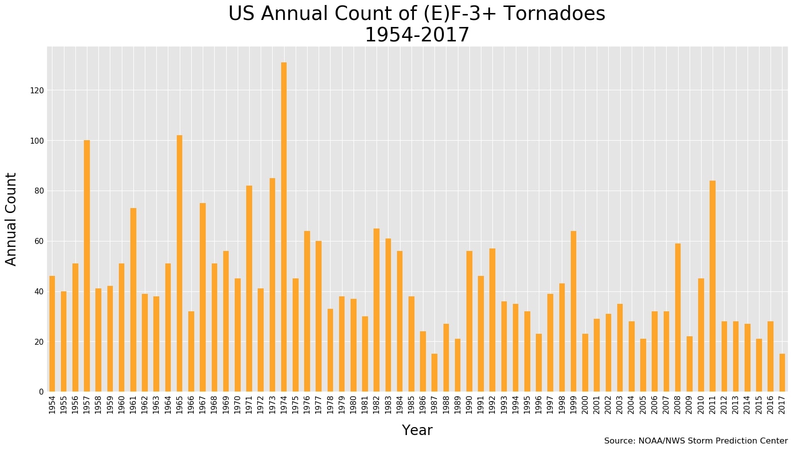
The next figure depicts the number of strong (EF3 or greater) tornadoes observed in the U.S. each year during the same period from 1954 to 2017. Clearly, the trend is downward instead of upward; the average number of strong tornadoes annually from 1986 to 2017 was 40% less than from 1954 to 1985. Once more, global warming cannot have played a role. 

US strong tornadoes (NOAA) 1954-2017.jpg

In the U.S., tornadoes cause about 80 deaths and more than 1,500 injuries per year. The deadliest episode of all time in a single day was the “tri-State” outbreak in 1925, which killed 747 people and resulted in the most damage from any tornado outbreak in U.S. history. The most ferocious tornado outbreak ever recorded, spawning a total of 30 EF4 or EF5 tornadoes, was in 1974.

Tornadoes also occur more rarely in other parts of the world such as South America and Europe. The earliest known tornado in history occurred in Ireland in 1054. The human toll from tornadoes in Bangladesh actually exceeds that in the U.S., at an estimated 179 deaths per year, partly due to the region’s high population density. It’s population growth and expansion outside urban areas that have caused the cost of property damage from tornadoes to mushroom in the last few decades, especially in the U.S.

Next: No Evidence That Climate Change Causes Weather Extremes: (5) Wildfires

No Evidence That Climate Change Causes Weather Extremes: (3) Hurricanes

This third post in our series on the spurious links between climate change and extreme weather examines the incidence of hurricanes – powerful tropical cyclones that all too dramatically demonstrate the fury nature is capable of unleashing.

Although the UN’s IPCC (Intergovernmental Panel on Climate Change) has noted an apparent increase in the strongest (Category 4 and 5) hurricanes in the Atlantic Ocean, there’s almost no evidence for any global trend in hurricane strength. And the IPCC has found “no significant observed trends” in the number of global hurricanes each year.

Hurricanes occur in the Atlantic and northeastern Pacific Oceans, especially in and around the Gulf of Mexico; their cousins, typhoons, occur in the northwestern Pacific. Hurricanes can be hundreds of miles in extent with wind speeds up to 240 km per hour (150 mph) or more, and often exact a heavy toll in human lives and personal property. The deadliest U.S. hurricane in recorded history struck Galveston, Texas in 1900, killing an estimated 8,000 to 12,000 people. In the Caribbean, the Great Hurricane of 1780 killed 27,500 and winds exceeded an estimated 320 km per hour (200 mph). The worst hurricanes and typhoons worldwide have each claimed hundreds of thousands of lives.

How often hurricanes have occurred globally since 1981 is depicted in the figure below.

Hurricane frequency global (Ryan Maue).jpg

You can see immediately that the annual number of hurricanes overall (upper graph) is dropping. But, while the number of major hurricanes of Category 2, 3, 4 or 5 strength (lower graph) seems to show a slight increase over this period, the trend has been ascribed to improvements in observational capabilities, rather than warming oceans that provide the fuel for tropical cyclones.

The lack of any trend in major global hurricanes is borne out by the number of Category 3, 4 or 5 global hurricanes that make landfall, illustrated in the next figure. 

Hurricanes - global landfalls 1970-2018.png

It’s clear that the frequency of landfalling hurricanes of any strength (Categories 1 through 5) hasn’t changed in the nearly 50 years since 1970 – during a time when the globe warmed by approximately 0.6 degrees Celsius (1.1 degrees Fahrenheit). So the strongest hurricanes today aren’t any more extreme or devastating than those in the past. If anything, major landfalling hurricanes in the U.S. are tied to La Niña cycles in the Pacific Ocean, not to global warming.

Data for the North Atlantic basin, which has the best quality data available in the world, do, however, show heightened hurricane activity over the last 20 years. The figure below illustrates the frequency of all North Atlantic hurricanes (top graph) and major hurricanes (bottom graph) for the much longer period from 1851 to 2018.

Hurricanes - North Atlantic & major 1850-2020.png

What the data reveals is that the annual number of major North Atlantic hurricanes during the 1950s and 1960s was at least comparable to that during the last two decades when, as can be seen, the number took a sudden upward hike from the 1970s, 1980s and 1990s. But, because the earth was cooling in the 1950s and 1960s, the present enhanced hurricane activity in the North Atlantic is highly unlikely to result from global warming.

Even though it appears from the figure that major North Atlantic hurricanes were less frequent before about 1940, the lower numbers simply reflect the relative lack of observations in early years of the record. Aircraft reconnaissance flights to gather data on hurricanes didn’t begin until 1944, while satellite coverage dates from only 1966. While the data shown in the figure above has been adjusted to compensate for these deficiencies, it’s probable that the number of major North Atlantic hurricanes before 1944 is still undercounted.

The true picture is much more complicated, and any explanation of changing hurricane behavior needs to account as well for other factors, such as the now more rapid intensification of these violent storms and their slower tracking than before, both of which result in heavier rain following landfall.

The short duration of the observational record, and the even shorter record from the satellite era, makes it impossible to assess whether recent hurricane activity is unusual for the present interglacial period. Paleogeological studies of sediments in North Atlantic coastal waters suggest that the current boosted hurricane activity is not at all unusual, with several periods of frequent intense hurricane strikes having occurred thousands of years ago.

Next: No Evidence That Climate Change Causes Weather Extremes: (4) Tornadoes

No Evidence That Climate Change Causes Weather Extremes: (2) Floods

Widespread flooding and devastating tornadoes in the U.S. Midwest this May only served to amplify the strident voices of those who claim that climate change has intensified the occurrence of major floods, droughts, hurricanes, heat waves and wildfires. Like-minded voices in other countries have also fallen into the same trap of linking weather extremes to global warming.  

Apart from the IPCC (Intergovernmental Panel on Climate Change)’s dismissal of such hysterical beliefs, an increasing number of research studies are helping to dispel the notion that a warmer world is necessarily accompanied by more severe weather.

A 2017 Australian study of global flood risk concluded very little evidence exists that worldwide flooding is becoming more prevalent. Despite average rainfall getting heavier as the planet warms, the study authors point out that excessive precipitation is not the only cause of flooding. What is less obvious is that alterations to the catchment area – such as land-use changes, deforestation and the building of dams – also play a major role. 

Yet the study found that the biggest influence on flood trends is not more intense precipitation, changes in forest cover or the presence of dams, but the size of the catchment area. Previous studies had emphasized small catchment areas, as these were thought less likely to have been extensively modified. However, the new study discovered that, while smaller catchments do show a trend in flood risk that’s increasing over time, larger catchments exhibit a decreasing trend.

Globally, larger catchments dominate, so the trend in flood risk is actually decreasing rather than increasing in most parts of the globe, if there’s any trend at all. This is illustrated in the figure below, the data coming from 1,907 different locations over the 40 years from 1966 to 2005. Additional data from other locations and for a longer (93-year) period show the same global trend.

Flood1.jpg

But while the overall trend is decreasing, the local trend in regions where smaller catchments are more common, such as Europe, eastern North America and southern Africa, is toward more flooding. The study authors suggest that the lower flood trend in larger catchment areas is due to the expanding presence of agriculture and urbanization.

Another 2017 study, this time restricted to North America and Europe, found “no compelling evidence for consistent changes over time” in the occurrence of major floods from 1930 to 2010. Like the first study described above, this research included both small and large catchment areas. But the only catchments studied were those with minimal alterations and less than 10% urbanization, so as to focus on any trends driven by climate change.

The second figure below shows the likelihood of a 100-year flood occurring in North America or Europe in any given year, during two slightly different periods toward the end of the 20th century. A 100-year flood is a massive flood that occurs on average only once a century, and has a 1 in 100 or 1% chance of occurring or being exceeded in any given year – although the actual interval between 100-year floods is often less than 100 years.

Flood2.jpg
Flood3.jpg

You can see that for both periods studied, the probability of a 100-year flood in North America or Europe hovers around the 1% (0.01) level or below, implying that 100-year floods were no more or less likely to occur during those intervals than at any time. The straight lines drawn through the data points are meaningless. Similar results were obtained for 50-year floods. 

Although the international study authors concluded that major floods in the Northern Hemisphere between 1931 and 2010 weren’t caused by global warming and were no more likely than expected from chance alone, they did find that floods were influenced by the climate. The strongest influence is the naturally occurring Atlantic Multidecadal Oscillation, an ocean cycle that causes heavier than normal rainfall in Europe and lighter rainfall in North America during its positive phase – leading to an increase in major European floods and a decrease in North American ones.

The illusion that major floods are becoming more common is due in part to the world’s growing population and the appeal, in the more developed countries at least, of living near water. This has led to people building their dream homes in harm’s way on river or coastal floodplains, where rainfall-swollen rivers or storm surges result in intermittent flooding and subsequent devastation. It’s changing human wants rather than climate change that are responsible for disastrous floods.

Next: No Evidence That Climate Change Causes Weather Extremes: (3) Hurricanes

No Evidence That Climate Change Causes Weather Extremes: (1) Drought

Weather extremes are a commonly cited line of evidence for human-caused climate change. Despite the UN’s IPCC (Intergovernmental Panel on Climate Change) having found little to no evidence that global warming triggers extreme weather, the mainstream media and more than a few climate scientists don’t hesitate to trumpet their beliefs to the contrary at every opportunity.

In this and subsequent blog posts, I’ll show how the quasi-religious belief linking extreme weather events to climate change is badly mistaken and at odds with the actual scientific record. We’ll start with drought.

Droughts have been a continuing feature of the earth’s climate for millennia. Although generally caused by a severe fall-off in precipitation, droughts can be aggravated by other factors such as elevated temperatures, soil erosion and overuse of available groundwater. The consequences of drought, which can be catastrophic for human and animal life, include crop failure, starvation and mass migration. A major exodus of early humans out of Africa about 135,000 years ago is thought to have been driven by drought.  

Getting a good handle on drought has only been possible since the end of the 19th century, when the instrumentation needed to measure extreme weather accurately was first developed. The most widely used gauge of dry conditions is the Palmer Drought Severity Index that measures both dryness and wetness and classifies them as “moderate”, “severe” or “extreme.” The figure below depicts the Palmer Index for the U.S. during the past century or so, for all three drought or wetness classifications combined.

US drought index 1900-2012 JPG.jpg

What jumps out immediately is the lack of any long-term trend in either dryness or wetness in the U.S. With the exception of the 1930s Dust Bowl years, the pattern of drought (upper graph) looks boringly similar over the entire 112-year period, as does the pattern of excessive rain (lower graph).

Much the same is true for the rest of the world. The next figure illustrates two different drought indices during the period 1910-2010 for India, a country subject to parching summer heat followed by drenching monsoonal rains; negative values denote drought and positive values wetness. The two indices are a version of the Palmer Drought Severity Index (sc-PDSI, top graph), and the Standardized Precipitation Index (SPI, bottom graph). The SPI, which relies on rainfall data only, is easier to calculate than the PDSI, which depends on both rainfall and temperature. While both indices are useful, the SPI is better suited to making comparisons between different regions.

India Drought Index

1910-2010

SPEI index India JPG TOP.jpg
SPEI index India JPG BOTTOM.jpg

You’ll see that the SPI in India shows no particular tendency over the 100-year period toward either dryness or wetness, though there are 20-year intervals exhibiting one of the two conditions; the apparent trend of the PDSI toward drought since 1990 is an artifact of the index. Similar records for other countries around the globe all show the same thing – no drying of the planet as a whole over more than 100 years.

Recently, the mainstream media created false alarm over drought by mindlessly broadcasting the results of a new study, purporting to demonstrate that global warming will soon result in “unprecedented drying.” By combining computer models with long-term observations, the study authors claim to have definitively connected global warming to drought.

But this claim doesn’t hold up, even in the study’s results. Although the authors were able to match warming to drought conditions during the first half of the 20th century, their efforts were a dismal failure after that. From 1950 to 1980, the “fingerprint” of human-caused global warming completely disappeared, in spite of ever-increasing CO2 in the atmosphere. And from 1981 onward, the fingerprint was so faint that it couldn’t be distinguished from background noise. So the assertion by the authors that global warming causes drought is nothing but wishful thinking.

As further evidence that climate change isn’t exacerbating drought, the final figure below shows the Palmer Index for the U.S. since 1996. Just like the record for the period from 1900 up to 2012 illustrated in the first figure above, there is no discernible trend in either dryness or wetness. While the West and Southwest have both experienced lengthy spells of drought during this period, extreme dry conditions now appear to have abated in both Texas and California.

US drought index 1996-2018 JPG.jpg

In summary, the scientific evidence simply doesn’t support any link between drought and climate change. The IPCC was right to express low confidence in any global-scale observed trend.

Next: No Evidence That Climate Change Causes Weather Extremes: (2) Floods

Science, Political Correctness and the Great Barrier Reef

A recent Australian court case highlights the intrusion of political correctness into science to bolster the climate change narrative. On April 16, a federal judge ruled that Australian coral scientist Dr. Peter Ridd had been unlawfully fired from his position at North Queensland’s James Cook University, for questioning his colleagues’ research on the impact of climate change on the Great Barrier Reef. In his ruling, the judge criticized the university for not respecting Ridd’s academic freedom.

Great Barrier Reef.jpg

The Great Barrier Reef is the world's largest coral reef system, 2,300 km (1,400 miles) long and visible from outer space. Labeled by CNN as one of the seven natural wonders of the world, the reef is a constant delight to tourists, who can view the colorful corals from a glass-bottomed boat or by snorkeling or scuba diving.

Rising temperatures, especially during the prolonged El Niño of 2014-17, have severely damaged portions of the Great Barrier Reef – so much so that the reef has become the poster child for global warming. Corals are susceptible to overheating and undergo bleaching when the water gets too hot, losing their vibrant colors. But exactly how much of the Great Barrier Reef has been affected, and how quickly it’s likely to recover, are controversial issues among reef researchers.

Ridd’s downfall came after he authored a chapter on the resilience of Great Barrier Reef corals in the book, Climate Change: The Facts 2017. In his chapter and subsequent TV interviews, Ridd bucked the politically correct view that the reef is doomed to an imminent death by climate change, and criticized the work of colleagues at the university’s Centre of Excellence for Coral Reef Studies. He maintained that his colleagues’ findings on the health of the reef in a warming climate were flawed, and that scientific organizations such as the Centre of Excellence could no longer be trusted.

Ridd had previously been censured by the university for going public with a dispute over a different aspect of reef health. This time, his employer accused Ridd of “uncollegial” academic misconduct and warned him to remain silent about the charge. When he didn’t, the university fired him after a successful career of more than 40 years.

At the crux of the issue of bleaching is whether or not it’s a new phenomenon. The politically correct view of many of Ridd’s fellow reef scientists is that bleaching didn’t start until the 1980s as global warming surged, so is an entirely man-made spectacle. But Ridd points to scientific records that reveal multiple coral bleaching events around the globe throughout the 20th century.

The fired scientist also disagrees with his colleagues over the extent of bleaching from the massive 2014-17 El Niño. Ridd estimates that just 8% of Great Barrier Reef coral actually died; much of the southern end of the reef didn’t suffer at all. But his politically correct peers maintain that the die-off was anywhere from 30% to 95%.

Such high estimates, however, are for very shallow water coral – less than 2 meters (7 feet) below the surface, which is only a small fraction of all the coral in the reef. A recent independent study found that deep water coral – down to depths of more than 40 meters (130 feet) – saw far less bleaching. And while Ridd’s critics claim that warming has reduced the growth rate of new coral by 15%, he finds that the growth rate has increased slightly over the past 100 years.

Ridd explains the adaptability of corals to heating as a survival mechanism, in which the multitude of polyps that constitute a coral exchange the microscopic algae that normally live inside the polyps and give coral its striking colors. Hotter than normal water causes the algae to poison the coral that then expels them, turning the polyps white. But to survive, the coral needs resident algae which supply it with energy by photosynthesis of sunlight. So from the surrounding water, the coral selects a different species of algae better suited to hot conditions, a process that enables the coral to recover within a few years, says Ridd.

Ridd attributes what he believes are the erroneous conclusions of his reef scientist colleagues to a failure of the peer review process in scrutinizing their work. To support his argument, he cites the so-called reproducibility crisis in contemporary science – the vast number of peer-reviewed studies that can’t be replicated in subsequent investigations and whose findings turn out to be false. Although it’s not known how severe irreproducibility is in climate science, it’s a serious problem in the biomedical sciences, where as many as 89% of published results in certain fields can’t be reproduced.

In Ridd’s opinion, as well as mine, studies predicting that the Great Barrier Reef is in imminent peril are based more on political correctness than good science.

Next: UN Species Extinction Report Spouts Unscientific Hype, Dubious Math

Grassroots Climate Change Movement Ignores Actual Evidence

Earth Day 2019 is marked by the recent launch of several grassroots organizations whose ostensible aim is to combat climate change. The crusades include the UK’s Extinction Rebellion, the Swedish WeDontHaveTime, and the pied-piper-like campaign sparked by striking Swedish schoolgirl Greta Thunberg. What’s most disturbing about them all is not their intentions or methods, but their ignorance and their disregard of scientific evidence.

Common to the entire movement is the delusional belief that climate Armageddon is imminent – a mere 12 years away, according to U.S. congresswoman Alexandria Ocasio-Cortez. The WeDontHaveTime manifesto declares that “climate change is killing us” and that we’re already experiencing catastrophe. Trumpets Extinction Rebellion: “The science is clear … we are in a life or death situation … ,” a sentiment echoed by the Sunrise Movement in the U.S. And a proclamation of the youth climate strikers insists that “The climate crisis … is the biggest threat in human history.”

But despite the climate hysteria, these activists show almost no knowledge of the science that supposedly underlies their doomsday claims. Instead, they resort to logically fallacious appeals to authority. Apart from the UN’s IPCC (Intergovernmental Panel on Climate Change), which is as much a political body as a scientific one, the authorities include the former head of NASA’s Goddard Institute for Space Studies, James Hansen – known for his hype on global warming – and the UK Met Office, an agency with a dismal track record of predicting even the coming season’s weather.

Among numerous mistaken assertions by the would-be crusaders is the constant drumbeat of extreme weather events attributed to human emissions of greenhouse gases. The sadly uninformed protesters seem completely unaware that anomalous weather has been part of the earth’s climate from ancient times, long before industrialization bolstered the CO2 level in the atmosphere. They don’t bother to check the actual evidence that reveals no long-term trend whatsoever in hurricanes, heat waves, floods, droughts and wildfires in more than 100 years. Linking weather extremes to global warming or CO2 is empty-headed ignorance.

Another fallacy is that the huge Antarctic ice sheet, containing about 90% of the freshwater ice on the earth’s surface, is losing ice and causing sea-level rise to accelerate. But while it’s true that glaciers in West Antarctica and the Antarctic Peninsula are thinning, there’s evidence, albeit controversial, that the ice loss is outweighed by new ice formation in East Antarctica from warming-enhanced snowfall. The much smaller Greenland ice sheet is indeed losing ice by melting, but not at an alarming rate.

The cluelessness of the climate change movement is also exemplified by its embrace of false predictions of the future, such as the claim that climate change will cause shortfalls in food production. If anything, exactly the reverse is true. Higher temperatures and the fertilizing effect of CO2, which helps plants grow, boost crop yields and make plants more resistant to drought.

Participation in the movement runs in the hundreds of thousands around the world, especially among school climate strikers. The eco-anarchist Extinction Rebellion, formed last year, promotes acts of nonviolent civil disobedience to achieve its goals, harking back to “Ban the Bomb” and US civil rights protests of the 1950s and 1960s. To “save the planet”, the organization is calling for greenhouse gas emissions to be reduced to net zero as soon as 2025.

The newly created WeDontHaveTime subscribes to the widely held political, but unscientific belief that climate change is an existential crisis, and that catastrophe lurks around the corner. Its particular focus is on building a global social media network dedicated to climate change, with the initial phase being launched today, April 22.

The school strike for climate has similar aims, to be achieved by children around the globe playing hooky from school. An estimated total of more than a million pupils in 125 countries demonstrated in strikes on March 15.

The movement’s lack of scientific knowledge extends to the origin of CO2 emissions as well. Extinction Rebellion and WeDontHaveTime, at least, appear oblivious to the fact that the lion’s share of the world’s CO2 emissions comes from China and India alone – 34% in 2019, by preliminary estimates, and increasing yearly. If the climate change catastrophists were really serious about their objectives, they’d be directing their efforts against the governments of these two countries instead of wasting time on the West.

Next: Science, Political Correctness and the Great Barrier Reef

Does Climate Change Threaten National Security?

Earth new.jpg

The U.S. White House’s proposed Presidential Committee on Climate Security (PCCS) is under attack – by the mainstream media, Democrats in Congress and military retirees, among others. The committee’s intended purpose is to conduct a genuine scientific assessment of climate change.

But the assailants’ claim that the PCCS is a politically motivated attempt to overthrow science has it backwards. The Presidential Committee will undertake a scientifically motivated review of climate change science, in the hope of eliminating the subversive politics that have taken over the scientific debate.

It’s those opposed to the committee who are playing politics and abusing science. The whole political narrative about greenhouse gases and dangerous anthropogenic (human-caused) warming, including the misguided Paris Agreement that the U.S. has withdrawn from, depends on faulty computer climate models that failed to predict the recent slowdown in global warming, among other shortcomings. The actual empirical evidence for a substantial human contribution to global warming is flimsy.

And the supposed 97% consensus among climate scientists that global warming is largely man-made is a gross exaggeration, mindlessly repeated by politicians and the media.

The 97% number comes primarily from a study of approximately 12,000 abstracts of research papers on climate science over a 20-year period. What is rarely revealed is that nearly 8,000 of the abstracts expressed no opinion at all on human-caused warming. When that and a subsidiary survey are taken into account, the climate scientist consensus percentage falls to between 33% and 63% only. So much for an overwhelming majority! 

Blatant exaggeration like this for political purposes is all too common in climate science. An example that permeates current news articles and official reports on climate change is the hysteria over extreme weather. Almost every hurricane, major flood, drought, wildfire or heat wave is ascribed to global warming.

But careful examination of the actual scientific data shows that if there’s a trend in any of these events, it’s downward rather than upward. Even the UN’s Intergovernmental Panel on Climate Change has found little to no evidence that global warming increases the occurrence of many types of extreme weather.

Polar bear JPG 250.jpg

Another over-hyped assertion about climate change is that the polar bear population at the North Pole is shrinking because of diminishing sea ice in the Arctic, and that the bears are facing extinction. Yet, despite numerous articles in the media and photos of apparently starving bears, current evidence shows that the polar bear population has actually been steady for the whole period that the ice has been decreasing and may even be growing, according to the native Inuit.

All these exaggerations falsely bolster the case for taking immediate action to combat climate change, supposedly by pulling back on fossil fuel use. But the mandate of the PCCS is to cut through the hype and assess just what the science actually says.  

A specific PCCS goal is to examine whether climate change impacts U.S. national security, a connection that the defense and national security agencies have strongly endorsed.

A recent letter of protest to the President from a group of former military and civilian national security professionals expresses their deep concern about “second-guessing the scientific sources used to assess the threat … posed by climate change.” The PCCS will re-evaluate the criteria employed by the national agencies to link national security to climate change.

The protest letter also claims that less than 0.2% of peer-reviewed climate science papers dispute that climate change is driven by humans. This is nonsense. In solar science alone during the first half of 2017, the number of peer-reviewed papers affirming a strong link between the sun and our climate, independent of human activity, represented approximately 4% of all climate science papers during that time – and there are many other fields of study apart from the sun.

Let’s hope that formation of the new committee will not be thwarted and that it will uncover other truths about climate science.

(This post was published previously on March 7, on The Post & Email blog.)

Next: Measles Rampant Again, Thanks to Anti-Vaccinationists