
CRED’s “2022 Disasters in Numbers” Report Is a Disaster in Itself
/The newly released 2022 annual disasters report from the highly acclaimed international agency, CRED (Centre for Research on the Epidemiology of Disasters), is even more dishonest than its 2021 report which I reviewed in a previous post. The 2022 report contains numerous statements that cannot be justified by the evidence, and demonstrates a misunderstanding of basic statistics which is puzzling for an organization that collects and analyzes data.
The most egregious statements involve the death toll from weather-related disasters. In one section of the report, CRED cites the well-known fact that mortality from natural disasters is 98% lower today than a century earlier. Although this is actually based on CRED’s EM-DAT (Emergency Events Database), the 2022 report gripes that “A more careful examination of mortality statistics indicates that this percentage may be misleading. Misinterpreting statistics could be harmful if it supports a discourse minimizing the importance of climate action.”
Laughably, it is CRED’s new report that is misleading and misinterprets statistics. This is evident from the following two figures from the report and the accompanying commentary. Figure A shows the global annual number of deaths per decade from natural disasters between 1900 and 2020, compiled from 12,223 records in the EM-DAT database, while the highly misleading Figure B shows the same data excluding the 50 deadliest disasters.

In Figure A, it is clear that disaster-related deaths have been falling since the 1920s and are now approaching zero. Nevertheless, the 2022 CRED report makes the weak argument that if the 1910s were taken as the comparison baseline instead of the 1920s, the 98% fall would be only 30%. But a close look at the data reveals a total of 1.27 million deaths recorded in the year 1900, yet almost none at all from 1901 to 1919 (less than 50,000 in most years) – suggesting some deficiency in data collection during that period.
However, far more blatant is the report’s manipulation of the data in Figure A, by removing the 50 deadliest disasters from the dataset and then claiming that disaster deaths show “a positive mortality trend” over the last century, as depicted in Figure B.
Such subterfuge is both dishonest and statistically flawed. Some disasters are more deadly, some less; the only way to present any trend honestly is to include all the data. A fundamental tenet of the scientific method is that you can’t ignore any piece of evidence that doesn’t fit your narrative, simply because it’s inconvenient. And statistically, a disaster trend is a disaster trend, regardless of the disaster magnitude. If anything, the deadliest disasters – not the least deadly, as plotted in Figure B – carry the most weight in illustrating any trend in deaths.
While CRED sheepishly admits that Figure B “does not necessarily mean that we now have firm evidence that disaster-related mortality is increasing,” it gives away its true motive in presenting the figure by musing whether the fictitious positive trend is “supported by other drivers, e.g., population growth in exposed areas and climate change.”
The report goes on to argue that the main trend observed in Figure A is a result of five drought-induced famines, which each caused more than one million deaths from the 1920s to the 1960s. This statement is also deceptive, as can be seen from the figure below. The figure is similar to CRED’s Figure A and based on the same EM-DAT database, but breaks down the number of people killed in each decade into disaster category and corrects for population increase over time; the same data uncorrected for population increase show exactly the same features.

You can see that deaths from drought were dominant in the 1900s, 1920s, 1940s, 1960s and 1980s, but not the 1910s, 1930s, 1950s and 1970s. So CRED’s argument that the strong downward trend in Figure A is due to a large number of drought-induced famine deaths between 1920 and 1970 is nonsense.
Another section of the CRED report presents disaster death data for 2022, which is summarized in the following figure from the report. CRED comments that “the total death toll of 30,704 in 2022 was three times higher than in 2021 but below the 2002-2021 average of 60,955 deaths,” both of which are correct statements. However, the report then goes on to claim that the relatively high 2002-2021 average is “influenced by a few mega-disasters” and that “a more useful comparison [is that] the 2022 toll is almost twice the 2002-2021 median of 16,011 deaths.”
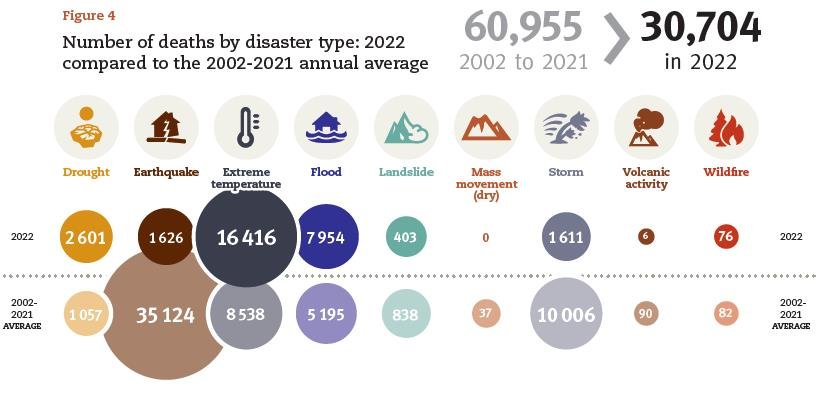
Again, these are meaningless comparisons that demonstrate an ignorance of statistics. The individual yearly death totals are unrelated – independent events in the language of statistics – so assigning any statistical significance to the 30,704 deaths in 2022 being lower than the long-term average, or higher than the long-term median, is invalid. CRED’s attempt to fit its data to a narrative emphasizing “the importance of climate action” falls flat.
The statistical inadequacies of CRED’s comparisons are also made clear by examining the recent trend in CRED’s EM-DAT data. The next figure shows the yearly number of climate-related disasters globally from 2000 through 2022 by major category. The disasters are those in the climatological (droughts, glacial lake outbursts and wildfires), meteorological (storms, extreme temperatures and fog), and hydrological (floods, landslides and wave action) categories.

As can be seen, the total number of climate-related disasters exhibits a slowly declining trend since 2000 (red line), falling by 4% over 23 years.
Next: Challenges to the CO2 Global Warming Hypothesis: (8) The Antarctic Centennial Oscillation as the Source of Global Warming


