Was the Permian Extinction Caused by Global Warming or CO2 Starvation?

Of all the mass extinctions in the earth’s distant past, by far the greatest and most drastic was the Permian Extinction, which occurred during the Permian between 300 and 250 million years ago. Also known as the Great Dying, the Permian Extinction killed off an estimated 57% of all biological families including rainforest flora, 81% of marine species and 70% of terrestrial vertebrate species that existed before the Permian’s last million years. What was the cause of this devastation?

The answer to that question is controversial among paleontologists. For many years, it has been thought the extinction was a result of ancient global warming. During Earth’s 4.5-billion-year history, the global average temperature has fluctuated wildly, from “hothouse” temperatures as much as 14 degrees Celsius (25 degrees Fahrenheit) above today’s level of about 14.8 degrees Celsius (27 degrees Fahrenheit), to “icehouse” temperatures 6 degrees Celsius (11 degrees Fahrenheit) below.

Hottest of all was a sudden temperature spike from icehouse conditions at the onset of the Permian to extreme hothouse temperatures at its end, as can be seen in the figure below. The figure is a 2021 estimate of ancient temperatures derived from oxygen isotopic measurements combined with lithologic climate indicators, such as coals, sedimentary rocks, minerals and glacial deposits. The barely visible time scale is in millions of years before the present.

The geological event responsible for this enormous surge in temperature is a massive volcanic eruption known as the Siberian Traps. The eruption lasted at least 1 million years and resulted in the outpouring of voluminous quantities of basaltic lava from rifts in West Siberia; the lava buried over 50% of Siberia in a blanket up to 6.5 km (4 miles) deep.

Volcanic CO2 released by the eruptions was supplemented by CO2 produced during combustion of thick, buried coal deposits that lay along the subterranean path of the erupting lava. This stupendous outburst boosted the atmospheric CO2 level from a very low 200 ppm (parts per million) to more than 2,000 ppm, as shown in the next figure.

The conventional wisdom in the past has been that this geologically sudden, gigantic increase in the CO2 level sent the global thermometer soaring – a conclusion sensationalized by mainstream media such as the New York Times. However, that argument ignores the saturation effect for atmospheric CO2, which limits CO2-induced warming to that produced by the first few hundred ppm of the greenhouse gas.

While the composition of the atmosphere 250 million years ago may have been different from today’s, the saturation effect would still have occurred. There’s no question, nevertheless, that end-Permian temperatures were as high as we think, whatever the cause. That’s because the temperatures are based on the highly reliable method of measuring oxygen 18O to 16O isotopic ratios in ancient microfossils.

Such hothouse conditions would have undoubtedly caused the extinction of various species; the severity of the extinction event is revealed by subsequent gaps in the fossil record. Organic carbon accumulated in the deep ocean, depleting oxygen and thus wiping out many marine species such as phytoplankton, brachiopods and reef-building corals. On land, vertebrates such as amphibians and early reptiles, as well as diverse tropical and temperate rainforest flora, disappeared.

All from extreme global warming? Not so fast, says ecologist Jim Steele.

Steele attributes the Permian extinction not to an excess of CO2 at the end of this geological period, but rather to a lack of it during the preceding Carboniferous and the early Permian, as can be seen in the figure above. He explains that all life is dependent on a supply of CO2, and that when its concentration drops below 150 ppm, photosynthesis ceases, and plants and living creatures die.

Steele argues that because of CO2 starvation over this interval, many species had either already become extinct, or were on the verge of extinction, long before the planet heated up so abruptly.

In comparison to other periods, the Permian saw the appearance of very few new species, as illustrated in the following figure. For example, far more new species evolved (and became extinct) during the earlier Ordovician, when CO2 levels were much, much higher but an icehouse climate prevailed.

When CO2 concentrations reached their lowest levels ever in the early Permian, phytoplankton fossils were extremely rare – some 40 million years or so before the later hothouse spike, which is when the conventional narrative claims the species became extinct. And Steele says that 35-47% of marine invertebrate genera went extinct, as well as almost 80% of land vertebrates, from 7 to 17 million years before the mass extinction at the end of the Permian.

Furthermore, Steele adds, the formation of the supercontinent Pangaea (shown to the left), which occurred during the Carboniferous, had a negative effect on biodiversity. Pangea removed unique niches from its converging island-like microcontinents, again long before the end-Permian.

Next: Unexpected Sea Level Fluctuations Due to Gravity, New Evidence Shows

El Niño and La Niña May Have Their Origins on the Sea Floor

One of the least understood aspects of our climate is the ENSO (El Niño – Southern Oscillation) ocean cycle, whose familiar El Niño (warm) and La Niña (cool) events cause drastic fluctuations in global temperature, along with often catastrophic weather in tropical regions of the Pacific and delayed effects elsewhere. A recent research paper attributes the phenomenon to tectonic and seismic activity under the oceans.

Principal author Valentina Zharkova, formerly at the UK’s Northumbria University, is a prolific researcher into natural sources of global warming, such as the sun’s internal magnetic field and the effect of solar activity on the earth’s ozone layer. Most of her studies involve sophisticated mathematical analysis and her latest paper is no exception.

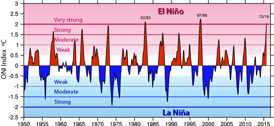
Zharkova and her coauthor Irina Vasilieva make use of a technique known as wavelet analysis, combined with correlation analysis, to identify key time periods in the ONI (Oceanic Niño Index). The index, which measures the strength of El Niño and La Niña events, is the 3-monthly average difference from the long-term average sea surface temperature in the ENSO region of the tropical Pacific. Shown in the figure below are values of the index from 1950 to 2016.

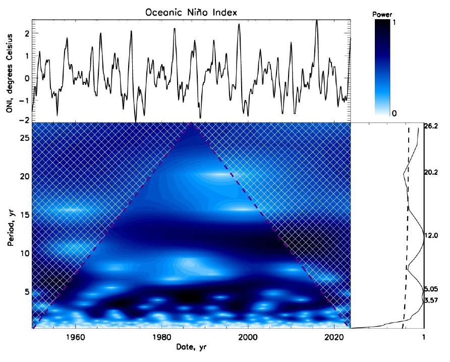
Wavelet analysis supplies information both on which frequencies are present in a time series signal, and on when those frequencies occur, unlike a Fourier transform which decomposes a signal only into its frequency components.

Using the wavelet approach, Zharkova and Vasilieva have identified two separate ENSO cycles: one with a shorter period of 4-5 years, and a longer one with a period of 12 years. This is illustrated in the next figure which shows the ONI at top left; the wavelet spectrum of the index at bottom left, with the wavelet “power” indicated by the colored bar at top right; and the global wavelet spectrum at bottom right. 

The authors link the 4- to 5-year ENSO cycle to the motion of tectonic plates, a connection that has been made by other researchers. The 12-year ENSO cycle identified by their wavelet analysis they attribute to underwater volcanic activity; it does not correspond to any solar cycle or other known natural source of warming.

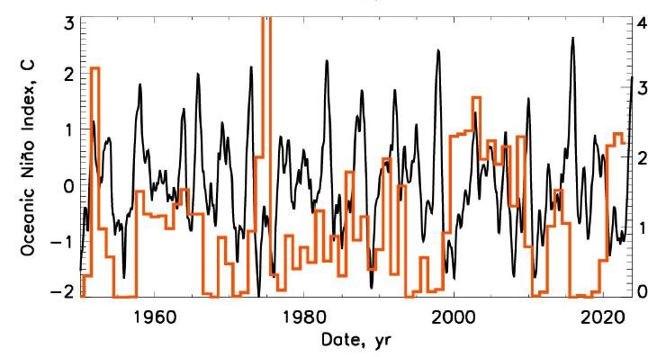
The following figure depicts an index (in red, right-hand scale), calculated by the authors, that measures the total annual volcanic strength and duration of all submarine volcanic eruptions from 1950 to 2023, superimposed on the ONI (in black) over the same period. A weak correlation can be seen between the ENSO ONI and undersea volcanic activity, the correlation being strongest at 12-year intervals.

Zharkova and Vasilieva estimate the 12-year ENSO correlation coefficient at 25%, a connection they label as “rather significant.” As I discussed in a recent post, retired physical geographer Arthur Viterito has proposed that submarine volcanic activity is the principal driver of global warming, via a strengthening of the thermohaline circulation that redistributes seawater and heat around the globe.

Zharkova and Vasilieva, however, link the volcanic eruptions causing the 12-year boost in the ENSO index to tidal gravitational forces on the earth from the giant planet Jupiter and from the sun. Jupiter of course orbits the sun and spins on an axis, just like Earth. But the sun is not motionless either: it too rotates on an axis and, because it’s tugged by the gravitational pull of the Jupiter and Saturn giants, orbits in a small but complex spiral around the center of the solar system.

Jupiter was selected by the researchers because its orbital period is 12 years - the same as the longer ENSO cycle identified by their wavelet analysis.

That Jupiter’s gravitational pull on Earth influences volcanic activity is clear from the next figure, in which the frequency of all terrestrial volcanic eruptions (underwater and surface) is plotted against the distance of Earth from Jupiter; the distance is measured in AU (astronomical units), where 1 AU is the average earth-sun distance. The thick blue line is for all eruptions, while the thick yellow line shows the eruption frequency in just the ENSO region.

What stands out is the increased volcanic frequency when Jupiter is at one of two different distances from Earth: 4.5 AU and 6 AU. The distance of 4.5 AU is Jupiter’s closest approach to Earth, while 6 AU is Jupiter’s distance when the sun is closest to Earth and located between Earth and Jupiter. The correlation coefficient between the 12-year ENSO cycle and the Earth-Jupiter distance is 12%.  

For the gravitational pull of the sun, Zharkova and Vasilieva find there is a 15% correlation between the 12-year ENSO cycle and the Earth-sun distance in January, when Earth’s southern hemisphere (where ENSO occurs) is closest to the sun. Although these solar system correlations are weak, Zharkova and Vasilieva say they are high considering the vast distances involved.

Next: Shrinking Cloud Cover: Cause or Effect of Global Warming?

Challenges to the CO2 Global Warming Hypothesis: (11) Global Warming Driven by Oceanic Seismic Activity, Not CO2

Although undersea volcanic eruptions can’t cause global warming directly, as I discussed in a previous post, they can contribute indirectly by altering the deep-ocean thermohaline circulation. According to a recent lecture, submarine volcanic activity is currently intensifying the thermohaline circulation sufficiently to be the principal driver of global warming.

The lecture was delivered by Arthur Viterito, a renowned physical geographer and retired professor at the College of Southern Maryland. His provocative hypothesis links an upsurge in seismic activity at mid-ocean ridges to recent global warming, via a strengthening of the ocean conveyor belt that redistributes seawater and heat around the globe.

Viterito’s starting point is the observation that satellite measurements of global warming since 1979 show distinct step increases following major El Niño events in 1997-98 and 2014-16, as demonstrated in the following figure. The figure depicts the satellite-based global temperature of the lower atmosphere in degrees Celsius, as compiled by scientists at the University of Alabama in Huntsville; temperatures are annual averages and the zero baseline represents the mean tropospheric temperature from 1991 to 2020.

Viterito links these apparent jumps in warming to geothermal heat emitted by volcanoes and hydrothermal vents in the middle of the world’s ocean basins – heat that shows similar step increases over the same time period, as measured by seismic activity. The submarine volcanoes and hydrothermal vents lie along the earth’s mid-ocean ridges, which divide the major oceans roughly in half and are illustrated in the next figure. The different colors denote the geothermal heat output (in milliwatts per square meter), which is highest along the ridges.

The total mid-ocean seismic activity along the ridges is shown in the figure below, in which the global tropospheric temperature, graphed in the first figure above, is plotted in blue against the annual number of mid-ocean earthquakes (EQ) in orange. The best fit between the two sets of data occurs when the temperature readings are lagged by two years: that is, the 1979 temperature reading is paired with the 1977 seismic reading, and so on. As already mentioned, seismic activity since 1979 shows step increases similar to the temperature.

A regression analysis yields a correlation coefficient of 0.74 between seismic activity and the two-year lagged temperatures, which implies that mid-ocean geothermal heat accounts for 55% of current global warming, says Viterito. However, a correlation coefficient of 0.74 is not as high as some estimates of the correlation between rising CO2 and temperature.

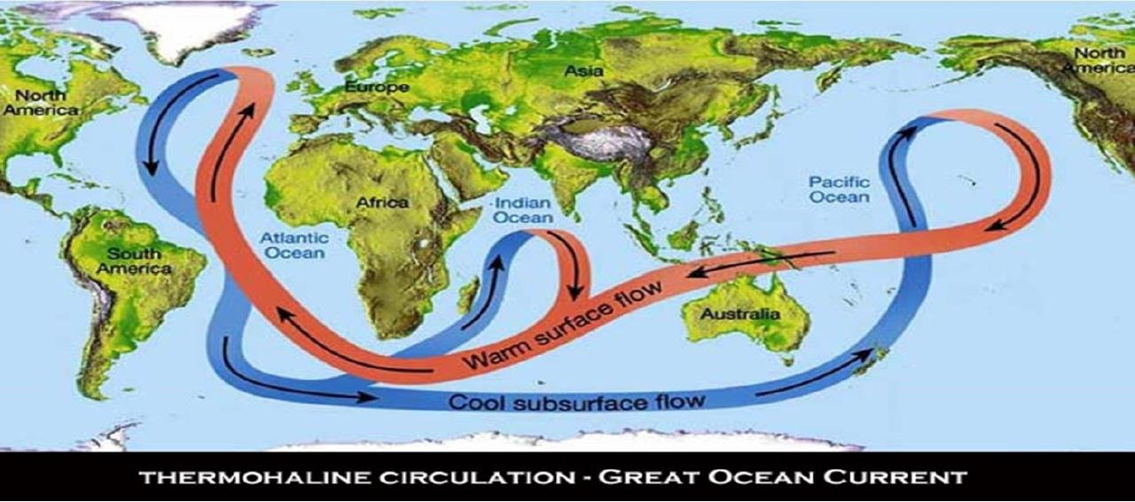
In support of his hypothesis, Viterito states that multiple modeling studies have demonstrated how geothermal heating can significantly strengthen the thermohaline circulation, shown below. He then links the recently enhanced undersea seismic activity to global warming of the atmosphere by examining thermohaline heat transport to the North Atlantic-Arctic and western Pacific oceans.

In the Arctic, Viterito points to several phenomena that he believes are a direct result of a rapid intensification of North Atlantic currents which began around 1995 – the same year that mid-ocean seismic activity started to rise. The phenomena include the expansion of a phytoplankton bloom toward the North Pole due to incursion of North Atlantic currents into the Arctic; enhanced Arctic warming; a decline in Arctic sea ice; and rapid warming of the Subpolar Gyre, a circular current south of Greenland.

In the western Pacific, he cites the increase since 1993 in heat content of the Indo-Pacific Warm Pool near Indonesia; a deepening of the Indo-Pacific Warm Pool thermocline, which divides warmer surface water from cooler water below; strengthening of the Kuroshio Current near Japan; and recently enhanced El Niños.

But, while all these observations are accurate, they do not necessarily verify Viterito’s hypothesis that submarine earthquakes are driving current global warming. For instance, he cites as evidence the switch of the AMO (Atlantic Multidecadal Oscillation) to its positive or warm phase in 1995, when mid-ocean seismic activity began to increase. However, his assertion begs the question: Isn’t the present warm phase of the AMO just the same as the hundreds of warm cycles that preceded it?

In fact, perhaps the AMO warm phase has always been triggered by an upturn in mid-ocean earthquakes, and has nothing to do with global warming.

There are other weaknesses in Viterito’s argument too. One example is his association of the decline in Arctic sea ice, which also began around 1995, with the current warming surge. What he overlooks is that the sea ice extent stopped shrinking on average in 2007 or 2008, but warming has continued.

And while he dismisses CO2 as a global warming driver because the rising CO2 level doesn’t show the same step increases as the tropospheric temperature, a correlation coefficient between CO2 and temperature as high as 0.8 means that any CO2 contribution is not negligible.

It’s worth noting here that a strengthened thermohaline circulation is the exact opposite of the slowdown postulated by retired meteorologist William Kininmonth as the cause of global warming, a possibility I described in an earlier post in this Challenges series (#7). From an analysis of longwave radiation from greenhouse gases absorbed at the tropical surface, Kininmonth concluded that a slowdown in the thermohaline circulation is the only plausible explanation for warming of the tropical ocean.

Next: Foundations of Science Under Attack in U.S. K-12 Education

Record Heat May Be from Natural Sources: El Niño and Water Vapor from 2022 Tonga Eruption

The record heat worldwide over the last few months – simultaneous heat waves in both the Northern and Southern Hemispheres, and abnormally warm oceans – has led to the hysterical declaration of “global boiling” by the UN Secretary General, the media and even some climate scientists. But a rational look at the data reveals that the cause may be natural sources, not human CO2.

The primary source is undoubtedly the warming El Niño ocean cycle, a natural event that recurs at irregular intervals from two to seven years. The last strong El Niño, which temporarily raised global temperatures by about 0.14 degrees Celsius (0.25 degrees Fahrenheit), was in 2016. For comparison, it takes a full decade for current global warming to increase temperatures by that much. 

However, on top of the 2023 El Niño has been an unexpected natural source of warming – water vapor in the upper atmosphere, resulting from a massive underwater volcanic eruption in the South Pacific kingdom of Tonga in January 2022.

Normally, erupting volcanoes cause significant global cooling, from shielding of sunlight by sulfate aerosol particles in the eruption plume that linger in the atmosphere. Following the 1991 eruption of Mount Pinatubo in the Philippines, for example, the global average temperature fell by 0.6 degrees Celsius (1.1 degrees Fahrenheit) for more than a year.

But the eruption of the Hunga Tonga–Hunga Haʻapai volcano did more than just launch a destructive tsunami and shoot a plume of ash, gas, and pulverized rock 55 kilometers (34 miles) into the sky. It also injected 146 megatonnes (161 megatons) of water vapor into the stratosphere (the layer of the atmosphere above the troposphere) like a geyser. Because it occurred only about 150 meters (500 feet) underwater, the eruption immediately superheated the shallow seawater above and converted it explosively into steam.

Although the excess water vapor – enough to fill more than 58,000 Olympic-size swimming pools – was originally localized to the South Pacific, it quickly diffused over the whole globe. According to a recent study by a group of atmospheric physicists at the University of Oxford and elsewhere, the eruption boosted the water vapor content of the stratosphere worldwide by as much as 10% to 15%. 

Water vapor is a powerful greenhouse gas, the dominant greenhouse gas in the atmosphere in fact; it is responsible for about 70% of the earth’s natural greenhouse effect, which keeps the planet at a comfortable enough temperature for living organisms to survive, rather than 33 degrees Celsius (59 degrees Fahrenheit) cooler. So even 10–15% extra water vapor in the stratosphere makes the earth warmer.

The study authors estimated the additional warming from the Hunga Tonga eruption using a simple climate model combined with a widely available radiative transfer model. Their estimate was a maximum global warming of 0.035 degrees Celsius (0.063 degrees Fahrenheit) in the year following the eruption, diminishing over the next five years. The cooling effect of the small amount of sulfur dioxide (SO2) from the eruption was found to be minimal.

As I explained in an earlier post, any increase in ocean surface temperatures from the Hunga Tonga eruption would have been imperceptible, at a minuscule 14 billionths of a degree Celsius or less. That’s because the oceans, which cover 71% of the earth’s surface, are vast and can hold 1,000 times more heat than the atmosphere. Undersea volcanic eruptions can, however, cause localized marine heat waves, as I discussed in another post.

Although 0.035 degrees Celsius (0.063 degrees Fahrenheit) of warming from the Hunga Tonga eruption pales in comparison with 2016’s El Niño boost of 0.14 degrees Celsius (0.25 degrees Fahrenheit), it’s nevertheless more than double the average yearly increase of 0.014 degrees Celsius (0.025 degrees Fahrenheit) of global warming from other sources such as greenhouse gases.

El Niño is the warm phase of ENSO (the El Niño – Southern Oscillation), a natural cycle that causes drastic temperature fluctuations and other climatic effects in tropical regions of the Pacific, as well as raising temperatures globally. Its effect on sea surface temperatures in the central Pacific is illustrated in the figure below. It can be seen that the strongest El Niños, such as those in 1998 and 2016, can make Pacific surface waters more than 2 degrees Celsius (3.6 degrees Fahrenheit) hotter for a whole year or so. 

Exactly how strong the present El Niño will be is unknown, but the heat waves of July suggest that this El Niño – augmented by the Hunga Tonga water vapor warming – may be super-strong. Satellite measurements showed that, in July 2023 alone, the temperature of the lower troposphere rose from 0.38 degrees Celsius (0.68 degrees Fahrenheit) to 0.64 degrees Celsius (1.2 degrees Fahrenheit) above the 1991-2020 mean.

If this El Niño turns out to be no stronger than in the past, then the source of the current “boiling” heat will remain a mystery. Perhaps the Hunga Tonga water vapor warming is larger than the Oxford group estimates. The source certainly isn’t any warming from human CO2, which raises global temperatures gradually and not abruptly as we’ve seen in 2023.

Next: Has the Mainstream Media Suddenly Become Honest in Climate Reporting?

Hottest in 125,000 Years? Dishonest Claim Contradicts the Evidence

Amidst the hysterical hype in the mainstream media about recent heat waves all over the Northern Hemisphere, especially in the U.S., the Mediterranean and Asia, one claim stands out as utterly ridiculous – which is that temperatures were the highest the world has seen in 125,000 years, since the interglacial period between the last two ice ages.

But the claim, repeated mindlessly by newspapers, magazines and TV networks in lockstep, is blatantly wrong. Aside from the media confusing the temperature of the hotter ground with that of the air above, there is ample evidence that the earth’s climate has been as warm or warmer than today’s – and comparable to that 125,000 years ago – several times during the past 11,000 years after the last ice age ended.

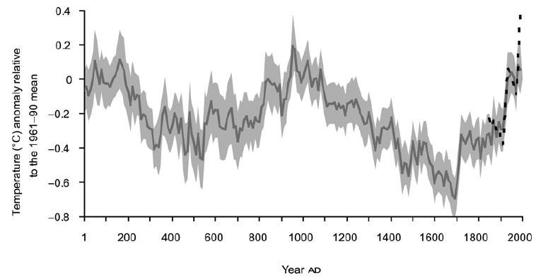
Underlying the preposterous claim is an erroneous temperature graph featured in the 2021 Sixth Assessment Report of the IPCC (Intergovernmental Panel on Climate Change). The report revives the infamous “hockey stick” – a reconstructed temperature graph for the past 2020 years resembling the shaft and blade of a hockey stick on its side, with no change or a slight decline in temperature for the first 1900 years, followed by a sudden, rapid upturn during the most recent 120 years.

Prominently displayed near the beginning of the report, the IPCC’s latest version of the hockey stick is shown in the figure above. The solid grey line from 1 to 2000 is a reconstruction of global surface temperature from paleoclimate archives, while the solid black line from 1850 to 2020 represents direct observations. Both are relative to the 1850–1900 mean and averaged by decade.

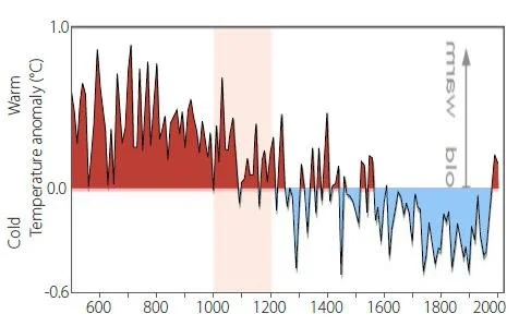
But what is missing from the spurious hockey stick are two previously well-documented features of our past climate: the MWP (Medieval Warm Period) around the year 1000, a time when warmer than normal conditions were reported in many parts of the world, and the cool period centered around 1650 known as the LIA (Little Ice Age).

The two features are clearly visible in a different reconstruction of past temperatures by Fredrik Ljungqvist, who is a professor of geography at Stockholm University in Sweden. Ljungqvist’s 2010 reconstruction, for extra-tropical latitudes (30–90°N) in the Northern Hemisphere only, is depicted in the next figure; temperatures are averaged by decade. Not only do the MWP and LIA stand out, but the end of the Roman Warm Period at the beginning of the previous millennium can also be seen on the left.

Both this reconstruction and the IPCC’s are based on paleoclimate proxies such as tree rings, marine sediments, ice cores, boreholes and leaf fossils. Although other reconstructions have supported the IPCC position that the MWP and LIA did not exist, a large number also provide strong evidence that they were real.

A 2016 summary paper by Ljungqvist and a co-author found that of the 16 large-scale reconstructions they studied, 7 had their warmest year during the MWP and 9 in the 20th century. The overall choice of research papers that the IPCC’s report drew from is strongly biased toward the lack of both the MWP and LIA, and many of the temperature reconstructions cited in the report are faulty because they rely on cherry-picked or incomplete proxy data.

A Southern Hemisphere example is shown in the figure below, depicting reconstructed temperatures for the continent of Antarctica back to the year 500. This also reveals a distinct LIA and what appears to be an extended MWP at the South Pole.

The hockey stick, the creation of climate scientist and IPCC author Michael Mann, first appeared in the IPCC’s Third Assessment Report in 2001, but was conspicuously absent from the fourth and fifth reports. It disappeared after its 2003 debunking by mining analyst Stephen McIntyre and economist Ross McKitrick, who found that the graph was based on faulty statistical analysis, as well as preferential data selection (see here and here). The hockey stick was also discredited by a team of scientists and statisticians assembled by the U.S. National Academy of Sciences.

Plenty of evidence, including that presented here, shows that global temperatures were not relatively constant for centuries as the hockey stick would have one believe. Maximum temperatures were actually higher than now during the MWP, when Scandinavian Vikings farmed in Greenland and wine was grown in the UK, and then much lower during the LIA, when frost fairs on the UK’s frozen Thames River became a common sight.

In a previous post, I presented evidence for a period even warmer than the MWP immediately following the last ice age, a period known as the Holocene Thermal Maximum.

Next: Record Heat May Be from Natural Sources: El Niño and Water Vapor from 2022 Tonga Eruption

Recent Marine Heat Waves Caused by Undersea Volcanic Eruptions, Not Human CO2

In a previous post, I showed how submarine volcanic eruptions don’t contribute to global warming, despite the release of enormous amounts of explosive energy. But they do contribute to regional climate change in the oceans, such as marine heat waves and shrinkage of polar sea ice, explained a retired geologist in a recent lecture.

Wyss Yim, who holds positions at several universities in Hong Kong, says that undersea volcanic eruptions – rather than CO2 – are an important driver of regional climate variability. The release of geothermal heat from these eruptions can explain oceanic heat waves, polar sea-ice changes and stronger-than-normal cycles of ENSO (the El Niño – Southern Oscillation), which causes temperature fluctuations and other climatic effects in the Pacific.

Submarine eruptions can eject basaltic lava at temperatures as high as 1,200 degrees Celsius (2,200 degrees Fahrenheit), often from multiple vents over a large area. Even though the hot lava is quickly quenched by the surrounding seawater, the heat absorbed by the ocean can have local, regional impacts that last for years.

The Pacific Ocean in particular is a major source of active terrestrial and submarine volcanoes, especially around the Ring of Fire bounding the Pacific tectonic plate, as illustrated in the figure below. Yim has identified eight underwater eruptions in the Pacific from 2011 to 2022 that had long-lasting effects on the climate, six of which emanated from the Ring of Fire.

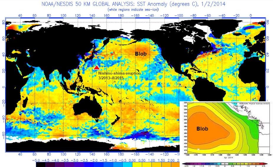
One of these eruptions was from the Nishino-shima volcano south of Tokyo, which underwent a massive blow-out, initially undersea, that persisted from March 2013 to August 2015. Yim says the event was the principal cause of the so-called North Pacific Blob, a massive pool of warm seawater that formed in the northeast Pacific from 2013 to 2015, extending all the way from Alaska to the Baja Peninsula in Mexico and up to 400 meters (1,300 feet) deep. Climate scientists at the time, however, attributed the Blob to global warming.

The Nishino-shima eruption, together with other submarine eruptions in the Pacific during 2014 and 2015, was a major factor in prolonging and strengthening the massive 2014-2017 El Niño. A map depicting sea surface temperatures in January 2014, at the onset of El Niño and almost a year after the emergence of the Blob, is shown in the next figure. At that time, surface temperatures across the Blob were about 2.5 degrees Celsius (4.5 degrees Fahrenheit) above normal.

By mid-2014, the Blob covered an area approximately 1,600 km (1,000 miles) square. Its vast extent, states Yim, contributed to the gradual decline of Arctic sea ice between 2014 and 2016, especially in the vicinity of the Bering Strait. The Blob also led to two successive years without winter along the northeast Pacific coast.

Biodiversity in the region suffered too, with sustained toxic algal blooms. Yet none of this was caused by climate change.

The 2014-2017 El Niño was further exacerbated by the eruption from May to June 2015 of the Wolf volcano on the Galapagos Islands in the eastern Pacific. Although the Wolf volcano is on land, its lava flows entered the ocean. The figure below shows the location of the Wolf eruption, along with submarine eruptions of both the Axial Seamount close to the Blob and the Hunga volcano in Tonga in the South Pacific.

According to Yim, the most significant drivers of the global climate are changes in the earth’s orbit and the sun, followed by geothermal heat, and – only in third place – human-induced changes such as increased greenhouse gases. Geothermal heat from submarine volcanic eruptions causes not only marine heat waves and contraction of polar sea ice, but also local changes in ocean currents, sea levels and surface winds.

Detailed measurements of oceanic variables such as temperature, pressure, salinity and chemistry are made today by the worldwide network of 3,900 Argo profiling floats. The floats are battery-powered robotic buoys that patrol the oceans, sinking 1-2 km (0.6-1.2 miles) deep once every 10 days and then bobbing up to the surface, recording the properties of the water as they ascend. When the floats eventually reach the surface, the data is transmitted to a satellite.

Yim says his studies show that the role played by submarine volcanoes in governing the planet’s climate has been underrated. Eruptions of any of the several thousand active underwater volcanoes can have substantial regional effects on climate, as just discussed.

He suggests that the influence of volcanic eruptions on atmospheric and oceanic circulation should be included in climate models. The only volcanic effect in current models is the atmospheric cooling produced by eruption plumes.

Next: Climate Heresy: To Avoid Extinction We Need More, Not Less CO2

Are Current Hot and Cold Extremes Climate Change or Natural Variability?

While sizzling temperatures in Europe have captured the attention of the mainstream media, recent prolonged bouts of cold in the Southern Hemisphere have gone almost unnoticed. Can these simultaneous weather extremes be ascribed to climate change, or is natural variability playing a major role?

It’s difficult to answer the question because a single year is a short time in the climate record. Formally, climate is the average of weather, or short-term changes in atmospheric conditions, over a 30-year period. But it is possible to compare the current heat and cold in different parts of the globe with their historical trends.

The recent heat wave in western and southern Europe is only one of several that have afflicted the continent recently. The July scorcher this year, labeled unprecedented by the media, was in fact less severe than back-to-back European heat waves in the summer of 2019.

In the second 2019 wave, which also occurred in July, the mercury in Paris reached a new record high of 42.6 degrees Celsius (108.7 degrees Fahrenheit), besting the previous record of 40.4 degrees Celsius (104.7 degrees Fahrenheit) set back in July 1947. A month earlier, during the first heat wave, temperatures in southern France hit a blistering 46.0 degrees Celsius (114.8 degrees Fahrenheit). Both readings exceed the highest temperatures reported in France during the July 2022 heat wave.

Yet back in 1930, the temperature purportedly soared to a staggering 50 degrees Celsius (122 degrees Fahrenheit) in the Loire valley during an earlier French heat wave, according to Australian and New Zealand newspapers. The same newspapers reported that in 1870, the ther­mometer had reached an even higher, unspecified level in that region. Europe’s official all-time high-temperature record is 48.0 degrees Celsius (118.4 degrees Fahrenheit) set in 1977.

Although the UK, Portugal and Spain have also suffered from searing heat this year, Europe experienced an unseasonably chilly spring. On April 4, France experienced its coldest April night since records began in 1947, with no less than 80 new low-temperature records being established across the nation. Fruit growers all across western Europe resorted to drastic measures to save their crops, including the use of pellet stoves for heating and spraying the fruit with water to create an insulating layer of ice.

South of the Equator, Australia and South America have seen some of their coldest weather in a century. Australia’s misery began with frigid Antarctic air enveloping the continent in May, bringing with it the heaviest early-season mountain snow in more than 50 years. In June, Brisbane in normally temperate Queensland had its coldest start to winter since 1904. And Alice Springs, which usually enjoys a balmy winter in the center of the country, has just endured 12 consecutive mornings of sub-freezing temperatures, surpassing the previous longest streak set in 1976.

South America too is experiencing icy conditions this year, after an historically cold winter in 2021 which decimated crops. The same Antarctic cold front that froze Australia in May brought bone-numbing cold to northern Argentina, Paraguay and southern Brazil; Brazil’s capital Brasilia logged its lowest temperature in recorded history. Later in the month the cold expanded north into Bolivia and Peru.

Based on history alone then, there’s nothing particularly unusual about the 2022 heat wave in Europe or the shivery winter down under, which included the coldest temperatures on record at the South Pole. Although both events have been attributed to climate change by activists and some climate scientists, natural explanations have also been put forward.

A recent study links the recent uptick in European heat waves to changes in the northern polar and subtropical jet streams. The study authors state that an increasingly persistent double jet stream pattern and its associated heat dome can explain "almost all of the accelerated trend" in heat waves across western Europe. Existence of a stable double-jet pattern is related to the blocking phenomenon, an example of which is shown in the figure below.

Blocking refers to a jet stream buckling that produces alternating, stationary highs and lows in pressure. Normally, highs and lows move on quickly, but the locking in place of a jet stream for several days or weeks can produce a heat dome. The authors say double jets and blocking are closely connected, but further research is needed to ascertain whether the observed increase in European double jets is part of internal natural variability of the climate system, or a response to climate change.

Likewise, it has been suggested that the frigid Southern Hemisphere winter may have a purely natural explanation, namely cooling caused by the January eruption of an undersea volcano in the South Pacific kingdom of Tonga. Although I previously showed how the massive submarine blast could not have contributed to global warming, it’s well known that such eruptions pour vast quantities of ash into the upper atmosphere, where it lingers and causes subsequent cooling by reflecting sunlight.

Next: Evidence for More Frequent and Longer Heat Waves Is Questionable

Ice Sheet Update (1): Evidence That Antarctica Is Cooling, Not Warming

Melting due to climate change of the Antarctic and Greenland ice sheets has led to widespread panic about the future impact of global warming. But, as we’ll see in this and a subsequent post, Antarctica may not be warming overall, while the rate of ice loss in Greenland has slowed recently.

The kilometers-thick Antarctic ice sheet contains about 90% of the world’s freshwater ice and would raise global sea levels by about 60 meters (200 feet) were it to melt completely. The Sixth Assessment Report of the UN’s IPCC (Intergovernmental Panel on Climate Change) maintains with high confidence that, between 2006 and 2018, melting of the Antarctic ice sheet was causing sea levels to rise by 0.37 mm (15 thousandths of an inch) per year, contributing about 10% of the global total.

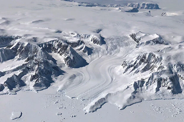
By far the largest region is East Antarctica, which covers two thirds of the continent as seen in the figure below and holds nine times as much ice by volume as West Antarctica. The hype about imminent collapse of the Antarctic ice sheet is based on rapid melting of the glaciers in West Antarctica; the glaciers contribute an estimated 63% (see here) to 73% (here) of the annual Antarctic ice loss. East Antarctica, on the other hand, may not have shed any mass at all – and may even have gained slightly – over the last three decades, due to the formation of new ice resulting from enhanced snowfall.  

The influence of global warming on Antarctica is uncertain. In an earlier post, I reported the results of a 2014 research study that concluded West Antarctica and the small Antarctic Peninsula, which points toward Argentina, had warmed appreciably from 1958 to 2012, but East Antarctica had barely heated up at all over the same period. The warming rates were 0.22 degrees Celsius (0.40 degrees Fahrenheit) and 0.33 degrees Celsius (0.59 degrees Fahrenheit) per decade, for West Antarctica and the Antarctic Peninsula respectively – both faster than the global average.

But a 2021 study reaches very different conclusions, namely that both West Antarctica and East Antarctica cooled between 1979 and 2018, while the Antarctic Peninsula warmed but at a much lower rate than found in the 2014 study. Both studies are based on reanalyses of limited Antarctic temperature data from mostly coastal meteorological stations, in an attempt to interpolate temperatures in the more inaccessible interior regions of the continent.

This later study appears to carry more weight as it incorporates data from 41 stations, whereas the 2014 study includes only 15 stations. The 2021 study concludes that East Antarctica and West Antarctica have cooled since 1979 at rates of 0.70 degrees Celsius (1.3 degrees Fahrenheit) per decade and 0.42 degrees Celsius (0.76 degrees Fahrenheit) per decade, respectively, with the Antarctic Peninsula having warmed at 0.18 degrees Celsius (0.32 degrees Fahrenheit) per decade.

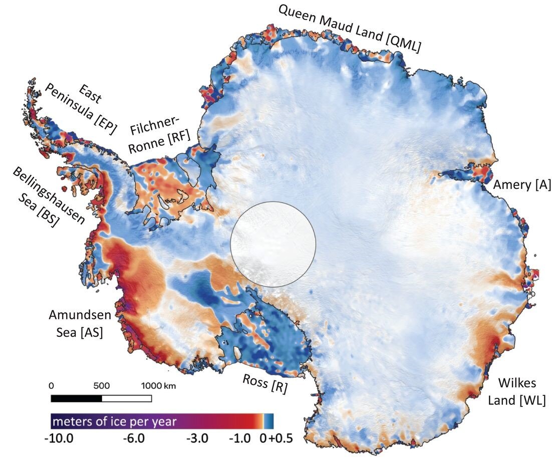
It’s the possible cooling of West Antarctica that’s most significant, because of ice loss from thinning glaciers. Ice loss and gain rates from Antarctica since 2003, measured by NASA’s ICESat satellite, are illustrated in the next figure, in which dark reds and purples show ice loss and blues show gain.

The high loss rates along the coast of West Antarctica have been linked to thinning of the floating ice shelves that terminate glaciers, by so-called circumpolar deep water warmed by climate change. Although disintegration of an ice shelf already floating on the ocean doesn’t raise sea levels, a retreating ice shelf can accelerate the downhill flow of glaciers that feed the shelf. It’s thought this can destabilize the glaciers and the ice sheets behind them.

However, not all the melting of West Antarctic glaciers is due to global warming and the erosion of ice shelves by circumpolar deep water. As I’ve discussed in a previous post, active volcanoes underneath West Antarctica are melting the ice sheet from below. One of these volcanoes is making a major contribution to melting of the Pine Island Glacier, which is adjacent to the Thwaites Glacier in the first figure above and is responsible for about 25% of the continent’s ice loss.

If the Antarctic Peninsula were to cool along with East Antarctica and West Antarctica, the naturally occurring SAM (Southern Annular Mode) – the north-south movement of a belt of strong southern westerly winds surrounding Antarctica – could switch from its present positive phase to negative. A negative SAM would result in less upwelling of circumpolar deep water, thus reducing ice shelf thinning and the associated melting of glaciers.

As seen in the following figure, the 2021 study’s reanalysis of Antarctic temperatures shows an essentially flat trend for the Antarctic Peninsula since the late 1990s (red curve); warming occurred only before that time. The same behavior is even evident in the earlier 2014 study, which goes back to 1958. So future cooling of the Antarctic Peninsula is not out of the question. The South Pole in East Antarctica this year experienced its coldest winter on record.

Peninsula.jpg

Next: Ice Sheet Update (2): Evidence That Greenland Melting May Have Slowed Down

Both Greenland and Antarctic Ice Sheets Melting from Below

Amidst all the hype over melting from above of the Antarctic and Greenland ice sheets due to global warming, little attention has been paid to melting from below due to the earth’s volcanic activity. But the two major ice sheets are in fact melting on both top and bottom, meaning that the contribution of global warming isn’t as large as climate activists proclaim.

In central Greenland, Japanese researchers recently discovered a flow of molten rocks, known as a mantle plume, rising up beneath the island. The previously unknown plume emanates from the boundary between the earth’s core and mantle (labeled CMB in the following figure) at a depth of 2,889 km (1,795 miles), and melts Greenland’s ice from below.

Greenland plume.jpg

As the figure shows, the Greenland plume has two branches. One of the branches feeds into the similar Iceland plume that arises underneath Iceland and supplies heat to an active volcano there. The Greenland plume provides heat to an active volcano on the island of Jan Mayen in the Arctic Ocean, as well as a geothermal area in the Svalbard archipelago in the same ocean.

To study the plume, the research team used seismic topography – a technique, similar to a CT scan of the human body, that constructs a three-dimensional image of subterranean structures from differences in the speed of earthquake sound waves traveling through the earth. Sound waves pass more slowly through rocks that are hotter, less dense or hydrated, but more quickly through rocks that are colder, denser or drier. The researchers took advantage of seismographs forming part of the Greenland Ice Sheet Monitoring Network, set up in 2009, to analyze data from 16,257 earthquakes recorded around the world.

The existence of a mantle plume underneath Antarctica, originating at a depth of approximately 2,300 km (1,400 miles), was confirmed by a Caltech (California Institute of Technology) study in 2017. Located under West Antarctica (labeled WA in the next figure), the plume generates as much as 150 milliwatts of heat per square meter – heat that feeds several active volcanoes and also melts the overlying ice sheet from below. For comparison, the earth’s geothermal heat is 40-60 milliwatts per square meter on average, but reaches about 200 milliwatts per square meter beneath geothermally active Yellowstone National Park in the U.S.

Heat Antarctica.jpg

A team of U.S. and UK researchers found in 2018 that one of the active volcanoes drawing heat from the mantle plume in West Antarctica is making a major contribution to the melting of the Pine Island Glacier. The Pine Island Glacier, situated adjacent to the Thwaites Glacier in the figure above, is the fastest melting glacier in Antarctica, responsible for about 25% of the continent’s ice loss.   

The researchers’ discovery was serendipitous. Originally part of an expedition to study ice melting patterns in seawater close to West Antarctica, the team was surprised to find high concentrations of the gaseous helium isotope 3He near the Pine Island Glacier. Because 3He is found almost exclusively in the earth’s mantle, where it’s given off by hot magma, the gas is a telltale sign of volcanism.

The study authors calculated that the volcano buried underneath the Pine Island Glacier released at least 2,500 megawatts of heat to the glacier in 2014, which is about 60% of the heat released annually by Iceland’s most active volcano and roughly 25 times greater than the annual heating caused by any one of over 100 dormant Antarctic volcanoes.

A more recent study by the British Antarctic Survey found evidence for a hidden source of heat beneath the ice sheet in East Antarctica (labeled EA in the figure above). From ice-penetrating radar data, the scientists concluded that the heat source is a combination of unusually radioactive rocks and hot water coming from deep underground. The heat melts the base of the ice sheet, producing meltwater which drains away under the ice to fill subglacial lakes. The estimated geothermal heat flux is 120 milliwatts per square meter, comparable to the 150 milliwatts per square meter from the mantle plume underneath West Antarctica that was discussed above.

Heat Antarctica2.jpg

All these hitherto unknown subterranean heat sources in Antarctica and Greenland, just like global warming, melt ice and contribute to sea level rise. However, as I’ve discussed in previous posts (see here and here), the giant Antarctic ice sheet may not be melting at all overall, and the Greenland ice sheet is only losing ice slowly.

Next: Science on the Attack: The Vaccine Revolution Spurred by Messenger RNA