Growing Antarctic Sea Ice Defies Climate Models

We saw in the previous post how computer climate models greatly exaggerate short-term warming. Something else they get wrong is the behavior of Antarctic sea ice. According to the models, sea ice at both the North and South Poles should shrink as global temperatures rise. It’s certainly contracting in the Arctic, faster in fact than most models predict, but contrary to expectations, sea ice in the Antarctic is actually expanding.

Scientific observations of sea ice in the Arctic and Antarctic have only been possible since satellite measurements began in 1979. The figure below shows satellite-derived images of Antarctic sea ice extent at its summer minimum in 2020 (left image), and its previous winter maximum in 2019 (right image). Sea ice expands to its maximum extent during the winter and contracts during summer months.

Blog 3-8-21 JPG(1).jpg

But in contrast to the increase in the maximum extent of sea ice around Antarctica shown by observations during the satellite era, the computer models all simulate a decrease. Two research groups have investigated this decrease in detail for the previous generation of CMIP5 models.

One of the groups is the BAS (British Antarctic Survey), which has a long history of scientific studies of Antarctica dating back to World War II and before. Their 2013 assessment of 18 CMIP5 climate models found marked differences in the modeled trend in month-to-month Antarctic sea ice extent from that observed over the previous 30 years, as illustrated in the next figure. The thick blue line at the top indicates the trend in average monthly ice extent measured over the period from 1979 to 2005, and the colored lines are the monthly trends simulated by the various models; the black line is the model mean.

Blog 3-8-21 JPG(2).jpg

It’s seen that almost all models exhibit an incorrect negative trend for every month of the year. The mean monthly trend for all models is a decline of -3.2% per decade between 1979 and 2005, with the largest mean monthly decline being -13.6% per decade in February. But the actual observed gain in Antarctic sea ice extent is (+)1.1% per decade from 1979 to 2005 according to the BAS, or a somewhat higher 1.8% per decade from 1979 to 2019, as estimated by the U.S. NSIDC (National Snow and Ice Data Center) and depicted below.

Blog 3-8-21 JPG(3).jpg

For actual sea ice extent, the majority of models simulate too meager an extent at the February minimum, while several models estimate less than two thirds of the real-world extent at the September maximum. Similar results were obtained in a study by a Chinese research group, as well as other studies.

The discrepancy in sea ice extent between the empirical satellite observations and the climate models is particularly pronounced on a regional basis. At the February minimum, the satellite data indicate substantial residual ice in the Weddell Sea to the east of the Antarctic Peninsula (see the first figure above), whereas most models show very little. And the few models that simulate a realistic amount of February sea ice fail to reproduce the loss of ice in the Ross Sea adjoining West Antarctica.

All these differences indicate that computer models are not properly simulating the physical processes that govern Antarctic sea ice. Various possible processes not incorporated in the models have been suggested to explain the model deficiencies. These include freshening of seawater by melting ice shelves attached to the Antarctic ice sheet; meltwater from rain; and atmospheric processes involving clouds or wind.

BAS climate modeler Paul Holland thinks the seasons may hold the key to the conundrum, having noticed that trends in sea ice growth or shrinkage vary in strength in the different seasons. Holland surmised that it was more important to look at how fast the ice was growing or shrinking from season to season than focusing on changes in ice extent. His calculations of the rate of growth led him to conclude that seasonal wind trends play a role.

The researcher found that winds are spreading sea ice out in some regions of Antarctica, while compressing or keeping it intact in others, and that these effects begin in the spring. “I always thought, and as far as I can tell everyone else thought, that the biggest changes must be in autumn, Holland said. “But the big result for me now is we need to look at spring. The trend is bigger in the autumn, but it seems to be created in spring.”

That’s where Holland’s research stands for now. More detailed work is required to check out his novel idea.

Next: Good Gene – Bad Gene: When GMOs Succeed and When They Don’t

Latest Computer Climate Models Run Almost as Hot as Before

The narrative that global warming is largely human-caused and that we need to take drastic action to control it hinges entirely on computer climate models. It’s the models that forecast an unbearably hot future unless we rein in our emissions of CO2.

But the models have a dismal track record. Apart from failing to predict a recent slowdown in global warming in the early 2000s, climate models are known even by modelers to consistently run hot. The previous generation of models, known in the jargon as CMIP5 (Coupled Model Intercomparison Project Phase 5), overestimated short-term warming by more than 0.5 degrees Celsius (0.9 degrees Fahrenheit) above observed temperatures. That’s 50% of all the global warming since preindustrial times.

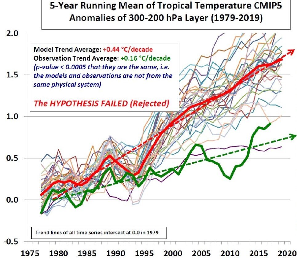
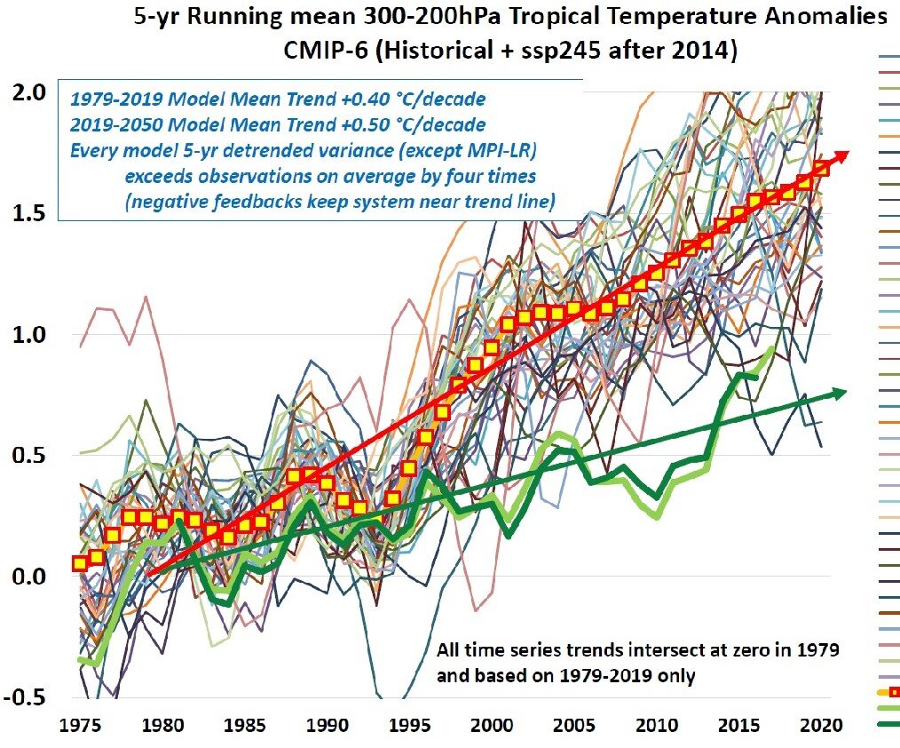
The new CMIP6 models aren’t much better. The following two figures reveal just how much both CMIP5 and CMIP6 models exaggerate predicted temperatures, and how little the model upgrade has done to shrink the difference between theory and observation. The figures were compiled by climate scientist John Christy, who is Director of the Earth System Science Center at the University of Alabama in Huntsville and an expert reviewer of the upcoming sixth IPCC (Intergovernmental Panel on Climate Change) report.

Models CMIP5.jpg
Models CMIP6.jpg

Both figures plot the warming relative to 1979 in degrees Celsius, measured in a band in the tropical upper atmosphere between altitudes of approximately 9 km (30,000 feet) and 12 km (40,000 feet). That’s a convenient band for comparison of model predictions with measurements made by weather balloons and satellites. The thin colored lines indicate the predicted variation of temperature with time for the different models, while the thick red and green lines show the mean trend for models and observations, respectively.

The trend for CMIP6 models is depicted more clearly in Christy’s next figure, which compares the warming rates for 39 of the models. The average CMIP6 trend in warming rate is 0.40 degrees Celsius (0.72 degrees Fahrenheit) per decade, compared with the actual observed rate of 0.17 degrees Celsius (0.31 degrees Fahrenheit) per decade – meaning that the predicted warming rate is 2.35 times too high.

Models CMIP6 warming rate.jpg

These CMIP6 numbers are only a marginal improvement over those predicted by the older CMIP5 models, for which the warming trend was 0.44 degrees Celsius (0.72 degrees Fahrenheit) per decade, or 2.75 times higher than the observed rate of 0.16 degrees Celsius (0.29 degrees Fahrenheit) per decade (for a slightly different set of measurements),

It’s seen that the warming rates for any particular model fluctuate wildly in both cases, much more so than the observations themselves. Christy says the large variability is a sign that the models underestimate negative feedbacks in the climate system, especially from clouds that I’ve discussed in another post. Negative feedback is stabilizing and acts to damp down processes that cause fluctuations. There is evidence, albeit controversial, that feedback from high clouds such as cirrus clouds – which normally warm the planet – may not be as strongly positive as the new models predict, and could even be negative overall.

You may be wondering why all these comparisons between models and observations are made high up in the atmosphere, rather than at the earth’s surface which is where we actually feel global warming. The reason is the atmosphere at 9 to 12 km (6 to 7 miles) above the tropics is a much more sensitive test of CO2 greenhouse warming than it is near the ground. Computer climate models predict that the warming rate at those altitudes should be about twice as large as at ground level, giving rise to the so-called CO2 “hot spot.”

The hot spot is illustrated in the figure below, showing the air temperature as a function of both altitude (measured as atmospheric pressure) and global latitude, as predicted by a Canadian model. Similar predictions come from the other CMIP6 models. The hot spot is the red patch at the center of the figure bounded by the 0.6 degrees Celsius (1.1 degrees Fahrenheit) contour, extending roughly 20o either side of the equator and at altitudes of 30,000-40,000 feet. The corresponding temperature on the ground is seen to be less than 0.3 degrees Celsius (0.5 degrees Fahrenheit).

Hot spot.jpg

But the hot spot doesn’t show up in measurements made by weather balloons or satellites. This mismatch between models and experiment is important because the 30,000-40,000 feet band in the atmosphere is the very altitude from which infrared heat is radiated away from the earth. The models run hot, according to Christy, because they trap too much heat that in reality is lost to outer space – a consequence of insufficient negative feedback in the models.

Next: Growing Antarctic Sea Ice Defies Climate Models

Both Greenland and Antarctic Ice Sheets Melting from Below

Amidst all the hype over melting from above of the Antarctic and Greenland ice sheets due to global warming, little attention has been paid to melting from below due to the earth’s volcanic activity. But the two major ice sheets are in fact melting on both top and bottom, meaning that the contribution of global warming isn’t as large as climate activists proclaim.

In central Greenland, Japanese researchers recently discovered a flow of molten rocks, known as a mantle plume, rising up beneath the island. The previously unknown plume emanates from the boundary between the earth’s core and mantle (labeled CMB in the following figure) at a depth of 2,889 km (1,795 miles), and melts Greenland’s ice from below.

Greenland plume.jpg

As the figure shows, the Greenland plume has two branches. One of the branches feeds into the similar Iceland plume that arises underneath Iceland and supplies heat to an active volcano there. The Greenland plume provides heat to an active volcano on the island of Jan Mayen in the Arctic Ocean, as well as a geothermal area in the Svalbard archipelago in the same ocean.

To study the plume, the research team used seismic topography – a technique, similar to a CT scan of the human body, that constructs a three-dimensional image of subterranean structures from differences in the speed of earthquake sound waves traveling through the earth. Sound waves pass more slowly through rocks that are hotter, less dense or hydrated, but more quickly through rocks that are colder, denser or drier. The researchers took advantage of seismographs forming part of the Greenland Ice Sheet Monitoring Network, set up in 2009, to analyze data from 16,257 earthquakes recorded around the world.

The existence of a mantle plume underneath Antarctica, originating at a depth of approximately 2,300 km (1,400 miles), was confirmed by a Caltech (California Institute of Technology) study in 2017. Located under West Antarctica (labeled WA in the next figure), the plume generates as much as 150 milliwatts of heat per square meter – heat that feeds several active volcanoes and also melts the overlying ice sheet from below. For comparison, the earth’s geothermal heat is 40-60 milliwatts per square meter on average, but reaches about 200 milliwatts per square meter beneath geothermally active Yellowstone National Park in the U.S.

Heat Antarctica.jpg

A team of U.S. and UK researchers found in 2018 that one of the active volcanoes drawing heat from the mantle plume in West Antarctica is making a major contribution to the melting of the Pine Island Glacier. The Pine Island Glacier, situated adjacent to the Thwaites Glacier in the figure above, is the fastest melting glacier in Antarctica, responsible for about 25% of the continent’s ice loss.   

The researchers’ discovery was serendipitous. Originally part of an expedition to study ice melting patterns in seawater close to West Antarctica, the team was surprised to find high concentrations of the gaseous helium isotope 3He near the Pine Island Glacier. Because 3He is found almost exclusively in the earth’s mantle, where it’s given off by hot magma, the gas is a telltale sign of volcanism.

The study authors calculated that the volcano buried underneath the Pine Island Glacier released at least 2,500 megawatts of heat to the glacier in 2014, which is about 60% of the heat released annually by Iceland’s most active volcano and roughly 25 times greater than the annual heating caused by any one of over 100 dormant Antarctic volcanoes.

A more recent study by the British Antarctic Survey found evidence for a hidden source of heat beneath the ice sheet in East Antarctica (labeled EA in the figure above). From ice-penetrating radar data, the scientists concluded that the heat source is a combination of unusually radioactive rocks and hot water coming from deep underground. The heat melts the base of the ice sheet, producing meltwater which drains away under the ice to fill subglacial lakes. The estimated geothermal heat flux is 120 milliwatts per square meter, comparable to the 150 milliwatts per square meter from the mantle plume underneath West Antarctica that was discussed above.

Heat Antarctica2.jpg

All these hitherto unknown subterranean heat sources in Antarctica and Greenland, just like global warming, melt ice and contribute to sea level rise. However, as I’ve discussed in previous posts (see here and here), the giant Antarctic ice sheet may not be melting at all overall, and the Greenland ice sheet is only losing ice slowly.

Next: Science on the Attack: The Vaccine Revolution Spurred by Messenger RNA

What Triggered the Ice Ages? The Uncertain Role of CO2

About a million years ago, the earth’s ice ages became colder and longer – with a geologically sudden jump from thinner, smaller glaciers that came and went every 41,000 years to thicker, larger ice sheets that persisted for 100,000 years. Although several hypotheses have been put forward to explain this transition, including a long-term decline in the atmospheric CO2 level, the phenomenon remains a scientific conundrum.

Two research teams spearheaded by geologists from Princeton University have recently described their attempts to resolve the mystery. A 2019 study measured the CO2 content in two-million-year-old ice cores extracted from Antarctica, which are by far the oldest cores ever recovered and span the puzzling transition to a 100,000-year ice age cycle that occurred a million years before. A just reported 2020 study utilized seabed sediment cores from the Antarctic Ocean to investigate storing of CO2 in the ocean depths over the last 150,000 years.

Both studies recognize that the prolonged deep freezes of the ice ages are set off partly by perpetual but regular changes in the earth’s orbit around the sun. That’s the basis of a hypothesis proposed by Serbian engineer and meteorologist Milutin Milankovitch. As shown in the figure below, the earth orbits the sun in an elliptical path and spins on an axis that is tilted. The elliptical orbit stretches and contracts over a 100,000-year cycle (top), while the angle of tilt or obliquity oscillates with a 41,000-year period (bottom), and the planet also wobbles on its axis in a 26,000-year cycle (center).

94_card_with_border.jpg

Milankovitch linked all three cycles to glaciation, but his hypothesis has been dogged by two persistent problems. First, it predicts a dominant 41,000-year cycle governed by obliquity, whereas the current pattern is ruled by the 100,000-year eccentricity cycle as mentioned above. Second, the orbital fluctuations thought to trigger the extended cooling cycles are too subtle to cause on their own the needed large changes in solar radiation reaching the planet – known as insolation. That’s where CO2 comes in, as one of various feedbacks that amplify the tiny changes that do occur.

Before the 2019 Princeton study, it had been suspected that the transition from 41,000-year to 100,000-year cycles was due to a long-term decline in the atmospheric CO2 level over both glacial and interglacial epochs. But that belief held when ice-core data went back only about 800,000 years. Armed with their new data from 2 million years in the past, the first Princeton team discovered surprisingly that the average CO2 level was unchanged over that time span, even though the minimum level dropped after the transition to longer ice age cycles.

This means that the 100,000-year transition can’t be attributed to CO2, although CO2 feedback has been invoked to explain the relatively sudden temperature rise at the end of ice ages. Rather, said the study authors, the switch in ice age length was probably caused by enhanced growth of ice sheets or changes in global ocean circulation.

It’s another feedback process involving CO2 that was investigated by the second Princeton team, who made measurements on tiny fossils embedded in Antarctic Ocean sediments. While it has long been known that the atmospheric CO2 level and global temperatures varied in tandem over glacial cycles, and that CO2 lagged temperature, the causes of the CO2 fluctuations are not well understood.

We know that the oceans can hold more CO2 than the atmosphere. Because CO2 is less soluble in warm water than cooler water, CO2 is absorbed from the atmosphere by cold ocean water at the poles and released by warmer water at the equator. The researchers found that, during ice ages, the Antarctic Ocean stored even more CO2 than expected. Absorption in the Antarctic is enabled by the sinking of floating algae that carry CO2 deep into the ocean before becoming fossilized, a process referred to as the "biological carbon pump."

But some of the sequestered CO2 normally escapes, due to the strong eastward winds encircling Antarctica that drag CO2-rich deep water up to the surface and vent the CO2 back to the atmosphere. The new research provides evidence that this wind-driven Antarctic Ocean upwelling slowed down during the ice ages, allowing less CO2 to be vented and more to remain locked up in the ocean waters.

Apart from any effect this retention of CO2 may have had on ice-age temperatures, the researchers say their data suggests that the past lag of CO2 behind temperature may have been caused directly by the effect on Antarctic upwelling of changing obliquity in the earth’s orbit – Milankovitch’s 41,000-year cycle. The study authors believe this explains why the eccentricity and precession cycles now prevail over the obliquity cycle.

Next: Both Greenland and Antarctic Ice Sheets Melting from Below

New Evidence That the Ancient Climate Was Warmer than Today’s

Two recently published studies confirm that the climate thousands of years ago was as warm or warmer than today’s – a fact disputed by some believers in the narrative of largely human-caused global warming. That was an era when CO2 levels were much lower than now, long before industrialization and SUVs.

One study demonstrates that the period known as the Roman Warming was the warmest in the last 2,000 years. The other study provides evidence that it was just as warm up to 6,000 years ago. Both studies reinforce the occurrence of an even warmer period immediately following the end of the last ice age 11,000 years ago, known as the Holocene Thermal Maximum.

The first study, undertaken by a group of Italian and Spanish researchers, reconstructed sea surface temperatures in the Mediterranean Sea over the past 5,300 years. Because temperature measurement using scientific thermometers goes back only to the 18th century, temperatures for earlier periods must be reconstructed from proxy data using indirect sources such as tree rings, ice cores, leaf fossils or boreholes.

This particular study utilized fossilized amoeba skeletons found in seabed sediments. The ratio of magnesium to calcium in the skeletons is a measure of the seawater temperature at the time the sediment was deposited; a timeline can be established by radiocarbon dating. The researchers focused on the central part of the Mediterranean Sea, specifically the Sicily Channel as indicated by the red arrow in the figure below. The samples came from a depth of 475 meters (1,550 feet).

Mediterranean Roman era.jpg

Analysis of the data found that ancient sea surface temperatures in the Sicily Channel ranged from 16.4 degrees Celsius (61.5 degrees Fahrenheit) to 22.7 degrees Celsius (72.9 degrees Fahrenheit) over the period from 3300 BCE to July 2014. This is illustrated in the next figure, in which the dark blue dashed line represents the Sicily Channel raw temperature data and the thick dark blue solid line shows smoothed values. The other lines are Mediterranean temperatures reconstructed by other research groups.

Mediterranean Mg-Ca.jpg

With the exception of the Aegean data, the results all show distinct warming during the Roman period from 0 CE to 500 CE, when temperatures were about 2 degrees Celsius (3.6 degrees Fahrenheit) higher than the average for Sicily and western Mediterranean regions in later centuries, and much higher than present-day Sicilian temperatures. The high temperatures in the Aegean Sea result from its land-locked nature. During the 500 years of the Roman Warming, the Roman Empire flourished and reached its zenith. Subsequent cooling, seen in the figure above, led to the Empire’s collapse prior to the Medieval Warm Period, say the researchers.

The second study was conducted by archaeologists in Norway, who discovered a treasure trove of arrows, arrowheads, clothing and other artifacts, unearthed by receding ice in a mountainous region of the country. Because the artifacts would have been deposited when no ice covered the ground, and are only being exposed now due to global warming, temperatures must have been at least as high as today during the many periods when the artifacts were cast aside.

Norway arrowhead.jpg

The oldest arrows and artifacts date from around 4100 BCE, the youngest from approximately 1300 CE, at the end of the Medieval Warm Period. That the artifacts come from several different periods separated by hundreds or thousands of years implies that the ice and snow in the region must have expanded and receded several times over the past 6,000 years.

During the Holocene Thermal Maximum, which occurred from approximately 10,000 to 6,000 years ago and preceded the period of the stunning Norwegian discoveries, global temperatures were higher yet. In upper latitudes, where the most reliable proxies are found, it was an estimated 2-3 degrees Celsius (3.6-5.4 degrees Fahrenheit) warmer than at present. The warmth contributed to the rise of agricultural societies around the globe and the development of human civilization.

Paradoxically though, the Greenland ice sheet – the present melting of which has sparked heated debate – is thought to have been even larger at the peak of the Holocene Thermal Maximum than it is today, when Greenland temperatures are lower. This can be seen in the following figure, showing that the ice sheet extent was about the same as now about 7,500 years (7.5 ka) ago, and even greater before that. The ice did, however, retract to a minimum during the intervening period (up to 7.5 ka ago) that includes both the Roman Warming and the period of the Norwegian discoveries discussed above.

Greenland ice Holocene.jpg

Puzzles like this mean that we still have much to learn about the earth’s climate, both past and present, especially in the area of natural variability.

Next: What Triggered the Ice Ages?  The Uncertain Role of CO2

No Evidence That 2020 Hurricane Season Was Record-Breaking

In a world that routinely hypes extreme weather events, it’s no surprise that the mainstream media and alarmist climate scientists have declared this year’s Atlantic hurricane season “unprecedented” and “record-shattering.” But the reality is that the season was merely so-so and no records fell.

While it’s true that the very active 2020 season saw a record-breaking 30 named storms, only 13 of these became hurricanes. That was fewer than the historical high of 15 recorded in 2005 and only one more than the 12 hurricanes recorded in 1969 and 2010, according to NOAA (the U.S. National Oceanic and Atmospheric Administration). The figure below shows the frequency of all Atlantic hurricanes from 1851 to 2020.

Atlantic hurricanes.jpg

Of 2020’s 13 hurricanes, only six were major hurricanes, less than the record eight in 1950 and seven in 1961 and 2005, as shown in the next figure. A major hurricane is defined as one in Category 3, 4 or 5 on the so-called Saffir-Simpson scale, corresponding to a top wind speed of 178 km per hour (111 mph) or greater. Although it appears that major Atlantic hurricanes were less frequent before about 1940, the lower numbers reflect the relative lack of observations in early years of the record. Aircraft reconnaissance flights to gather data on hurricanes only began in 1944, while satellite coverage dates only from the 1960s.

Atlantic major hurricanes.jpg

Despite the lack of any significant trend in Atlantic hurricanes in a warming world, the frequency of hurricanes globally is actually diminishing as seen in the following figure. The apparent slight increase in major hurricanes since 1981 has been ascribed to improvements in observational capabilities, rather than warming oceans that provide the fuel for hurricanes and typhoons.

Hurricane frequency global (Ryan Maue).jpg

As further evidence that recent hurricane activity is nothing unusual, the figure below depicts what is known as the ACE (Accumulated Cyclone Energy) index for the Atlantic basin from 1855 to 2020. The ACE index is an integrated metric combining the number of storms each year, how long they survive and how intense they become. Mathematically, the index is calculated by squaring the maximum sustained wind speed in a named storm every six hours that it remains above tropical storm intensity and summing that up for all storms in the season.

Atlantic ACE.jpg

For 2020, the Atlantic basin ACE index was 179.8, which ranks 13th behind 2017, 2005, the peak in 1933 and nine other years. For comparison, this year’s ACE index for the northwestern Pacific, where typhoons are common, was 148.5. The higher value for the Atlantic this year reflects the greater number of named storms.

NOAA attributes the enhanced number of atmospheric whirligigs in the Atlantic in recent years to the warm phase of the naturally occurring AMO (Atlantic Multi-Decadal Oscillation). The AMO, which has a cycle time of approximately 65 years and alternates between warm and cool phases, governs many extremes, such as cyclonic storms in the Atlantic basin and major floods in eastern North America and western Europe. The present warm phase began in 1995, marking the beginning of a period when both named Atlantic storms and hurricanes have become more common on average – as seen in the first two figures above.

Another contribution to storm activity in the Atlantic comes from La Niña cycles in the Pacific. Apart from a cooling effect, La Niñas result in quieter conditions in the eastern Pacific and heightened activity in the Atlantic. The current La Niña started several months ago and is expected to continue into 2021.

Despite NOAA’s recognition of what has caused so many Atlantic storms in 2020, activists continue to claim that climate change is making hurricanes stronger and more destructive and increasing the likelihood of more frequent major hurricanes. Pontificates Michael “hockey stick” Mann: “The impacts of climate change are no longer subtle. We’re seeing them play out right now in the form of unprecedented wildfires out West and an unprecedented hurricane season back East.”

Clearly, there’s no evidence for such nonsensical, unscientific statements.

Next: New Evidence That the Ancient Climate Was Warmer than Today’s

No Evidence for Dramatic Loss of Great Barrier Reef Corals

A 2020 study of the Great Barrier Reef that set alarm bells ringing in the mainstream media is based on faulty evidence, according to Australian scientist and leading coral reef authority, Professor Peter Ridd. The study claims that between 1995 and 2017 the reef lost half its corals, especially small baby colonies, because of global warming – but Ridd says the claims are false.

The breathtakingly beautiful Great Barrier Reef, labeled by CNN as one of the seven natural wonders of the world, is the planet’s largest living structure. Visible from outer space and 2,300 km (1,400 miles) long, the reef hugs the northeastern coast of Australia. A healthy portion of the reef is shown in the image below.

Ridd-GBF coral.jpg

CREDIT: DAVID CHILD, EVENING STANDARD.

But corals are susceptible to overheating and undergo bleaching when the water gets too hot, losing their vibrant colors. During the prolonged El Niño of 2016-17, higher temperatures caused mass bleaching that damaged portions of the northern and central regions of the Great Barrier Reef. Ridd’s fellow reef scientists contended at the time that as much as 30% to 95% of the reef’s corals died. However, Ridd disagreed, estimating that only 8% of the Great Barrier Reef suffered; much of the southern end of the reef wasn’t affected at all. 

Likewise, Ridd finds no evidence for the 50% loss of corals since 1995 claimed in the recent study. He says the most reliable data on coral extent comes from AIMS (the Australian Institute of Marine Science), who have been measuring over 100 reefs every year since 1986. As the following figure illustrates, AIMS data shows that coral cover fluctuates dramatically with time but there is approximately the same amount of Great Barrier Reef coral today as in 1995. Adds Ridd:

There was a huge reduction in coral cover in 2011 which was caused by two major cyclones that halved coral cover. Cyclones have always been the major cause of temporary coral loss on the Reef.

Ridd coral cover.jpg

It can be seen that the coral cover averages only about 20% in the years since 1986, when AIMS measurements began. But a 2019 research paper reported that the first reef expedition back in 1928-29 discovered very similar coverage: on a reef island known as Low Isles, the coral cover ranged from 8% to 42% in different parts of the island. So essentially no coral has disappeared over a period of 90 years that encompasses both warming and cooling periods.

The paper’s authors did find that the coral colonies on Low Isles were 30% smaller in 2019 than in 1928-29, and that coral “richness” had declined. Apart from its faulty conclusion about coral loss, the 2020 study also found smaller colony sizes throughout the reef, even though the relative abundance of large colonies was unchanged.

Nevertheless, the most recent AIMS report records small gains in the cover of hard corals in the central and southern Great Barrier Reef, following another mass bleaching event in late 2019. Hard corals are the primary reef-building corals; soft corals don’t form reefs.

Even more encouraging news for coral reef health comes from a just-reported survey of coral reefs on the opposite side of the country – the Rowley Shoals, a chain of three coral atolls 300 km (190 miles) off the coast of northwest Western Australia. Following an extensive marine heat wave in December 2019, an April 2020 survey found that up to 60% of the Rowley Shoals corals had become a pallid white (left image below). Yet a follow-up survey just six months later revealed that much of the bleached coral had already recovered (right image) and that perhaps only 10% of the reef had been killed.

Rowley Shoals bleaching.jpg
Rowley Shoals coral.jpg

CREDIT: WESTERN AUSTRALIA DBCA.

Tom Holmes, the marine monitoring coordinator at Western Australia’s DBCA (Department of Biodiversity, Conservation and Attractions), said "We were expecting to see widespread mortality, and we just didn't see it … which is a really amazing thing." Holmes explained that, while high ocean temperatures cause coral to bleach, what is less well known is that bleached corals don’t die immediately. Bleaching is initially just a sign of stress, but if the stress continues for a long time, it does lead to mortality.
However, Holmes – ever the cautious scientist – feels the reef may have been lucky and dodged a bullet this time. That’s because the marine heat wave that caused the bleaching was short-lived, dissipating at the end of the Australian summer a few months ago and giving the corals a chance to recover.

The resilience of the Rowley Shoals is no surprise to Ridd. Despite having been fired from his position at James Cook University in northern Queensland for his politically incorrect views on the Great Barrier Reef and climate change, Ridd continues to push the case for more accurate measurements and better quality assurance in coral reef science.

Next: No Evidence That 2020 Hurricane Season Was Record-Breaking

Evidence Mounting for Global Cooling Ahead: Record Snowfalls, Less Greenland Ice Loss

Despite the ongoing drumbeat of apocalyptic proclamations about our warming climate, a close look at recent evidence suggests we’re on the threshold of a cooling spell. Even before the northern 2020-21 winter arrives, early-season snowfall records are tumbling all over North America and Europe. And, while Greenland has been losing ice for decades, the rate of loss has slowed dramatically since 2016.

Could all this be a prelude to the upcoming grand solar minimum?

Snow extent in the Northern Hemisphere fall has in fact been increasing yearly since at least the 1960s, as shown in the figure below depicting the fall monthly average snowfall measured by satellite, up to 2019. The trend is the same for Eurasia as it is for North America.

Snow NH Fall.jpg

But the 2020 fall extent is likely to surpass that of any previous year, based on data from the Finnish Meteorological Institute for Northern Hemisphere snow mass (as opposed to extent) to date. As seen in the next figure, the snow mass this season is already tracking above the average for 1982-2012; the mass is measured in billions of tonnes (gigatonnes, where 1 tonne = 1.102 U.S. tons).

fmi_swe_tracker.jpg

In the U.S., much of the white powder blanketing the northern states prematurely in 2020 has fallen in Minnesota. The state recently experienced its largest early-season snowstorm in recorded history, going back about 140 years. Dropping up to 23 cm (9 inches) of snow in some places, which is a lot for the fall, the storm produced the second biggest October snowfall ever in the state. The cities of Alexandria and St. Cloud, Minnesota saw their snowiest October on record.

And snow records were also smashed in towns and cities across Montana and South Dakota. All of this has been accompanied by misery in the form of bitterly cold temperatures across the U.S. and Canada.

In Europe, skiing and sledding enthusiasts are delighted with the early onset of a snowpack deeper than 80 cm (3 feet) on some Austrian glaciers. Both the Alps and Pyrenees had several heavy early-season snowfalls in October, and even parts of lower-altitude Scandinavia are already buried in snow.

As for ice, much recent attention has been focused on the Greenland ice sheet. A  research paper published in the journal Nature in October 2020 set alarm bells ringing by insisting that Greenland’s ice is now melting faster than at any time in the past 12,000 years. This spurious claim seems to have been influenced by a big jump in the rate of ice loss, from an average 75 gigatonnes (83 gigatons) yearly in the 20th century to an average annual loss of 258 gigatonnes (284 gigatons) between 2002 and 2016; a greater-than-average loss of 329 gigatonnes (363 gigatons) occurred in 2019.

However, the paper’s authors failed to note that the rate of Greenland ice loss has not increased since 2002, or that the 2019 loss was less than seen seven years before, in 2012. In fact, as illustrated in the figure below, the loss rate has drastically slowed since 2016. The figure shows satellite measurements of the ice loss at regular intervals from April 2002 to April 2019, in gigatonnes, but doesn’t include the massive summer melt in 2019. The 2020 loss was only 152 gigatonnes (168 gigatons).
Greenland mass loss 2002-19.jpg

Although a hefty amount of ice is normally lost during the short Greenland summer, some of this ice loss is compensated by ice gained over the long winter from the accumulation of compacted snow. The ice sheet, 2-3 km (6,600-9,800 feet) thick, consists of layers of compressed snow built up over at least hundreds of thousands of years. In addition to summer melting, the sheet loses ice by calving of icebergs at its edges.

The slowdown in ice loss since 2016 is a clear sign that the doomsday talk and panic engendered by the Nature paper is unwarranted. And, not only is Greenland losing less ice, and snowfall in the Northern Hemisphere setting new records, but this year’s winter in the Southern Hemisphere was also exceptionally snowy and brutal – all likely harbingers of the soon-to-arrive grand solar minimum.

Next: No Evidence for Dramatic Loss of Great Barrier Reef Corals

How Clouds Hold the Key to Global Warming

One of the biggest weaknesses in computer climate models – the very models whose predictions underlie proposed political action on human CO2 emissions – is the representation of clouds and their response to global warming. The deficiencies in computer simulations of clouds are acknowledged even by climate modelers. Yet cloud behavior is key to whether future warming is a serious problem or not.

Uncertainty about clouds is why there’s such a wide range of future global temperatures predicted by computer models, once CO2 reaches twice its 1850 level: from a relatively mild 1.5 degrees Celsius (2.7 degrees Fahrenheit) to an alarming 4.5 degrees Celsius (8.1 degrees Fahrenheit). Current warming, according to NASA, is close to 1 degree Celsius (1.8 degrees Fahrenheit).

Clouds can both cool and warm the planet. Low-level clouds such as cumulus and stratus clouds are thick enough to reflect 30-60% of the sun’s radiation that strikes them back into space, so they act like a parasol and cool the earth’s surface. High-level clouds such as cirrus clouds, on the other hand, are thinner and allow most of the sun’s radiation to penetrate, but also act as a blanket preventing the escape of reradiated heat to space and thus warm the earth. Warming can result from either a reduction in low clouds, or an increase in high clouds, or both.

Clouds Marohasy (2).jpg

Our inability to model clouds satisfactorily is partly because we just don’t know much about their inner workings either during a cloud’s formation, or when it rains, or when a cloud is absorbing or radiating heat.  So a lot of adjustable parameters are needed to describe them. It’s partly also because actual clouds are much smaller than the minimum grid scale in supercomputers, by as much as several hundred or even a thousand times.  For that reason, clouds are represented in computer models by average values of size, altitude, number and geographic location.

Most climate models predict that low cloud cover will decrease as the planet heats up, but this is by no means certain and meaningful observational evidence for clouds is sparse. To remedy the shortcoming, a researcher at Columbia University’s Earth Institute has embarked on a project to study how low clouds respond to climate change, especially in the tropics which receive the most sunlight and where low clouds are extensive.

The three-year project will utilize NASA satellite data to investigate the response of puffy cumulus clouds and more layered stratocumulus clouds to both surface temperature and the stability of the lower atmosphere. These are the two main influences on low cloud formation. It’s only recent satellite technology that makes it possible to clearly distinguish the two types of cloud from each other and from higher clouds. The knowledge obtained will test how well computer climate models simulate present-day low cloud behavior, as well as help narrow the range of warming expected as CO2 continues to rise.

High clouds are controversial. Climate models predict that high clouds will get higher and become more numerous as the atmosphere warms, resulting in a greater blanket effect and even more warming. This is an example of expected positive climate feedback – feedback that amplifies global warming. Positive feedback is also the mechanism by which low cloud cover is expected to diminish with warming.

But there’s empirical satellite evidence, obtained by scientists from the University of Alabama and the University of Auckland in New Zealand, that cloud feedback for both low-level and high-level clouds is negative. The satellite data also support an earlier proposal by atmospheric climatologist Richard Lindzen that high-level clouds near the equator open up, like the iris of an eye, to release extra heat when the temperature rises – also a negative feedback effect.

If indeed cloud feedback is negative rather than positive, it’s possible that combined negative feedbacks in the climate system dominate the positive feedbacks from water vapor, which is the primary greenhouse gas, and from snow and ice. That would mean that the overall response of the climate to added CO2 in the atmosphere is to lessen, rather than magnify, the temperature increase from CO2 acting alone, the reverse of what climate models say.

The latest generation of computer models, known as CMIP6, predicts an even greater – and potentially deadly – range of future warming than earlier models. This is largely because the models find that low clouds would thin out, and many would not form at all, in a hotter world. The result would be even stronger positive cloud feedback and additional warming. However, as many of the models are unable to accurately simulate actual temperatures in recent decades, their predictions about clouds are suspect.

Next: Evidence Mounting for Global Cooling Ahead: Record Snowfalls, Less Greenland Ice Loss

The Scientific Method at Work: The Carbon Cycle Revisited

The crucial test of any scientific hypothesis is whether its predictions match real-world observations. If empirical evidence doesn’t confirm the predictions, the hypothesis is falsified. The scientific method then demands that the hypothesis be either tossed out, or modified to fit the evidence. This post illustrates just such an example of the scientific method at work.

The hypothesis in question is a model of the carbon cycle, which describes quantitatively the exchange of carbon between the earth’s land masses, atmosphere and oceans, proposed by physicist Ed Berry and described in a previous post. Berry argues that natural emissions of CO2 since 1750 have increased as the world has warmed, contrary to the CO2 global warming hypothesis, and that only 25% of the increase in atmospheric CO2 after 1750 is due to humans.

One prediction of his model, not described in my earlier post, involves the atmospheric concentration of the radioactive carbon isotope 14C, produced by cosmic rays interacting with nitrogen in the upper atmosphere. It’s the isotope commonly used for radiocarbon dating. With a half-life of 5,730 years, 14C is absorbed by living but not dead biological matter, so the amount of 14C remaining in a dead animal or plant is a measure of the time elapsed since its death. Older fossils contain less 14C than more recent ones.

Berry’s prediction is of the recovery since 1970 of the 14C level in atmospheric CO2, a level that became elevated by radioactive fallout from above-ground nuclear bomb testing in the 1950s and 1960s. The atmospheric concentration of 14C almost doubled following the tests and has since been slowly dropping – at the same time as concentrations of the stable carbon isotopes 12C and 13C, generated by fossil-fuel burning, have been steadily rising. Because the carbon in fossil fuels is millions of years old, all the 14C in fossil-fuel CO2 has decayed away.

The recovery in 14C concentration predicted by Berry’s model is illustrated in the figure below, where the solid line purportedly shows the empirical data and the black dots indicate the model’s predicted values from 1970 onward. It appears that the model closely replicates the experimental observations which, if true, would verify the model.

Carbon14 Berry.jpg

However, as elucidated recently by physicist David Andrews, the prediction is flawed because the data depicted by the solid line in the figure are not the concentration of 14C, but rather its isotopic or abundance ratio relative to 12C. This ratio is most often expressed as the “delta value” Δ14C, calculated from the isotopic ratio R = 14C/12C as

Δ14C = 1000 x (Rsample/Rstandard – 1), measured in parts per thousand.

The relationship between Δ14C and the 14C concentration is

14C conc = (total carbon conc) x Rstandard x (Δ14C/1000 + 1).

Unfortunately, Berry has failed to distinguish between Δ14C and 14C concentration. As Andrews remarks, “as Δ14C [calculated from measured isotope ratios] approaches zero in 2020, this does not mean that 14C concentrations have nearly returned to 1955 values. It means that the isotope abundance ratio has nearly returned to its previous value. Therefore, since atmospheric 12CO2 has increased by about 30% since 1955, the 14C concentration remains well above its pre-bomb test value.”

This can be seen clearly in the next figure, showing Andrews’ calculations of the atmospheric 14CO2 concentration compared to the experimentally measured concentration of all CO2 isotopes, in parts per million by volume (ppmv), over the last century. The behavior of the 14CO2 concentration after 1970 is unquestionably different from that of Δ14C in the previous figure, the current concentration leveling off at close to 350 ppmv, about 40% higher than its 1955 pre-bomb spike value, rather than reverting to that value. In fact, the 14CO2 concentration is currently increasing.

Carbon 14 Andrews.jpg

At first, it seems that the 14CO2 concentration in the atmosphere should decrease with time as fossil-fuel CO2 is added, since fossil fuels are devoid of 14C. The counterintuitive increase arises from the exchange of CO2 between the atmosphere and oceans. Normally, there’s a balance between 14CO2 absorbed from the atmosphere by cooler ocean water at the poles and 14CO2 released into the atmosphere by warmer water at the equator. But the emission of 14C-deficient fossil-fuel CO2 into the atmosphere perturbs this balance, with less 14CO2 now being absorbed by the oceans than released. The net result is a buildup of 14CO2 in the atmosphere.

As the figures above show, the actual 14C concentration data falsify Berry’s model, as well as other similar ones (see here and here). The models, therefore, must be modified in order to accurately describe the carbon cycle, if not discarded altogether.

The importance of hypothesis testing was aptly summed up by Nobel Prize winning physicist Richard Feynman (1918-88), who said in a lecture on the scientific method:

If it [the hypothesis] disagrees with experiment, it’s WRONG.  In that simple statement is the key to science.  It doesn’t make any difference how beautiful your guess is, it doesn’t matter how smart you are, who made the guess, or what his name is … If it disagrees with experiment, it’s wrong.  That’s all there is to it.

Next: How Clouds Hold the Key to Global Warming

Upcoming Grand Solar Minimum Could Wipe Out Global Warming for Decades

Unknown to most people except those with an interest in solar science, the sun is about to shut down. Well, not completely – we’ll still have plenty of sunlight and heat, but the small dark blotches on the sun’s surface called sunspots, visible in the figure below, are on the verge of disappearing. According to some climate scientists, this heralds a prolonged cold stretch of maybe 35 years starting in 2020, despite global warming.  

Blog 10-1-18 JPG.jpg

How could that happen? Because sunspots, which are caused by magnetic turbulence in the sun’s interior, signal subtle changes in solar output or activity – changes that can have a significant effect on the earth’s climate. Together with the sun’s heat and light, the monthly or yearly number of sunspots goes up and down during the approximately 11-year solar cycle. For several decades now, the maximum number of sunspots seen in a cycle has been declining.

The last time sunspots disappeared altogether was during the so-called Maunder Minimum, a 70-year cool period in the 17th and 18th centuries forming part of the Little Ice Age, and illustrated in the next figure showing the sunspot number over time. The Maunder Minimum from approximately 1645 to 1710 was the most recent occurrence of what are known as grand solar minima, or periods of very low solar activity, that recur every 350 to 400 years. So we’re due for another minimum.

GSM Sunspot history.jpg

Northumbria University’s Valentina Zharkova, a researcher who’s published several papers on sunspots and grand solar minima, has linked the minima to a drastic falloff in the sun’s internal magnetic field. The roughly 70% downswing in magnetic field from its average value is part of a 350- to 400-year cycle arising from regular variations in behavior of the very hot plasma powering our sun.

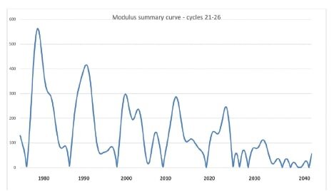
In between grand solar minima come grand solar maxima, when the magnetic field and number of sunspots reach their highest values. The most recent (“modern”) grand solar maximum, even though slightly lopsided, is represented by the blue peaks in the figure above. The figure below shows Zharkova’s calculated magnitude of the magnetic field from 1975 to 2040, which is seen to diminish as the minimum approaches.

GSM Zharkova.jpg

Her calculations predict that the upcoming grand solar minimum will last from 2020 to 2053, with global temperatures dropping by up to 1.0 degrees Celsius (1.8 degrees Fahrenheit) in the late 2030s. That’s as much as the world has warmed since preindustrial times, and would put the mercury only 0.4 degrees Celsius (0.7 degrees Fahrenheit) above the frigid temperatures recorded in 1710 at the end of the Maunder Minimum.

GSM Frost fair.jpg

The Maunder Minimum was unquestionably chilly: alpine glaciers in Europe encroached on farmland; the Netherlands’ canals froze every winter; and frost fairs on the UK’s frozen Thames River became a common sight. Solar scientists have calculated that the sun’s heat and light output, a quantity known as the total solar irradiance, decreased by 0.22% during the Maunder minimum, which is about four times its normal rise or fall over an 11-year cycle.

Other solar researchers have also predicted an imminent grand solar minimum, but for different reasons. One of the earliest predictions was by German astronomer and scholar, Theodor Landscheidt, in 2003. Landscheidt predicted a protracted cold period centered on the year 2030, based on his observations of an 87-year solar cycle known as a Gleissberg cycle, which has been linked to regional climate fluctuations such as flooding of the Nile River in Africa.

A more recent prediction, based on a longer 210-year solar cycle, is that of Russian astrophysicist Habibullo Abdussamatov. He projects a more extended period of global cooling than either Zharkova or Landscheidt, lasting as long as 65 years, with the coldest interval around 2043.

Not all solar scientists agree with such predictions. Although NOAA (the U.S. National Oceanic and Atmospheric Administration) has recognized that sunspot numbers are falling and may approach zero in the 2030s, the international Solar Cycle 25 Prediction Panel forecasts that the sunspot number will remain the same in the coming 11-year cycle (Cycle 25) as it was in the cycle just completed (Cycle 24). Declaring that the recent decline in sunspot number is at an end, panel co-chair and solar physicist Lisa Upton says: “There is no indication we are approaching a Maunder-type minimum in solar activity.”

But if the predictions of Zharkova and others are correct, tough times are ahead. A relatively sudden drop in temperature of 1.0 degrees Celsius (1.8 degrees Fahrenheit) would have drastic effects on agriculture, causing crop failures and widespread hunger – as occurred during the Maunder Minimum. And the need for extra heating in both hemispheres would come at a time when it’s likely that much of our heating capacity, supplied largely by fossil fuels, will have been eliminated in the name of combating climate change.

Next: The Scientific Method at Work: The Carbon Cycle Revisited

It’s Cold, Not Hot, Extremes That Are on the Rise

Despite the hullabaloo about hot weather extremes in the form of heat waves and drought, little attention has been paid to cold weather extremes by the mainstream media or the IPCC (Intergovernmental Panel on Climate Change), whose assessment reports are the voice of authority for climate science. Yet, though few people know it, cold extremes appear to be on the rise – in contrast to weather extremes in general which are trending downward rather than upward, if at all.

The WMO (World Meteorological Organi­zation) does at least acknowledge the existence of cold weather extremes, but has no explanation for their origin nor their rising frequency. Cold extremes include prolonged cold spells, unusually heavy snowfalls and longer winter seasons. In a world obsessed with global warming, such events go almost unnoticed.

One person who has noticed is Madhav Khandekar, who has a PhD in meteorology and was formerly a research scientist at Environment Canada as well as an expert reviewer for the Fourth Assessment Report of the IPCC. Although much of Khandekar’s work on cold extremes has focused on Canada, he has also catalogued cold weather events worldwide. In remarking recently that extreme weather – both hot and cold – is part of natural climate variability, Khandekar points out:

“Even when the earth’s climate was cooling down during the 1945-77 period there were as many extreme weather events as there are now.”

Before we look at recent cold weather extremes, it’s important to distinguish between climate and weather. Weather is what’s predicted in daily forecasts which describe short-term changes in atmospheric conditions. Climate, on the other hand, is a long-term average of the weather over an extended period of time, typically 30 years.

Recurring frigid global temperatures over the past 15 years have been documented by Khandekar, the WMO and the blog Electroverse. The northern winter of 2005-06 was exceptionally cold over most of western and northeastern Europe, while in May 2006 during the southern winter, South Africa reported 54 cold weather records. The winter of 2009-10 was equally brutal: Scotland suffered some of the bitterest winter months in almost 100 years; Siberia witnessed perhaps its coldest winter ever; and Beijing saw its coldest day in 50 years.

Northern climes experienced abnormally low temperatures again in the winters of 2014-15, 2015-16 and 2018-2019. The period from January to March 2015 was the coldest in the northeastern U.S. since 1895, as shown in the figure below. In January 2016, eastern China froze as far south as Thailand, a very rare event. And in early 2019, bone-chilling cold persisted for months over much of the north-central U.S. and western Canada.

Cold - Khandekar Northeast PNG.png

During the current southern winter and northern summer, cold temperature records have been smashed all over the globe. The Australian island state of Tasmania recorded its coldest ever winter minimum, exceeding the previous low by 1.2 degrees Celsius (2.2 degrees Fahrenheit); Norway endured its coldest July in 50 years; neighboring Sweden shivered through its coldest summer since 1962; and Russia was also anomalously cold.

Snowfalls around the planet show the same pattern, in contrast to the climate change narrative that predicted snow would disappear in a warming world. In 2007, snow fell in Buenos Aires, Argentina for the first time since 1918. In the winter of 2009-10, record snowfall blanketed the entire mid-Atlantic coast of the U.S. in an event called Snowmaggedon. Extremely heavy snow that fell in the Panjshir Valley of Afghanistan in February 2015 killed over 200 people. In the winter of 2017-18, eastern Ireland had its heaviest snowfalls for more than 50 years with totals exceeding 50 cm (20 inches).

Cold- Patagonia sheeep.jpg

In the southern winter this year, massive snowstorms covered much of Patagonia in more than 150 cm (60 inches) of snow, and buried at least 100,000 sheep and 5,000 cattle alive. Snowfalls not seen for decades occurred in other parts of South America, and in South Africa, southeastern Australia and New Zealand. In the chilly northern summer mentioned above, monster snowdrifts almost obliterated the southern Russian village of Kurush.

Cold - Kurush.jpg

Despite the mainstream media’s assertion that cold weather extremes are caused by climate change, Khandekar says such an explanation lacks scientific credibility. He links colder and snowier-than-normal winters in North America not to global warming, but to the naturally occurring North Atlantic Oscillation and Pacific Decadal Oscillation, and those in Europe to the current slowdown in solar activity. The IPCC and WMO are largely silent on the issue.

Next: Upcoming Grand Solar Minimum Could Wipe Out Global Warming for Decades

Challenges to the CO2 Global Warming Hypothesis: (3) The Greenhouse Effect Doesn’t Exist

This final post of the present series reviews two papers that challenge the CO2 global warming hypothesis by purporting to show that there is no greenhouse effect, a heretical claim that even global warming skeptics such as me find hard to accept. According to the authors of the two papers, greenhouses gases in the earth’s atmosphere have played no role in heating the earth, either before or after human emissions of such gases began.

The first paper, published in 2017, utilizes the mathematical tool of dimensional analysis to identify which climatic forcings govern the mean surface temperature of the rocky planets and moons in the solar system that have atmospheres: Venus, Earth, Mars, our Moon, Europa (a moon of Jupiter), Titan (a moon of Saturn) and Triton (a moon of Neptune). A forcing is a disturbance that alters climate, producing heating or cooling.

The paper’s authors, U.S. research scientists Ned Nikolov and Karl Zeller, claim that planetary temperature is controlled by only two forcing variables. These are the total solar irradiance, or total energy from the sun incident on the atmosphere, and the total atmospheric pressure at the planet’s (or moon’s) surface.

In addition to solar irradiance and atmospheric pressure, other forcings considered by Nikolov and Zeller include the near-surface partial pressure and density of greenhouse gases, as well as the mean planetary surface temperature without any greenhouse effect. In their model, the radiative effects integral to the greenhouse effect are replaced by a previously unknown thermodynamic relationship between air temperature, solar heating and atmospheric pressure, analogous to compression heating of the atmosphere. Their findings are illustrated in the figure below, in which Ts is the surface temperature and Tna the temperature with no atmosphere.

Nikolov.jpg

A surprising result of their study is that the earth’s natural greenhouse effect – from the greenhouse gases already present in Earth’s preindustrial atmosphere, without any extra CO2 – warms the planet by a staggering 90 degrees Celsius. This is far in excess of the textbook value of 33 degrees Celsius, or the 18 degrees Celsius calculated by Denis Rancourt and discussed in my previous post. The same 90 degrees Celsius result had also been derived by Nikolov and Zeller from an analytical model, rather than dimensional analysis, in a 2014 paper published under pseudonyms (consisting of their names spelled backwards).

Needless to say, Nikolov and Zeller’s work has been heavily criticized by climate change alarmists and skeptics alike. Skeptical climate scientist Roy Spencer, who has a PhD in meteorology, argues that compression of the atmosphere can’t explain greenhouse heating, because Earth’s average surface temperature is determined not by air pressure, but by the rates at which energy is gained or lost by the surface.

Spencer argues that, if atmospheric pressure causes the lower troposphere (the lowest layer of the atmosphere) to be warmer than the upper troposphere, then the same should be true of the stratosphere, where the pressure at the bottom of the stratosphere is about 100 times larger than that at the top. Yet the bottom of the stratosphere is cooler than the top.

In a reply, Nikolov and Zeller fail to address Spencer’s stratosphere argument, but attempt to defend their work by claiming incorrectly that Spencer ignores the role of adiabatic processes and focuses instead on diabatic radiative processes. Adiabatic processes alter the temperature of a gaseous system without any exchange of heat energy with its surroundings.

The second paper rejecting the greenhouse effect was published in 2009 by German physicists Gerhard Gerlich and Ralf Tscheuschner. They claim that the radiative mechanisms of the greenhouse effect – the absorption of solar shortwave radiation and emission of longwave radiation, which together trap enough of the sun’s heat to make the earth habitable – are fictitious and violate the Second Law of Thermodynamics.

The Second Law forbids the flow of heat energy from a cold region (the atmosphere) to a warmer one (the earth’s surface) without supplying additional energy in the form of external work. However, as other authors point out, the Second Law is not contravened by the greenhouse effect because external energy is provided by downward solar shortwave radiation, which passes through the atmosphere without being absorbed. The greenhouse effect arises from downward emission from the atmosphere of radiation previously emitted upward from the earth.

Furthermore, there’s a net upward transfer of heat energy from the warmer surface to the colder atmosphere when all energy flows are taken into account, including non-radiative convection and latent heat transfer associated with water vapor. Gerlich and Tscheuschner mistakenly insist that heat and energy are separate quantities.

Both of these farfetched claims that the greenhouse effect doesn’t exist therefore stem from misunderstandings about energy.

Next: Science on the Attack: The Hunt for a Coronavirus Vaccine (1)

Challenges to the CO2 Global Warming Hypothesis: (2) Questioning Nature’s Greenhouse Effect

A different challenge to the CO2 global warming hypothesis from that discussed in my previous post questions the magnitude of the so-called natural greenhouse effect. Like the previous challenge, which was based on a new model for the earth’s carbon cycle, the challenge I’ll review here rejects the claim that human emissions of CO2 alone have caused the bulk of current global warming.

It does so by disputing the widely accepted notion that the natural greenhouse effect – produced by the greenhouse gases already present in Earth’s preindustrial atmosphere, without any added CO2 – causes warming of about 33 degrees Celsius (60 degrees Fahrenheit). Without the natural greenhouse effect, the globe would be 33 degrees Celsius cooler than it is now, too chilly for most living organisms to survive.

The controversial assertion about the greenhouse effect was made in a 2011 paper by Denis Rancourt, a former physics professor at the University of Ottawa in Canada, who says that the university opposed his research on the topic. Based on radiation physics constraints, Rancourt finds that the planetary greenhouse effect warms the earth by only 18 degrees, not 33 degrees, Celsius. Since the mean global surface temperature is currently 15.0 degrees Celsius, his result implies a mean surface temperature of -3.0 degrees Celsius in the absence of any atmosphere, as opposed to the conventional value of -18.0 degrees Celsius.

In addition, using a simple two-layer model of the atmosphere, Rancourt finds that the contribution of CO2 emissions to current global warming is only 0.4 degrees Celsius, compared with the approximately 1 degree Celsius of observed warming since preindustrial times.

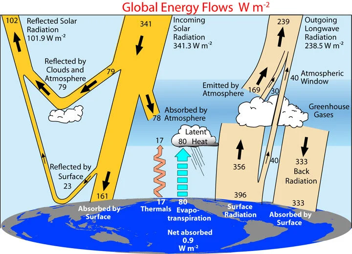
Actual greenhouse warming, he says, is a massive 60 degrees Celsius, but this is tempered by various cooling effects such as evapotranspiration, atmospheric thermals and absorption of incident shortwave solar radiation by the atmosphere. These effects are illustrated in the following figure, showing the earth’s energy flows (in watts per square meter) as calculated from satellite measurements between 2000 and 2004. It should be noted, however, that the details of these energy flow calculations have been questioned by global warming skeptics.

radiation_budget_kiehl_trenberth_2008_big.jpg

The often-quoted textbook warming of 33 degrees Celsius comes from assuming that the earth’s mean albedo, which measures the reflectivity of incoming sunlight, is the same 0.30 with or without its atmosphere. The albedo with an atmosphere, including the contribution of clouds, can be calculated from the shortwave satellite data on the left side of the figure above, as (79+23)/341 = 0.30. Rancourt calculates the albedo with no atmosphere from the same data, as 23/(23+161) = 0.125, which assumes the albedo is the same as that of the earth’s present surface.

This value is considerably less than the textbook value of 0.30. However, the temperature of an earth with no atmosphere – whether it’s Rancourt’s -4.0 degrees Celsius or a more frigid -19 degrees Celsius – would be low enough for the whole globe to be covered in ice.

Such an ice-encased planet, a glistening white ball as seen from space known as a “Snowball Earth,” is thought to have existed hundreds of millions of years ago. What’s relevant here is that the albedo of a Snowball Earth would be at least 0.4 (the albedo of marine ice) and possibly as high as 0.9 (the albedo of snow-covered ice).

That both values are well above Rancourt’s assumed value of 0.125 seems to cast doubt on his calculation of -4.0 degrees Celsius as the temperature of an earth stripped of its atmosphere. His calculation of CO2 warming may also be on weak ground because, by his own admission, it ignores factors such as inhomogeneities in the earth’s atmosphere and surface; non-uniform irradiation of the surface; and constraints on the rate of decrease of temperature with altitude in the atmosphere, known as the lapse rate. Despite these limitations, Rancourt finds with his radiation balance approach that his double-layer atmosphere model yields essentially the same result as a single-layer model.

He also concludes that the steady state temperature of Earth’s surface is a sizable two orders of magnitude more sensitive to variations in the sun’s heat and light output, and to variations in planetary albedo due to land use changes, than to increases in the level of CO2 in the atmosphere. These claims are not accepted even by the vast majority of climate change skeptics, despite Rancourt’s accurate assertion that global warming doesn’t cause weather extremes.

Next: Challenges to the CO2 Global Warming Hypothesis: (3) The Greenhouse Effect Doesn’t Exist

Challenges to the CO2 Global Warming Hypothesis: (1) A New Take on the Carbon Cycle

Central to the dubious belief that humans make a substantial contribution to climate change is the CO2 global warming hypothesis. The hypothesis is that observed global warming – currently about 1 degree Celsius (1.8 degrees Fahrenheit) since the preindustrial era – has been caused primarily by human emissions of CO2 and other greenhouse gases into the atmosphere. The CO2 hypothesis is based on the apparent correlation between rising worldwide temperatures and the CO2 level in the lower atmosphere, which has gone up by approximately 47% over the same period.

In this series of blog posts, I’ll review several recent research papers that challenge the hypothesis. The first is a 2020 preprint by U.S. physicist and research meteorologist Ed Berry, who has a PhD in atmospheric physics. Berry disputes the claim of the IPCC (Intergovernmental Panel on Climate Change) that human emissions have caused all of the CO2 increase above its preindustrial level in 1750 of 280 ppm (parts per million), which is one way of expressing the hypothesis.

The IPCC’s CO2 model maintains that natural emissions of CO2 since 1750 have remained constant, keeping the level of natural CO2 in the atmosphere at 280 ppm, even as the world has warmed. But Berry’s alternative model concludes that only 25% of the current increase in atmospheric CO2 is due to humans and that the other 75% comes from natural sources. Both Berry and the IPCC agree that the preindustrial CO2 level of 280 ppm had natural origins. If Berry is correct, however, the CO2 global warming hypothesis must be discarded and another explanation found for global warming.

Natural CO2 emissions are part of the carbon cycle that accounts for the exchange of carbon between the earth’s land masses, atmosphere and oceans; it includes fauna and flora, as well as soil and sedimentary rocks. Human CO2 from burning fossil fuels constitutes less than 5% of total CO2 emissions into the atmosphere, the remaining emissions being natural. Atmospheric CO2 is absorbed by vegetation during photosynthesis, and by the oceans through precipitation. The oceans also release CO2 as the temperature climbs.

Berry argues that the IPCC treats human and natural carbon differently, instead of deriving the human carbon cycle from the natural carbon cycle. This, he says, is unphysical and violates the Equivalence Principle of physics. Mother Nature can't tell the difference between fossil fuel CO2 and natural CO2. Berry uses physics to create a carbon cycle model that simulates the IPCC’s natural carbon cycle, and then utilizes his model to calculate what the IPCC human carbon cycle should be.

Berry’s physics model computes the flow or exchange of carbon between land, atmosphere, surface ocean and deep ocean reservoirs, based on the hypothesis that outflow of carbon from a particular reservoir is equal to its level or mass in that reservoir divided by its residence time. The following figure shows the distribution of human carbon among the four reservoirs in 2005, when the atmospheric CO2 level was 393 ppm, as calculated by the IPCC (left panel) and Berry (right panel).

Human carbon IPCC.jpg
Human carbon Berry.jpg

A striking difference can be seen between the two models. The IPCC claims that approximately 61% of all carbon from human emissions remained in the atmosphere in 2005, and no human carbon had flowed to land or surface ocean. In contrast, Berry’s alternative model reveals appreciable amounts of human carbon in all reservoirs that year, but only 16% left in the atmosphere. The IPCC’s numbers result from assuming in its human carbon cycle that human emissions caused all the CO2 increase above its 1750 level.

The problem is that the sum total of all human CO2 emitted since 1750 is more than enough to raise the atmospheric level from 280 ppm to its present 411 ppm, if the CO2 residence time in the atmosphere is as long as the IPCC claims – hundreds of years, much longer than Berry’s 5 to 10 years. The IPCC’s unphysical solution to this dilemma, Berry points out, is to have the excess human carbon absorbed by the deep ocean alone without any carbon remaining at the ocean surface.

Contrary to the IPCC’s claim, Berry says that human emissions don’t continually add CO2 to the atmosphere, but rather generate a flow of CO2 through the atmosphere. In his model, the human component of the current 131 (= 411-280) ppm of added atmospheric CO2 is only 33 ppm, and the other 98 ppm is natural.

The next figure illustrates Berry’s calculations, showing the atmospheric CO2 level above 280 ppm for the period from 1840 to 2020, including both human and natural contributions. It’s clear that natural emissions, represented by the area between the blue and red solid lines, have not stayed at the same 280 ppm level over time, but have risen as global temperatures have increased. Furthermore, the figure also demonstrates that nature has always dominated the human contribution and that the increase in atmospheric CO2 is more natural than human.

Human carbon summary.jpg

Other researchers (see, for example, here and here) have come to much the same conclusions as Berry, using different arguments.

Next: Challenges to the CO2 Global Warming Hypothesis: (2) Questioning Nature’s Greenhouse Effect

Science vs Politics: The Precautionary Principle

Greatly intensifying the attack on modern science is invocation of the precautionary principle – a concept developed by 20th-century environmental activists. Targeted at decision making when the available scientific evidence about a potential environmental or health threat is highly uncertain, the precautionary principle has been used to justify a number of environmental policies and laws around the globe. Unfortunately for science, the principle has also been used to support political action on alleged hazards, in cases where there’s little or no evidence for those hazards.

precautionary principle.jpg

The origins of the precautionary principle can be traced to the application in the early 1970s of the German principle of “Vorsorge” or foresight, based on the belief that environmental damage can be avoided by careful forward planning. The “Vorsorgeprinzip” became the foundation for German environmental law and policies in areas such as acid rain, pollution and global warming. The principle reflects the old adage that “it’s better to be safe than sorry,” and can be regarded as a restatement of the ancient Hippocratic oath in medicine, “First, do no harm.”

Formally, the precautionary principle can be stated as:

When an activity raises threats of harm to human health or the environment, precautionary measures should be taken even if some cause and effect relationships are not fully established scientifically.

But in spite of its noble intentions, the precautionary principle in practice is based far more on political considerations than on science. It’s the “not fully established scientifically” statement that both embraces the principle involved and, at the same time, leaves it open to manipulation and subversion of science.

A notable example of the intrusion of precautionary principle politics into science is the bans on GMO (genetically modified organism) crops by more than half the countries in the European Union. The bans stem from the widespread, fear-based belief that eating genetically altered foods is unsafe, despite the lack of any scientific evidence that GMOs have ever caused harm to a human.

In a 2016 study by the U.S. NAS (National Academy of Sciences, Engineering and Medicine), no substantial evidence was found that the risk to human health was any different for current GMO crops on the market than for their traditionally crossbred counterparts. This conclusion came from epidemiological studies conducted in the U.S. and Canada, where the population has consumed GMO foods since the late 1990s, and similar studies in the UK and Europe, where very few GMO foods are eaten.

The precautionary principle also underlies the UNFCCC (UN Framework Convention on Climate Change), the 1992 treaty that formed the basis for all subsequent political action on global warming. In another post, I’ve discussed the lack of empirical scientific evidence for the narrative of catastrophic anthropogenic (human-caused) climate change. Yet Irrational fear of disastrous consequences of global warming pushes activists to invoke the precautionary principle in order to justify unnecessary, expensive remedies such as those embodied in the Paris Agreement or the Green New Deal.

One of the biggest issues with the precautionary principle is that it essentially advocates risk avoidance. But risk avoidance carries its own risks.

Dangers, great and small, are an accepted part of everyday life. We accept the risk, for example, of being killed or badly injured while traveling on the roads because the risk is outweighed by the convenience of getting to our destination quickly, or by our desire to have fresh food available at the supermarket. Applying the precautionary principle would mean, in addition to the safety measures already in place, reducing all speed limits to 10 mph or less – a clearly impractical solution that would take us back to horse-and-buggy days.  

Another, real-life example of an unintended consequence of the precautionary principle is what happened in Fukushima, Japan in the aftermath of the nuclear accident triggered by a massive earthquake and tsunami in 2011. As described by the authors of a recent discussion paper, Japan’s shutdown of nuclear power production as a safety measure and its replacement by fossil-fueled power raised electricity prices by as much as 38%, decreasing consumption of electricity, especially for heating during cold winters. This had a devastating effect: in the authors’ words,

“Our estimated increase in mortality from higher electricity prices significantly outweighs the mortality from the accident itself, suggesting the decision to cease nuclear production caused more harm than good.”

Adherence to the precautionary principle can also stifle innovation and act as a barrier to technological development. In the worst case, an advantageous technology can be banned because of its potentially negative impact, leaving its positive benefits unrealized. This could well be the case for GMOs. The more than 30 nations that have banned the growing of genetically engineered crops may be shutting themselves off from the promise of producing cheaper and more nutritious food.

The precautionary principle pits science against politics. In an ideal world, the conflict between the two would be resolved wisely. As things are, however, science is often subjugated to the needs and whims of policy makers.

Next: Challenges to the CO2 Global Warming Hypothesis: (1) A New Take on the Carbon Cycle

Absurd Attempt to Link Climate Change to Cancer Contradicted by Another Medical Study

Extreme weather has already been wrongly blamed on climate change. More outlandish claims have linked climate change to medical and social phenomena such as teenage drinking, declining fertility rates, mental health problems, loss of sleep by the elderly and even Aretha Franklin’s death.

Now the most preposterous claim of all has been made, that climate change causes cancer. A commentary last month in a leading cancer journal contends that climate change is increasing cancer risk through increased exposure to carcinogens after extreme weather events such as hurricanes and wildfires. Furthermore, the article declares, weather extremes impact cancer survival by impeding both patients' access to cancer treatment and the ability of medical facilities to deliver cancer care.

How absurd! To begin with, there’s absolutely no evidence that global warm­ing triggers extreme weather, or even that extreme weather is becoming more frequent. The following figure, depicting the annual number of global hurricanes making landfall since 1970, illustrates the lack of any trend in major hurricanes for the last 50 years – during a period when the globe warmed by ap­proximately 0.6 degrees Celsius (1.1 degrees Fahrenheit). The strongest hurricanes today are no more extreme or devastating than those in the past. If anything, major landfalling hurricanes in the US are tied to La Niña cycles in the Pacific Ocean, not to global warming.

Blog 7-15-19 JPG(2).jpg

And wildfires in fact show a declining trend over the same period. This can be seen in the next figure, displaying the estimated area worldwide burned by wildfires, by decade from 1900 to 2010. While the number of acres burned annually in the U.S. has gone up over the last 20 years or so, the present burned area is still only a small fraction of what it was back in the 1930s.

Blog 8-12-19 JPG(2).jpg

Apart from the lack of any connection between climate change and extreme weather, the assertion that hurricanes and wildfires result in increased exposure to carcinogens is dubious. Although hurricanes occasionally cause damage that releases chemicals into the atmosphere, and wildfires generate copious amounts of smoke, these effects are temporary and add very little to the carcinogen load experienced by the average person.

A far greater carcinogen load is experienced continuously by people living in poorer countries who rely on the use of solid fuels, such as coal, wood, charcoal or biomass, for cooking. Incomplete combustion of solid fuels in inefficient stoves results in indoor air pollution that causes respiratory infections in the short term, especially in children, and heart disease or cancer in adults over longer periods of time.

The 2019 Lancet Countdown on Health and Climate Change, an annual assessment of the health effects of climate change, found that mortality from climate-sensitive diseases such as diarrhea and malaria has fallen as the planet has heated, with the exception of dengue fever. Although the Countdown didn’t examine cancer specifically, it did find that the number of people still lacking access to clean cooking fuels and technologies is almost three billion, a number that has fallen by only 1% since 2010.

What this means is that, regardless of ongoing global warming, those billions are still being exposed to indoor carcinogens and are therefore at greater-than-normal risk of later contracting cancer. But the cancer will be despite climate change, not because of it – completely contradicting the claim in the cancer journal that climate change causes cancer.

Because climate change is actually reducing the frequency of hurricanes and wildfires, the commentary’s contention that extreme weather is worsening disruptions to health care access and delivery is also fallacious. Delays due to weather extremes in cancer diagnosis and treatment initiation, and the interruption of cancer care, are becoming less, not more common.

It makes no more sense to link climate change to cancer than to avow that it causes hair loss or was responsible for the creation of the terrorist group ISIS.

Next: Science vs Politics: The Precautionary Principle

Why Both Coronavirus and Climate Models Get It Wrong

Most coronavirus epidemiological models have been an utter failure in providing advance information on the spread and containment of the insidious virus. Computer climate models are no better, with a dismal track record in predicting the future.

This post compares the similarities and differences of the two types of model. But similarities and differences aside, the models are still just that – models. Although I remarked in an earlier post that epidemiological models are much simpler than climate models, this doesn’t mean they’re any more accurate.     

Both epidemiological and climate models start out, as they should, with what’s known. In the case of the COVID-19 pandemic the knowns include data on the progression of past flu epidemics, and demographics such as population size, age distribution, social contact patterns and school attendance. Among the knowns for climate models are present-day weather conditions, the global distribution of land and ice, atmospheric and ocean currents, and concentrations of greenhouse gases in the atmosphere.

But the major weakness of both types of model is that numerous assumptions must be made to incorporate the many variables that are not known. Coronavirus and climate models have little in common with the models used to design computer chips, or to simulate nuclear explosions as an alternative to actual testing of atomic bombs. In both these instances, the underlying science is understood so thoroughly that speculative assumptions in the models are unnecessary.

Epidemiological and climate models cope with the unknowns by creating simplified pictures of reality involving approximations. Approximations in the models take the form of adjustable numerical parameters, often derisively termed “fudge factors” by scientists and engineers. The famous mathematician John von Neumann once said, “With four [adjustable] parameters I can fit an elephant, and with five I can make him wiggle his trunk.”

One of the most important approximations in coronavirus models is the basic reproduction number R0 (“R naught”), which measures contagiousness. The numerical value of R0 signifies the number of other people that an infected individual can spread the disease to, in the absence of any intervention. As shown in the figure below, R0 for COVID-19 is thought to be in the range from 2 to 3, much higher than for a typical flu at about 1.3, though less than values for other infectious diseases such as measles.

COVID-19 R0.jpg

It’s COVID-19’s high R0 that causes the virus to spread so easily, but its precise value is still uncertain. What determines how quickly the virus multiplies, however, is the incubation period, during which an infected individual can’t infect others. Both R0 and the incubation period define the epidemic growth rate. They’re adjustable parameters in coronavirus models, along with factors such as the rate at which susceptible individuals become infectious in the first place, travel patterns and any intervention measures taken.

In climate models, hundreds of adjustable parameters are needed to account for deficiencies in our knowledge of the earth’s climate. Some of the biggest inadequacies are in the representation of clouds and their response to global warming. This is partly because we just don’t know much about the inner workings of clouds, and partly because actual clouds are much smaller than the finest grid scale that even the largest computers can accommodate – so clouds are simulated in the models by average values of size, altitude, number and geographic location. Approximations like these are a major weakness of climate models, especially in the important area of feedbacks from water vapor and clouds.

An even greater weakness in climate models is unknowns that aren’t approximated at all and are simply omitted from simulations because modelers don’t know how to model them. These unknowns include natural variability such as ocean oscillations and indirect solar effects. While climate models do endeavor to simulate various ocean cycles, the models are unable to predict the timing and climatic influence of cycles such as El Niño and La Niña, both of which cause drastic shifts in global climate, or the Pacific Decadal Oscillation. And the models make no attempt whatsoever to include indirect effects of the sun like those involving solar UV radiation or cosmic rays from deep space.

As a result of all these shortcomings, the predictions of coronavirus and climate models are wrong again and again. Climate models are known even by modelers to run hot, by 0.35 degrees Celsius (0.6 degrees Fahrenheit) or more above observed temperatures. Coronavirus models, when fed data from this week, can probably make a reasonably accurate forecast about the course of the pandemic next week – but not a month, two months or a year from now. Dr. Anthony Fauci of the U.S. White House Coronavirus Task Force recently admitted as much.

Computer models have a role to play in science, but we need to remember that most of them depend on a certain amount of guesswork. It’s a mistake, therefore, to base scientific policy decisions on models alone. There’s no substitute for actual, empirical evidence.

Next: How Science Is Being Misused in the Coronavirus Pandemic

Does Planting Trees Slow Global Warming? The Evidence

It’s long been thought that trees, which remove CO2 from the atmosphere and can live much longer than humans, exert a cooling influence on the planet. But a close look at the evidence reveals that the opposite could be true – that planting more trees may actually have a warming effect.

This is the tentative conclusion reached by a senior scientist at NASA, in evaluating the results of a 2019 study to estimate Earth’s forest restoration potential. It’s the same conclusion that the IPCC (Intergovernmental Panel on Climate Change) came to in a comprehensive 2018 report on climate change and land degradation. Both the 2019 study and IPCC report were based on various forest models.

The IPCC’s findings are summarized in the following figure, which shows how much the global surface temperature is altered by large-scale forestation (crosses) or deforestation (circles) in three different climatic regions: boreal (subarctic), temperate and tropical; the figure also shows how much deforestation affects regional temperatures.

Forestation.jpg

Trees impact the temperature through either biophysical or biogeochemical effects. The principal biophysical effect is changes in albedo, which measures the reflectivity of incoming sunlight. Darker surfaces such as tree leaves have lower albedo and reflect the sun less than lighter surfaces such as snow and ice with higher albedo. Planting more trees lowers albedo, reducing reflection but increasing absorption of solar heat, resulting in global warming.

The second main biophysical effect is changes in evapotranspiration, which is the release of moisture from plant and tree leaves and the surrounding soil. Forestation boosts evapotranspiration, pumping more water vapor into the atmosphere and causing global cooling that competes with the warming effect from reduced albedo.

These competing biophysical effects of forestation are accompanied by a major geochemical effect, namely the removal of CO2 from the atmosphere by photosynthesis. In photosynthesis, plants and trees take in CO2 and water, as well as absorbing sunlight, producing energy for growth and releasing oxygen. Lowering the level of the greenhouse gas CO2 in the atmosphere results in the cooling traditionally associated with planting trees.

The upshot of all these effects, plus other minor contributions, is demonstrated in the figure above. For all three climatic zones, the net global biophysical outcome of large-scale forestation (blue crosses) – primarily from albedo and evapotranspiration changes – is warming.

Additional biophysical data can be inferred from the results for deforestation (small blue circles), simply reversing the sign of the temperature change to show forestation. Doing this indicates global warming again for forestation in boreal and temperate zones, and perhaps slight cooling in the tropics, with regional effects (large blue circles) being more pronounced. There is strong evidence, therefore, from the IPCC report that widespread tree planting results in net global warming from biophysical sources.

The only region for which there is biogeochemical data (red crosses) for forestation – signifying the influence of CO2 – is the temperate zone, in which forestation results in cooling as expected. Additionally, because deforestation (red dots) results in biogeochemical warming in all three zones, it can be inferred that forestation in all three zones, including the temperate zone, causes cooling.

Which type of process dominates, following tree planting – biophysical or biogeochemical? A careful examination of the figure suggests that biophysical effects prevail in boreal and temperate regions, but biogeochemical effects may have the upper hand in tropical regions. This implies that large-scale planting of trees in boreal and temperate regions will cause further global warming. However, two recent studies (see here and here) of local reforestation have found evidence for a cooling effect in temperate regions.

Forest.jpg

But even in the tropics, where roughly half of the earth’s forests have been cleared in the past, it’s far from certain that the net result of extensive reforestation will be global cooling. Among other factors that come into play are atmospheric turbulence, rainfall, desertification and the particular type of tree planted.

Apart from these concerns, another issue in restoring lost forests is whether ecosystems in reforested areas will revert to their previous condition and have the same ability as before to sequester CO2. Says NASA’s Sassan Saatchi, “Once connectivity [to the climate] is lost, it becomes much more difficult for a reforested area to have its species range and diversity, and the same efficiency to absorb atmospheric carbon.”

So, while planting more trees may provide more shade for us humans in a warming world, the environmental benefits are not at all clear.

Next: Why Both Coronavirus and Climate Models Get It Wrong

The Futility of Action to Combat Climate Change: (2) Political Reality

In the previous post, I showed how scientific and engineering realities make the goal of taking action to combat climate change inordinately expensive and unattainable in practice for decades to come, even if climate alarmists are right about the need for such action. This post deals with the equally formidable political realities involved.

By far the biggest barrier is the unlikelihood that the signatories to the 2015 Paris Agreement will have the political will to adhere to their voluntary pledges for reducing greenhouse gas emissions. Lacking any enforcement mechanism, the agreement is merely a “feel good” document that allows nations to signal virtuous intentions without actually having to make the hard decisions called for by the agreement. This reality is tacitly admitted by all the major CO2 emitters.

Evidence that the Paris Agreement will achieve little is contained in the figure below, which depicts the ability of 58 of the largest emitters, accounting for 80% of the world’s greenhouse emissions, to meet the present goals of the accord. The goals are to hold “the increase in the global average temperature to well below 2 degrees Celsius (3.6 degrees Fahrenheit) above pre-industrial levels,” preferably limiting the increase to only 1.5 degrees Celsius (2.7 degrees Fahrenheit).

Paris commitments.jpg

It’s seen that only seven nations have declared emission reductions big enough to reach the Paris Agreement’s goals, including just one of the largest emitters, India. The seven largest emitters, apart from India which currently emits 7% of the world’s CO2, are China (28%), the USA (14%), Russia (5%), Japan (3%), Germany (2%, biggest in the EU) and South Korea (2%). The EU designation here includes the UK and 27 European nations.

As the following figure shows, annual CO2 emissions from both China and India are rising, along with those from the other developing nations (“Rest of world”). Emissions from the USA and EU, on the other hand, have been steady or falling for several decades. Ironically, the USA’s emissions in 2019, which dropped by 2.9% from the year before, were no higher than in 1993 – despite the country’s withdrawal from the Paris Agreement.

emissions_by_country.jpg

As the developing nations, including China and India, currently account for 76% of global emissions, it’s difficult to imagine that the world as a whole will curtail its emissions anytime soon.

China, although a Paris Agreement signatory, has declared its intention of increasing its annual CO2 emissions until 2030 in order to fully industrialize – a task requiring vast amounts of additional energy, mostly from fossil fuels. The country already has over 1,000 GW of coal-fired power capacity and another 120 GW under construction. China is also financing or building 250 GW of coal-fired capacity as part of its Belt and Road Initiative across the globe. Electricity generation in China from burning coal and natural gas accounted for 70% of the generation total in 2018, compared with 26% from renewables, two thirds of which came from hydropower.

India, which has also ratified the Paris Agreement, believes it can meet the agreement’s aims even while continuing to pour CO2 into the atmosphere. Coal’s share of Indian primary energy consumption, which is predominantly for electricity generation and steelmaking, is expected to decrease slightly from 56% in 2017 to 48% in 2040. However, achieving even this reduction depends on doubling the share of renewables in electricity production, an objective that may not be possible because of land acquisition and funding barriers.

Nonetheless, it’s not China nor India that stand in the way of making the Paris Agreement a reality, but rather the many third world countries who want to reach the same standard of living as the West – a lifestyle that has been attained through the availability of cheap, fossil fuel energy. In Africa today, for example, 600 million people don’t have access to electricity and 900 million are forced to cook with primitive stoves fueled by wood, charcoal or dung, all of which create health and environmental problems. Coal-fired electricity is the most affordable remedy for the continent.

In the words of another writer, no developing country will hold back from increasing their CO2 emissions “until they have achieved the same levels of per capita energy consumption that we have here in the U.S. and in Europe.” This drive for a better standard of living, together with the lack of any desire on the part of industrialized countries to lower their energy consumption, spells disaster for realizing the lofty goals of the Paris Agreement.

Next: Science on the Attack: Cancer Immunotherapy