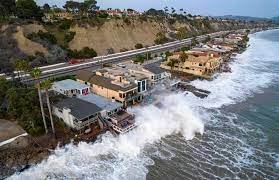
Sea Level Rise Is Partly Anthropogenic – but Due to Subsidence, Not Global Warming
/Rising sea levels are all too often blamed on climate change by activists and the media. But a recent research study has revealed that, while much of sea level rise in coastal cities is indeed due to human activity, the culprit is land subsidence caused by groundwater extraction, rather than any human-induced global warming.
The study, conducted by oceanographers at the University of Rhode Island, measured subsidence rates in 99 coastal cities around the world between 2015 and 2020, using data from a pair of Europe’s Sentinel-1 satellites. The subsidence rates for each city were calculated from satellite images taken once every two months during the observation period – a procedure that enabled the researchers to measure the height of the ground with millimeter accuracy.
Several different processes can affect vertical motion of land, as I discussed in a previous post. Long-term glacial rebound after melting of the last ice age’s heavy ice sheets is causing land to rise in high northern latitudes. But in many regions, the ground is sinking because of sediment settling and aquifer compaction caused by human activities, especially groundwater depletion resulting from rapid urbanization and population growth.
The study found that subsidence is common across the globe. The figure below shows the maximum subsidence rates measured by the authors in the 99 coastal cities studied, from 2015 to 2020.
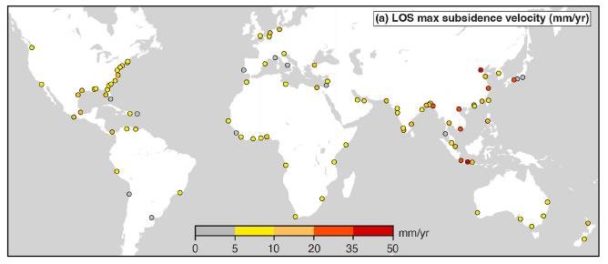
In Tianjin, China and Jakarta, Indonesia, parts of the city are subsiding at alarming rates exceeding 30 mm (1.2 inches) per year. Maximum rates of this magnitude dwarf average global sea level rise by as much as 15 times. Even in 31 other cities, the maximum subsidence rate is more than 5 times faster than global sea level rise.
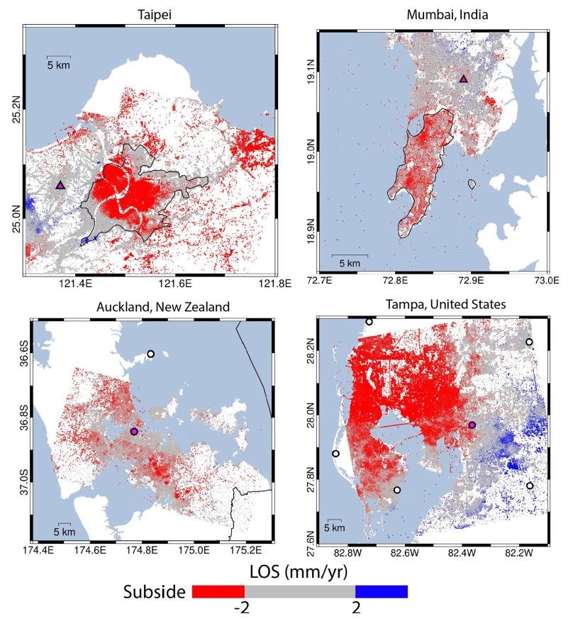
The most rapid subsidence is occurring in southern, southeastern and eastern Asia. Even in cities that are relatively stable, some areas of the cities are sinking faster than sea levels are rising. The next figure demonstrates four examples: Taipei, the largest city in Taiwan with a population of 2.7 million; Mumbai, with a population of about 20 million; Auckland, the largest city in New Zealand and home to 1.6 million people; and for comparison with the U.S., Tampa, which has a population of over 3 million. Both Taipei and Tampa are seen to have major subsidence.
This study of subsidence throws light on a long-standing dilemma: what is the true rate of global sea level rise? According to NOAA (the U.S. National Oceanic and Atmospheric Administration) tide gauge records, the average rate of rise during the 20th century was 1.7 mm (about 1/16th of an inch) per year. But NASA’s satellite measurements say the rate is more like 3.4 mm (1/8th of an inch) per year, double NOAA’s value.
The difference comes from subsidence. Satellite observations of absolute sea level measure the height of the sea – the distance of its surface to the center of the earth. Tide gauges measure the height of the sea relative to the land to which the gauge is attached, the so-called RSL (Relative Sea Level) metric. Sinking of the land independently of sea level, as in the case of the 99 cities studied, artificially amplifies the RSL rise and makes satellite-measured sea levels higher than tide gauge RSLs.
But it's the tide gauge measurements that matter to the local community and its engineers and planners. Whether or not tidal cycles or storms cause flooding of critical coastal structures depends on the RSL measured at that location. Adaptation needs to be based on RSLs, not sea levels determined by satellite.
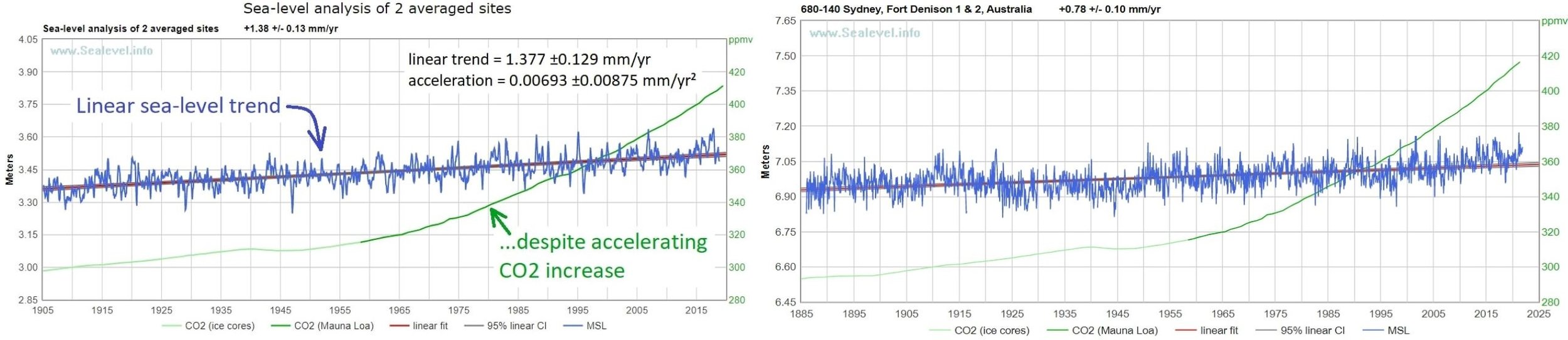
Shown in the two figures below are tide gauge time series compiled by NOAA for various sites around the globe that have long-term records dating back to 1900 or before. The graph in the left panel of the upper figure is the average of records at two sites: Harlingen in the Netherlands and Honolulu in Hawaii. The average rate of RSL rise at these two locations is 1.38 mm (0.05 inches) per year, with an acceleration of only 0.007 mm per year per year, which is essentially zero. At Sydney in Australia (right panel of upper figure), the RSL is rising at only 0.78 mm (0.03 inches) per year.
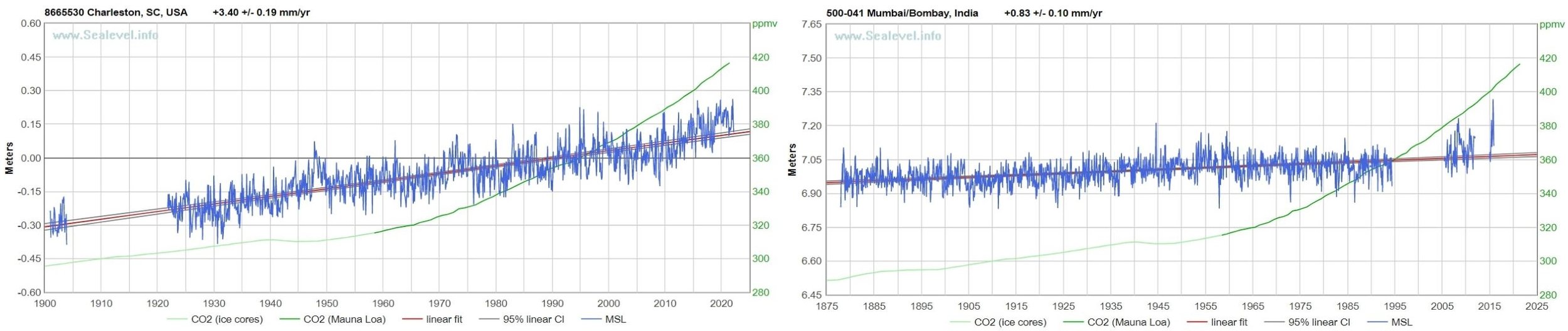
In the lower figure, the rate of RSL rise at Charleston – a “hotspot” for sea level rise on the U.S. Atlantic coast – is a high 3.4 mm (0.13 inches) per year. At Mumbai, where much of the city is subsiding more rapidly than 2 mm (0.08 inches) per year as seen earlier, the RSL is rising at 0.83 mm (0.03 inches) per year, comparable to Sydney. Without subsidence at Mumbai, the RSL would be falling.
Were it not for anthropogenic subsidence, actual rates of sea level rise in many parts of the world would be considerably lower than they appear.
Next: Climate Science Establishment Finally Admits Some Models Run Too Hot