Nitrous Oxide No More a Threat for Global Warming than Methane

Nitrous oxide (N2O), a minor greenhouse gas, has recently come under increasing scrutiny for its supposed global warming potency. But, just as with methane (CH4, concerns over N2O emissions stem from a basic misunderstanding of the science. As I discussed in a previous post, CH4 contributes only one tenth as much to global warming as carbon dioxide (CO2). N2O contributes even less.

The misunderstanding has been elucidated in a recent preprint by a group of scientists including atmospheric physicists William Happer and William van Wijngaarden, who together wrote an earlier paper on CH4. The new paper compares the radiative forcings – disturbances that alter the earth’s climate – of N2O and CH4 to that of CO2.

The largest source of N2O emissions is agriculture, particularly the application of nitrogenous fertilizers to boost crop production, together with cow manure management. As the world’s population continues to grow, so does the use of fertilizers in soil and the head count of cows. Agriculture accounts for approximately 75% of all N2O emissions in the U.S., emissions which comprise about 7% of the country’s total greenhouse gas emissions from human activities.

But the same hype surrounding the contribution of CH4 to climate change extends to N2O as well. The U.S. EPA (Environmental Protection Agency)’s website, among many others, claims that the impact of N2O on global warming is a massive 300 times that of CO2 – surpassing even that of CH4 at supposedly 25 times CO2. Happer, van Wijngaarden and their coauthors, however, show that the actual contribution of N2O is tiny, comparable to that of CH4.

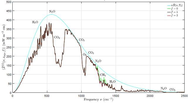
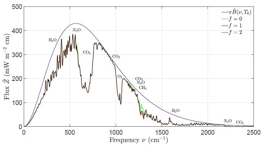
The authors have calculated the spectrum of cooling outgoing radiation for several greenhouse gases at the top of the atmosphere. A calculated spectrum emphasizing N2O is shown in the figure below, as a function of wavenumber or spatial frequency. The dark blue curve is the spectrum for an atmosphere with no greenhouse gases at all, while the black curve is the spectrum including all greenhouse gases. Removing the N2O results in the green curve; the red curve, barely distinguishable from the black curve, represents a doubling of the present N2O concentration.

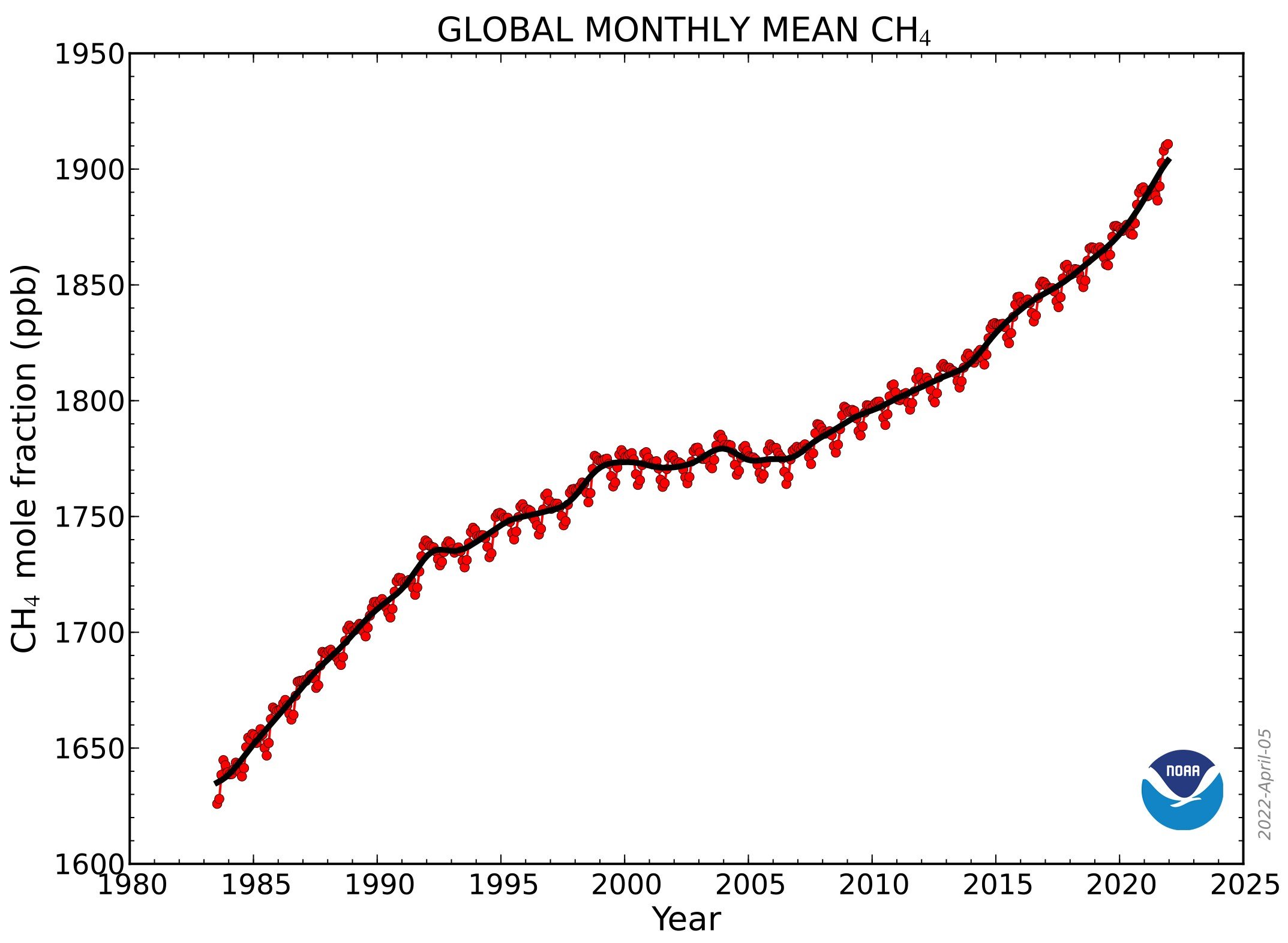
The yearly abundance of N2O in the atmosphere since 1977, as measured by NOAA (the U.S. National Oceanic and Atmospheric Administration), is depicted in the adjacent figure. Currently, the N2O concentration is about 0.34 ppm (340 ppb), three orders of magnitude lower than the CO2 level of approximately 415 ppm, and increasing much more slowly – at a rate of 0.85 ppb per year since 1985, 3000 times smaller than the rate of increase of CO2.

At current atmospheric concentrations of N2O and CO2, the radiative forcing for each additional molecule of N2O is about 230 times larger than that for each additional molecule of CO2. Importantly, however, because the rate of increase in the N2O level is 3000 times smaller, the contribution of N2O to the annual increase in forcing is only 230/3000 or about one thirteenth that of CO2. For comparison, the contribution of CH4 is about one tenth the CO2 contribution.

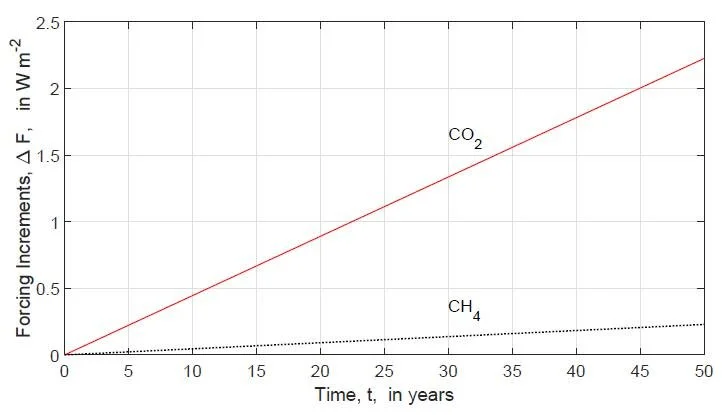
The relative contributions to future forcing of N2O, CH4 and CO2 can be seen in the next figure, showing the research authors’ evaluation of expected forcings at the top of the troposphere over the next 50 years; the forcings are increments relative to today, measured in watts per square meter. The horizontal lines are the projected temperatures increases (ΔT) corresponding to particular values of the forcing increase.

Atmospheric N2O dissociates into nitrogen (N2), the most abundant gas in the atmosphere. N2 is “fixed” by microrganisms in soils and the oceans as ammonium ions, which are then converted to inorganic nitric oxide ions (NO3-) and various compounds. These in turn are incorporated into organic molecules such as amino acids and other nitrogen-containing molecules essential for life, like DNA (deoxyribonucleic acid). Nitrogen is the third most important requirement for plant growth, after water and CO2.

Greatly increased use of nitrogen fertilizers is the main reason for massive increases in crop yields since 1961, part of the so-called green revolution in agriculture. The following figure shows U.S. crop yields relative to yields in 1866 for corn, wheat, barley, grass hay, oats and rye. The blue dashed curve is the annual agricultural usage of nitrogen fertilizer in megatonnes (Tg). The strong correlation with crop yields is obvious.

While most soil nitrogen is eventually returned to the atmosphere as N2 molecules, some of the slow increase in the atmospheric N2O level seen in the second figure above may be due to nitrogen fertilizer usage. But the impact of nitrogen fertilizer and natural nitrogen fixation on the nitrogen cycle is not yet clear and more research is needed.

Nonetheless, proposed cutbacks in fertilizer use will drastically reduce agricultural yields around the world, for the sake of only a tiny reduction in global warming potential.

Next: Science on the Attack: The James Webb Telescope and Mysteries of the Universe

New Observations Upend Notion That Global Warming Diminishes Cloud Cover

Climate scientists have long thought that low clouds, which act like a parasol and cool the earth’s surface, will diminish as the earth heats up – thus amplifying warming in a positive feedback process. This notion has been reinforced by climate models. But recent empirical observations refute the idea and show that the mechanism causing the strongest cloud reductions in models doesn’t actually occur in nature.

The observations were reported in a 2022 paper by an international team of French and German scientists. In a major field campaign, the team collected and analyzed observational data from cumulus clouds near the Atlantic island of Barbados, utilizing two research airplanes and a ship. Barbados is in the tropical trade-wind region where low-level cumulus clouds are common.

More than 800 probes were dropped from one plane that flew in circles about 200 km (120 miles) in diameter at an altitude of 9 km (6 miles); the probes gathered data on atmospheric temperature, moisture, pressure and winds as they fell. The other plane used radar and lidar sensors to measure cloudiness at the base of the cloud layer, at an altitude of 0.8 km (2,600 feet), while the ship conducted surface-based measurements.

The response to global warming of small cumulus clouds in the tropics is critically dependent on how much extra moisture from increased evaporation of seawater accumulates at the base of the clouds.

In climate models, dry air from the upper cloud layer is transported or entrained downward when the clouds grow higher and mixes with the moister air at the cloud base, drying out the lower cloud layer. This causes moisture there to evaporate more rapidly and boosts the probability that the clouds will dissipate. The phenomenon is known to climate scientists as the “mixing-desiccation hypothesis,” the strength of the mixing mechanism increasing with global warming.

But the observations of the research team reveal that the mixing-desiccation mechanism is not actually present in nature. This is because – as the researchers found – mesoscale (up to 200 km) circulation of air vertically upward dominates the smaller-scale entrainment mixing downward. Although mesoscale circulations are ubiquitous in trade-wind regions, their effect on humidity is completely absent from climate models.

The two competing processes are illustrated in the figure below, in which M represents mixing, E is downward entrainment, W is mesoscale vertical air motion, and z is the altitude; the dashed line represents the trade-wind inversion layer.

Predicted by the mixing-desiccation hypothesis is that warming strongly diminishes cloudiness compared with the base state shown in the left panel above. In the base state, vertical air motion is mostly downward and normal convective mixing occurs. According to the hypothesis, stronger mixing (M++ in panel a) caused by entrainment (E++) of dry air from higher to lower cloud layers, below the cloud base, results in excessive drying and fewer clouds.

The mesoscale circulation mechanism, on the other hand, prevents drying through mesoscale vertical air motion upward (W++ in panel b) that overcomes the entrainment mixing, thus preventing cloud loss. If anything, cloud cover actually increases with more vertical mixing. Climate models simulate only the mixing-desiccation mechanism, but the new research demonstrates that a second and more dominant mechanism operates in nature.

That cloudiness increases with mixing can be seen from the next figure, which shows the research team’s observed values of the vertical mixing rate M (in mm per second) and the cloud-base cloudiness (as a percentage). The trend is clear: as M gets larger, so does cloudiness.

The research has important implications for cloud feedback. In climate models, the refuted mixing-desiccation mechanism leads to strong positive cloud feedback – feedback that amplifies global warming. The models find that low clouds would thin out, and many would not form at all, in a hotter world.

Analysis of the new observations, however, shows that climate models with large positive feedbacks are implausible and that a weak trade cumulus feedback is much more likely than a strong one. Climate models with large trade cumulus feedbacks exaggerate the dependence of cloudiness on cloud-base moisture compared with mixing, as well as overestimating variability in cloudiness.

Weaker than expected low cloud feedback is also suggested by lack of the so-called CO2 “hot spot” in the atmosphere, as I discussed in a previous post. Climate models predict that the warming rate at altitudes of 9 to 12 km (6 to 7 miles) above the tropics should be about twice as large as at ground level. Yet the hot spot doesn’t show up in measurements made by weather balloons or satellites.

Next: Nitrous Oxide No More a Threat for Global Warming than Methane

Mainstream Media Jump on Extreme Weather Caused by Climate Change Bandwagon

The popular but mistaken belief that weather extremes are worsening be­cause of climate change has been bolstered in recent years by ever increasing hype in nearly all mainstream media coverage of extreme events, despite a lack of scientific evidence for the assertion. This month’s story by NPR (National Public Radio) in the U.S. is just the latest in a steady drumbeat of media misinformation.

Careful examination of the actual data reveals that if there is any trend in most weather extremes, it is downward rather than upward. In fact, a 2016 survey of extreme weather events since 1900 found strong evidence that the first half of the 20th century saw more weather extremes than the second half, when global warming was more prominent. More information can be found in my recent reports on weather extremes (here, here and here).

To be fair, the NPR story merely parrots the conclusions of an ostensibly scientific report from the AMS (American Meteorological Society), Explaining Extreme Events in 2021 and 2022 from a Climate Perspective. Both the AMS and NPR claim to show how the most extreme weather events of the previous two years were driven by climate change.

Nevertheless, all the purported connections rely on the dubious field of extreme-event attribution science, which uses statistics and climate models to supposedly detect the impact of global warming on weather disasters. The shortcomings of this approach are twofold. First, the models have a dismal track record in predicting the future (or indeed of hindcasting the past); and second, attri­bution studies that assign specific extremes to either natural variability or human causes are based on highly questionable statistical meth­odology (see here and here).  

So the NPR claim that “scientists are increasingly able to pinpoint exactly how the weather is changing as the earth heats up” and “how climate change drove unprecedented heat waves, floods and droughts in recent years” is utter nonsense. These weather extremes have occurred from time im­memorial, long before modern global warming began.

Yet the AMS and NPR insist that extreme drought in California and Nevada in 2021 was “six times more likely because of climate change.” This is completely at odds with a 2007 U.S. study which reconstructed the drought pattern in North America over the last 1200 years, using tree rings as a proxy.

The reconstruction is illustrated in the figure below, showing the drought area in western North America from 800 to 2003, as a percentage of the total land area. The thick black line is a 60-year mean, while the blue and red horizon­tal lines represent the average drought area during the periods 1900–2003 and 900–1300, respectively. Clearly, several unprecedently long and severe megadroughts have occurred in this region since the year 800; 2021 (not shown in the graph) was unexceptional.

The same is true for floods. A 2017 study of global flood risk concluded there is very little evidence that flooding is becoming more prevalent worldwide, despite average rainfall getting heavier as the planet warms. And, although the AMS report cites an extremely wet May of 2021 in the UK as likely to have resulted from climate change, “rescued” Victorian rainfall data reveals that the UK was just as wet in Victorian times as today.

The illusion that major floods are becoming more frequent is due in part to the world’s growing population and the appeal, in the more developed countries at least, of living near water. This has led to more people building their dream homes in vulner­able locations, on river or coastal floodplains, as shown in the next figure.

Depicted is what has been termed the “Expanding Bull’s-Eye Effect” for a hypothetical river flood impacting a growing city. It can be seen that the same flood will cause much more destruction in 2040 than in 1950. A larger and wealthier population exposes more individuals and property to the devastation wrought by intermittent flooding from rainfall-swollen rivers or storm surges. Population expansion beyond urban areas, not climate change, has also worsened the death toll and property damage from hurricanes and tornadoes.

In a warming world, it is hardly surprising that heat waves are becoming more common. However, the claim by the AMS and NPR that heat waves are now “more extreme than ever” can be questioned, either because heat wave data prior to 1950 is completely ignored in many compilations, or because the data before 1950 is sparse. No recent heat waves come close to matching the frequency and duration of those experienced worldwide in the 1930s.

The media are misleading and stoking fear in the public about perfectly normal extreme weather, although there are some notable exceptions such as The Australian. The alarmist stories of the others are largely responsible for the current near-epidemic of “climate anxiety” in children, the most vulnerable members of our society.

Next: New Observations Upend Notion That Global Warming Diminishes Cloud Cover

Are Ocean Surface Temperatures, Not CO2, the Climate Control Knob?

According to the climate change narrative, modern global warming is largely the result of human emissions of CO2 into the atmosphere. But a recent lecture questioned that assertion with an important observation suggesting that ocean surface temperatures, not CO2, are the planet’s climate control knob.

The lecture was delivered by Norwegian Ole Humlum, who was formerly a full professor in physical geography at both the University Centre in Svalbard, Norway and the University of Oslo, in addition to holding visiting positions in Scotland and the Faroe Islands. He currently publishes regular updates on the state of the global climate.

In his lecture, Humlum dwelt on temperature measurements of the world’s oceans. Since 2004, ocean temperatures have been studied in detail at depths of up to 2 km (1.2 miles), by means of a global array of almost 3,900 Argo profiling floats. These free-drifting robotic floats patrol the oceans, taking a deep dive every 10 days to probe the temperature and salinity of the watery depths, and transmitting the data to a satellite within hours of reaching the surface again. A 2018 map of the Argo array is shown below.

The next figure illustrates how the oceans have warmed during the period that the floats have been in operation, up to August 2020. The vertical scale is the global ocean temperature change in degrees Celsius averaged from 65oS to 65oN (excluding the polar regions), while the horizontal scale gives the depth up to 1,900 meters (6,200 feet).

You can see that warming has been most prominent at the surface, where the average sea surface temperature has gone up since 2004 by about 0.27 degrees Celsius (0.49 degrees Fahrenheit). The temperature increase deep down is an order of magnitude smaller. Most of the temperature rise at shallow depths comes from the tropics (30oS to 30oN) and the Antarctic (65oS to 55oS), although the Arctic (55oN to 65oN) measurements reveal considerable cooling down to about 1,400 meters (4,600 feet) in that region.

But Humlum’s most profound observation is of the timeline for Argo temperature measurements as a function of depth. These are depicted in the following figure showing global depth profiles for the tropical oceans in degrees Celsius, from 2004 to 2014. The tropics cover almost 40% of the earth’s surface; the oceans in total cover 71%.

The fluctuations in each Argo depth profile arise from seasonal variations in temperature from summer to winter, which are more pronounced at the surface than at greater depths. If you focus your attention on any yearly summer peak at zero depth, you will notice that it moves to the right – that is, to later times – as the depth increases. In other words, there is a time delay of any temperature change with depth.

From a correlation analysis of the Argo data, Humlum finds that the time delay at a depth of 200 meters (650 feet) is a substantial 20 months, so that it takes 20 months for a temperature increase or decrease at the tropical surface to propagate down to that depth. A similar, though smaller, delay exists between any change in sea surface temperature (SST) and corresponding temperature changes in the atmosphere and on land, as shown in the figure below.

At an altitude of 200 meters (650 feet) in the atmosphere, changes in the SST show up slightly less than half a month later. But in the lower troposphere, where satellite temperature measurements are made, the delay is 2 months, as it is also for land surface temperatures. Humlum’s crucial argument is that sea surface temperatures lead all other global temperature observations – that is, the global temperature signal originates at the ocean surface.

However, according to the CO2 global warming hypothesis, the CO2 signal originates at an altitude of about 9 km (5.6 miles) in the upper troposphere and is seen at the sea surface some time later. So the CO2 hypothesis predicts that the sea surface is a lagging, not a leading indicator – exactly the opposite of what actual observations are telling us.

Humlum concludes that CO2 cannot be the earth’s climate control knob and that our global climate is apparently controlled by the SST. The climate control knob must instead be whatever natural system controls sea surface temperatures. Potential candidates, he says, include the sun, cloud cover, sediments and organic life in the oceans, and the action of winds. Further research is needed to identify which of these possibilities truly powers the global climate.

Next: Mainstream Media Jumps on Extreme Weather Caused by Climate Change Bandwagon

New Research Finds Climate Models Unable to Reproduce Ocean Surface Temperatures

An earlier post of mine described how a group of prestigious U.S. climate scientists recently admitted that some climate models run too hot, greatly exaggerating future global warming. Now another group has published a research paper revealing that a whole ensemble of models is unable to reproduce observed sea surface temperature trends in the Pacific and Southern Oceans since 1979.

The observed trends include enhanced warming in the Indo-Pacific Warm Pool – a large body of water near Indonesia where sea surface temperatures exceed 28 degrees Celsius (82 degrees Fahrenheit) year-round – as well as slight cooling in the eastern equatorial Pacific, and cooling in the Southern Ocean.

Climate models predict exactly opposite effects in all three regions, as illustrated in the following figure. The top panel depicts the global trend in measured sea surface temperatures (SSTs) from 1979 to 2020, while the middle panel depicts the multimodel mean of hindcasted temperatures over the same period from a large 598-member ensemble, based on 16 different models and various possible CO2 emissions scenarios ranging from low (SSP2-4.5) to high (RCP8.5) emissions. The bottom panel shows the difference.

You can see that the difference between observed and modeled temperatures is indeed marked. Considerable warming in the Indo-Pacific Warm Pool and the western Pacific, together with cooling in the eastern Pacific and Southern Ocean, are absent from the model simulations. The researchers found that sea-level pressure trends showed the same difference. The differences are especially pronounced for the Indo-Pacific Warm Pool.

The contributions of the individual model ensemble members to several key climate indices is illustrated in the figure below, where the letters A to P denote the 16 model types and the horizontal lines show the range of actual observed trends.

The top panel shows the so-called Pacific SST gradient, or difference between western and eastern Pacific; the center panel shows the ratio of Indo-Pacific Warm Pool warming to tropical mean warming; and the bottom panel portrays the Southern Ocean SST. All indices are calculated as a relative rate of warming per degree Celsius of tropical mean SST change. It is clear that the researchers’ findings hold across all members of the ensemble.

The results suggest that computer climate models have systematic biases in the transient response of ocean temperature patterns to any anthropogenic forcing, say the research authors. That’s because the contribution of natural variability to multidecadal trends is thought to be small in the Indo-Pacific region.

To determine whether the difference between observations and models comes from internal climate variability or from climate forcing not captured by the models, the researchers conducted a signal-to-noise maximizing pattern analysis. This entails maximizing the signal-to-noise ratio in global temperature patterns, where the signal is defined as the difference between observations and the multimodel mean on 5-year and longer timescales, and the noise consists of inter-model differences, inter-ensemble-member differences, and less-than-5-year variability. The chosen ensemble had 160 members.

As seen in the next figure, the leading pattern from this analysis (Difference Pattern 1) shows significant discrepancies between observations and models, similar to the difference panel designated “e” in the first figure above. Lack of any difference would appear as a colorless pattern. Only one of the 598 ensemble members came anywhere close to matching the observed trend in this pattern, indicating that the models are the problem, not a misunderstanding of natural variability.

The second pattern (Difference Pattern 2), which focuses on the Northern Pacific and Atlantic Oceans, also shows an appreciable difference between models and observations. The research team found that only a handful of ensemble members could reproduce this pattern. They noted that the model that most closely matched the trend in Pattern 1 was furthest from reproducing the Pattern 2 trend.

Previously proposed explanations for the differences seen between observed and modeled trends in sea surface temperatures include systematic biases in the transient response to climate forcing, and model biases in the representation of multidecadal natural variability.

However, the paper’s authors conclude it is extremely unlikely that the trend discrepancies result entirely from internal variability, such as the anomalous return to warming during the recent cool phase of the PDO (Pacific Decadal Oscillation) as proposed by other researchers. The authors say that the large difference in the Warm Pool warming rate between models and observations (“b” in the second figure above) is particularly hard to explain by natural variability.

They suggest that multidecadal variability of both tropical and subtropical sea surface temperatures is much too weak in climate models. The authors suggest that damping feedbacks in response to Warm Pool warming may be too strong in the models, which would reduce both the modeled warming rate and the modeled amplitude of multidecadal variability.

Next: Are Ocean Surface Temperatures, Not CO2, the Climate Control Knob?

Climate Heresy: To Avoid Extinction We Need More, Not Less CO2

A recent preprint advances the heretical idea that all life on Earth will perish in as little as 42,000 years unless we take action to boost – not lower – the CO2 level in the atmosphere. The preprint’s author claims that is when the level could fall to a critical 150 ppm (parts per million), below which plants die due to CO2 starvation.

Some of the arguments of author Brendan Godwin, a former Australian meteorologist, are sound. But Godwin seriously underestimates the time frame for possible extinction. It can easily be shown that the interval is in fact millions of years.

Plants are essential for life because they are the source, either directly or indirectly, of all the food that living creatures eat. Both CO2 and water, as well as sunlight, are necessary for the photosynthesis process by which plants grow. In the carbon cycle, the ultimate repository for CO2 pulled out of both the air and the oceans is limestone or calcium carbonate (CaCO3), of which there are two types: chemical and biological.

Chemical limestone is formed from the weathering over time of silicate rocks, which make up about 90% of the earth’s crust, and to a lesser extent, of carbonate rocks. Silicate weathering draws CO2 out of the atmosphere when the CO2 combines with rainwater to form carbonic acid (H2CO3) that dissolves silicates. A representative chemical reaction for calcium silicate (CaSiO3) is

CaSiO3 + 2CO2 + H2O → Ca2+ + 2HCO3- + SiO2.

The resulting calcium (Ca2+) and bicarbonate (HCO3-) ions, together with dissolved silica (SiO2), are then carried away mostly by rivers to the oceans. There, calcium carbonate (CaCO3) precipitates when marine organisms utilize the Ca2+ and HCO3- ions to build their skeletons and shells:

Ca2+ + 2HCO3- → CaCO3 + CO2 + H2O.

Once the organisms die, the CaCO3 skeletons and shells sink to the ocean floor and are deposited as chemical limestone in deep-sea sediment.

Biological limestone, on the other hand, comes from fossilized coral reefs and is approximately twice as abundant as chemical limestone. Just like the marine organisms or plankton that ultimately form chemical limestone, the polyps that constitute a coral build the chambers in which they live out of CaCO3. Biological limestone from accumulated coralline debris accumulates mainly in shallow ocean waters, and is transformed over time by plate tectonic processes into major outcrops on land and in the highest mountains – even the top of Mount Everest.

Godwin’s estimate of only 42,000 years before life is extinct stems from a misunderstanding about the carbon cycle, which is illustrated in the figure below depicting the global carbon budget in gigatonnes of carbon. Carbon stocks are shown in blue, with annual flows between carbon reservoirs shown in red.

The carbon sequestered as chemical limestone in deep-sea sediment, and as biological limestone, is represented by the 100 million gigatonnes stored in the earth’s crust. As you can see, today’s atmosphere contains approximately 850 gigatonnes of carbon (as CO2) and the oceans another 38,000 gigatonnes, most of which was originally dissolved as atmospheric CO2.

The erroneous estimate of Godwin simply divides the 38,000 gigatonnes of carbon in the oceans by 0.9 gigatonnes per year, which is the known rate of carbon sequestration into chemical and biological limestone combined; chemical weathering of silicate rocks contributes 0.3 gigatonnes per year, while fossilized coral contributes 0.6 gigatonnes per year.

This calculation is wrong because Godwin fails to understand that the carbon cycle is dynamic, with carbon constantly being exchanged between land, atmospheric and ocean reservoirs. The carbon sequestered into chemical and biological limestone is included in the flow from rivers to ocean and in ocean uptake in the figure above. But there are many flows in the opposite direction that replenish carbon in the atmosphere, even when fossil fuel burning is ignored. Simply depleting the ocean reservoir will not lead to extinction.

A realistic estimate can be made by assuming that atmospheric carbon will continue to decline at the same rate as it has over the past 540 million years. As shown in the next figure, the concentration of CO2 in the atmosphere over that period has dropped from a high of about 7,000 ppm at the beginning of the so-called Cambrian Explosion, to today’s 417 ppm.

Using a conversion factor of 2.13 gigatonnes of carbon per ppm of atmospheric CO2, the drop corresponds to an average decline of approximately 26 kilotonnes of carbon per year. At that rate, the 150 ppm (320 gigatonnes) level at which life on earth would begin to die will not be reached until 22 million years from now.

Given that the present CO2 level is rising due to fossil fuel emissions, the 22 million years is likely to be an underestimate. However, ecologist Patrick Moore points out that a future cessation of fossil fuel burning could make the next ice age – which may be only thousands of years away – devastating for humanity, as temperatures and CO2 levels could fall to unprecedentedly low levels, drastically reducing plant growth and creating widespread famine.

Next: New Research Finds Climate Models Unable to Reproduce Ocean Surface Temperatures

Recent Marine Heat Waves Caused by Undersea Volcanic Eruptions, Not Human CO2

In a previous post, I showed how submarine volcanic eruptions don’t contribute to global warming, despite the release of enormous amounts of explosive energy. But they do contribute to regional climate change in the oceans, such as marine heat waves and shrinkage of polar sea ice, explained a retired geologist in a recent lecture.

Wyss Yim, who holds positions at several universities in Hong Kong, says that undersea volcanic eruptions – rather than CO2 – are an important driver of regional climate variability. The release of geothermal heat from these eruptions can explain oceanic heat waves, polar sea-ice changes and stronger-than-normal cycles of ENSO (the El Niño – Southern Oscillation), which causes temperature fluctuations and other climatic effects in the Pacific.

Submarine eruptions can eject basaltic lava at temperatures as high as 1,200 degrees Celsius (2,200 degrees Fahrenheit), often from multiple vents over a large area. Even though the hot lava is quickly quenched by the surrounding seawater, the heat absorbed by the ocean can have local, regional impacts that last for years.

The Pacific Ocean in particular is a major source of active terrestrial and submarine volcanoes, especially around the Ring of Fire bounding the Pacific tectonic plate, as illustrated in the figure below. Yim has identified eight underwater eruptions in the Pacific from 2011 to 2022 that had long-lasting effects on the climate, six of which emanated from the Ring of Fire.

One of these eruptions was from the Nishino-shima volcano south of Tokyo, which underwent a massive blow-out, initially undersea, that persisted from March 2013 to August 2015. Yim says the event was the principal cause of the so-called North Pacific Blob, a massive pool of warm seawater that formed in the northeast Pacific from 2013 to 2015, extending all the way from Alaska to the Baja Peninsula in Mexico and up to 400 meters (1,300 feet) deep. Climate scientists at the time, however, attributed the Blob to global warming.

The Nishino-shima eruption, together with other submarine eruptions in the Pacific during 2014 and 2015, was a major factor in prolonging and strengthening the massive 2014-2017 El Niño. A map depicting sea surface temperatures in January 2014, at the onset of El Niño and almost a year after the emergence of the Blob, is shown in the next figure. At that time, surface temperatures across the Blob were about 2.5 degrees Celsius (4.5 degrees Fahrenheit) above normal.

By mid-2014, the Blob covered an area approximately 1,600 km (1,000 miles) square. Its vast extent, states Yim, contributed to the gradual decline of Arctic sea ice between 2014 and 2016, especially in the vicinity of the Bering Strait. The Blob also led to two successive years without winter along the northeast Pacific coast.

Biodiversity in the region suffered too, with sustained toxic algal blooms. Yet none of this was caused by climate change.

The 2014-2017 El Niño was further exacerbated by the eruption from May to June 2015 of the Wolf volcano on the Galapagos Islands in the eastern Pacific. Although the Wolf volcano is on land, its lava flows entered the ocean. The figure below shows the location of the Wolf eruption, along with submarine eruptions of both the Axial Seamount close to the Blob and the Hunga volcano in Tonga in the South Pacific.

According to Yim, the most significant drivers of the global climate are changes in the earth’s orbit and the sun, followed by geothermal heat, and – only in third place – human-induced changes such as increased greenhouse gases. Geothermal heat from submarine volcanic eruptions causes not only marine heat waves and contraction of polar sea ice, but also local changes in ocean currents, sea levels and surface winds.

Detailed measurements of oceanic variables such as temperature, pressure, salinity and chemistry are made today by the worldwide network of 3,900 Argo profiling floats. The floats are battery-powered robotic buoys that patrol the oceans, sinking 1-2 km (0.6-1.2 miles) deep once every 10 days and then bobbing up to the surface, recording the properties of the water as they ascend. When the floats eventually reach the surface, the data is transmitted to a satellite.

Yim says his studies show that the role played by submarine volcanoes in governing the planet’s climate has been underrated. Eruptions of any of the several thousand active underwater volcanoes can have substantial regional effects on climate, as just discussed.

He suggests that the influence of volcanic eruptions on atmospheric and oceanic circulation should be included in climate models. The only volcanic effect in current models is the atmospheric cooling produced by eruption plumes.

Next: Climate Heresy: To Avoid Extinction We Need More, Not Less CO2

Ample Evidence Debunks Gloomy Prognosis for World’s Coral Reefs

According to a just-published research paper, dangers to the world’s coral reefs due to climate change and other stressors have been underestimated and by 2035, the average reef will face environmental conditions unsuitable for survival. This is scientific nonsense, however, as there is an abundance of recent evidence that corals are much more resilient than previously thought and recover quickly from stressful events.

The paper, by a trio of environmental scientists at the University of Hawai‘i, attempts to estimate the year after which various anthropogenic (human-caused) disturbances acting simultaneously will make it impossible for coral reefs to adapt and survive. The disturbances examined are marine heat waves, ocean acidification, storms, land use changes, and pressures from population density such as overfishing, farming runoff and coastal development.

Of these disturbances, the two expected to have the greatest future effect on coral reefs are marine heat waves and ocean acidification, supposedly exacerbated by rising greenhouse gas emissions. The figure to the left shows the scientists’ projected dates of environmental unsuitability for continued existence of the world’s coral reefs, assuming an intermediate CO2 emissions scenario (SSP2). The yellow curve is for marine heat waves, the green curve for ocean acidification.

You can see that the projected unsuitability rises to an incredible 75% by the end of the century for both perturbations, and even surpasses 50% for marine heat waves by 2050. The red arrow indicates the time difference at 75% unsuitability between heat waves considered alone and all disturbances combined (solid black curve).

But these gloomy prognostications are refuted by several recent field studies, two of which I discussed in an earlier blog post. The latest paper, published in May this year, reports on a 10-year study of coral-reef stability on Palmyra Atoll in the remote central Pacific Ocean. The scuba-diving researchers, from California’s Scripps Institution of Oceanography and Saudi Arabia’s King Abdullah University, discovered – by analyzing more than 1,500 digital images – that Palmyra reefs made a remarkable recovery from two major bleaching events in 2009 and 2015.

Bleaching occurs when the multitude of polyps that constitute a coral eject the microscopic algae that normally live inside the polyps and give coral its striking colors. Hotter than normal seawater causes the algae to poison the coral that then expels them, turning the polyps white. The bleaching events studied by the Palmyra researchers were a result of prolonged El Niños in the Pacific.

However, the researchers found that, at all eight Palmyra sites investigated, the corals returned to pre-bleaching levels within two years. This was true for corals on both a wave-exposed fore reef and a sheltered reef terrace. Stated Jennifer Smith, one of the paper’s coauthors,  “During the warming event of 2015, we saw that up to 90% of the corals on Palmyra bleached but in the year following we saw less than 10% mortality.”

The rapid coral recovery can be seen in the figure on the left below, showing the percentage of coral cover from 2009 to 2019 at all sites combined; FR denotes fore reef, RT reef terrace, and the dashed vertical lines indicate the 2009 and 2015 bleaching events. It’s clear there was only a small change in the reef’s coral and algae populations after a decade, despite the violent disruption of two bleaching episodes. A typical healthy reefscape is shown on the right.

Another 2022 study, discussed in my earlier post, came to much the same conclusions for a massive reef of giant rose-shaped corals hidden off the coast of Tahiti, the largest island in French Polynesia in the South Pacific. The giant corals measure more than 2 meters (6.5 feet) in diameter. Again, the reef survived a mass 2019 bleaching event almost unscathed.

Both these studies were conducted on relatively pristine coral reefs, free from local human stressors such as fishing, pollution, coastal development and tourism. But the same ability of corals to recover from bleaching events has been demonstrated in research on Australia’s famed Great Barrier Reef, many parts of which are subject to such stressors.

Studies in 2021 and 2020 (see here and here) found that both the Great Barrier Reef and coral colonies on reefs around Christmas Island in the Pacific were able to recover quickly from bleaching caused by the 2015-17 El Niño, even while seawater temperatures were still higher than normal. Recovery of the Great Barrier Reef is illustrated in the figure below, showing that the amount of coral on the reef in 2021 and 2022 was at record high levels, in spite of extensive bleaching a few years before.

Apart from making a number of arbitrary and questionable assumptions, the new University of Hawai‘i research is fundamentally flawed because it fails to take into account the ability of corals to rebound from potentially devastating events.

Next: Recent Marine Heat Waves Caused by Undersea Volcanic Eruptions, Not Human CO2

Challenges to the CO2 Global Warming Hypothesis: (7) Ocean Currents More Important than the Greenhouse Effect

A rather different challenge to the CO2 global warming hypothesis from the challenges discussed in my previous posts postulates that human emissions of CO2 into the atmosphere have only a minimal impact on the earth’s temperature. Instead, it is proposed that current global warming comes from a slowdown in ocean currents.

The daring challenge has been made in a recent paper by retired Australian meteorologist William Kininmonth, who was head of his country’s National Climate Centre from 1986 to 1998. Kininmonth rejects the claim of the IPCC (Intergovernmental Panel on Climate Change) that greenhouse gases have caused the bulk of modern global warming. The IPCC's claim is based on the hypothesis that the intensity of cooling longwave radiation to space has been considerably reduced by the increased atmospheric concentration of gases such as CO2.

But, he says, the IPCC glosses over the fact that the earth is spherical, so what happens near the equator is very different from what happens at the poles. Most absorption of incoming shortwave solar radiation occurs over the tropics, where the incident radiation is nearly perpendicular to the surface. Yet the emission of outgoing longwave radiation takes place mostly at higher latitudes. Nowhere is there local radiation balance.

In an effort by the climate system to achieve balance, atmospheric winds and ocean currents constantly transport heat from the tropics toward the poles. Kininmonth argues, however, that radiation balance can’t exist globally, simply because the earth’s average surface temperature is not constant, with an annual range exceeding 2.5 degrees Celsius (4.5 degrees Fahrenheit). This shows that the global emission of longwave radiation to space varies seasonally, so radiation to space can’t define Earth’s temperature, either locally or globally.

In warm tropical oceans, the temperature is governed by absorption of solar shortwave radiation, together with absorption of longwave radiation radiated downward by greenhouse gases; heat carried away by ocean currents; and heat (including latent heat) lost to the atmosphere. Over the last 40 years, the tropical ocean surface has warmed by about 0.4 degrees Celsius (0.7 degrees Fahrenheit).

But the warming can’t be explained by rising CO2 that went up from 341 ppm in 1982 to 417 ppm in 2022. This rise boosts the absorption of longwave radiation at the tropical surface by only 0.3 watts per square meter, according to the University of Chicago’s MODTRAN model, which simulates the emission and absorption of infrared radiation in the atmosphere. The calculation assumes clear sky conditions and tropical atmosphere profiles of temperature and relative humidity.

The 0.3 watts per square meter is too little to account for the increase in ocean surface temperature of 0.4 degrees Celsius (0.7 degrees Fahrenheit), which in turn increases the loss of latent and “sensible” (conductive) heat from the surface by about 3.5 watts per square meter, as estimated by Kininmonth.

So twelve times as much heat escapes from the tropical ocean to the atmosphere as the amount of heat entering the ocean due to the increase in CO2 level. The absorption of additional radiation energy due to extra CO2 is not enough to compensate for the loss of latent and sensible heat from the increase in ocean temperature.

The minimal contribution of CO2 is evident from the following table, which shows how the amount of longwave radiation from greenhouse gases absorbed at the tropical surface goes up only marginally as the CO2 concentration increases. The dominant greenhouse gas is water vapor, which produces 361.4 watts per square meter of radiation at the surface in the absence of CO2; its value in the table (surface radiation) is the average global tropical value.

You can see that the increase in greenhouse gas absorption from preindustrial times to the present, corresponding roughly to the CO2 increase from 300 ppm to 400 ppm, is 0.62 watts per square meter. According to the MODTRAN model, this is almost the same as the increase of 0.63 watts per square meter that occurred as the CO2 level rose from 200 ppm to 280 ppm at the end of the last ice age – but which resulted in tropical warming of about 6 degrees Celsius (11 degrees Fahrenheit), compared with warming of only 0.4 degrees Celsius (0.7 degrees Fahrenheit) during the past 40 years.

Therefore, says Kininmonth, the only plausible explanation left for warming of the tropical ocean is a slowdown in ocean currents, those unseen arteries carrying the earth’s lifeblood of warmth away from the tropics. His suggested slowing mechanism is natural oscillations of the oceans, which he describes as the inertial and thermal flywheels of the climate system.

Kininmonth observes that the overturning time of the deep-ocean thermohaline circulation is about 1,000 years. Oscillations of the thermohaline circulation would cause a periodic variation in the upwelling of cold seawater to the tropical surface layer warmed by solar absorption; reduced upwelling would lead to further heating of the tropical ocean, while enhanced upwelling would result in cooling.

Such a pattern is consistent with the approximately 1,000-year interval between the Roman and Medieval Warm Periods, and again to current global warming.

Next: Ample Evidence Debunks Gloomy Prognosis for World’s Coral Reefs

The Scientific Method at Work: The Carbon Cycle Revisited, Again

In a previous post, I demonstrated how a new model of the carbon cycle, described in a 2020 preprint, is falsified by empirical observations that fail to confirm a prediction of the model. The crucial test of any scientific hypothesis is whether its predictions match real-world observations. But a newly publicized discussion now questions the foundations of the model itself.

The model in question, developed by U.S. physicist Ed Berry, describes quantitatively the exchange of carbon between the earth’s land masses, atmosphere and oceans. Berry argues that natural emissions of CO2 into the atmosphere since 1750 have increased as the world has warmed, and that only 25% of the increase in atmospheric CO2 after 1750 is from humans.

This is contrary to the CO2 global warming hypothesis that human emissions have caused all of the CO2 increase above its preindustrial level in 1750 of 280 ppm (parts per million). The CO2 hypothesis is based on the apparent correlation between rising worldwide temperatures and the CO2 level in the lower atmosphere, which has gone up by 49% over the same period.

Natural CO2 emissions are part of the carbon cycle that includes fauna and flora, as well as soil and sedimentary rocks. Human CO2 from burning fossil fuels constitutes less than 5% of total CO2 emissions into the atmosphere, the remaining emissions being natural. Atmospheric CO2 is absorbed by vegetation during photosynthesis, and by the oceans through precipitation. The oceans also release CO2 as the temperature climbs.

In a recent discussion between Ed Berry and the CO2 Coalition, the Coalition says that Berry confuses the 5% of CO2 emissions originating from fossil fuels with the percentage of atmospheric CO2 molecules that actually come from fossil fuel burning. This percentage is very small, because the molecules are continually recycled and thus “diluted” with the much larger quantity of CO2 molecules from natural emissions.

Physicist David Andrews amplifies this comment of the CO2 Coalition in a 2022 preprint, by pointing out that total CO2 emissions into the atmosphere from human activity over time exceed the rise in atmospheric CO2 over the same interval. So all the modern CO2 increase (from 280 to 416 ppm) must come from human emissions. Adds Andrews:

… we know immediately that land and sea reservoirs together have been net sinks, not sources, of carbon during this period. We can be sure of this without knowledge of the detailed inventory changes of individual non-atmospheric reservoirs. … Global uptake is simply what is left over after atmospheric accumulation has been subtracted from total emissions. If more carbon was injected into the atmosphere by fossil fuel burning than stayed there, it had to have gone somewhere else.

The arguments of both Andrews and the CO2 Coalition are at odds with Berry’s calculations, depicted in the figure below; H denotes human and N natural CO2.

This figure shows that the sum total of human CO2 emissions (blue dots) exceeds the rise in atmospheric CO2 (black dots), at least since 1960, in agreement with Andrews’ comment. Where Berry goes astray is by claiming that natural emissions, represented by the area between the blue and red solid lines, have not stayed at the same 280 ppm level over time, but have gone up as global temperatures have increased.

Such a claim is extremely puzzling, as the model requires the addition to the atmosphere of approximately 100 ppm of CO2 from natural sources since 1840 – an amount far in excess of the roughly 10 ppm of CO2 outgassed from the oceans as ocean temperatures rose about 1 degree Celsius (1.8 degrees Fahrenheit) over that time. Berry acknowledges the problem, but only proposes unphysical explanations, such as mysteriously adding new carbon to the carbon cycle.

The falsified prediction of his model, on the other hand, involves the atmospheric concentration of the radioactive carbon isotope 14C, produced by cosmic rays interacting with nitrogen in the upper atmosphere. The concentration of 14C almost doubled following above-ground nuclear bomb tests in the 1950s and 1960s, and has since been slowly dropping. At the same time, concentrations of the stable carbon isotopes 12C and 13C, generated by fossil-fuel burning, have been steadily rising. Because the carbon in fossil fuels is millions of years old, all the 14C in fossil-fuel CO2 has decayed away.

Although Berry claims that his model’s prediction of the recovery in 14C concentration since 1970 matches experimental observations, Andrews found that Berry had confused the concentration of 14C with its isotopic or abundance ratio relative to 12C, as I described in my earlier post.

As a result, Berry’s carbon cycle model does not replicate the actual measurements of 14C concentration in the atmosphere since 1970, as he insists it does. Needless to say, he also disputes the arguments of Andrews and the CO2 Coalition about the very basis of his model.

Next: Challenges to the CO2 Global Warming Hypothesis: (7) Ocean Currents More Important than the Greenhouse Effect

Climate-Related Disasters Wrongly Linked to Global Warming by Two International Agencies

Two 2022 reports by highly acclaimed international agencies – CRED (Centre for Research on the Epidemiology of Disasters), a Belgian non-profit, and the WMO (World Meteorological Organi­zation), a UN agency – insist that climate-related disasters are escalating as the world warms. But the evidence shows that such a claim is indisputably wrong.

The 2022 CRED report, which covers events in 2021, draws a strong link between global warming and climate disasters, the majority of which are floods and storms. The report pointedly comments that “… 2021 was marked by an increase in the number of disaster events,” and that the total of 432 catastrophic events was “considerably higher” than the annual average of 347 catastrophic events for 2001-2020. A breakdown of these numbers by disaster category is presented in the figure below from the report.

Both CRED statements, while literally true, are dishonest as they completely ignore statistics. Although the total of 432 events for 2021 was indeed higher than the 20-year average from 2001 to 2020, the total for, say, 2018 of 289 events was lower than the 19-year annual average from 2001 to 2018 of 333 events. The individual yearly totals are unrelated – independent events in the language of statistics – and any comparison of them to a long-term average is meaningless.

The statistical inadequacy of such a comparison is also made clear by examining the long-term trend in CRED’s data. The next figure shows the yearly number of climate-related disasters globally from 2000 through 2020 by major category. The disasters are those in the yellow climatological (droughts, glacial lake outbursts and wildfires), green meteorological (storms, extreme temperatures and fog), and blue hydrological (floods, landslides and wave action) categories.

The disaster data comes from CRED’s EM-DAT (Emergency Events Database). To be recorded as a disaster, an event must meet at least one of the following criteria: 10 or more people reported killed; 100 or more people reported affected; a state of emergency declared; or a call put out for international assis­tance.

What the figure shows is that the total number of climate-related disasters exhibits a distinctly declining trend from 2000 to 2020, falling by 11% over 21 years. Yet the same graph for the period one year later, from 2001 to 2021, shows a decline of only 1% over that 21-year interval. As any statistician knows, both the trend and the average value of a time series are highly sensitive to the endpoints chosen. Nevertheless, the disaster trend is clearly downward.

The 2022 WMO report makes the same error as an earlier CRED report and a previous WMO report in claiming that climate-related disasters have increased significantly since 1970. A key message of the 2022 report is that “weather-related disasters have increased fivefold over the last 50 years,” as purportedly shown by the WMO figure below. The WMO data is derived from the same EM-DAT database as the CRED data.

However, the WMO claim is nonsense and the figure is highly misleading. This is because, just like similar data in the earlier CRED report, the claim fails to take into account a major increase in disaster reporting since 1998 due to the arrival of the Internet. Climate writers Paul Homewood and Roger Pielke Jr. uncovered a sudden jump – a near doubling – in the annual number of disasters listed in EM-DAT in 1998 and the years thereafter. Surprisingly, CRED had acknowledged as much both in its 2004 disaster report:

Over the past 30 years, development in telecommunications, media and increased international cooperation has played a critical role in the number of disasters reported at an international level. In addition, increases in humanitarian funds have encouraged reporting of more disasters, especially smaller events that were previously managed locally.

and even more explicitly in its 2006 disaster report:

Two periods can be distinguished: 1987–1997, with the number of disasters varying generally between 200 and 250; and 2000–2006, with the number of disasters increasing by nearly a multiple factor of two. An increase of this magnitude can be partially explained by increased reporting of disasters, particularly by press organizations and specialized agencies.

That the impact of natural disasters is diminishing over time can be seen in data on the associated loss of life. The next figure illustrates the annual global number of deaths from natural disasters, including weather extremes, from 1900 to 2015, corrected for population increase over time and averaged by decade.

 Because the data is compiled from the same EM-DAT da­tabase, the annual number of deaths shows an uptick from the 1990s to the 2000s. It is clear though that disaster-related deaths from extreme weather have been falling since the 1920s and are now approaching zero. This is due as much to improved planning, more robust structures and early warning systems, as it is to diminishing numbers of natural disasters. And, as can be seen from the figure, it is earthquakes – entirely natural events – that have been the deadliest disasters over the last two decades.

Ignoring all the evidence, however, the press release accompanying the latest WMO report proclaims that “Climate science is clear: we are heading in the wrong direction,” the UN Secretary-General adding, with characteristic hype, that the report “shows climate impacts heading into uncharted territory of destruction.”

A more detailed discussion of the erroneous claims of both CRED and the WMO can be found in my two most recent reports on weather extremes (here and here).

Next: The Scientific Method at Work: The Carbon Cycle Revisited, Again

Arctic Sea Ice Refuses to Disappear, despite Ever Rising Arctic Temperatures

The loss of sea ice in the Arctic due to global warming has long been held up by the mainstream media and climate activists as cause for alarm. The ice would be completely gone in summer, they predicted, by 2013, then 2016, then 2030. But the evidence shows that Arctic ice is not cooperating, and in fact its summer extent in 2022 was the same as in 2008. And this stasis has occurred even as Arctic temperatures continue to soar.

The minimum summer Arctic ice extent this month was about 67% of its coverage in 1979, which is when satellite measurements of sea ice in the Arctic and Antarctic began. The figure to the left shows satellite-derived images of Arctic sea ice extent in the summer of 2022 (September 18) and the winter of 2021 (March 7) , which was similar to 2022. Sea ice shrinks during summer months and expands to its maximum extent during the winter.

Over the interval from 1979 to 2022, Arctic summer ice detached from the Russian coast, although it still encases northern Greenland as can be seen. The figure below compares the monthly variation of Arctic ice extent from its March maximum to the September minimum, for the years 2022 (blue curve) and 2008 (red curve). The 2022 summer minimum is seen to be almost identical to that in 2008, as was the 2021 minimum, with the black curve depicting the median extent over the period from 1981 to 2010.

The next figure illustrates the estimated Arctic ice thickness and volume at the 2022 minimum. The volume depends on both ice extent and thickness, which varies with location as well as season. Arctic ice thickness is notoriously difficult to measure, the best data coming from limited submarine observations.

The thickest, and oldest, winter ice currently lies along the northern coasts of the Canadian Arctic Archipelago and Greenland. According to a trio of Danish research institutions, just 20% of the Arctic ice pack today consists of thick ice more than one to two years old, compared to 40% in 1983. Thick, multi-year ice doesn’t melt away in the summer, but much of the ice cover currently formed during winter consists of thin, first-year ice. 

What is surprising, however, is that the lack of any further loss in summer ice extent since 2008 has been accompanied by a considerable increase in Arctic temperature. The left panel of the next figure, from a dataset compiled by the European Union’s Copernicus Climate Change Service, shows the mean surface temperature in the Arctic since 1979.

You can see that the Arctic has been warming steadily since at least 1979, when the first satellite measurements were made. As shown in the figure, the mean temperature there shot up by 3 degrees Celsius (5.4 degrees Fahrenheit), compared to global warming over the same interval of only 0.68 degrees Celsius (1.2 degrees Fahrenheit). That’s an Arctic warming rate 4 times faster than the globe as a whole. From 2008 to 2022, during which the summer ice extent remained unchanged on average, the Arctic nevertheless warmed by about 1.3 degrees Celsius (2.3 degrees Fahrenheit).

This phenomenon of excessive warming at the North Pole is known as Arctic amplification, depicted numerically in the right panel of the figure above. The effect shows strong regional variability, with some areas – such as the Taymyr Peninsula region in Siberia and the sea near Novaya Zemlya Island – warming by as much as seven times the global average. The principal reason for the high amplification ratio in these areas is exceptionally low winter ice cover, which is most pronounced in the Barents Sea near Novaya Zemlya.

The amplification is a result of so-called albedo (reflectivity) feedback. Sea ice is covered by a layer of white snow that reflects around 85% of incoming sunlight back out to space. As the highly reflective ice melts from global warming, it exposes more of the darker seawater underneath. The less reflective seawater absorbs more incoming solar radiation than sea ice, pushing the temperature higher. This in turn melts more ice and exposes more seawater, amplifying the warming in a feedback loop.

Interestingly, computer climate models, most of which exaggerate the impact of global warming, underestimate Arctic warming. The models typically estimate an average Arctic amplification ratio of about 2.5, much lower than the average ratio of 4 deduced from actual observations. A recent research study attributes this difference to possible errors in the modeled sensitivity to greenhouse gas forcing, and in the distribution of heating from the forcing between the atmosphere, cryosphere and ocean.

They also suggest that climate models underestimate multi-decadal internal variability, especially of atmospheric circulation in mid-latitudes (30o to 60o from the equator), which influences temperature variability in the Arctic as well.

Next: Climate-Related Disasters Wrongly Linked to Global Warming by Two International Agencies

Challenges to the CO2 Global Warming Hypothesis: (6) The Greenhouse Effect Doesn’t Exist, Revisited

As a further addendum to my series of posts in 2020 and 2021 on the CO2 global warming hypothesis, this post presents another challenge to the hypothesis central to the belief that humans make a substantial contribution to climate change. The hypothesis is that observed global warming – currently about 0.85 degrees Celsius (1.5 degrees Fahrenheit) since the preindustrial era – has been caused primarily by human emissions of CO2 and other greenhouse gases into the atmosphere.

The challenge, made in two papers published by Australian scientist Robert Holmes in 2017 and 2018 (here and here), purports to show that there is no greenhouse effect, a heretical claim that even global warming skeptics such as me find dubious. According to the paper’s author, greenhouses gases in the earth’s atmosphere have played essentially no role in heating the earth, either before or after human emissions of such gases began.

The papers are similar to one that I discussed in an earlier post in the series, by U.S. research scientists Ned Nikolov and Karl Zeller, who claim that planetary temperature is controlled by only two forcing variables. A forcing is a disturbance that alters climate, producing heating or cooling. The two forcings are the total solar irradiance, or total energy from the sun incident on the atmosphere, and the total atmospheric pressure at a planetary body’s surface.

In Nikolov and Zeller’s model, the radiative effects integral to the greenhouse effect are replaced by a previously unknown thermodynamic relationship between air temperature, solar heating and atmospheric pressure, analogous to compression heating of the atmosphere.

Their findings are illustrated in the figure below where the red line shows the modeled, and the circles the actually measured, mean surface temperature of the rocky planets and moons in the solar system that have atmospheres: Venus, Earth, Mars, our Moon, Titan (a moon of Saturn) and Triton (a moon of Neptune). Ts is the surface temperature and Tna the calculated temperature with no atmosphere.

Like Nikolov and Zeller, Holmes claims that the temperatures of all planets and moons with an atmosphere are determined only by solar insolation and surface atmospheric pressure, but with a twist. The twist, in the case of Earth, is that its temperature of -18.0 degrees Celsius (-0.4 degrees Fahrenheit) in the absence of an atmosphere is entirely due to heating by the sun, but the additional 33 degrees Celsius (59 degrees Fahrenheit) of warmth provided by the atmosphere comes solely from atmospheric compression heating.

Holmes argues that the extra 33 degrees Celsius (59 degrees Fahrenheit) of heating cannot be provided by the greenhouse effect. If it were, he says, planetary surface temperatures could not be accurately calculated using the ideal gas law, as Holmes shows that they can.

The next figure compares Holmes’ calculated temperatures for seven planets including Earth, the moon Titan and Earth’s South Pole, using the ideal gas law in the form T = PM/Rρ, where T is the near-surface temperature, M is the mean molar mass near the surface, R is the gas constant and ρ is the near-surface atmospheric density.

However, the close agreement between calculated and actual surface temperatures is not as remarkable as Holmes thinks, simply because we would expect planets and moons with an atmosphere to obey the ideal gas law.

In any case, the argument of both Holmes and Nikolov and Zeller that compression of the atmosphere can explain greenhouse heating has been invalidated by PhD meteorologist Roy Spencer. Spencer points out that, if atmospheric pressure causes the lower troposphere (the lowest layer of the atmosphere) to be warmer than the upper troposphere, then the same should be true of the stratosphere, where the pressure at the bottom of this atmospheric layer is about 100 times larger than that at the top.

Yet the bottom of the stratosphere is cooler than the top for all planets except Venus, as can be seen clearly from the following figure of Holmes. The vertical scale of decreasing pressure is equivalent to increasing altitude; the dotted horizontal line at 0.100 bar (10 kilopascals) marks the boundary between the troposphere and stratosphere.

Both of these farfetched claims that there is no greenhouse effect stem from misunderstandings about energy, as I discussed in my earlier post.

Next: Arctic Sea Ice Refuses to Disappear, despite Ever Rising Arctic Temperatures

No Evidence That Climate Change Is Making Droughts Any Worse

The hullabaloo in the mainstream media about the current drought in Europe, which has been exacerbated by the continent’s fourth heat wave this summer, has only amplified the voices of those who insist that climate change is worsening droughts around the world. Yet an exami­nation of the historical record quickly confirms that severe droughts have been a feature of the earth’s climate for millennia – a fact corroborated by several recent research studies, which I described in a recent report.

The figure below shows a reconstruction of the drought pattern in central Europe from 1000 to 2012, using tree rings as a proxy, with observational data from 1901 to 2018 super­imposed. The width and color of tree rings consti­tute a record of past climate, including droughts. Black in the figure depicts the PDSI or Palmer Drought Severity Index that measures both dryness (negative values) and wetness (positive values); red denotes the so-called self-calibrated PDSI (scPDSI); and the blue line is the 31-year mean.

You can see that historical droughts from 1400 to 1480 and from 1770 to 1840 were much longer and more severe than any of those in the 21st century, when modern global warming began. The study’s conclusions are rein­forced by the results of another recent study, which failed to find any statistically significant drought trend in western Europe during the last 170 years.

Both studies give the lie to the media claim that this year’s drought is the “worst ever” in France, where rivers have dried up and crops are suffering from lack of water. But French measurements date back only to 1959: the media habitually ignores history, as indeed does the IPCC (Intergovernmental Panel on Climate Change)’s Sixth Assessment Report in discussing drought and other weather extremes.

And while it’s true that the 2022 drought in Italy is worse than any on record there since 1800, the 15th century was drier yet across Europe, as indicated in the figure above.

Another study was able to reconstruct the drought pattern in North America over the last 1200 years, also from tree ring proxies. The reconstruction is illustrated in the next figure, showing the PDSI-based drought area in western North America from 800 to 2003, as a percentage of the total land area. The thick black line is a 60-year mean, while the blue and red horizon­tal lines represent the average drought area during the periods 1900–2003 and 900–1300, respectively.

The reconstruc­tion reveals that several unprecedently long and severe “megadroughts” have also occurred in western North America since the year 800, droughts that the study authors re­mark have never been experienced in the modern era. This is em­phasized in the figure by the comparison between the period from 1900 to 2003 and the much more arid, 400-year interval from 900 to 1300. The four most significant historical droughts during that dry interval were centered on the years 936, 1034, 1150 and 1253.

As evidence that the study’s conclusions extend be­yond 2003, the figure below displays observational data showing the percentage of the contiguous U.S. in drought from 1895 up until 2015.

Comparison of this figure with the yearly data in the previous figure shows that the long-term pattern of overall drought in North America continues to be featureless, despite global warming during both the Medieval Warm Period and today. A similar conclusion was reached by a 2021 study comparing the duration and sever­ity of U.S. hydrological droughts between 1475 and 1899 to those from 1900 to 2014. A hydrological drought refers to drought-induced decreases in streamflow, reservoir levels and groundwa­ter.

A very recent 2022 paper claims that the southwestern U.S. is currently experiencing its dri­est 22-year period since at least the year 800, although it does not attribute this entirely to climate change. As shown in the figure below, from another source, the years 2000-2018 were the second-driest 19-year period in California over the past 1,200 years.

However, although the third-driest period in the 1100s and the fifth driest period in the 1200s both occurred during the Medieval Warm Period, the driest (1500s) and fourth-driest (800s) periods of drought occurred during relatively cool epochs. So there is no obvious connection between droughts and global warming. Even the IPCC concedes that a recent harsh drought in Mada­gascar cannot be attributed to climate change; one of the main sources of episodic droughts globally is the ENSO (El Niño Southern Oscillation) ocean cycle.

Regional variations are significant too. A 2021 research pa­per found that, from 1901 to 2017, the drought risk increased in the southwestern and southeastern US, while it decreased in northern states. Such regional differences in drought patterns are found throughout the world.

Next: Challenges to the CO2 Global Warming Hypothesis: (6) The Greenhouse Effect Doesn’t Exist, Revisited

Evidence for More Frequent and Longer Heat Waves Is Questionable

In a warming world, it would hardly be surprising if heat waves were becoming more common. By definition, heat waves are periods of abnormally hot weather, last­ing from days to weeks. But is this widely held belief actually supported by observational evidence?

Examination of historical temperature records reveals a lack of strong evidence linking increased heat waves to global warming, as I’ve explained in a recent report. Any claim that heat waves are now more frequent and longer than in the past can be questioned, either because data prior to 1950 is completely ignored in many compilations, or because the data before 1950 is sparse.

One of the main compilations of global heat wave and other tem­perature data comes from a large international group of climate scientists and meteorologists, who last updated their dataset in 2020. The dataset is derived from the UK Met Office Hadley Centre’s gridded daily temperature da­tabase.

The figure below depicts the group’s global heat wave frequency (lower panel) from 1901 to 2018, and the calculated global trend (upper panel) from 1950 to 2018. The frequency is the annual number of calendar days the maximum temperature exceeded the 90th percentile for 1961–1990 for at least six consecutive days, in a window centered on that calendar day.

As you can see, the Hadley Centre data­set appears to support the assertion that heat waves have been on the rise globally since about 1990. However, the dataset also indicates that current heat waves are much more frequent than during the 1930s – a finding at odds with heat wave frequency data for the U.S., which has detailed heatwave records back to 1900. The next figure shows the frequency (top panel) and magnitude (bottom panel) of heat waves in the U.S. from 1901 to 2018.

It's clear that there were far more frequent and/or longer U.S. heat waves, and they were hotter, in the 1930s than in the present era of global warming. The total annual heat­ wave (warm spell) duration is seen to have dropped from 11 days during the 1930s to about 6.5 days during the 2000s. The peak heat wave index in 1936 was a full three times higher than in 2012 and up to nine times higher than in many other years.

Al­though the records for both the U.S. (this figure) and the world (previous figure) show an increase in the total annual heat wave duration since 1970, the U.S. increase is well below its 1930s level of 11 days – a level that is only about 7 days in the Hadley dataset’s global record.

The discrepancy between the two datasets very likely reflects the difference in the number of temperature stations used to calculate the average maximum temperature: the Hadley dataset used only 942 stations, compared with as many as 11,000 stations in the U.S. dataset. Before one can have any confidence in the Hadley global compilation, it needs to be tested on the much larger U.S. data­set to see if it can reproduce the U.S. data profile.

A noticeable feature of the global trend data from 1950 in the first figure above is a pronounced variation from country to country. The purported trend varies from an increase of more than 4 heat ­wave days per decade in countries such as Brazil, to an in­crease of less than 0.5 days per decade in much of the U.S. and South Africa, to a decrease of 0.5 days per decade in north­ern Argentina.

While regional differences should be expected, it seems improbable that global warming would result in such large variations in heat wave trend worldwide. The disparities are more likely to arise from insufficient data. Furthermore, the trend is artificially exaggerated because the start date of 1950 was in the middle of a 30-year period of global cooling, from 1940 to 1970.

The 1930s heat waves in the U.S. were exacerbated by Dust Bowl drought that depleted soil moisture and reduced the moderating effects of evaporation. But it wasn’t only the Dust Bowl that experienced searing temperatures in the 1930s.

In the summer of 1930 two record-setting, back-to-back scorchers, each lasting eight days, afflicted Washington, D.C.; while in 1936, the province of Ontario – well removed from the Great Plains, where the Dust Bowl was concentrated – saw the mercury soar to 44 degrees Celsius (111 degrees Fahrenheit) during the longest, deadliest Canadian heat wave on record. On the other side of the Atlantic Ocean, France too suffered during a heat wave in 1930.

Next: No Evidence That Climate Change Is Making Droughts Any Worse

Are Current Hot and Cold Extremes Climate Change or Natural Variability?

While sizzling temperatures in Europe have captured the attention of the mainstream media, recent prolonged bouts of cold in the Southern Hemisphere have gone almost unnoticed. Can these simultaneous weather extremes be ascribed to climate change, or is natural variability playing a major role?

It’s difficult to answer the question because a single year is a short time in the climate record. Formally, climate is the average of weather, or short-term changes in atmospheric conditions, over a 30-year period. But it is possible to compare the current heat and cold in different parts of the globe with their historical trends.

The recent heat wave in western and southern Europe is only one of several that have afflicted the continent recently. The July scorcher this year, labeled unprecedented by the media, was in fact less severe than back-to-back European heat waves in the summer of 2019.

In the second 2019 wave, which also occurred in July, the mercury in Paris reached a new record high of 42.6 degrees Celsius (108.7 degrees Fahrenheit), besting the previous record of 40.4 degrees Celsius (104.7 degrees Fahrenheit) set back in July 1947. A month earlier, during the first heat wave, temperatures in southern France hit a blistering 46.0 degrees Celsius (114.8 degrees Fahrenheit). Both readings exceed the highest temperatures reported in France during the July 2022 heat wave.

Yet back in 1930, the temperature purportedly soared to a staggering 50 degrees Celsius (122 degrees Fahrenheit) in the Loire valley during an earlier French heat wave, according to Australian and New Zealand newspapers. The same newspapers reported that in 1870, the ther­mometer had reached an even higher, unspecified level in that region. Europe’s official all-time high-temperature record is 48.0 degrees Celsius (118.4 degrees Fahrenheit) set in 1977.

Although the UK, Portugal and Spain have also suffered from searing heat this year, Europe experienced an unseasonably chilly spring. On April 4, France experienced its coldest April night since records began in 1947, with no less than 80 new low-temperature records being established across the nation. Fruit growers all across western Europe resorted to drastic measures to save their crops, including the use of pellet stoves for heating and spraying the fruit with water to create an insulating layer of ice.

South of the Equator, Australia and South America have seen some of their coldest weather in a century. Australia’s misery began with frigid Antarctic air enveloping the continent in May, bringing with it the heaviest early-season mountain snow in more than 50 years. In June, Brisbane in normally temperate Queensland had its coldest start to winter since 1904. And Alice Springs, which usually enjoys a balmy winter in the center of the country, has just endured 12 consecutive mornings of sub-freezing temperatures, surpassing the previous longest streak set in 1976.

South America too is experiencing icy conditions this year, after an historically cold winter in 2021 which decimated crops. The same Antarctic cold front that froze Australia in May brought bone-numbing cold to northern Argentina, Paraguay and southern Brazil; Brazil’s capital Brasilia logged its lowest temperature in recorded history. Later in the month the cold expanded north into Bolivia and Peru.

Based on history alone then, there’s nothing particularly unusual about the 2022 heat wave in Europe or the shivery winter down under, which included the coldest temperatures on record at the South Pole. Although both events have been attributed to climate change by activists and some climate scientists, natural explanations have also been put forward.

A recent study links the recent uptick in European heat waves to changes in the northern polar and subtropical jet streams. The study authors state that an increasingly persistent double jet stream pattern and its associated heat dome can explain "almost all of the accelerated trend" in heat waves across western Europe. Existence of a stable double-jet pattern is related to the blocking phenomenon, an example of which is shown in the figure below.

Blocking refers to a jet stream buckling that produces alternating, stationary highs and lows in pressure. Normally, highs and lows move on quickly, but the locking in place of a jet stream for several days or weeks can produce a heat dome. The authors say double jets and blocking are closely connected, but further research is needed to ascertain whether the observed increase in European double jets is part of internal natural variability of the climate system, or a response to climate change.

Likewise, it has been suggested that the frigid Southern Hemisphere winter may have a purely natural explanation, namely cooling caused by the January eruption of an undersea volcano in the South Pacific kingdom of Tonga. Although I previously showed how the massive submarine blast could not have contributed to global warming, it’s well known that such eruptions pour vast quantities of ash into the upper atmosphere, where it lingers and causes subsequent cooling by reflecting sunlight.

Next: Evidence for More Frequent and Longer Heat Waves Is Questionable

No Evidence That Hurricanes Are Becoming More Likely or Stronger

Despite the claims of activists and the mainstream media that climate change is making major hurricanes – such as U.S. Hurricane Harvey in 2017 or Hurricane Katrina in 2005 – more frequent and stronger, several recent studies have found no evidence for either of these assertions.

In fact, a 2022 study reveals that tropical cyclones in general, which include hurricanes, typhoons and tropical storms, are letting up as the globe warms. Over the period from 1900 to 2012, the study authors found that the annual number of tropical cyclones declined by about 13% compared with the period between 1850 and 1900, when such powerful storms were actually on the rise.

This is illustrated in the figure below, showing the tropical cyclone trend calculated by the researchers, using a combination of actual sea-level observations and climate model experiments. The solid blue line is the annual number of tropical cyclones globally, and the red line is a five-year running mean. 

The tropical cyclone trend is almost the opposite of the temperature trend: the average global temperature went down from 1880 to 1910, and increased by approximately 1.0 degrees Celsius (1.8 degrees Fahrenheit) between 1910 and 2012. After 1950, the rate of cyclone decline accelerated to about 23% compared to the 1850-1900 baseline, as global warming increased during the second half of the 20th century. Although the study authors noted a variation from one ocean basin to another, all basins demonstrated the same downward trend.

The authors remark how their findings are consistent with the predictions of climate models, in spite of the popular belief that a warming climate will spawn more, not fewer, hurricanes and typhoons, as more water evaporates into the atmosphere from the oceans and provides extra fuel. At the same time, however, tropical cyclone formation is inhibited by wind shear, which also increases as sea surface temperatures rise.    

Some climate scientists share the view of the IPCC (Intergovernmental Panel on Climate Change)’s Sixth Assessment Report that, while tropical cyclones overall may be diminishing as the climate changes, the strongest storms are becoming more common, especially in the North Atlantic. The next figure depicts the frequency of all major North Atlantic hurricanes back to 1851. Major hurricanes in Categories 3, 4 or 5 have a top wind speed of 178 km per hour (111 mph) or higher.

You can see that hurricane activity in this basin has escalated over the last 20 years, especially in 2005 and 2020. But, despite the upsurge, the data also show that the frequency of major North Atlantic hurricanes in recent decades is merely comparable to that in the 1950s and 1960s – a period when the earth was cooling rather than warming.

A team of hurricane experts concluded in a 2021 study that, at least in the Atlantic, the recent apparent increase in major hur­ricanes results from improvements in observational capabilities since 1970 and is unlikely to be a true climate trend. And, even though it appears that major Atlantic hurricanes were less frequent before about 1940, the lower numbers simply reflect the rela­tive lack of measurements in early years of the record. Aircraft re­connaissance flights to gather data on hurricanes only began in 1944, while satellite coverage dates only from the 1960s.

The team of experts found that once they corrected the data for under­counts in the pre-satellite era, there were no significant recent increases in the frequency of either major or all North Atlantic hurricanes. They suggested that the reduction in major hurricanes between the 1970s and the 1990s, clearly visible in the figure above, could have been the result of natural climate variability or possibly aerosol-induced weakening.

Natural climate cycles thought to contribute to Atlantic hurricanes include the AMO (Atlantic Multi-Decadal Oscillation) and La Niña, the cool phase of ENSO (the El Niño – Southern Oscillation). The AMO, which has a cycle time of approximately 65 years and alternates between warm and cool phases, governs many extremes, such as cyclonic storms in the Atlantic basin and major floods in eastern North America and western Europe. In the U.S., La Niñas influence major landfalling hurricanes.

Just as there’s no good evidence that global warming is increasing the strength of hurricanes, the same is true for their typhoon cous­ins in the northwestern Pacific. Although long-term data on major typhoons is not available, the frequency of all typhoon categories combined appears to be un­changed since 1951, according to the Japan Meteorological Agency. Yet a new study demonstrates a decline in both total and major typhoons for the 32-year period from 1990 to 2021, reinforcing the recent decrease in global tropical cyclones discussed above.

Next: Are Current Hot and Cold Extremes Climate Change or Natural Variability?

Why There’s No Need to Panic about Methane in the Atmosphere

You’ve probably heard that methane, one of the minor greenhouse gases, allegedly makes an outsized contribution to global warming. But the current obsession with methane emissions is totally unwarranted and based on a fundamental misunderstanding of basic physics.

This misconception has been explained in detail by atmospheric physicists William Happer and William van Wijngaarden, in a recent summary of an extensive paper being prepared for a research publication. Happer is an emeritus professor at Princeton University with over 200 scientific papers to his credit, while van Wijngaarden is a professor at York University in Canada. The new paper compares the radiative forcings – disturbances that alter the earth’s climate – of methane (CH4) and carbon dioxide (CO2).

The largest source of CH4 in the atmosphere is emissions from cows and other livestock, in burps from animal mouths during rumination – not farts, as is popularly believed – together with decay of animal dung. Natural gas is mostly CH4, and large quantities of CH4 are sequestered on the seafloor as methane clathrates.

Hype about the impact of CH4 on climate change abounds, both in the media and in pronouncements from scientific organizations. One environmental website claims that “At least 25% of today's global warming is driven by methane from human actions.” To show how small an effect CH4 actually has on global warming in comparison with CO2, Happer and van Wijngaarden have calculated the spectrum of cooling outgoing radiation for various greenhouse gases at the top of the atmosphere.

The calculated spectrum is shown in the figure below, as a function of wavenumber or spatial frequency. The blue curve is the spectrum for an atmosphere with no greenhouse gases at all, while the black curve is the spectrum including all greenhouse gases. Removing the CH4 results in the green curve; the red curve, barely distinguishable from the black curve, represents a doubling of the CH4 concentration from its present 1.9 ppm to 3.8 ppm.

The tiny decrease in area underneath the curve, from black to red, as the CH4 level is doubled corresponds to a total forcing increase of 0.8 watts per square meter. This increase in forcing, which decreases the earth’s cooling radiation emitted to space and thus results in warming, is trivial compared with the total greenhouse gas forcing of about 140 watts per square meter at the top of the troposphere, or 120 watts per square meter at the top of the whole atmosphere.

The 25% attribution of global warming to CH4 that I mentioned above probably comes from comparing its 0.8 watts per square meter forcing increase for doubled CH4 to the 3 watts per square meter additional forcing for doubling of CO2, which I discussed in a previous post – 0.8 being approximately 25% of 3. However, the fallacy in such a comparison is that it completely ignores the much smaller concentration of CH4 relative to CO2, and a much smaller rate of increase from year to year.

The yearly abundance of CH4 in the atmosphere since 1980, as measured by NOAA (the U.S. National Oceanic and Atmospheric Administration), is depicted in the next figure. Currently, the CH4 concentration is about 1.9 ppm (1900 ppb), two orders of magnitude lower than the CO2 level of approximately 415 ppm.

Combining the forcing calculations with the concentration data, the forcing per added molecule for CH4 is about 30 times larger than it is for CO2. But the rate of increase in the CH4 level over the last 10 years, of about 0.0076 ppm (7.6 ppb) per year, is about 300 times smaller than the rate of increase in the CO2 level, which is around 2.3 ppm per year. This means the contribution of CH4 to the annual increase in forcing is only 30/300 or one tenth that of CO2.

Although the CH4 concentration increased at a faster rate in 2020 and 2021, the rate has fluctuated in the past, both speeding up and slowing down (from 2000 to 2008, for example) for years at a time – as you can see from the figure above. But even if the rate were to permanently double, the CH4 contribution to the forcing increase would still be just one fifth (0.2) of the CO2 contribution. That’s nowhere near NOAA’s contention that "methane is roughly 25 times more powerful than carbon dioxide at trapping heat in the atmosphere."

It won’t be any different in the future. Using average rates of increase for CH4 and CO2 concentrations from the past, Happer and van Wijngaarden have evaluated forcings at the top of the troposphere for the next 50 years, as shown in the following figure; the forcings are increments relative to today.

As can be seen, both projected forcings will still be small a half century from now. Panic over methane (or CO2) is completely unnecessary.

Next: No Evidence That Hurricanes Are Becoming More Likely or Stronger

No Convincing Evidence That Cleaner Air Causes More Hurricanes

According to a new research study by NOAA (the U.S. National Oceanic and Atmospheric Administration), aerosol pollution plays a major role in hurricane activity. The study author claims that a recent decline in atmospheric pollutants over Europe and the U.S. has resulted in more hurricanes in the North Atlantic Ocean, while a boost in aerosols over Asia has suppressed tropical cyclones in the western Pacific.

But this claim, touted by the media, is faulty since the study only examines changes in aerosol emissions and hurricane frequency since 1980 – a selective choice of data becoming all too common among climate scientists trying to bolster the narrative of anthropogenic climate change. The aerosol pollution is mostly in the form of sulfate particles and droplets from industrial and vehicle emissions. When pre-1980 evidence is included, however, the apparent connection between aerosols and hurricanes falls apart.

Let’s look first at the North Atlantic. Data for the Atlantic basin, which has the best quality data in the world, do indeed show heightened hurricane ac­tivity over the last 20 years, particularly in 2005 and 2020. You can see this in the following figure, which illustrates the frequency of all major Atlantic hurricanes as far back as 1851. Major hurricanes (Category 3 or greater) have a top wind speed of 178 km per hour (111 mph) or higher. The recent enhanced activity is less pronounced, though still noticeable, for Category 1 and 2 hurricanes.

The next figure shows the observed increase in Atlantic hurricane frequency (top), from the 20 years between 1980 and 2000 to the 20 years between 2001 and 2020, compared to the NOAA study’s simulated change in sulfate aerosols during the same interval (bottom).

The hurricane frequency TCF is for all (Categories 1 through 5) hurricanes, with positive and negative color values denoting higher and lower frequency, respectively. A similar color scheme is used for the sulfate calculations. Both the Atlantic increase and western Pacific decrease in hurricane frequency are clearly visible, as well as the corresponding decrease and increase in aerosol pollution from 1980 to 2020.

But what the study overlooks is that the frequency of major Atlantic hurricanes in the 1950s and 1960s was at least compara­ble to that in the last two decades when, as the figure shows, it took a sudden upward hike from the 1970s, 1980s and early 1990s. If the study’s conclusions are correct, then pollution levels in Europe and the U.S. during the 1950s and 1960s must have been as low as they were from 2001 to 2020.

However, examination of pollution data for the North Atlantic reveals that the exact opposite is true: European and U.S. aerosol concentrations in the 1960s were much higher than in any later decade, including decades after 1980 during the study period. This can be seen in the figure below, which depicts the sulfate concentration in London air over the 50 years from 1962 to 2012; similar data exists for the U.S. (see here, for example).

Were the NOAA study valid, such high aerosol levels in European and U.S. skies during the 1960s would have decreased North Atlantic hurricane activity in that period – the reverse of what the data demonstrates in the first figure above. In the Pacific, the study links a supposed reduction in tropical cyclones to a well-documented rise in aerosol pollution in that region, due to growing industrial emissions.

But a close look at the bottom half of the second figure above shows the increase in pollution since 1980 has occurred mostly in southern Asia. The top half of the same figure indicates increased cyclone activity near India and the Persian Gulf, associated with higher, not lower pollution. The only decreases are in the vicinity of Japan and Australia, where any changes in pollution level are slight.

The NOAA study aside, changes in global hurricane frequency are much more likely to be associated with naturally occurring ocean cycles than with aerosols. Indeed, NOAA has previously linked increased Atlantic hurricane activity to the warm phase of the Atlantic Multidecadal Oscillation (AMO).

The AMO, which has a cycle time of approximately 65 years and alternates between warm and cool phases, governs many extremes, such as cyclonic storms in the Atlantic basin and major floods in eastern North America and western Europe. The present warm phase began in 1995, triggering a more tempestuous period when both named Atlantic storms and hurricanes have become more common on average.

Another contribution to storm activity in the Atlantic comes from La Niña cycles in the Pacific. Apart from a cooling effect, La Niñas result in quieter conditions in the eastern Pacific and enhanced activity in the Atlantic. In the U.S., major landfalling hurricanes are tied to La Niña cycles in the Pacific, not to global warming.

Next: Why There’s No Need to Panic about Methane in the Atmosphere

Climate Science Establishment Finally Admits Some Models Run Too Hot

The weaknesses of computer climate models – in particular their exaggeration of global warming’s impact – have long been denied or downplayed by modelers. But in a recent about-face published in the prestigious scientific journal Nature, a group of prominent climate scientists tell us it’s time to “recognize the ‘hot model’ problem.” 

The admission that some models predict a future that gets too hot too soon has far-reaching implications, not only for climate science, but also for worldwide political action being considered to curb greenhouse gas emissions. Widespread panic about an unbearably hot future is largely a result of overblown climate model predictions.

I’ve discussed the shortcomings of climate models in previous posts (see here and here). As well as their omission of many types of natural variability and their overestimation of predicted future temperatures, most models can’t even reproduce the past climate accurately – a process known to modelers as hindcasting. You can see this in the following figure, which shows global warming, relative to 1979 in degrees Celsius, hindcasted by 43 different models for the period from 1975 to 2019.  

The thin colored lines indicate the modeled variation of temperature with time for the different models, while the thick red and green lines show the mean trend for models and observations, respectively. It's evident that, even in the past, many models run too hot, with only a small number coming close to actual measurements.

Current projections of future warming represent an average of an ensemble of typically 55 different models. Researchers have found the reason some of the 55 models run hot is because of their inaccurate representation of clouds, which distorts the ensemble average upwards. When these too-hot models are excluded from the ensemble, the projected global mean temperature in the year 2100 drops by as much as 0.7 degrees Celsius (1.3 degrees Fahrenheit).  

Zeke Hausfather, lead author of the Nature article, remarks that it’s therefore a mistake for scientists to continue to assume that each climate model is independent and equally valid. “We must move away from the naïve idea of model democracy,” he says.

This approach has in fact been adopted in the Sixth Assessment Report (AR6) of the UN’s IPCC (Intergovernmental Panel on Climate Change). To estimate future global temperatures, AR6 authors assigned weights to the different climate models before averaging them, using various statistical weighting methods. More weight was given to the models that agreed most closely with historical temperature observations.

Their results are illustrated in the next figure, showing projected temperature increases to 2100, for four different possible CO2 emissions scenarios ranging from low (SSP1-2.6) to high (SSP5-8.5) emissions. The dashed lines for each scenario are projections that average all models, as done previously; the thin solid lines are projections that average all but the hottest models; and the thick solid lines are projections based on the IPCC statistical adjustment, which are seen to be slightly lower than the average excluding hot models

The figure sheds light on a second reason that climate models overestimate future temperatures, aside from their inadequate simulation of climatic processes, namely an emphasis on unrealistically high emissions scenarios. The mean projected temperature rise by 2100 is seen to range up to 4.8 degrees Celsius (8.6 degrees Fahrenheit) for the highest emissions scenario.

But the somewhat wide range of projected warming has been narrowed in a recent paper by the University of Colorado’s Roger Pielke Jr. and coauthors, who select the scenarios that are most consistent with temperature observations from 2005 to 2020, and that best match emissions projected by the IEA (International Energy Agency).

As shown in the figure below, their selected scenarios project warming by 2100 of between 2 and 3 degrees Celsius (3.6 and 5.4 degrees Fahrenheit), the exact value depending on the particular filter used in the analysis. Boxes denote the 25th to 75th percentile ranges for each filter, while white lines denote the medians.

Overall, the projected median is 2.2 degrees Celsius (4 degrees Fahrenheit), considerably lower than the implausible 4 to 5 degrees Celsius (7.2 to 9 degrees Fahrenheit) of future warming often touted by the media – although it’s slightly above the upper limit of 2 degrees Celsius (3.6 degrees Fahrenheit) targeted by the 2015 Paris Agreement. But, as Pielke has commented, the unrealistic high-emissions scenarios are the basis for dozens of research papers published every week, leading to ever-proliferating “sources of error in projections of future climate change.”

Likewise, Hausfather and his coauthors are concerned that “… much of the scientific literature is at risk of reporting projections that are … overly influenced by the hot models.” In addition to prioritizing models with realistic warming rates, he suggests adopting another IPCC approach to predicting the future climate: one that emphasizes the effects of specific levels of global warming (1.5, 2, 3 and 4 degrees Celsius for example), regardless of when those levels are reached.

Next: No Convincing Evidence That Cleaner Air Causes More Hurricanes